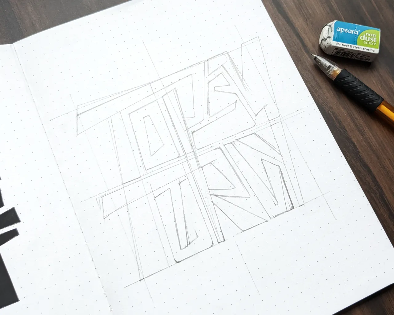
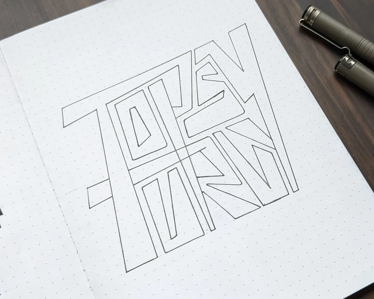
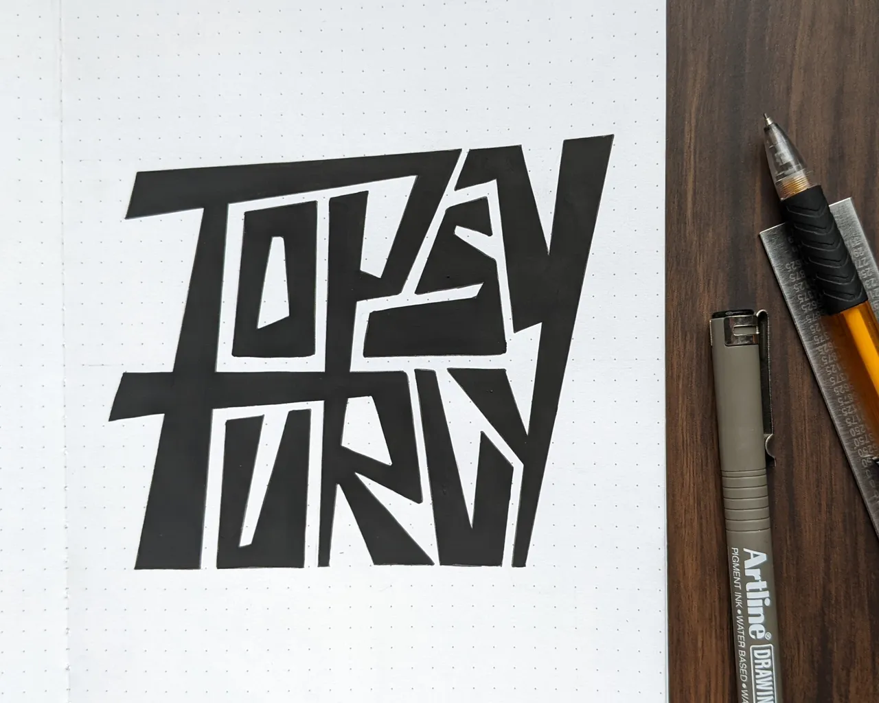
Another attempt on 'topsy-turvy'.
I am not exactly happy with the results, but it was a good exploration. I wanted to explore the squarish format with letters connecting but horizontally and vertically. I like the chunky and heavy lettering style in this one.
Things I can improve here - the square format isn't working well here, and there's a lack of balance with the vertical letter connecting lines.
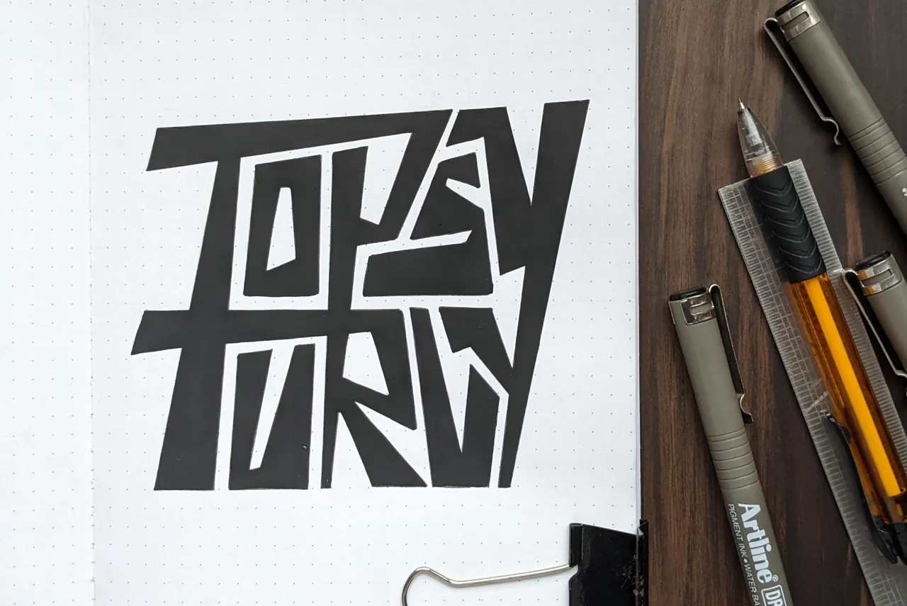
Process Shots