Vestido inspirado en "Mujer bonita" / Dress inspired by "Pretty Woman" [ESP/ENG]

Hola, fashionista!

Sé que he estado un poco perdida de la comunidad, pues últimamente he estado un poco limitada de tiempo, sin embargo, hoy les traigo una de las ultimas ilustraciones que hice, inspirada en el icónico vestido rojo que uso Julia Roberts en la comedia romántica "Mujer bonita". Espero les guste mucho y aquí les dejo el proceso!

Hello fashionista!

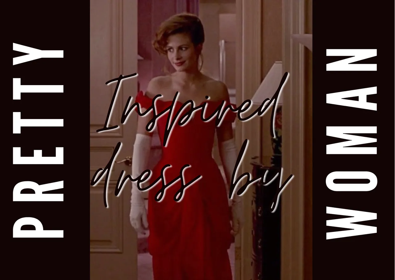
I know I've been a bit lost from the community, because lately I've been a bit limited of time, however, today I bring you one of the last illustrations I did, inspired by the iconic red dress that Julia Roberts wore in the romantic comedy "Pretty Woman". I hope you like it a lot and here you have the process!
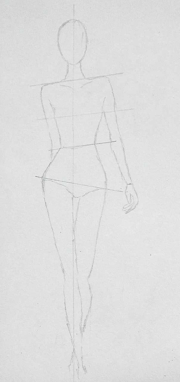
Fuente / Source

Fotografía de mi autoría editada en Canva / Photograph of my authorship edited in Canva

Boceto / Sketch

Empecé haciendo el croquis, trazando primeramente una línea vertical para de ahí partir a hacer la cabeza, ubicar los hombros, la cintura, caderas y extremidades superiores e inferiores.

Aquí pueden ver cómo lo hice:

I started by making the sketch, drawing first a vertical line to start from there to make the head, place the shoulders, waist, hips and upper and lower extremities.

Here you can see how I did it:

Luego empecé a bocetar el vestido, el cual es muy largo, con escote corazón y con unas pequeñas mangas abombadas, también le añadí los accesorios (el collar y los guantes). En este punto no sabía si hacer una versión más casual del vestido y por eso omití ciertos detalles.

Then I started sketching the dress, which is very long, with a sweetheart neckline and small puffed sleeves, I also added the accessories (necklace and gloves). At this point I didn't know whether to make a more casual version of the dress and so I omitted certain details.

Añadí la textura al vestido, la cual era muy importante ya que este tenia una serie de pliegues de arriba a abajo.

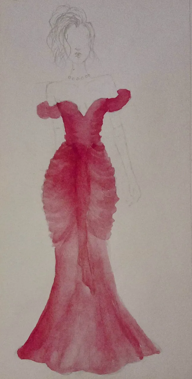
I added texture to the dress, which was very important as it had a series of pleats from top to bottom.

Como ven, gracias a los pliegues que le hice ya va tomando mas forma. Me decidí por hacerlo largo, pues si quería que se pareciera mucho al original o por lo menos acertar en algunas cosas. Realmente me estaba gustando como se veía hasta este punto, pues me daba esa vibra de "Mujer bonita" que estaba buscando.

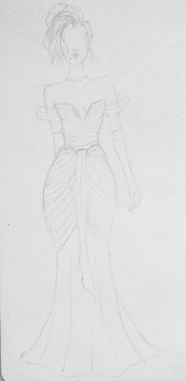
As you can see, thanks to the folds I made, it's already taking more shape. I decided to make it long, because I wanted it to look a lot like the original or at least get some things right. I was really liking the way it looked up to this point, as it gave me that "Pretty Woman" vibe I was looking for.

Pintura / Painting

Claramente el color base iba a ser el rojo fuerte, así que empecé dando una leve capa un poco diluida, dando pinceladas suaves de abajo hacia arriba, siempre cuidando la forma de los pliegues.

Clearly the base colour was going to be a strong red, so I started by applying a light, slightly diluted layer, making gentle strokes from the bottom upwards, always taking care of the shape of the folds.

Cómo pudieron ver, de una vez fue marcando las zonas de luz y sombra. Esto es importante, porque al momento de detallar se debe tener muy en cuenta en que partes profundizar el color y en que otras hay que diluir más.

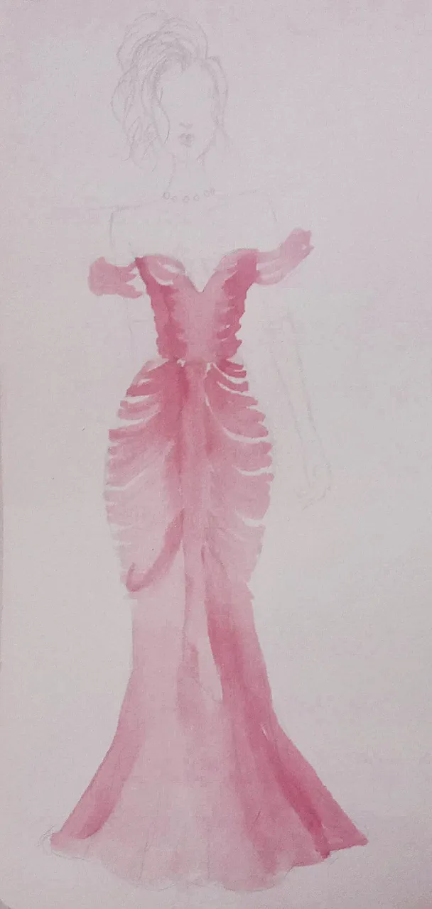
As you could see, he was marking the areas of light and shadow at the same time. This is important, because at the moment of detailing, it is important to take into account in which parts to deepen the colour and in which others to dilute more.

En esta segunda capa, intensifiqué el color rojo en las zonas que yo sentí que necesitaban profundidad, por ejemplo, el torso; pues como pueden ver, al agregar profundidad en esta zona, la figura se ve mas esvelta y por ende la parte de abajo (de las caderas) se verá mas voluminosa.

No se si han escuchado que algunas personas dicen "si quieres que tu torso o la parte de tu cuerpo se vea "delgada", es preferible usar colores oscuros que claros", esto lo dicen ya que estos colores (como el negro por ejemplo) suelen crear una sensación óptica de menos volumen.

In this second layer, I intensified the red colour in the areas that I felt needed depth, for example, the torso; as you can see, by adding depth in this area, the figure looks slimmer and therefore the bottom (hips) will look more voluminous.

I don't know if you have heard that some people say "if you want your torso or body part to look "slim", it is preferable to use dark colours rather than light", they say this because these colours (like black for example) tend to create an optical sensation of less volume.

Para finalizar, agregué más color para que se viera mas saturado y los pliegues los hice con un pincel delgado y no tan diluido, pues quería que el color se viera más marcado.

Los toques finales los hice con un lápiz de color negro y lo use para resaltar los pliegues y darle un poco de sombra a los guantes.

Con respecto al cabello y accesorios, me inspiré un poco en el peinado de Julia Roberts y el collar no lo hice exactamente igual, porque quería algo más sencillo.

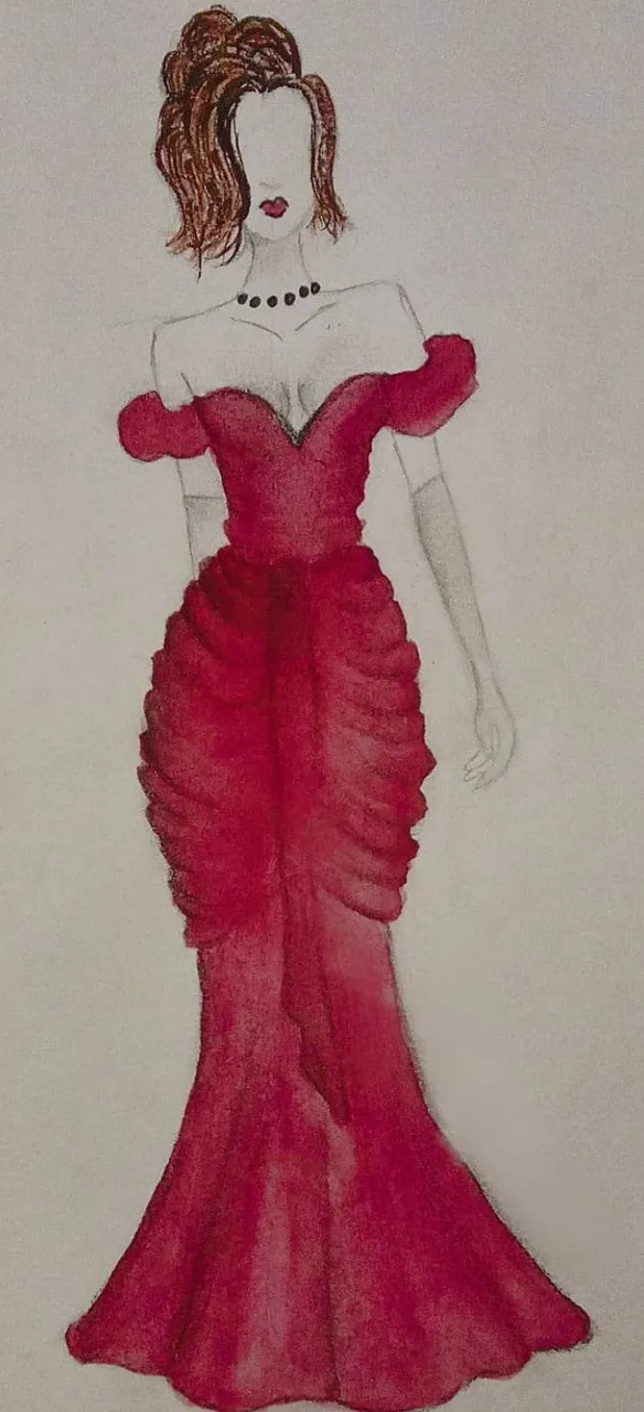
To finish, I added more colour to make it look more saturated and the folds were done with a thin brush and not so diluted, as I wanted the colour to look more marked.

The final touches were made with a black pencil and I used it to highlight the creases and give a little shadow to the gloves.

Regarding the hair and accessories, I was a bit inspired by Julia Roberts' hairstyle and I didn't do the necklace exactly the same, because I wanted something simpler.

Gracias por leer y observar, espero les haya gustado mucho. Muy pronto les traeré mas inspiraciones!!

Thanks for reading and watching, I hope you liked it a lot. I will bring you more inspirations very soon!

Texto traducido en: DeepL

Instagram

H2
H3
H4
3 columns
2 columns
1 column
Join the conversation now
Logo
Center