Hello devs👋! Hope we had a splendid week.
A few days ago I was writing a post on the leofinance dApp with my mobile phone, along the line I had to switch to my tablet to finish it up. When I did I noticed that the way the buttons on the page were displayed on my phone was kind of different from the way they were on my tablet.
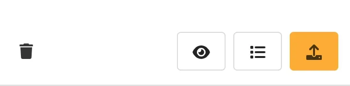
My mobile phone view:
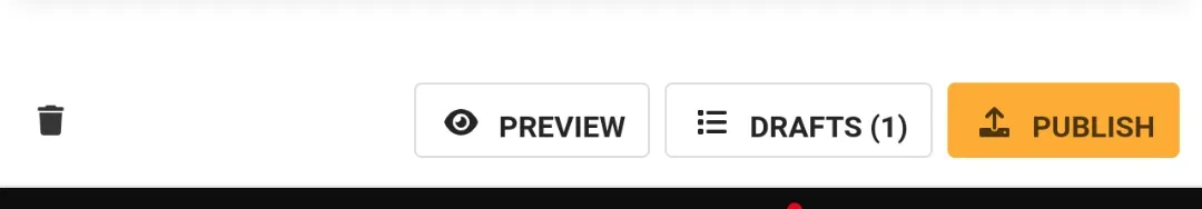
My tablet view:
Now this is actually very normal as webpages are built to be responsive, that is they can automatically adjust theirselves to fit any screen size so as to produce the best view and enhance better user experience.
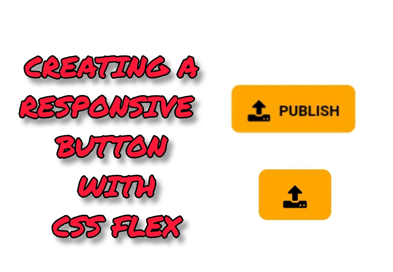
But it did get me curious to know how it works so I decided to try recreating the "PUBLISH" button with HTML and CSS and I'll be sharing a simple tutorial about how I got it done.
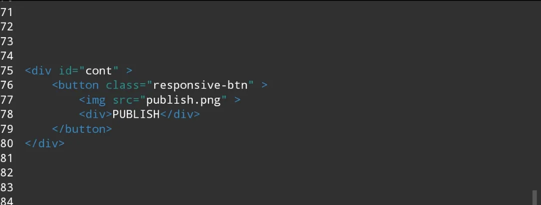
I started off with writing the HTML, I created the container div for the button, then the button element and I nested a png image of the upload icon and another div containing the "PUBLISH" text in the button tag.
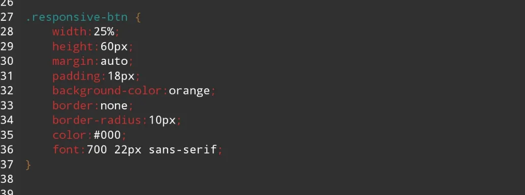
Then I styled the button to make it appear the way it looked on the page by setting the color , background color, font, height and others. Then I set the with to span 25% of the viewing screen , which is what I'd use to test the responsiveness of the button. The margin was also set to position the botton in the middle of the screen.
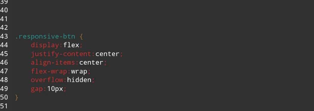
As for the responsiveness, I realized the easiest and less complicated way to achieve this is by using CSS Flex. So I set the button display to flex which will make the contents nested in it to become flexible.
Then I set the button to wrap, which will make the div containing the the publish text to go below the icon when the space in the button is limited due to a smaller viewing screen. The overflow was also set to hidden and I added some gap, this is to hide the "PUBLISH" text completely when it wraps.
Now let's see the outcome.
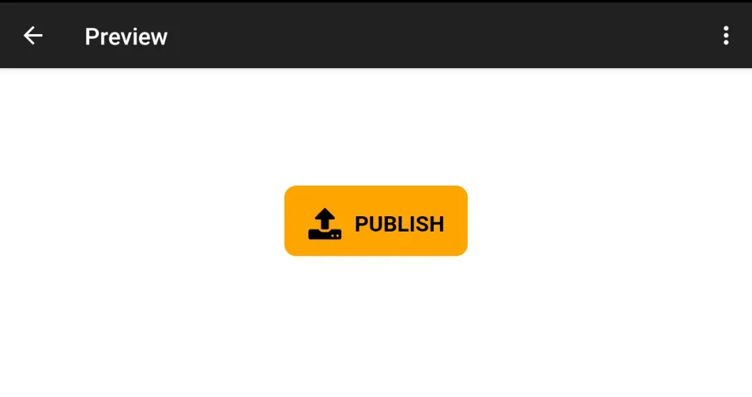
View on larger screes:
View on smaller sreens:
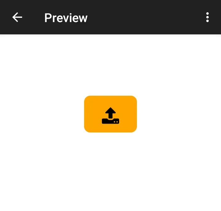
And that's how I did it, on larger screens the icon and the text will be displayed side by side but on smaller screens the text is hidden but the functionality of the button is retained.
Thanks for your time and have a nice weekend!😊