So far, so good. I'm not even close to being a JavaScript adept and I'm nowhere close to being able to hold myself at an entry level job or even an internship gig in a tech company, I'm still ages from that. But I'm ready to start some mini projects to begin polishing my HTML, CSS and JS skills.
I bought a website, pretty cheap if you ask me, and I plan to set it as some sort of resume once the crap I get done is worth showing it in a job interview or at a corporate level, but baby steps at the moment, I can't learn how to fly if I don't practice several times how to breath.
Well, this is my breathing practice, or maybe it's just my existing practice, but hopefully as I continue learning I'll be able to get more exciting and amazing stuff done.
I realized that in many of my previous code related posts I didn't update my learning timetable - the one I use for my How long does it take to be a fullstack developer post series - so, here it goes:
| Concept | Time spent |
|---|---|
| Researching Howto | 8 hours |
| Downloading programs | 2 hours |
| Configuring programs | 2 hours |
| Learning HTML | 4 hours |
| Learning CSS | 2 hours |
| Learning Javascript | 84 hours (so far) |
| JS Mini Projects | 4 hours |
| Total (so far) | 106 hours |
It's not very impressive, I still have a lot to go but considering that I started around a month and a half, I'm pretty satisfied with how much I have advanced and where I am standing. If only I knew how far I could reach in so short time, I would've started 4 years ago just like I wanted to, but never got to do it.
Either way, I'm here now, and I want to show you two small projects that I worked on yesterday. They are not flashy at all, in fact they are something you see on your everyday interwebz roaming, but to me, it's a huge step towards learning how websites work and how to achieve specific things that happen naturally on every non-mediocre website.
Collapsing and expanding an image menu
This one is straightforward. I want to have 5 images on my frontpage, and I want the first one to be expanded while the rest are collapsed. When the user clicks on one of the images, the one that is expanded will collapse and the one that the user clicked will expand, giving place for a text to show only once the image is fully expanded.
Sounds pretty simple right?
HTML code
We begin with the HTML code, which will be the bones of this little frontpage.
<h1></h1>
<!DOCTYPE html>
<html lang="en">
<head>
<meta charset="UTF-8" />
<meta http-equiv="X-UA-Compatible" content="IE=edge" />
<meta name="viewport" content="width=device-width, initial-scale=1.0" />
<link rel="stylesheet" href="style.css" />
<title>Urban Exploration</title>
</head>
<body>
<div class="container">
//container wrapped around five div with the class of panel
<div
class="panel active"
style="
background-image: url('https://images.hive.blog/DQmX9dt8Z3A9VDc7fpAHyKo3z2H13voc7suMkwRkE57hWH9/IMG_20210612_132101379.jp');
"
>
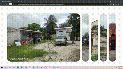
<h3>Forgotten Front Yard</h3>
</div>
<div
class="panel"
style="
background-image: url('https://images.hive.blog/DQmYC8dwtnbtFCMuMaxV4E5yxzHBYQ874tr4TgYbQaxFMWq/IMG_20210612_134338666.jp');
"
>
<h3>Motorcycle Repair Shop</h3>
</div>
<div
class="panel"
style="
background-image: url('https://images.hive.blog/DQmcVQj4XX79NUJF74njDG74E8jCZkWHYPkw2jLh5bGSa5f/IMG_20210616_104120524.jp');
"
>
<h3>Ancient house</h3>
</div>
<div
class="panel"
style="
background-image: url('https://images.hive.blog/DQmcwpCi6195trakbBxCESAuNxxgj7cEKJs1gDYuxABw1uc/IMG_20210614_121313344.jp');
"
>
<h3>Abandoned Factory</h3>
</div>
<div
class="panel"
style="
background-image: url('https://images.hive.blog/DQmVYN8qRDiBTDfmCBnAWkcx2HLoFCcp8nEb71fVenj6GvK/IMG_20210614_125735021.jp');
"
>
<h3>Colonial Monastery</h3>
</div>
</div>
<script src="script.js"></script>
</body>
</html>
So, after the HTML code, I now have the bones of my frontpage, which is not great, it's just some lines of text with a simple background behind each line, but it's horrible, it looks gross.
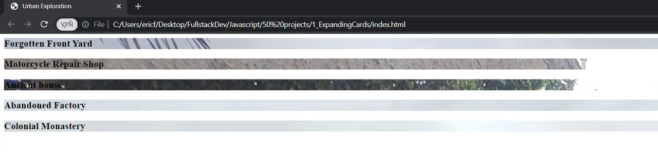
But hey, it's something. If we were only bones we would look even more horrible, we have to put some skin, muscles and body features.
CSS Code
I want to give the images a specific size, to put the texts in the middle and justify it, to align the pictures horizontally, store them in a container to be able to manipulate them and a few other things.
@import url("https://fonts.googleapis.com/css?family=Muli&display=swap");

* {
  box-sizing: border-box; // 1
}
/* * Means we are applying it to everything on the file*/

body {
  font-family: "Roboto", sans-serif;
  display: flex; // 2
  flex-direction: column; // 3
  align-items: center; // 4
  justify-content: center;
  height: 100vh; // 5
  overflow: hidden; // 6
  margin: 0;
}


.container { // 7
  display: flex; // 8
  width: 90vw; // 9
}
1.If we add any padding or border into an element it doesn't affect the width of it. Great tip.
2.This centers everything on the project. Everything we write will be displayed horizontal with no "enter" between them unless we specify it.
3.By doing this we specify that the above parameter is cool, but we want it to be vertical instead of horizontal.
4.If your flex box is horizontal, it will align them to the center of the row. If its a row, it will align them to the center of the column.
5.viewport height: Take the entire height of the browser.
6.Hidden because we don't want scrollbars to be shown by default.
7.We have a container on our HTML file, so everything we do to the container will affect that class.
8.Our container is now a flex box so any immediate children (all the divs for the pics).
9.Right now it takes 100 view ports for the content, so we have to set the image container to something.
And this is what we have so far, not very impressive right? But hey, let's see how far you get with only 100 hours under your belt.
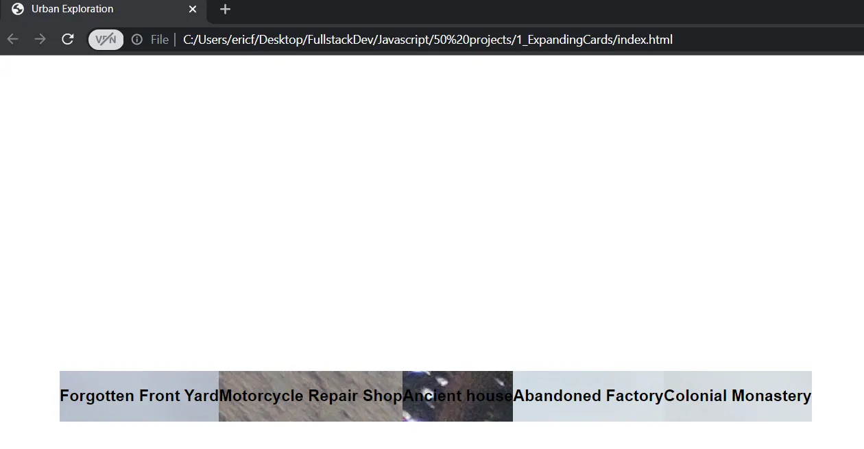
We already have the background images there and they begin to look like something, but we can set some other attributes to them.
.panel {
  background-size: cover; //1
  background-position: center;
  background-repeat: no-repeat;
  height: 80vh;
  border-radius: 50px;
  color: #fff;
  cursor: pointer; // 2
  flex: 0.5; // 3
  margin: 10px; // 4
  position: relative; // 5
  transition: flex 0.7s ease-in; // 6
}

.panel h3 {
  font-size: 24px;
  position: absolute; // 7
  bottom: 20px;
  left: 20px;
  margin: 0; // 8
  opacity: 0; // 9
}

// Now we can set the attributes of the active panel.

.panel.active {
  flex: 5;
}

.panel.active h3 {
  opacity: 1;
  transition: opacity 0.3s ease-in 0.4s;
}

// If the screen of the user is really small, we don't want to show crammed up images, so let's show only three.

@media (max-width: 480px) { //10

  .container {  // 11
    width: 100vw;
  }
  // We don't have a lot of space in small screes, so let's remove the last two panels.
  .panel:nth-of-type(4),
  .panel:nth-of-type(5) {  // 12
    display: none;
  }
}
1.We could change it to background-size: cover to preserve the rounded corners on large screens.
2.So when we hover over the pics we get a cursor.
3.For the width we can use the flex property because we are using a flex box.
4.It's to separate each image or panel
5.Because we want to position the H3's inside absolute. Meaning the H3 container div has to be relative.
6.We add a transition on the flex property. When we change click the image to be the active one, we want a transition there, not just the image to grow.
7.That's why we made the position of the panel class to be relative, so we could make this one absolute
8.We only want the h3 to show when it's active so we have to hide it.
9.This will make them invisible as long as they are inactive.
10.Any style that we put here will only take effect is the screen is under 490 pixels.
11.The container is initially set to 90 viewport widths (vw). We set it to 100 in small screens so it takes more room and gives us extra space.
12.We use the pseudo selector nth by using a colon.
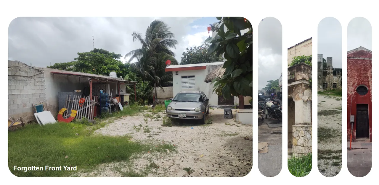
And now it begins to actually take some real form, just as I want it to look. Can you see that we already achieved the appearance I described at the beginning of this post?
The problem is, if you click on any image, nothing happens. That's because we need JavaScript to make the bones and muscles dance, and that's exactly what we are gonna do right now.
JavaScript code
All the pictures are part of the "panel" class, the only thing we need to do is change the class type when we click on the image, so the attributes of the "panel active" class kick in.
const panels = document.querySelectorAll(".panel");
// We can loop through a node list just like we can loop through arrays (in fact, the panel class is an array of images that we can loop through)
panels.forEach((panel) => {    // 1
  // 2
  panel.addEventListener("click", () => {    // 3
    panel.classList.add("active");     // 4
  });
});
1.forEach loops take a function as an argument.
2.We want an event listener on each of the images so if we click, something happens.
3.We want to listen for a click, when that click happens we want a function to run.
4.We want to have a click, and when that click happens we add the class of active.
With this little line of code we can already see how when we click on an image, the class changes and the images are bigger, but the other images still keep their "active" class because we didn't take it away from them. So we still have work to do.
panels.forEach((panel) => {
  panel.addEventListener("click", () => {
// Before we set the class to active, we have to remove the class of active from all the other ones.
    removeActiveClasses();
    panel.classList.add("active");
  });
});

function removeActiveClasses() {
// Since there's more than one panel, we have to loop through the class and then remove the active classes.
  panels.forEach((panel) => {
// What we are saying: For the panel that we are looping through, we          want to remove the active class.
    panel.classList.remove("active");
  });
}
The two functions above work as follows: First we loop through the classes and remove the active attribute from them, then when the click event happens we will only give the "active" attribute to the one we clicked.
Right before it gives the active class to the image we are clicking, it takes the active class away from all the others.
But as soon as we click on the image, the text appears on the bottom left and we don't want that, we want the text to show once the image is fully opened so let's change the opacity and give it a transition, just as we did with the active panel.
.panel.active h3 {
    opacity: 1;
    transition: opacity 0.3s ease-in 0.4s;
  }
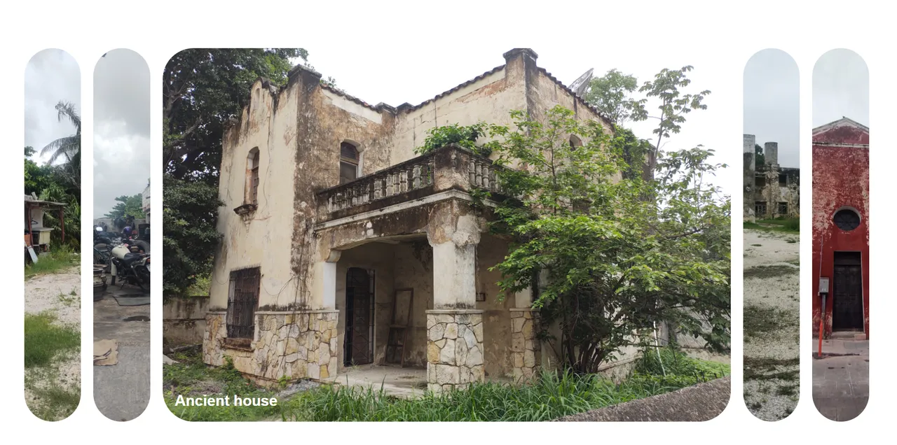
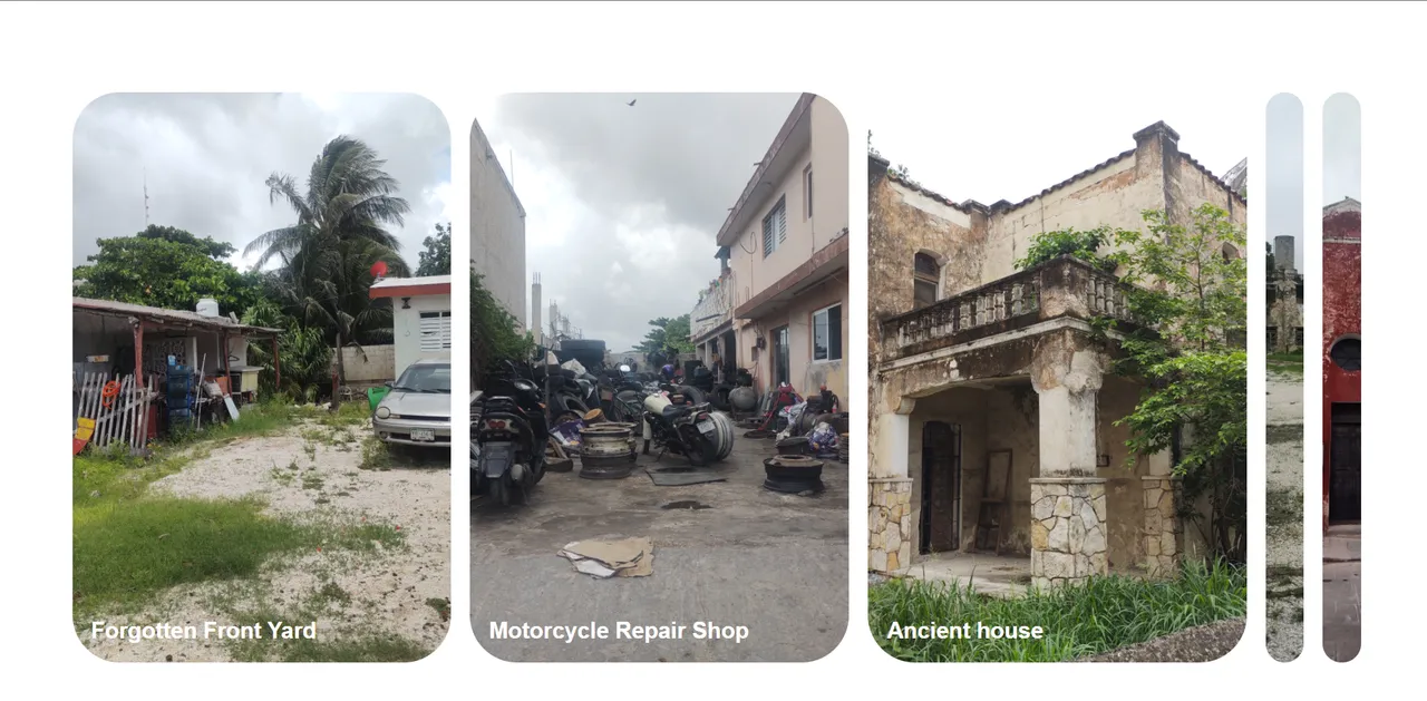
Thanks to the magic of HTML, CSS and JS, here's the final result:
Setting up a progress bar
After the HTML
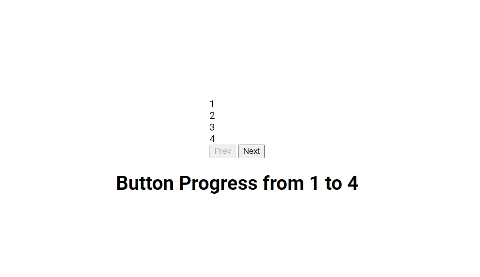
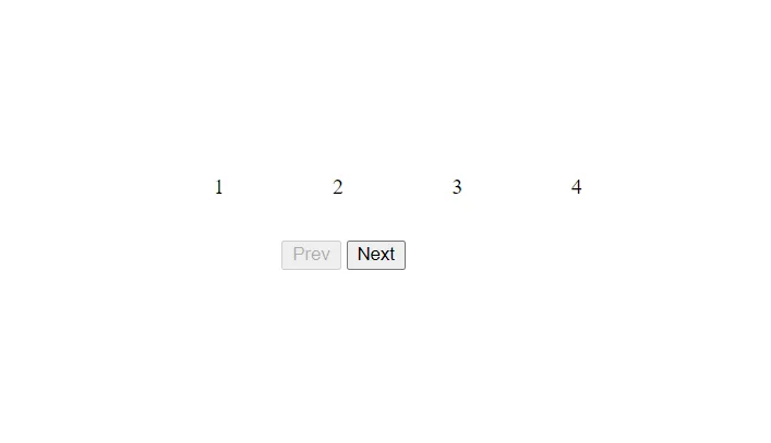
So, I want to make a progress bar that has two buttons, a prev and a next one, and when I click either button, the progress bar reacts to it and shows a forward or rewind transition. If the progress is on the first step, the prev button must be disabled, and if the progress is at 100%, the next button must be disabled.
Let's get to it.
HTML Code
<h1></h1>
<!DOCTYPE html>
<html lang="en">
  <head>
    <meta charset="UTF-8" />
    <meta http-equiv="X-UA-Compatible" content="IE=edge" />
    <meta name="viewport" content="width=device-width, initial-scale=1.0" />
    <link rel="stylesheet" href="style.css" />

    <title>Progress Steps</title>
  </head>
  <body>
    <div class="container">    // 1
      <div class="progress-container">
        <div class="progress" id="progress"></div>
        <div class="circle active">1</div>    // 2
        <div class="circle">2</div>    // 3
        <div class="circle">3</div>
        <div class="circle">4</div>
      </div>
      <button class="btn" id="prev" disabled>Prev</button>    // 4
      <button class="btn" id="next">Next</button>
    </div>
    <script src="script.js"></script>
  </body>
</html>
1.We put everything inside the container so we can manipulate the style of the whole project.
2.This is the button that will by default be active, hence the class.
3.There can only be one active button so we don't give these buttons the active class.
4.We don't want the "prev" button to be enabled at first, because it will the step one, we'll make it be enabled in the JS file.
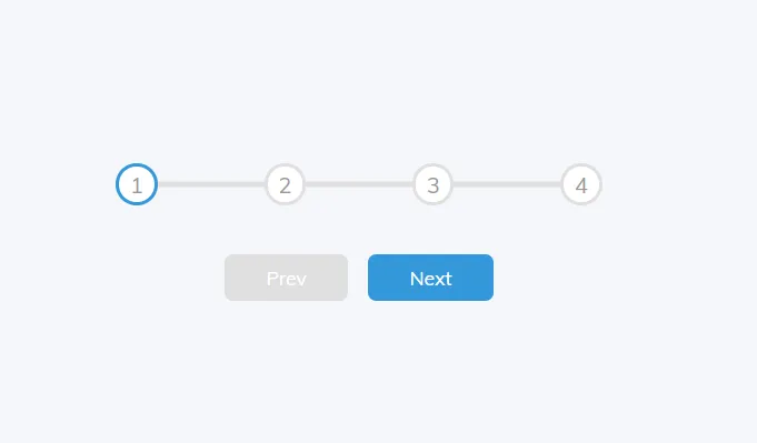
And voilá, we have close to nothing, but we already have all the elements that we need to tweak in order to make the progress bar, we just need to put the skin and clothes.
CSS Code
After line 29 CSS
@import url("https://fonts.googleapis.com/css?family=Muli&display=swap");

* {
  box-sizing: border-box; // 1
}

body {
  background-color: #f6f7fb;
  font-family: "Muli", sans-serif;
  display: flex; // 2
  align-items: center; // 3
  justify-content: center;
  height: 100vh; // 4
  overflow: hidden; // 5
  margin: 0;
}

.container {
  text-align: center;
}

.progress-container {    // 6
  display: flex; // 7
  justify-content: space-between; // 8
  position: relative; // 9
  margin-bottom: 30px;
  max-width: 100%;
  width: 350px;
}
1. If we add any padding or border into an element it doesn't affect the width of it.
2.This centers everything on the project. Everything we write will be displayed horizontal with no "enter" between them unless we specify it.
3.If your flex box is horizontal, it will align them to the center of the row. If its a row, it will align them to the center of the column.
4.viewport height: Take the entire height of the browser.
5.Hidden because we don't want scrollbars to be shown by default.
6.This is the container of the 1,2,3,4 buttons, not the prev and next buttons.
7.We want the 1-4 buttons to be in a flex row.
8.So the remaining space at the end comes in between the numbers.
9.So we can position other things inside of it.
.progress-container::before {    // 1
  content: ""; /   2
  background-color: #e0e0e0;
  position: absolute;
  top: 50%;
  left: 0;
  transform: translateY(-50%);
  height: 4px;
  width: 100%;     // 3
  z-index: -1;
}

.progress {
  background-color: #3498db;
  position: absolute;   // 4
  top: 50%;   // 5
  left: 0;
  transform: translateY(
    -50%
  );  // 6
  height: 4px;    // 7
  width: 0%;   // 8
  z-index: -1;    //  9
  transition: 0.4s ease;    // 10
}
1.Before: Represents a styleable child pseudo-element immediately before the originating element’s actual content.
2.When you use before, you have to set the content into an empty string.
3.This represents the empty line of the progress that will be filled with blue once we click on the "next" and "prev" buttons; that's why this line is at 100% and the blue one below is at 0%.
4.We want it to be absolute within the progress container which is positioned relative.
5.We want it in the middle of the page, vertically.
6.We want the line of the progress directly in the middle of the Y axis.
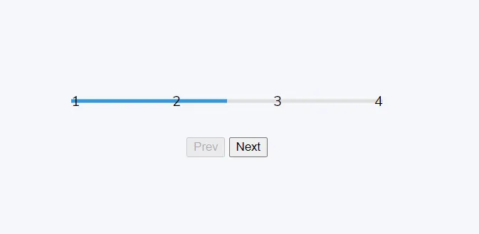
7.For the progress picture I'll put this at 50% so you see how it works, but I'll set it at 0% once i take the screenshot.
8.This is at 0% width because it is the starting point, but in the JS we'll play with it.
9.We want to make sure this is behind the numbers.
10.When we click previous or next, we want a transition between the numbers.
We are slowly getting there but let's style the numbers and the circles, so visually we are all set and all we need to do is to write the JS code.
After CSS is finished
.circle {
  background-color: #fff;
  color: #999;
  border-radius: 50%; // 1
  height: 30px;
  width: 30px;
  // 2
  display: flex;
  align-items: center;
  justify-content: center;
  border: 3px solid #e0e0e0;
  transition: 0.4s ease;   // 3
}

.circle.active {
  border-color: #3498db;
}

.btn {
  background-color: #3498db;
  color: #fff;
  border: 0;
  border-radius: 6px;
  cursor: pointer;
  font-family: inherit;
  padding: 8px 30px;   // 4
  margin: 5px;
  font-size: 14px;
}

.btn:active {
  transform: scale(0.98);   // 5
}

.btn:focus {
  outline: 0;    // 6
}

.btn:disabled {
  background-color: #e0e0e0;    // 7
  cursor: not-allowed;    // 8
}

.panel.active h3 {
  opacity: 1;
  transition: opacity 0.3s ease-in 0.4s;
};
1.Because we want it to be rounded.
2.To center the numbers in the circles we use the three attributes below.
3.The border is going to change depending on where the blue line is, which depends on the active class.
4.We set 8 for top and bottom, 30 for left and right.
5.When we click the button, it will scale to 0.98.
6.When it's in focus state, there will be no outline.
7.If the button is disabled, we color it grey.
8.If it is disabled, we can't click on the button.
Still not where I want it to be, but slowly getting there. This is it for the CSS part, now we can begin with the JS code which is actually the hard part.
JavaScript code
We want to be able to click on the "next" and the "prev" button and that the buttons react to the click, then the progress on the 1-4 line respond.
First, we bring the buttons over from the index.html file and store them into variables so we can use them more easily:
const progress = document.getElementById("progress");
const prev = document.getElementById("prev");
const next = document.getElementById("next");
const circles = document.querySelectorAll(".circle");
Since there are more than one circle, we have to use the "querySelectorAll" and store them into a variable that brings them all in as a node list, which is pretty much an array.
let currentActive = 1; // 1

next.addEventListener("click", () => {    // 2
  currentActive++;    //  3
  if (currentActive > circles.length) {    // 4
    currentActive = circles.length;    // 5
  }
  update(); // We will define update in the lines below
});

prev.addEventListener("click", () => {
  currentActive--;
  if (currentActive < 1) {
    currentActive = 1;
  }
  update();
});
1.This variable will act as an index. It will represent whichever circle is active, we'll set the circle 1 as default.
2.We take the next button and add an event listener to it.
3.Whatever the active is at the time, increment it by 1.
4.We are making sure that if it gets to the end, it doesn't go over 4
5.If it goes over 4, we set it to 4 (the array length, remember we brought the circles as a node list, that works just like an array?)
We already have the prev and next buttons working, but we need to define the update function, which will modify the previous circle buttons and the next circle buttons, so the colors and everything makes sense (we can't have the second circle colored and not the first one, for example).
function update() {
  circles.forEach((circle, idx) => {
    if (idx < currentActive) {
      circle.classList.add("active");
    } else {
      circle.classList.remove("active");
    }
  });
And now we are talking...
We can click the next button as many times as we want and the circles will fill blue, but we also want the progress lines to be blue up until the point the progress goes, so we need to keep coding in the JS file.
const actives = document.querySelectorAll(".active"); // 1
Remember that the progress is measured in the .progress class? And that progress is measured by the % of the width of the line, so, all the we have to do is make that progress width change as we click the next or prev buttons.
  progress.style.width =
    ((actives.length - 1) / (circles.length - 1)) * 100 + "%";    // 2
  if (currentActive === 1) {    // 3
    prev.disabled = true;
  } else if (currentActive === circles.length) {    // 4
    next.disabled = true;
  } else {
    prev.disabled = false;    // 5
    next.disabled = false;
  }
}
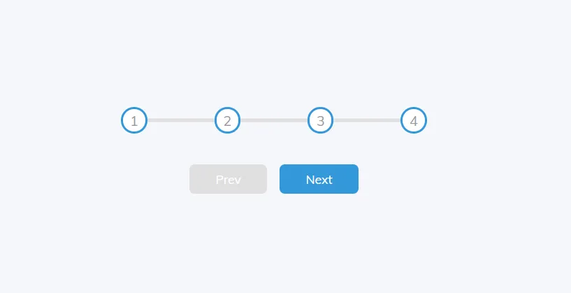
And so, after all that riddly code and two hours just to post this, let me show you the final outcome:
I hope you enjoyed this post, it took me more than 2 hours to post - imagine how long it took me to write the actual code. Any comment or feedback is much appreciated. Now get out of here, go vote on other posts.
Disclaimer: I am learning to code, I'm not an expert. I base my learning in several courses (both paid and free online), MDN, hundreds of articles, stackoverflow research and much more. I based the logic of these two projects on a paid course I have, but one can't copyright code, so any similarities you find online well thank you, that means my code is written somewhat clean and dry, and I am getting exactly where I want to be, where the real coders are.