Hello Everyone,
If you've been in the back woods for months or living under a rock you might have missed the New LeoFinance User Interface dropped yesterday. Khal has been asking for reviews and feedback and suggested just making a post, so here we are!
This release is considered an Alpha release for public testing and is still missing some features and is highly geared at threads, so let's take a look. (You can browse it by yourself here) https://alpha.leofinance.io/publish
For the purpose of this review I am going to assume that you are already a Hive/Leo User who has the ability to log in with Keychain or another Key Utility.
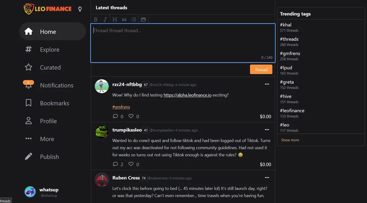
Once you log into and land on the front page if you use Twitter it will likely look quite familiar to you.
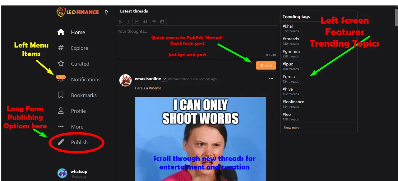
A list of menu options and settings are framed on the Far Left of your screen, while the middle section invites you to make a quick "Thread Post" and the right frame is a list of trending topics, making navigation to any activity a quick click away. A bonus over twitter is the "publish" features make it easy to use BOLD, HEADINGS and more.
**There is potential here for a user to be confused about entering a Thread vs. a post. This would not be confusing for those who have been here and know the site, but a new user is unlikely to know the difference or where they should start.
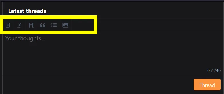
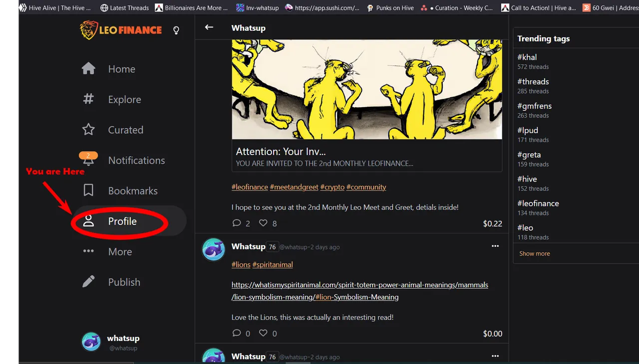
Let's take a look at notifications here.
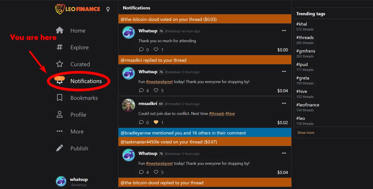
I love how much information you can get here, but I am confused on how to clear these notifications or work on them. I expected the orange notifications to be clickable and to link to where I can "respond", clear or other action. However, at least in FireFox there isn't a click action on the orange notification bar. I like my notifications to be like a task list that I can work through for responses, votes, or other action. So, that I know where I am in the list and feel like I haven't missed anything.
I like the look and the information, just make it easier to click and move.
Moving on to the profile section.
For now this works exactly as you might think with your profile information and the ability to scroll though you threads and posts. Looks nice and works as expected.
I am assuming a future release will add the ability to edit and change profile setting, pictures and text from this screen. This is all great and and as expected!
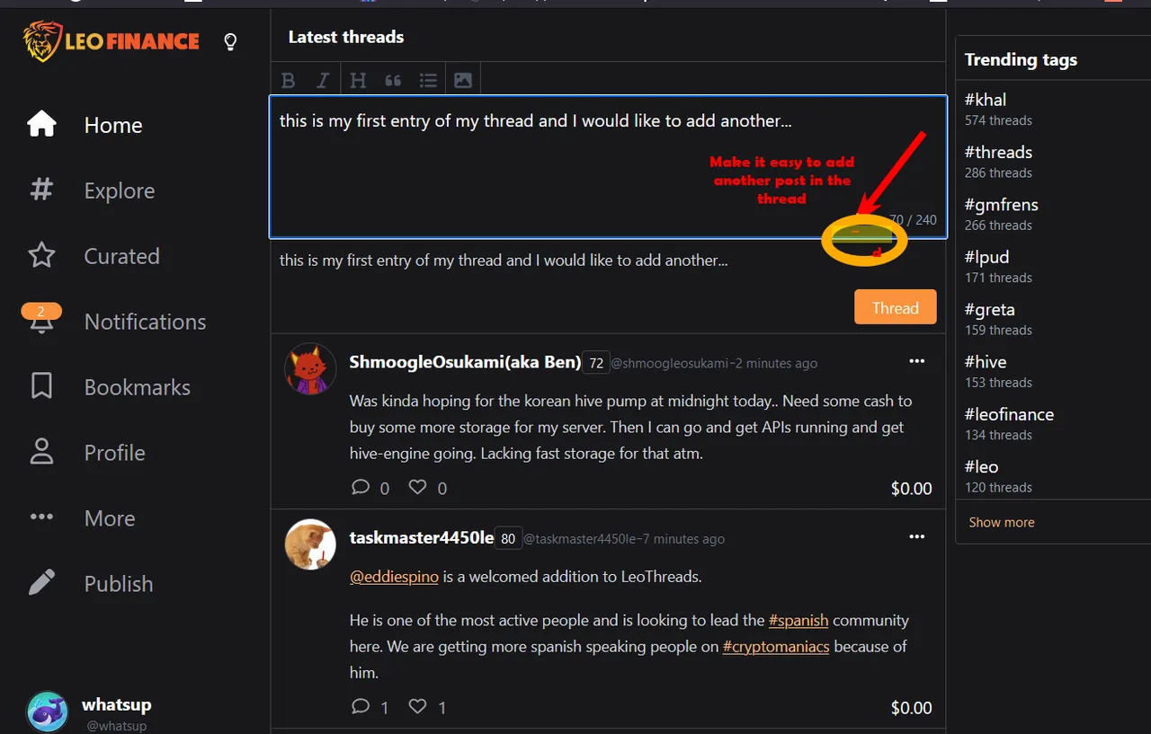
During one of the Quests I discovered it is quite a pain to make a thread of 5, due to having to submit each post wait for it to reach the blockchain and then reply. While I realize that the blockchain only accepts one action per user, every 3 seconds, maybe allow me to create all 5 threads and then publish them one at a time in the background. (or some other easier solution) The point is I want to type and add them quickly!
In general I am really excited about the new front end and how user friendly it is for threads and curation. As new features are added and more use the new UI be sure and provide lot's of feedback!
Also, I want to thank everyone who came to the Meet and Greet today and I will be making a post about that tomorrow!
Add your thoughts on the new UI in the comments, or better yet, make your own post!