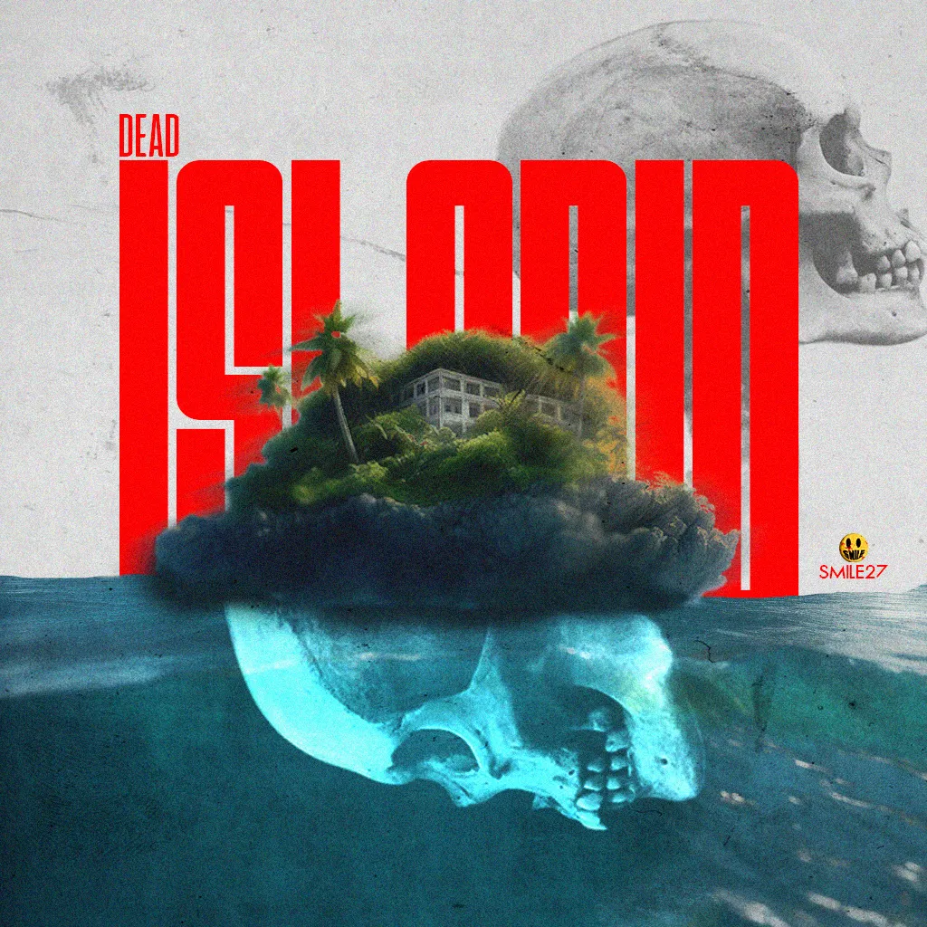
DEAD ISLAND
Saludos, comunidad de Alien Art!
Al llegar a nuestra décima portada, decidí rendir un pequeño homenaje a las películas de terror que han explorado la temática de islas infestadas de monstruos o zombies, tomando inspiración de juegos emblemáticos como el conocido DEAD ISLAND.
Si el diseño capturó tu atención, te invito a acompañarme en un recorrido por el fascinante proceso creativo detrás de esta pieza.
Greetings, Alien Art Community!
As we reach our tenth cover, I've decided to pay a small tribute to horror films that have delved into the theme of islands infested with monsters or zombies, drawing inspiration from iconic games such as the well-known DEAD ISLAND.
If the design has caught your attention, I invite you to join me on a journey through the fascinating creative process behind this piece.

PROCESO / PROCESS
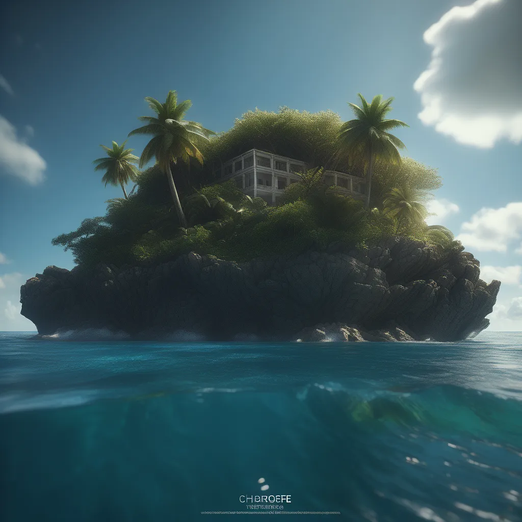
Una imagen generada por inteligencia artificial.
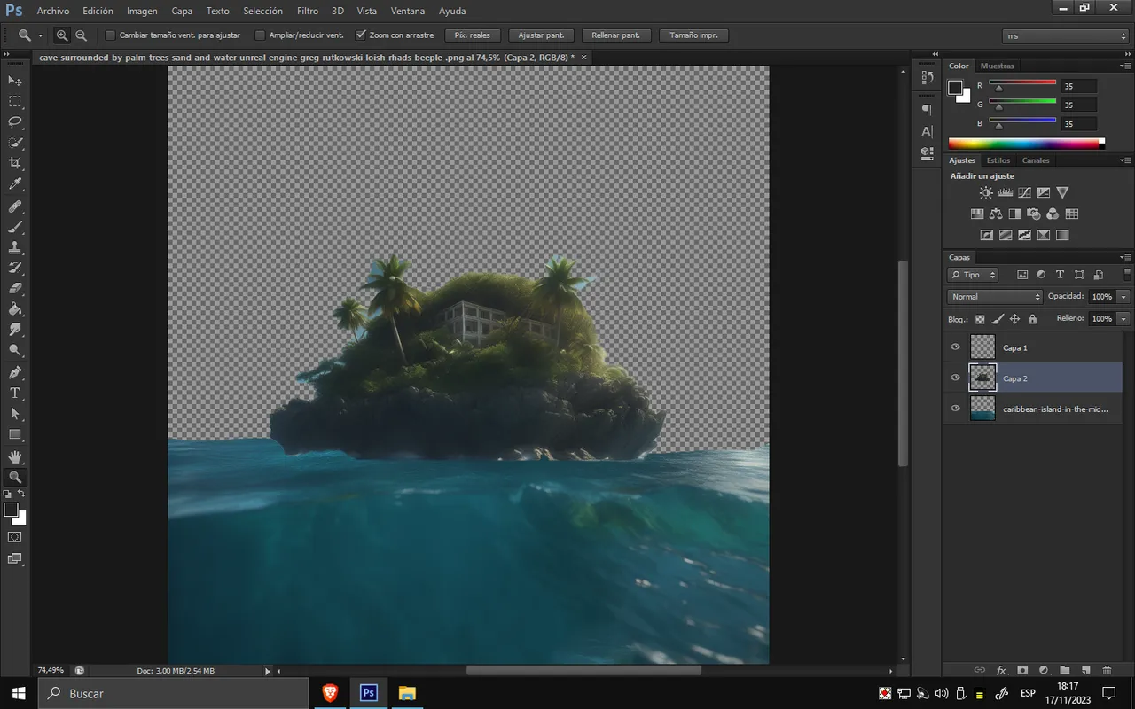
Al comenzar a crear la imagen, empecé a diseñar visualmente el enfoque que tendría esta vez. Así que procedí a eliminar el cielo correspondiente y a aislar la isla, redimensionándola y detallándola para que mantuviera un contraste con el agua.
A generated image by AI.
When creating the image, I started visually designing where my focus would be this time. So, I proceeded to remove its respective sky and isolate the island, resizing and detailing it to maintain contrast with the water.
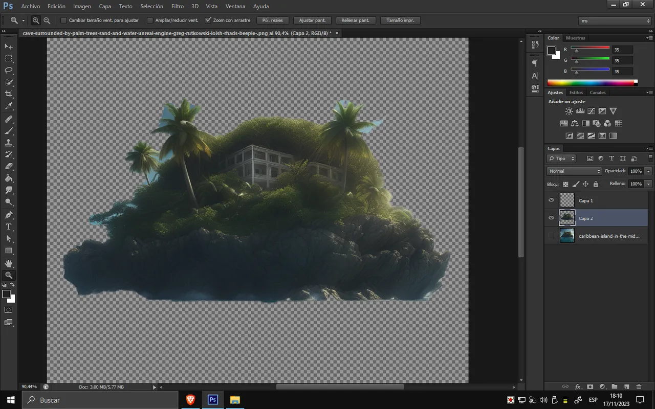
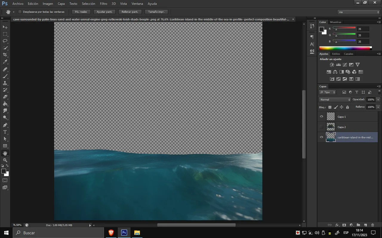
Así quedarían los objetos separados.
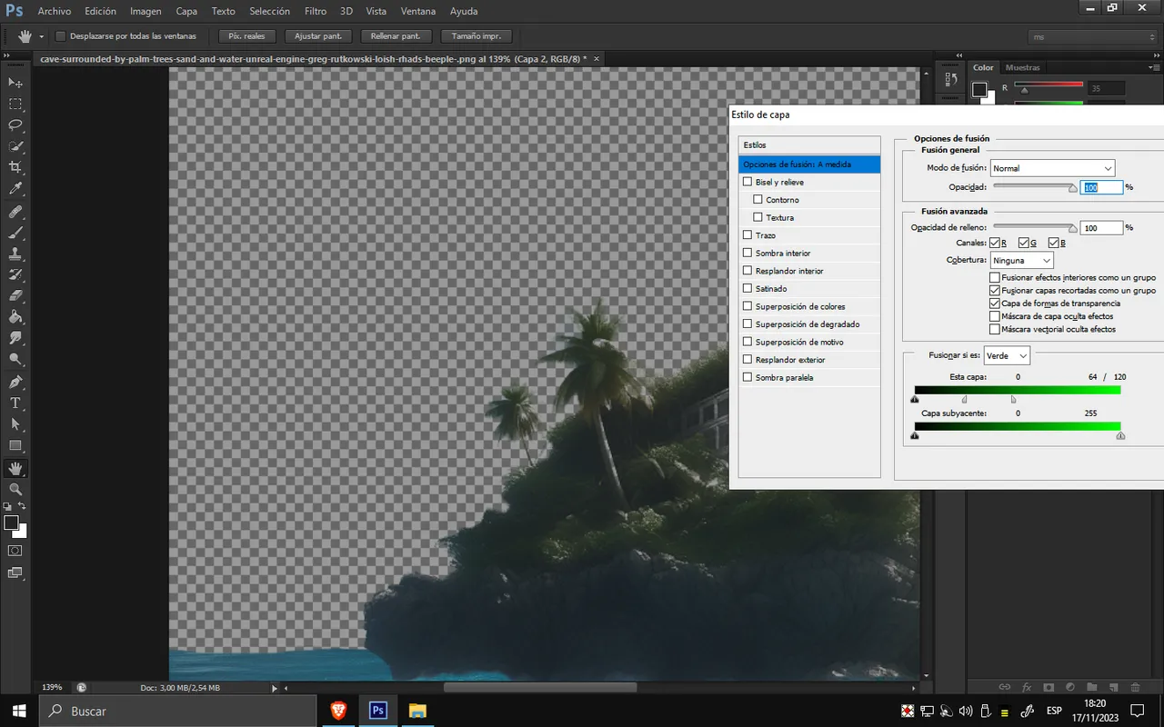
Como se puede observar, algunas imperfecciones son muy notorias a simple vista. Para corregirlas, una vez ubicados en sus posiciones y redimensionados, procedí a ir a las opciones de fusión. Esto me permitió eliminar los tonos verdes, eliminando así gran parte del fondo del cielo.
This is how the objects would look when separated. As we can see, some imperfections are quite noticeable. To address this, once they were placed in their positions and resized, I proceeded to go to the blending options. This allowed me to eliminate the green tones, removing a significant portion of the sky background.
Como se puede apreciar en la imagen de abajo, se corrigieron varias imperfecciones, resultando en una isla redimensionada y perfeccionada en los bordes.
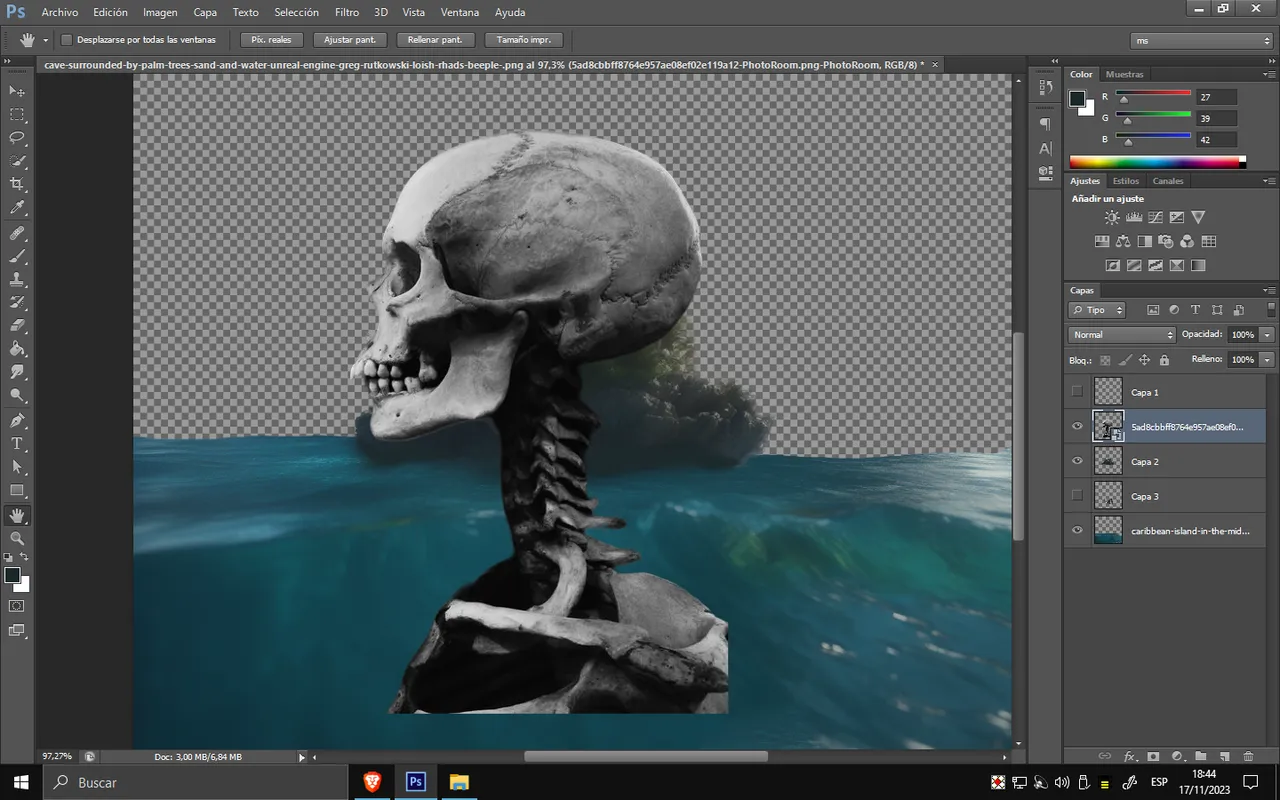
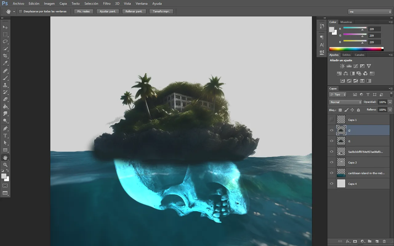
El diseño debía ajustarse a mi idea, así que procedí a agregar una calavera como base de la isla. Esto también transmitiría el mensaje de muerte y peligro en la isla, sugiriendo significados ocultos según la interpretación.
As seen in the image below, several imperfections were corrected, resulting in a resized and refined island with smoothed edges. The design needed to align with my idea, so I proceeded to add a skull as the base of the island. This also conveys the message of death and danger on the island, hinting at hidden meanings according to interpretation
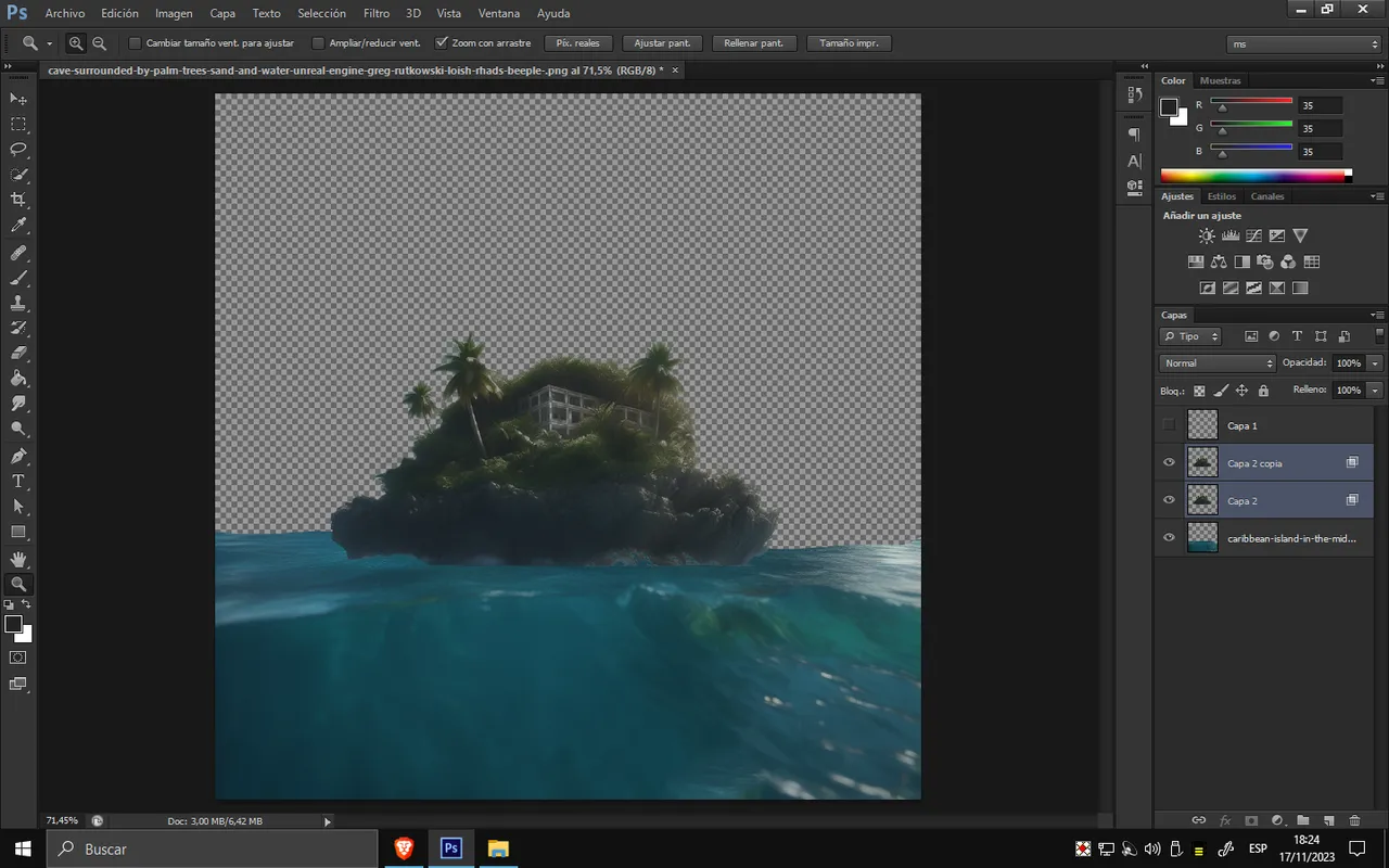
Realicé dos copias de la isla y, en cuanto a la capa inferior, apliqué un efecto de movimiento mediante filtros.
I created two copies of the island, and for the bottom layer, I applied a motion effect using filters
Para la parte del título, utilicé dos tipos de fuentes que resultaron elegantes para el diseño. Aplicando un texto en grande y otro en pequeño lograría un buen dinamismo para el título. La elección del color ROJO se debe a que, al tratarse de una isla de muerte, quería recurrir a la sangre como simbolismo del color rojo, quizás asociándolo con el peligro. La paleta de colores ya nos indica cómo una vista hermosa puede ocultar cosas oscuras.
For the title, I used two types of fonts that turned out to be elegant for the design. Applying a large and a small text would create a good dynamic for the title. The choice of the color RED is because, being an island of death, I wanted to evoke blood as a symbol of the red color, perhaps taking it down the path of danger. The color palette already hints at how a beautiful view can hide dark things
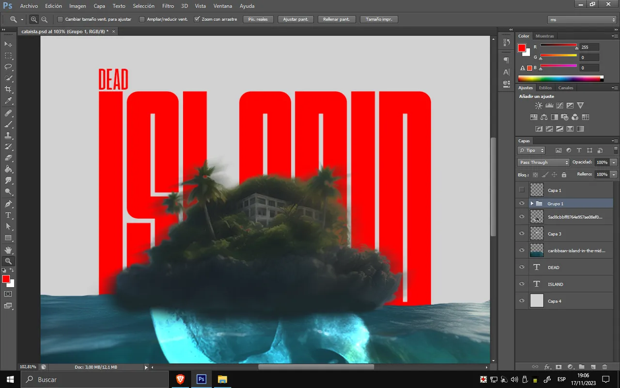
Si observamos el ejemplo, el color negro le confiere elegancia, pero no transmite la misma sensación que el color rojo. Además, logra un buen contraste visual con el verde de la isla.
If we observe the example, the black color adds elegance, but it doesn't convey the same feeling as the red color. Additionally, it achieves a good visual contrast with the green of the island
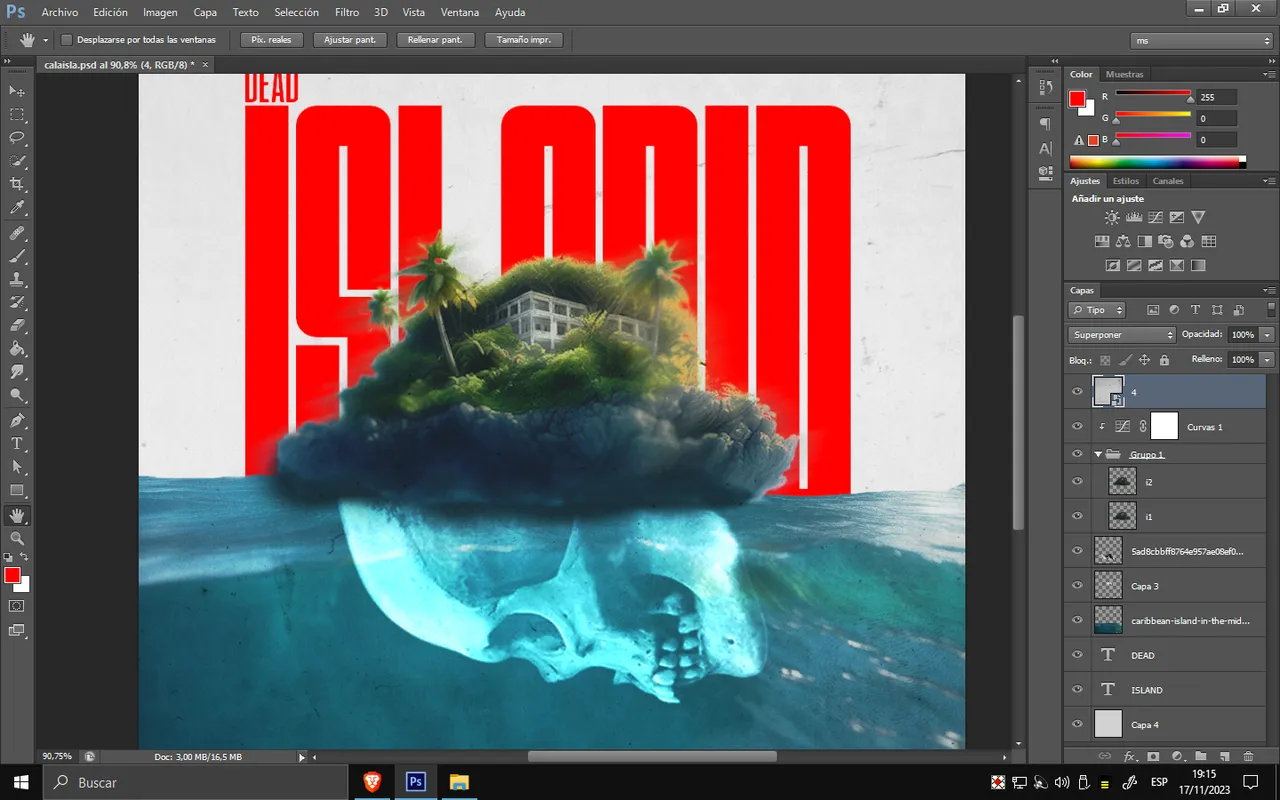
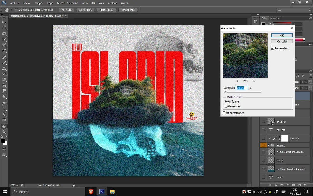
La colección de brillo y luz se realizó con una capa de curvas, lo que me permitió añadir más iluminación y color, y la diferencia es notoria. Para finalizar, apliqué un filtro con ruido para otorgarle un aspecto antiguo y desgastado a la portada y darle el toque final. Espero que hayas disfrutado del proceso. Nos vemos en el próximo post
The brightness and light correction was done with a curves layer, allowing me to add more illumination and color, and the difference is noticeable. To finish, I applied a noise filter to give it an old and worn look to the cover and add the final touch. I hope you enjoyed the process. See you in the next post
Tools Used :
Photoshop
WACOM CTL 472
Font AI