Finally, after a few days of sketching, coloring, and shading, I managed to wrap up my entry for this week's Splinterlands Art Contest! Man, what a relief it is to have my second digital piece done using my Huion tablet. I was so stressed about not having enough time to really dive into my art with the tablet, and it’s been kinda frustrating. Like, I really want to get lost in my work, but there’s just not enough hours in the day to do it justice.
Lucky for me, today’s a holiday because the country is celebrating its national day, which means I got some extra time to finish up my artwork.
Last week, I did a piece for the Holozing community, inspired by the character Raccomon, and I was stoked to get such good feedback from everyone. So this week, I’m excited to share my contribution to another awesome gaming community here on our platform—Splinterlands!
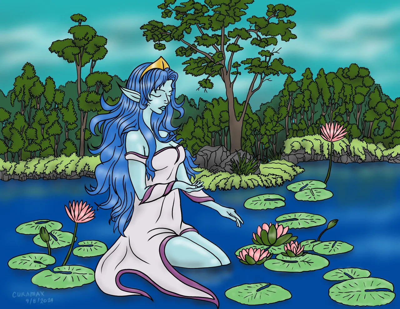
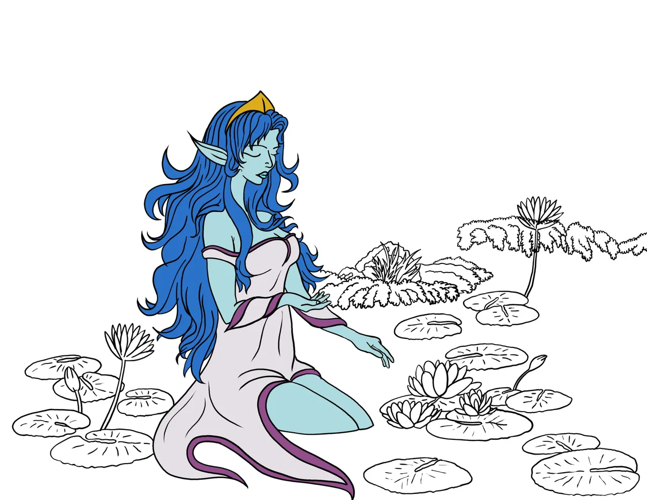
I picked River Nymph as my muse this time. She’s one of the less complicated characters in the game, but still super popular. I’ve noticed a lot of artists get inspired by her, so I thought it’d be cool to reimagine her through my own lens.
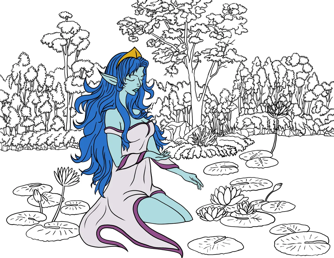
My workflow for this piece was a bit different from what I did before. I decided to simplify my approach, focusing on getting the doodles and character outlines just right.
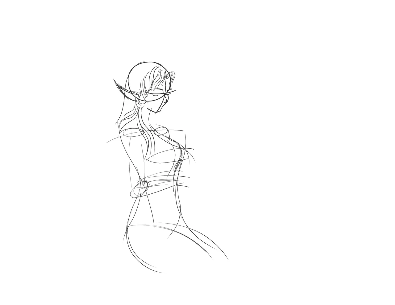
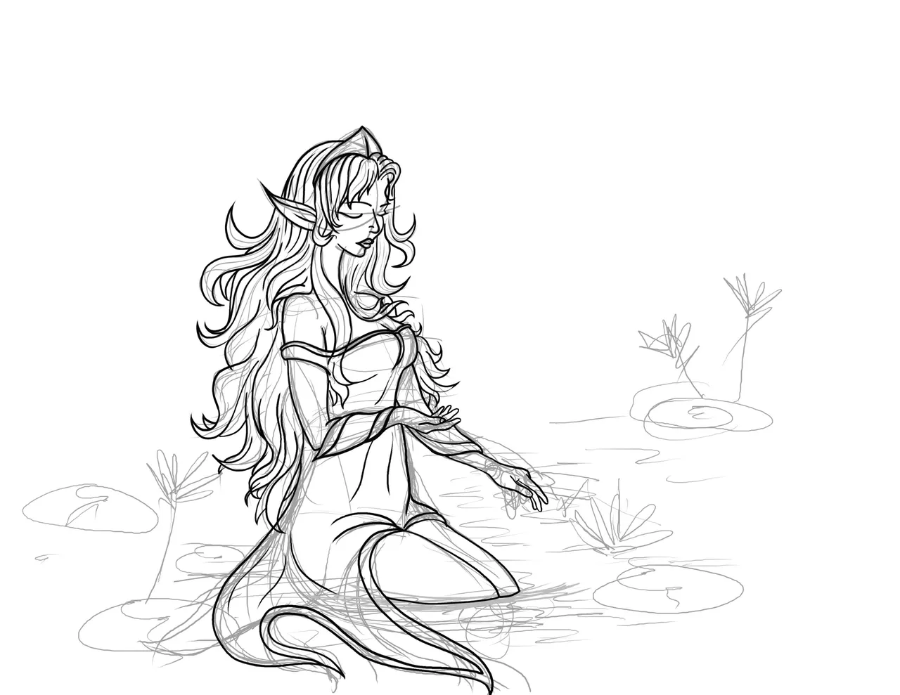
I really wanted to test out the pen pressure on my Huion, so I stuck with a basic brush, cranked up the pressure sensitivity, and just let my hand do its thing to create the varying thickness in the lines.
Honestly, I’m so hyped that the pen followed my every move exactly how I wanted. Technology these days, man; it’s wild how much it’s improved the quality of digital art.
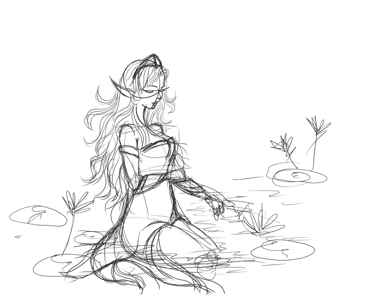
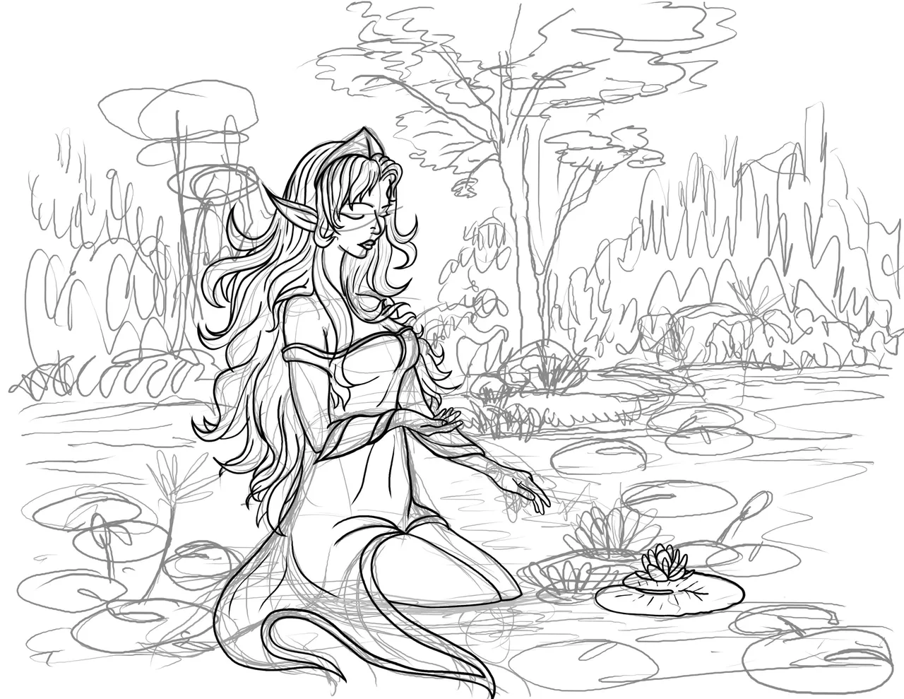
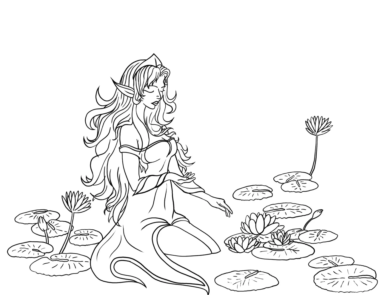
Once I nailed down the outlines, doodles, and foreground and background elements, I jumped into the colors.
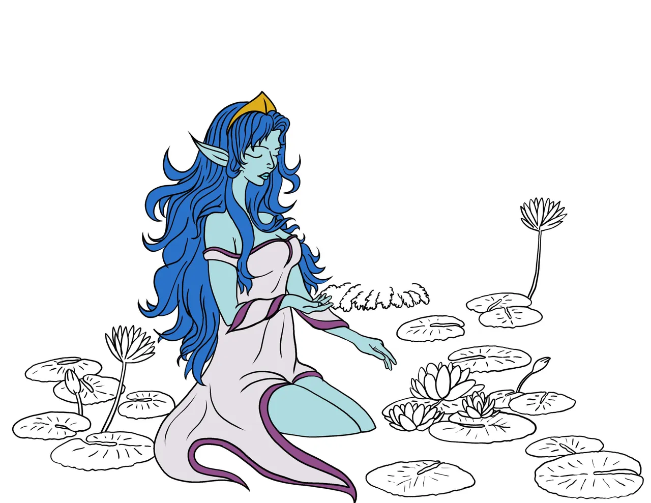
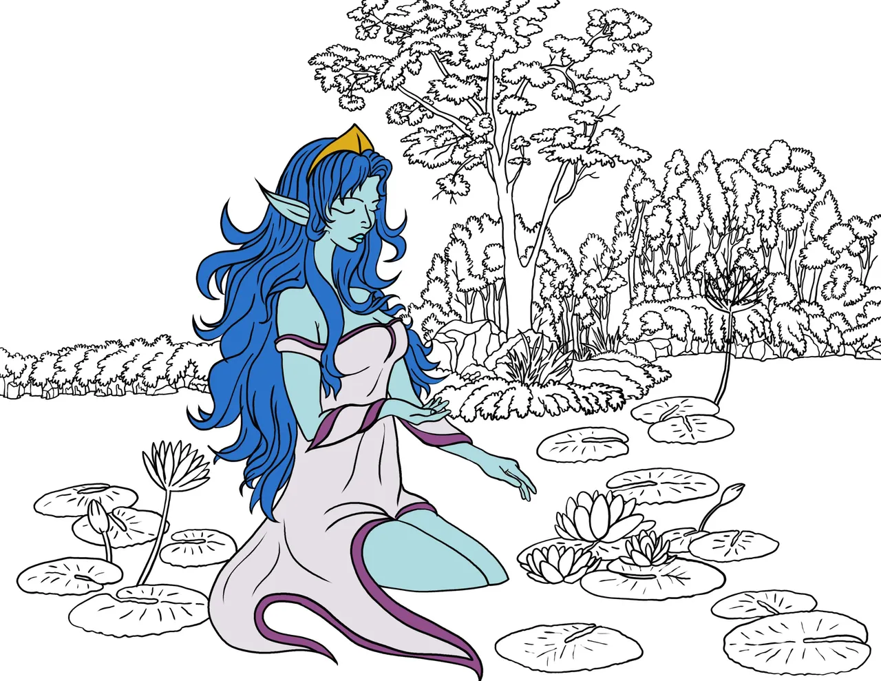
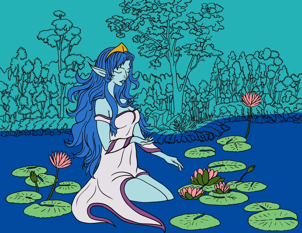
I kept the original character’s colors as a base but tweaked them a bit to match my own vibe.
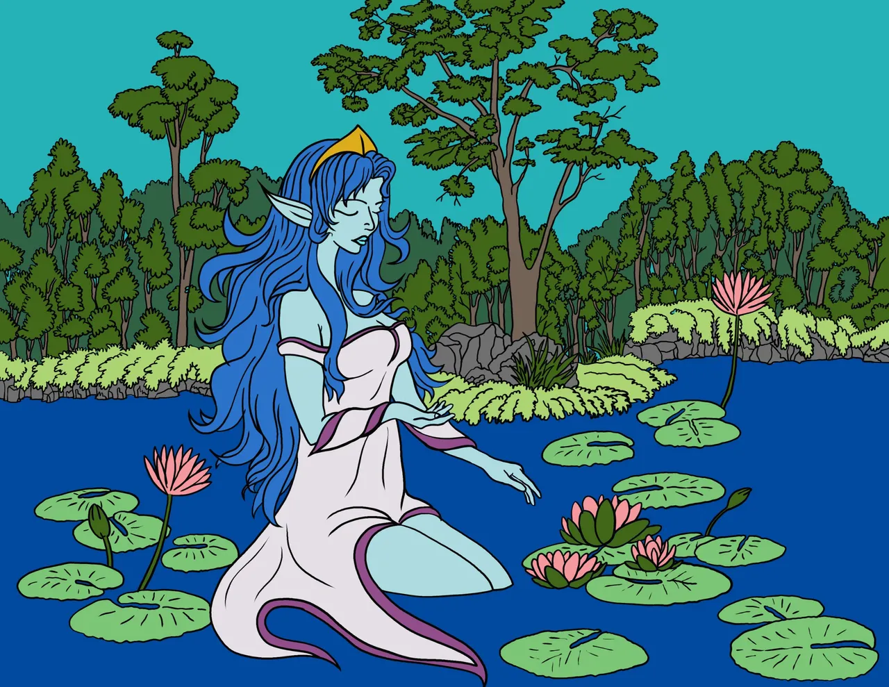
Here's the final result!
For shading, I went with simple brushstrokes, adding highlights and shadows where I felt they were needed. Then, I played around with the opacity until everything blended nicely and fit the overall tone of the piece.
I think there are still a couple of things I could improve on with this piece, and I’m looking forward to tackling those in my next artwork. Hope you all enjoy my presentation today. Have an awesome day, everyone!