Español - Click aquí
¡¡Un weekee-saludo a todos los Hivers!! He estado buscando comunidades de arte en Hive y esta fue una de las que más llamó mi atención. Quisiera comenzar a hacer vida aquí y conocer nuevos artistas :)
He estado animando toda mi vida, tanto en 2D digital como 3D, pero tengo un pequeño problema que ha dificultado mi superación personal desde siempre: no saber colorear.
Nunca he seleccionado una paleta de colores específica para un video y siempre he dibujado o bocetado en blanco y negro.
Intentar comprender la teoría del color siempre ha volado mi cabeza. Busqué unos días atrás tutoriales y explicaciones sobre ella, pero no me sentía lo suficientemente a gusto para intentar aplicarla haciendo mi típica arte digital. Aún no he desarrollado una visión de dibujante, me es complicado representar directamente en un plano algo que veo o que imagino.
Entonces pensé en alguna alternativa diferente para aprender y aplicar esta teoría, un estilo de dibujo más geométrico, dependiente de unos contados colores, y lo primero que me vino a la cabeza fue el Pixelart.
Era una idea fenomenal, aprender teoría del color mientras aprendo el pixelart. Conseguí un software llamado Aseprite, muy cómodo de utilizar y facilita el manejo de herramientas. Me encantó muchísimo el funcionamiento del programa.
Antes de comenzar mi primer dibujo hice una paleta de 32 colores siguiendo los conceptos de HSL.
No es espectacular pero para comenzar a practicar estaba bien.
En los tutoriales que ví algunos artistas recomendaron empezar por piezas pequeñas, como de 8×8 o 16×16 píxeles y más tarde durante la práctica ir aumentando el lienzo; esto es para acostumbrarse a definir formas y objetos desde el inicio incluso en los tamaños más diminutos posibles.
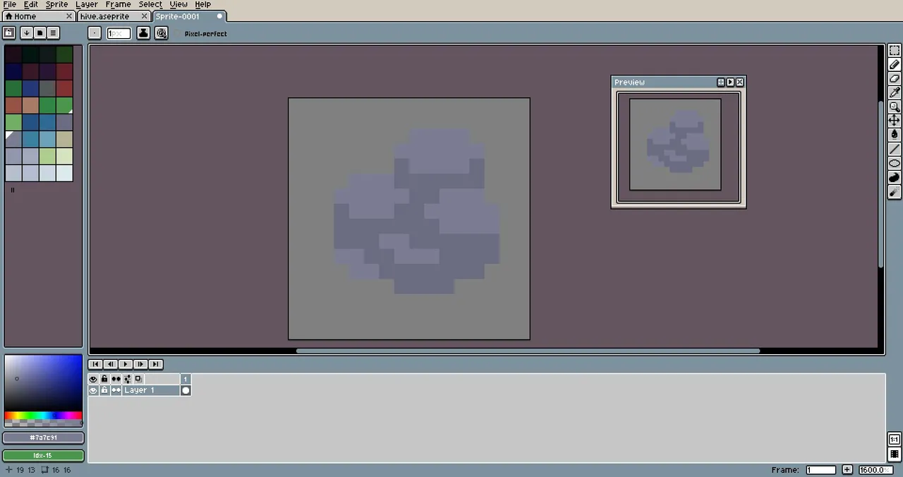
Quise comenzar dibujando una roca en un lienzo 16×16 (abajo el proceso)
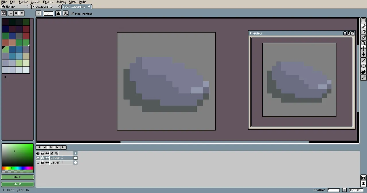
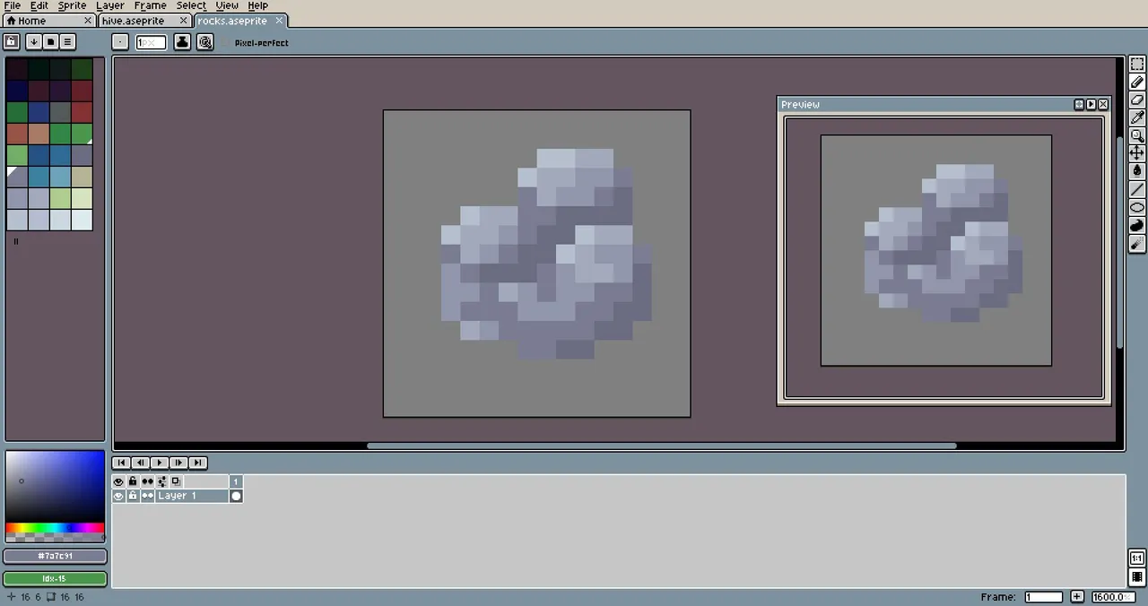
Probé con otra (abajo el proceso)
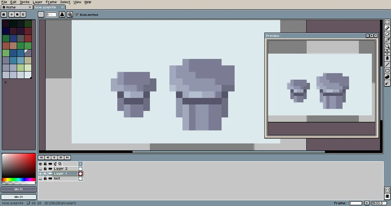
Hice también unas cositas de metal que aún no sé que son exactamente, pero parecen... Botones?
Me cogió la medianoche, la hora cuando por alguna razón siempre adquiero un efecto poderoso de enfoque y motivación para el arte jaja. Así que aproveché.
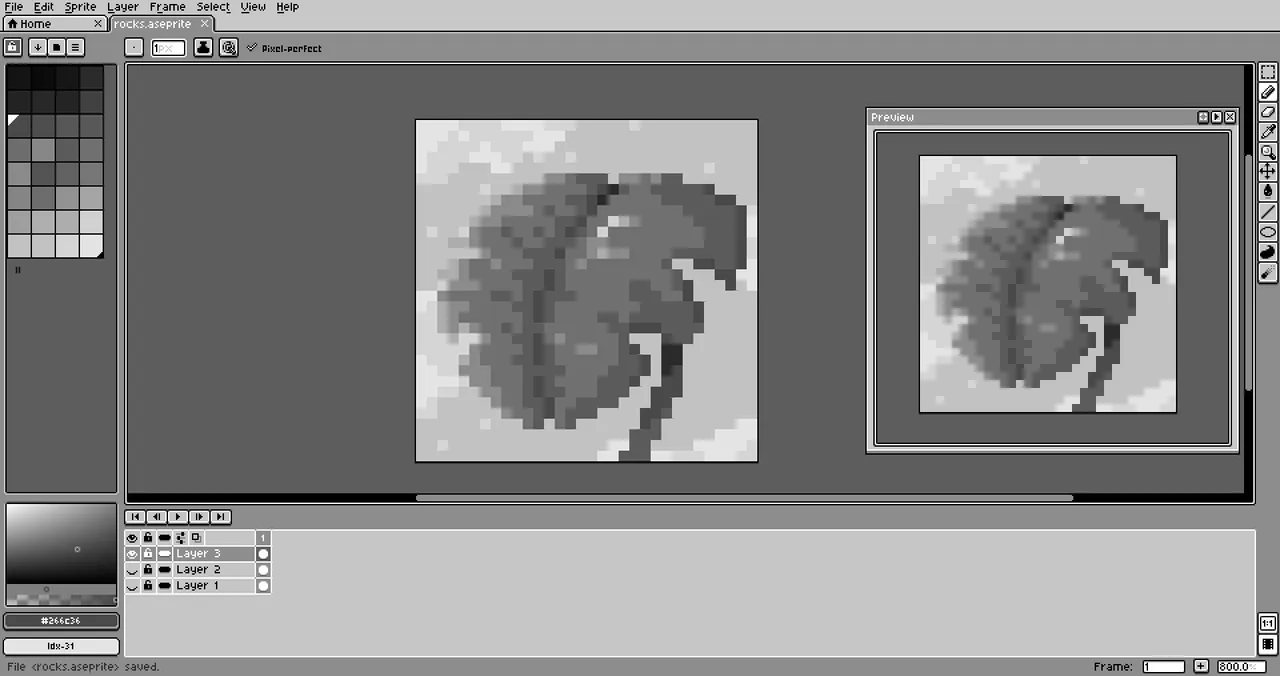
Hice la hoja en un lienzo 32×32 con mi paleta y le añadí fondo.
Una manera de comprobar si el contraste de un dibujo es correcto es poniéndolo en blanco y negro. Si se ve bien, los colores contrastan unos con otros como deben. Creo que eso también lo conseguí en la pieza.
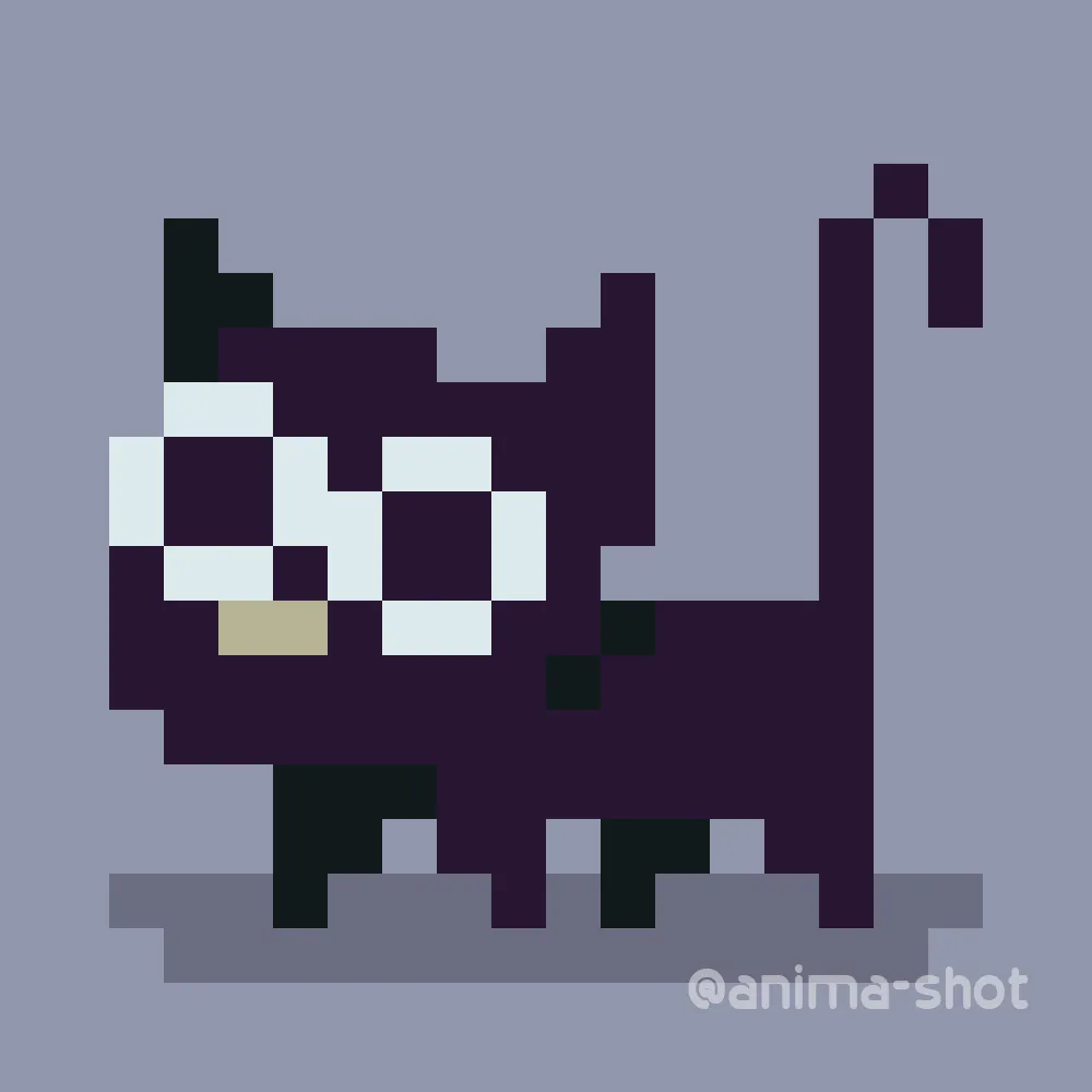
Bueno, antes de ir a dormir ese día, hice un simpático michi (gatito) :3
¡Nos weekee-leemos!
A weekee-greeting to all Hivers!! I've been looking for art communities on Hive and this was one that caught my attention the most. I'd like to start developing a life here and meet new artists :)
I've been animating all my life, using both 2D and 3D digital techniques, but a small problem has hindered my self-improvement since forever: not knowing how to colorize.
I've never selected a specific color palette for a video and have always drawn or sketched in black & white.
Trying to understand color theory has always blown my mind. I looked for tutorials and explanations on it, but I didn't feel comfortable enough to try to apply it by doing my typical digital art. I still haven't developed a draftsman's vision, it's complicated for me to represent directly on a plane something I see or imagine.
So I thought of a different alternative to learn and apply this theory, I thought of a more geometric style of drawing that doesn't always rely on black outlines, a style that depends in a small range of specific colors, and the first thing that came to my mind was Pixelart.
It was a phenomenal idea, learning color theory while learning pixelart. I got a software called Aseprite, very comfortable to use with handy tools specifically for pixelart. I really loved the program, it motivated me even more to start.
Before making my first drawing I made a palette of 32 colors following basic HSL concepts.
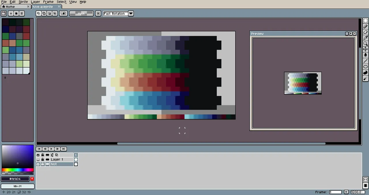
It's not spectacular but to start practicing it was fine.
In the tutorials I saw some artists recommended to start with small pieces, like 8×8 or 16×16 pixels and later during the practice increase the canvas; this is to get used to define shapes and objects even in the smallest possible sizes at an early learning stage.
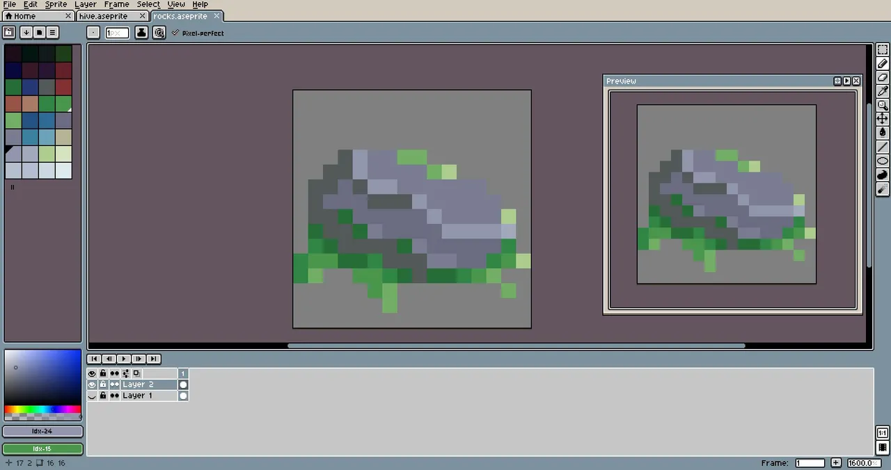
I wanted to start by drawing a rock on a 16×16 canvas. I gave it a base color.
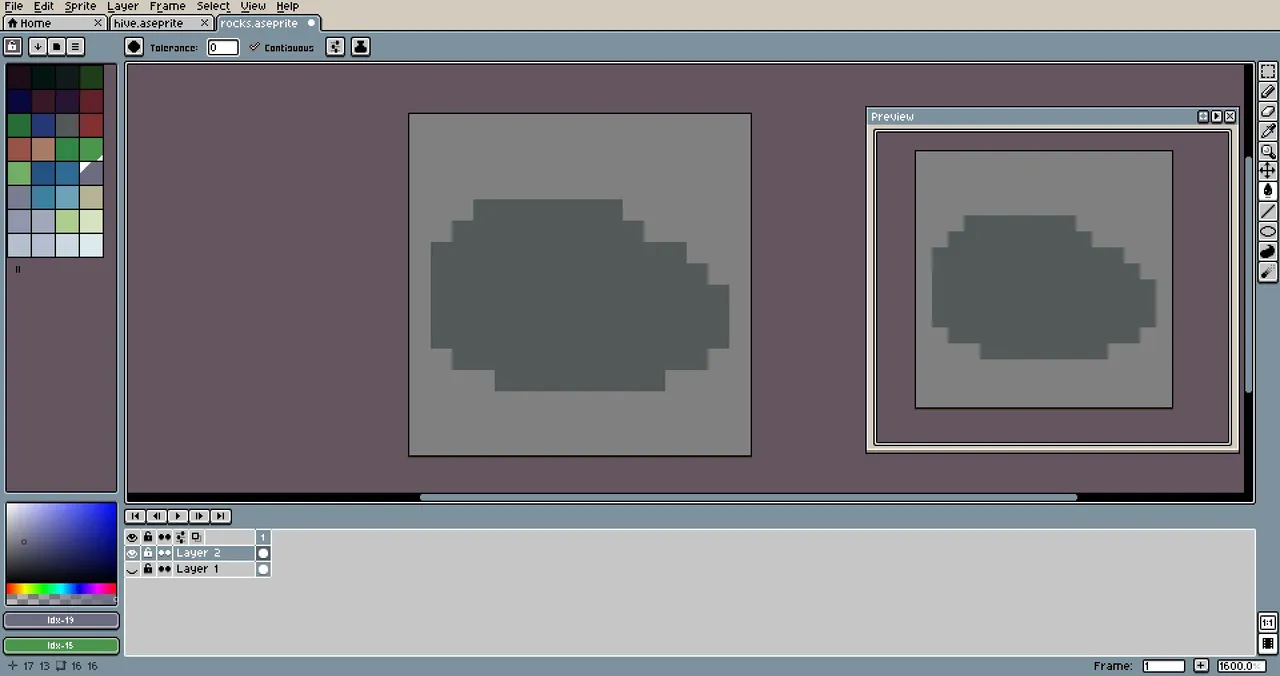
And a light source.
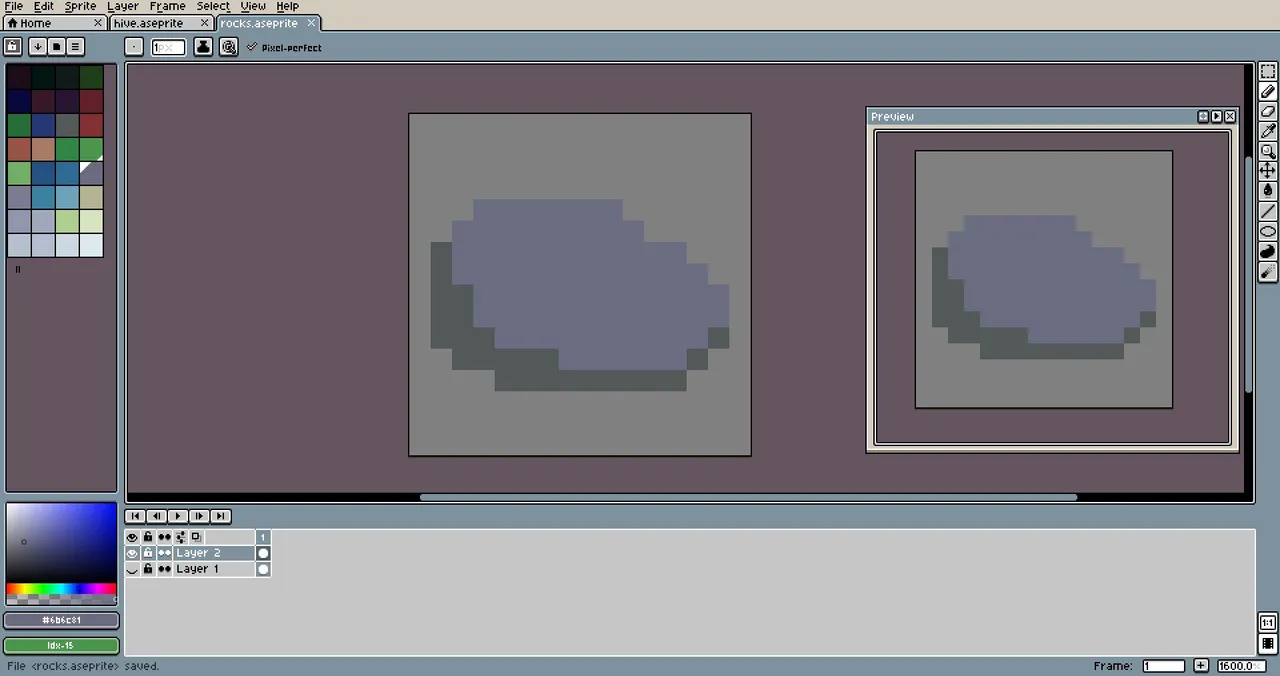
I added some mold around it.
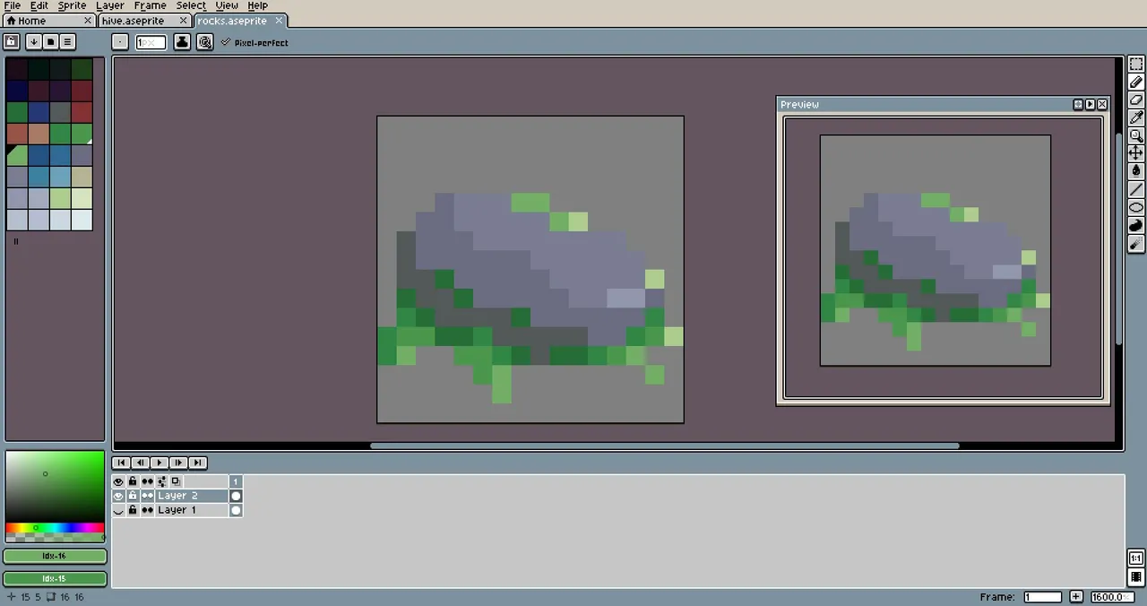
I wasn't convinced, the figure didn't look defined yet. I ended up with this.
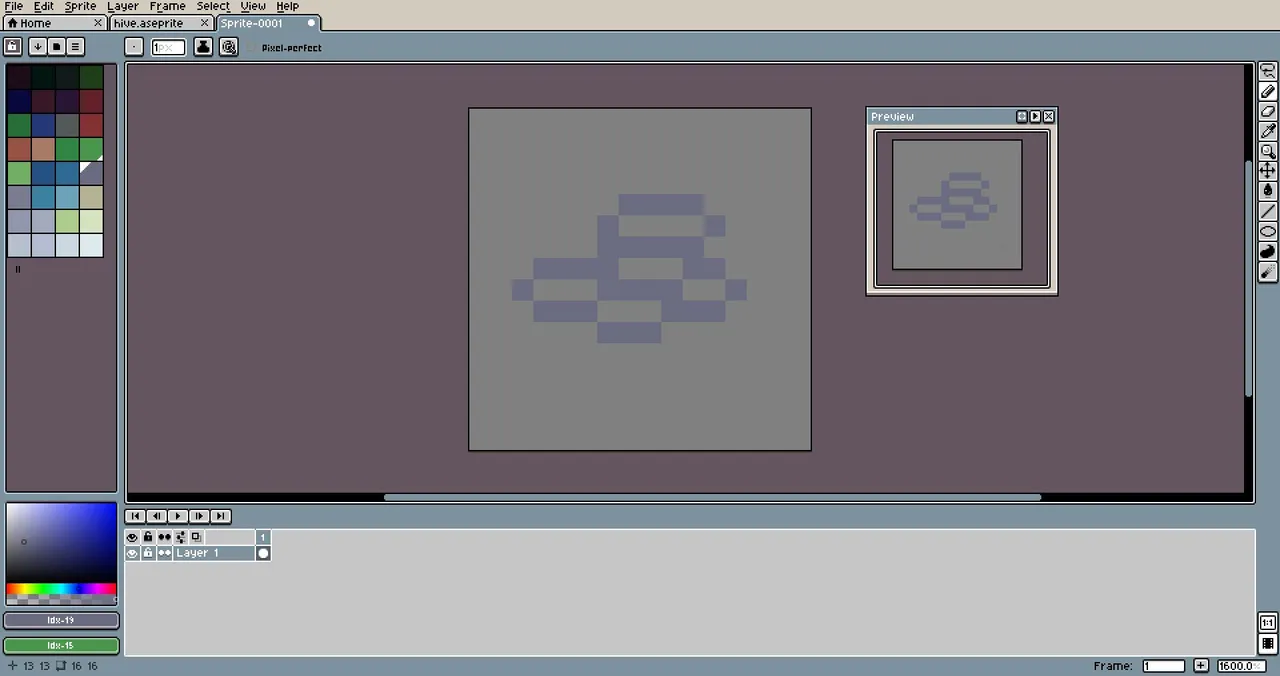
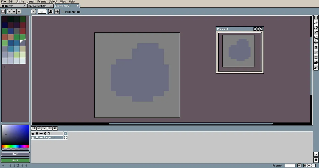
I tried another stone. Here's the process.
I also made these little metal things that I still don't know exactly what they are, but they look like... Buttons?
I got surprised by midnight, the time when for some reason I always get a powerful effect of focus and motivation for art haha. So I took advantage of it.
I did this on a 32×32 canvas with my palette and added background.
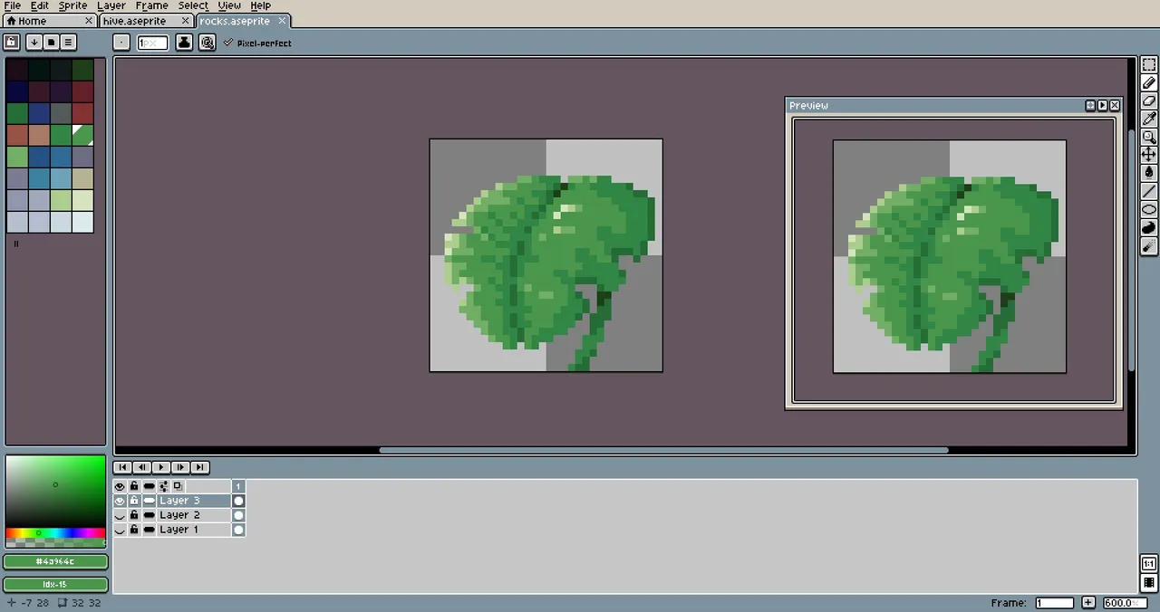
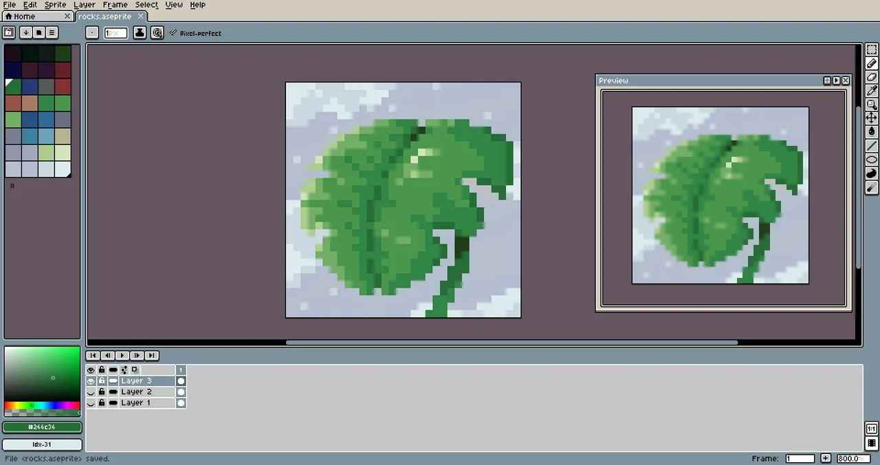
One way to check if the contrast of a drawing is correct is to put it in black and white. If it looks right, the colors contrast with each other as they should. I think I managed that in the piece.
Well, before going to sleep that day, I made this cute michi (kitty) :3
Weekee-see you in the next post!
All images are screenshots of my projects. English translation by me.