Hey Hive!
We're back again with another Art Attack! If you're new to the series, this is where I share my drawings and the process behind them. A behind-the-scenes look at my artwork, if you will. This is not to say that I'm very good at art, or that I'm a professional in any way. In fact this is the opposite, and serves as a reminder to how I first started, and lets me track my progress too!
This was from back in April 2023, when I decided to try and draw along to another youtube tutorial from Art with Flo! I've shared a bunch of drawings I've done with her help and I really like them. She typically draws colourful landscapes and cute characters but I found out she does some ink artwork as well!
This reminded me so much of some of my ink landscapes I used to do on paper back in the day. I loved those pieces a lot, and I've never done a digital version before so thought this was a good opportunity to see how it translates to digital art.
Here's my first minimalist piece that I did back in 2020, and it's still one of my favourites to this day.
I did a few others since then, and I really like this style a lot. It's simple yet still has enough detail to hold its own and looks clean in black and white.
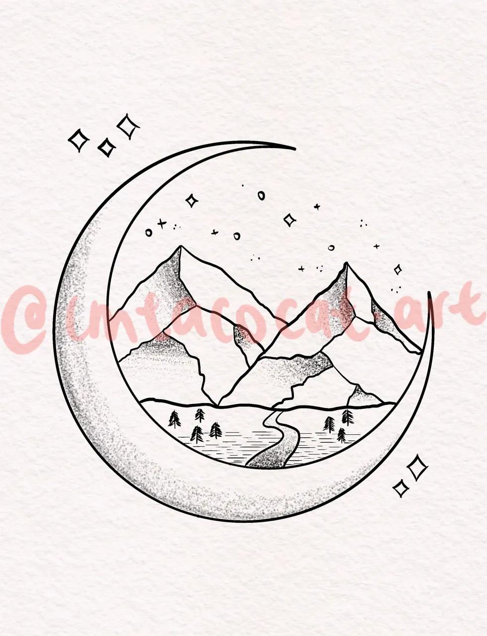
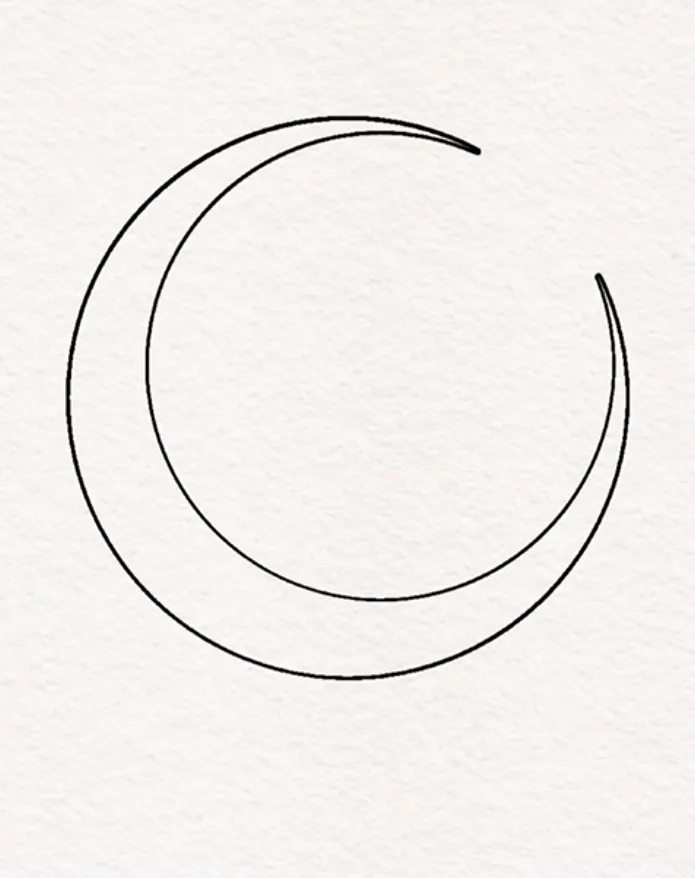
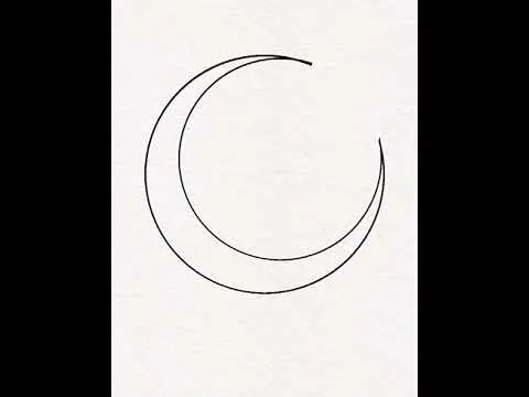
Anyway, following along to Flo's video, she provided a nice realistic paper background to contrast the ink drawing which I thought fit really well. We draw the crescent shape by first drawing a perfect circle and then erasing with another circle.
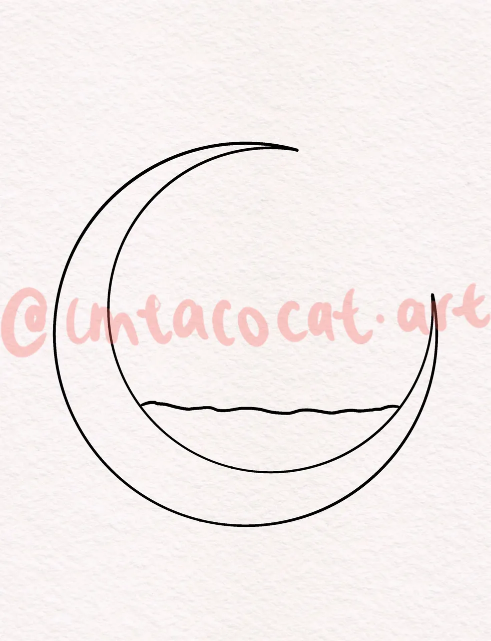
Then we draw a line for the base of the land.
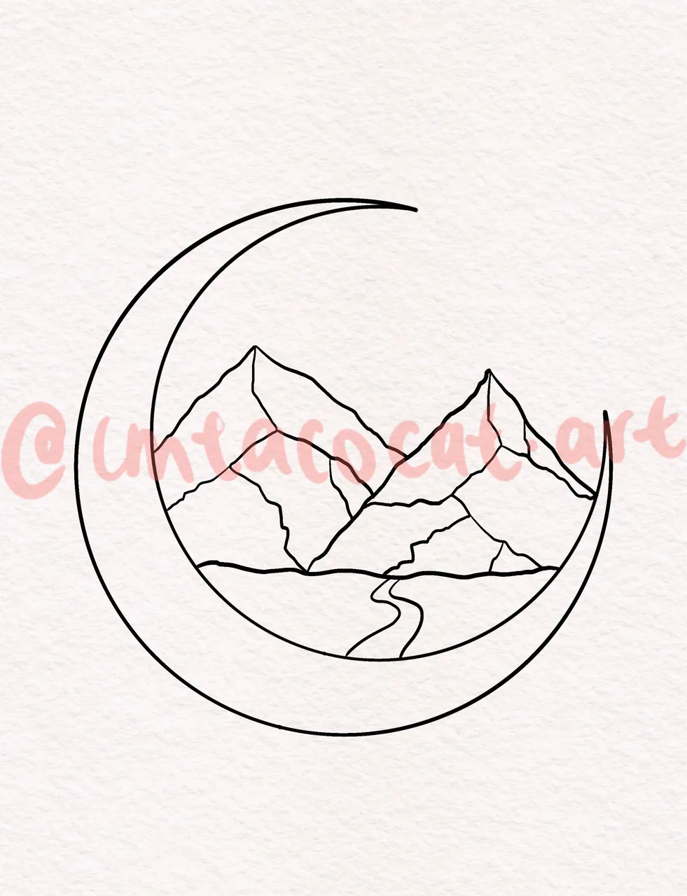
Then we draw in the mountains and some lines to show the contours and slopes. This one took a while to get right since I wanted it to look natural.
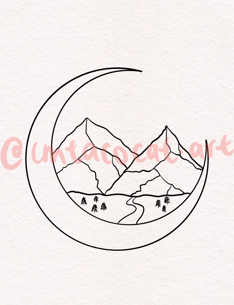
Then we draw in a river at the base of the mountains, and some happy little trees.
We added some touches with little stars in the background and sky to link it to the moon, which I thought was pretty brilliant.
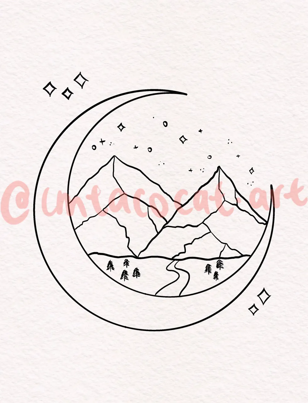
Lastly, we use a Stipple brush to give some depth to the mountains, river and moon. I thought this was a really nice touch as well and really elevated the drawing.
Here's the timelapse:
All in all, this piece looks pretty simple but it does have a certain charm to it. I was a little iffy on this calligraphy brush but I think it worked out pretty well. I'll definitely try more of this style on digital art especially with the same paper background since it looks so good!
Thanks so much for reading!

To find out more about me, check out my intro post here!