Hi, everybody. I hope you have a happy night!
Today I share with you this illustration that I recently made to participate in the Splinterlands Art Contest // Week 105 . This time I decided to recreate a very different card from the one I drew last week, but I loved it so much as soon as I saw it because I like and enjoy drawing women's faces, that's why I decided to focus on that part of the character and not the whole body; but I couldn't leave out a very important, necessary and characteristic element of the character that is the sword she carries on her back, and that is Lorna Shine of the Life element. As always I made some changes to give my own touch to the card, but always respecting the original design of the card.
All my illustrations are made with colored pencils, also with some markers for some details that I want to highlight and paint only for more complex backgrounds. I hope you like the final result of the card I chose, I did it with a lot of love.
Thanks to #splinterlands for giving us the opportunity to express our art in the best possible way through this contest, which I find impressive to see and be part of.
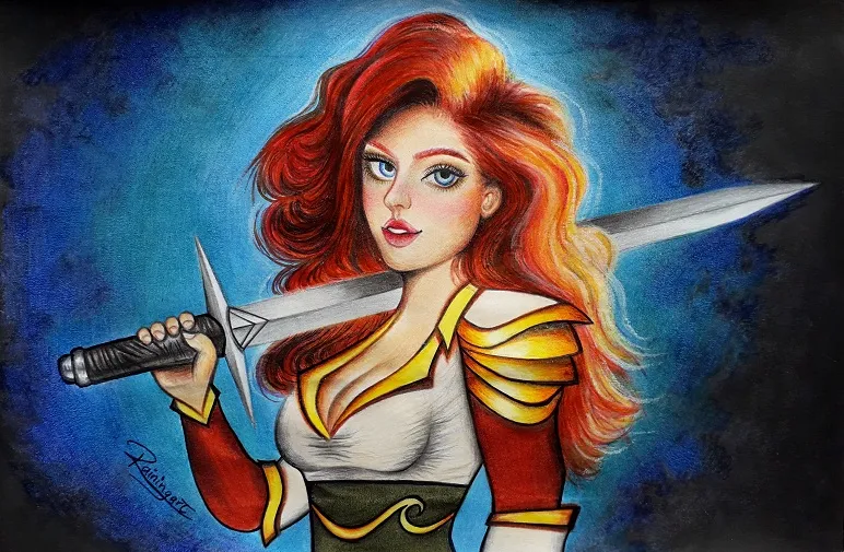

The Making Process
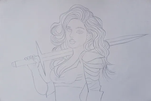

- As a first step to make my illustration will always be, of course, to capture with pencil all the parts of my drawing, which in this case will be the character of the card I chose this week. Then, once I have a good base I can start applying the color.

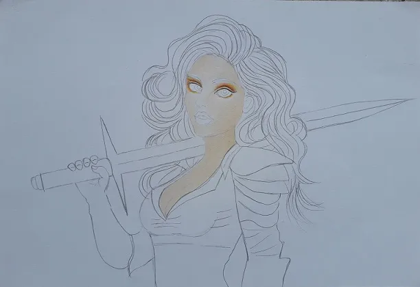

- Now in the next image you can see how I applied color to the girl's skin and just a little bit of eye shadow in a warm tone, all in a very soft way to create a kind of base first that I will continue working on the other images.

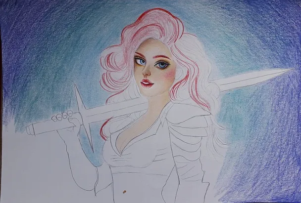

- In the third step you can see how I am applying three different shades of blue, this as a base for the gradient in which I will continue working later. I have also progressed a lot in the details of the eyes giving shadow to create more depth, and light in some parts to get some realism; for the eyebrows and mouth I applied reddish tones, in the same way in the hair that is characteristic of the character I chose this week.

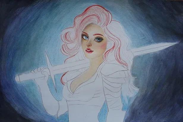

- I continued working on the background and for this I intensified the blue colors. In the corners I decided to apply a little black paint until I obtained the effect I wanted.

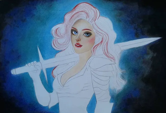

- Now is completely ready the background, you can see how I applied more black paint, the next step is the girl's hair.

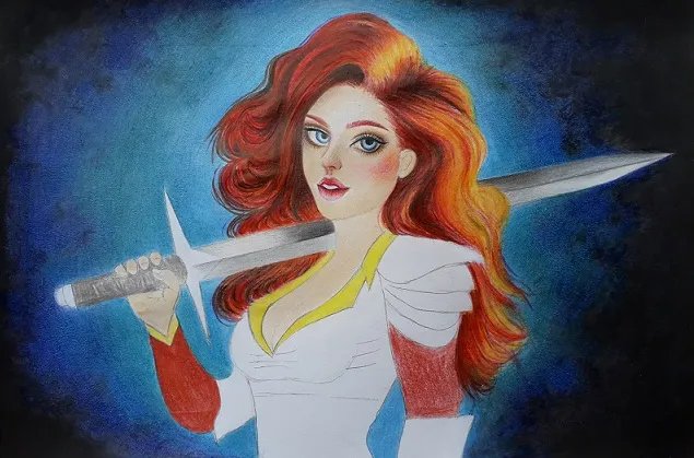

- For the hair I used reddish colors, brown, orange, yellow to give the effect of light in some locks and a little bit of black to highlight the other colors. I also started to apply color to the girl's clothes, which I will continue working on the other images; and on the sword on her back which is an important part of this character.

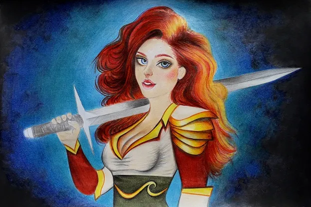

- I worked much more on the clothes giving light and shadow with the right colors to get more dimension, and the image doesn't look too flat. I applied colors as close as possible to the original card, this time I decided to do it that way because I really loved how they look.

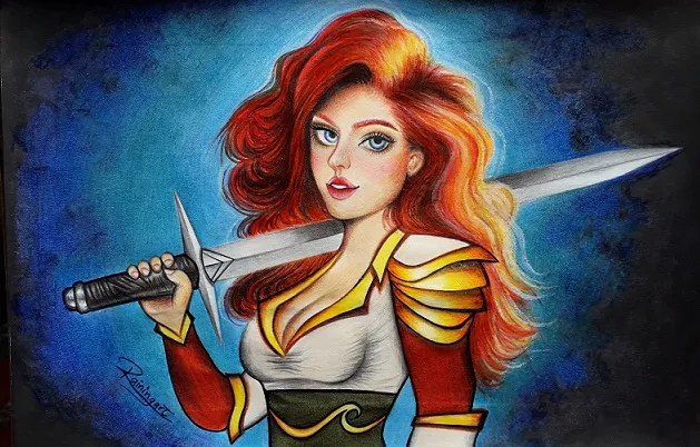

- I finished the last details of the face giving more shadow to the forehead and color in the cheeks; I also finished the sword completely intensifying the gray tones, and now my drawing is ready. I hope you like it too.

Final Result

Soon you will be able to see more of my art. Thank you for your support!
