Painting the balance between peace and playful activity was my goal while contemplating on this painting, on the very beginning.
THE PROCESS:
This piece started out as a sketch, you can see in the following photograph:
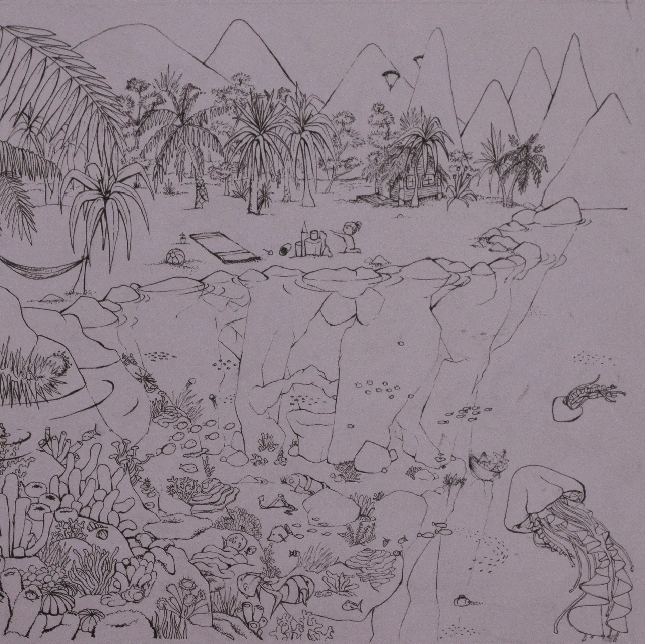
The sketch
Ink pen
23 x 23 cm
I was aiming for diagonal composition, following baroque diagonal, in order to achieve uplifting and positive connotation about this piece.
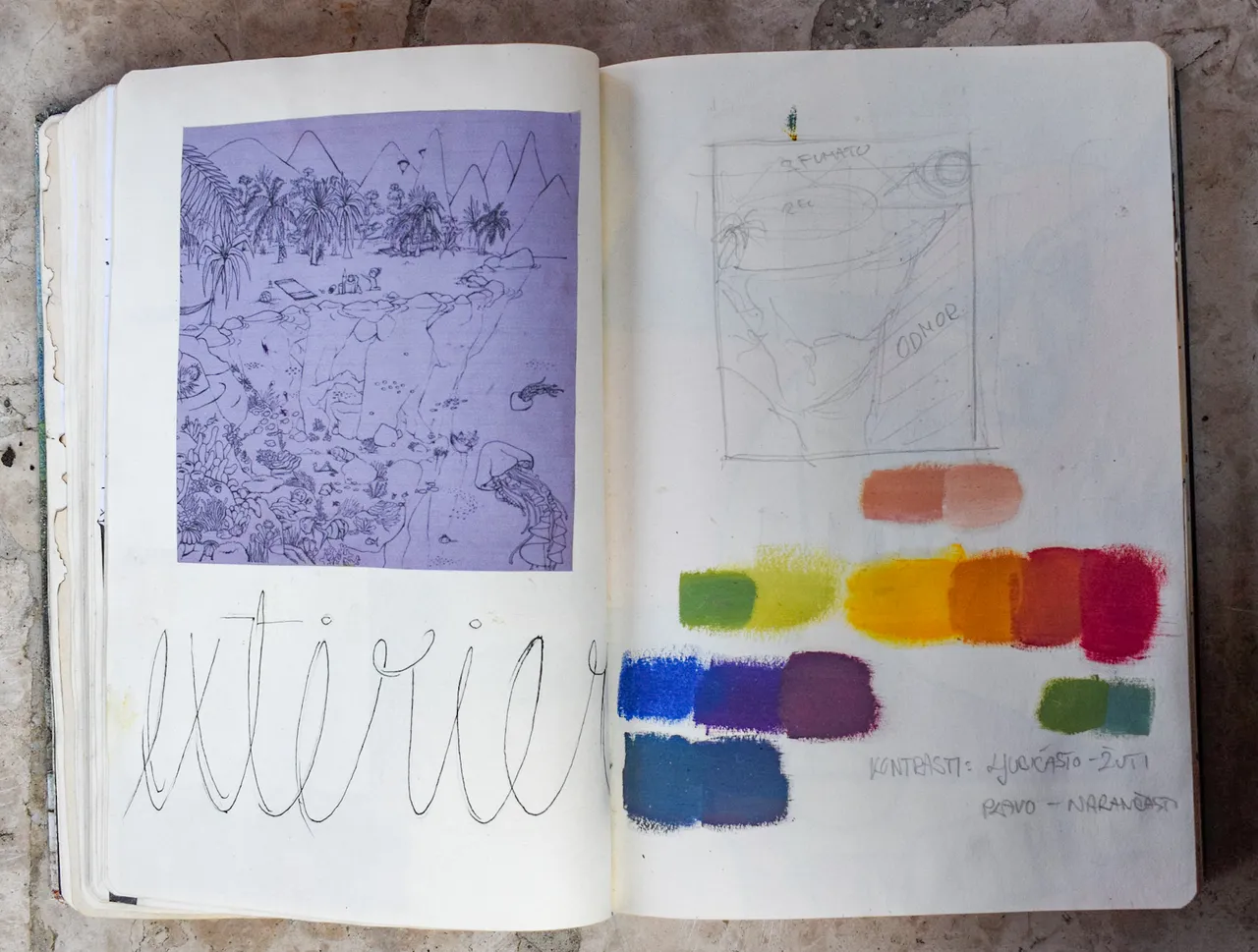
In the photograph below, you can see a section of my artsy dairy, where I decided on the medium and a color palette.
I am choosing oils for this particular painting, a medium which allows me to achieve soft and dreamy effect really easy.
While transferring on the sketch the canvas, I decided to reduce in detail, and concentrate more on the colors.
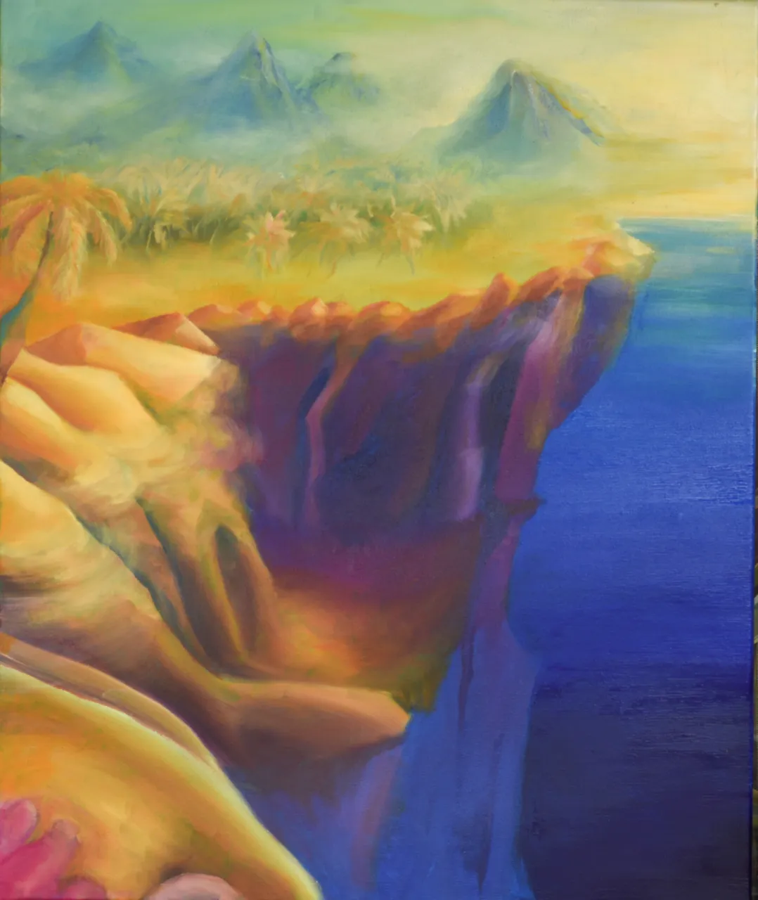
I used two complement pairs as dominants of this painting. Yellow - purple, orange - blue. Every now and then I induced little bit of greens, pink and whites to make the composition more interesting and playful.
Blue section is reserved as a spot for "eye resting". I used deep ultramarine and beautiful cyan blue to get the effect of a deep water, which is meant to be pleasant for the eyes and mind. It is creating the balance between movement and piece.
In the creation of this particular painting I partly drew an inspiration from famous painter Charles Turner. It mesmerizes me the way he works with light, so I decided to place a light source, in the right upper corner and hide it with mist.
I created the depth illusion by using the "sfumato" effect on the background, and adding more content to that part of the painting.
Finished product:
Painting blue
Oil on canvas
60 x 50 cm
You can check out my other artworks here: @petraa ,
Support via Instagram : https://www.instagram.com/petrakostanjevac/
I appreciate your spending time on this post!
Have a wonderful day :)