OK so VYB has finally dropped and I have 5000 of the sweet things so I decided to poke around and I found a little competition to redesign the VYB logo so I thought I would give it a shot.
OK so first of all I wanted to verify my brain by twisting the logo into something a little different
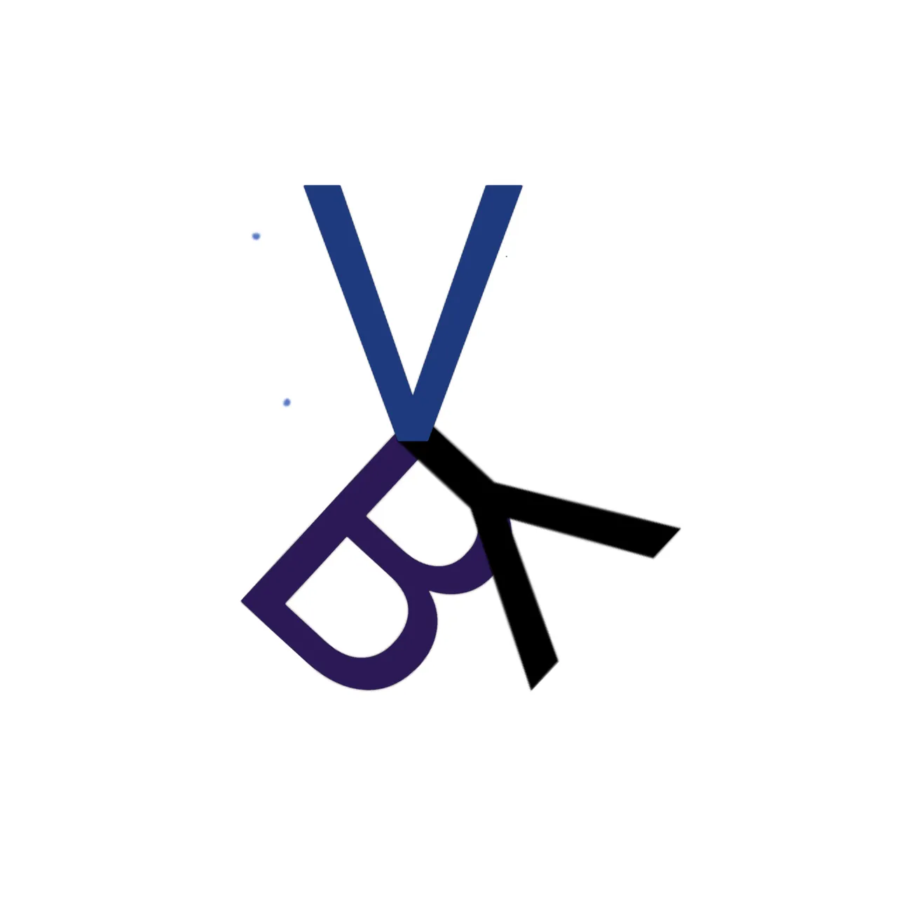
I kinda wanted the Y to look like a reflection of the V and then move along to the B
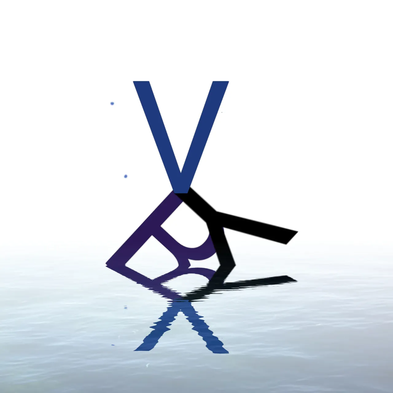
OK so one of the most important thing to verify your brain is to always be reflecting :p so I went literal and decided to add a reflection
Finally we need some focus so I worked on drawing the eye to the symbol and here we go !
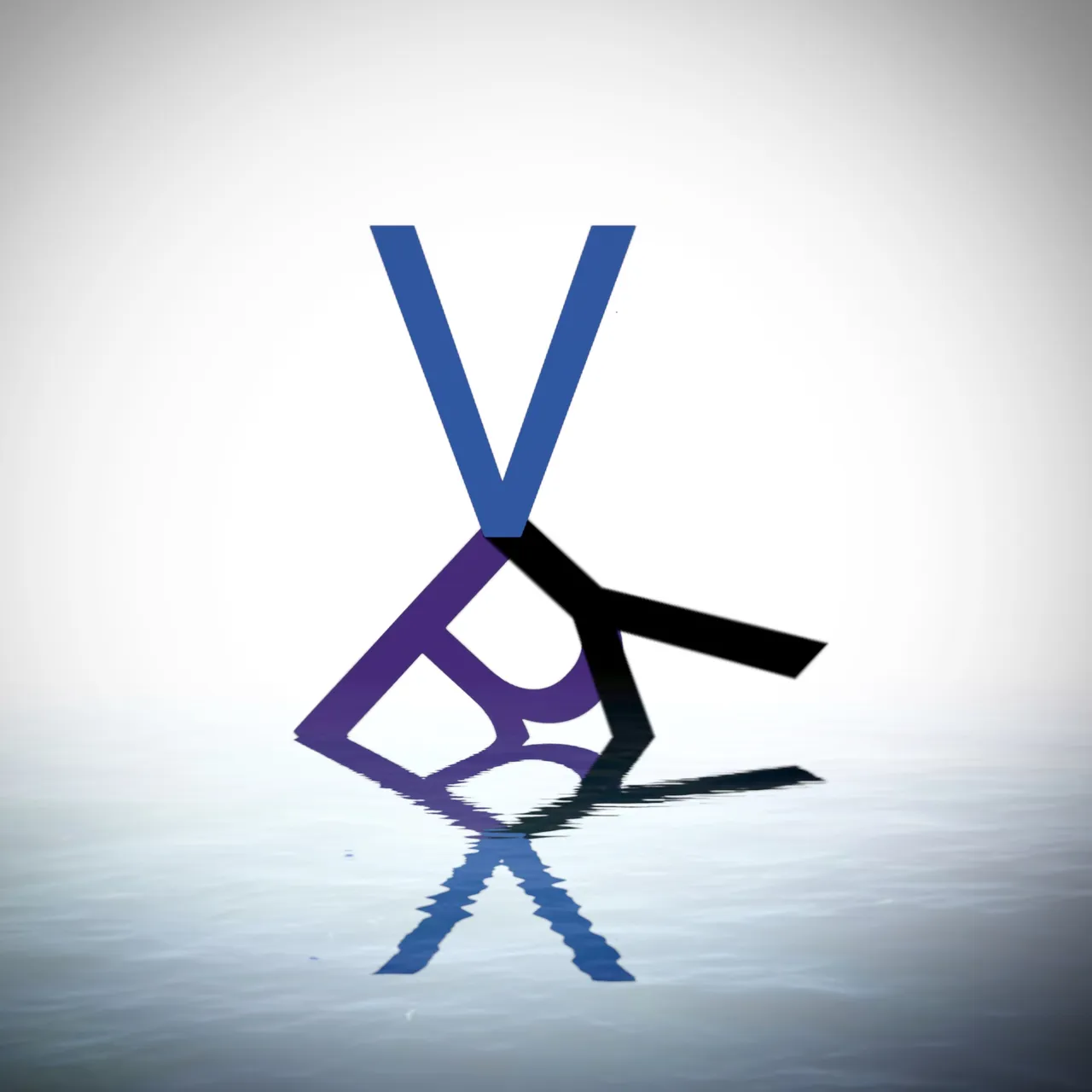
And I am really happy with how this came out ! Feel like it really captured the metaphors I was trying to get in it :)