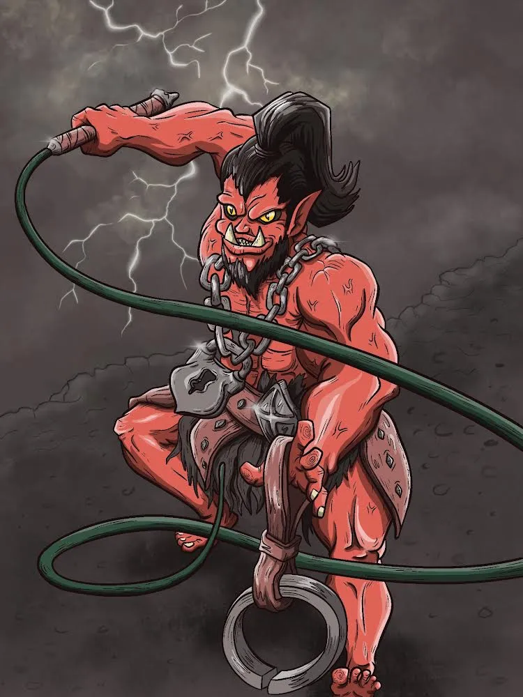
Finally! I’ve just completed my new fan art for the Splinterlands community: the Chaos Jailer. Here’s the final piece.
I’m starting to get the hang of using my iPad and Procreate for digital painting. I feel like this is going to become my favorite tool and workflow for creating art. At first, using Procreate felt complicated, but after giving it another try, it started to feel much easier compared to the drawing tablet I have. It's as if the iPad and digital pen were made for creating digital artwork, especially for beginners.
The pen is intuitive and responds well to the pressure I apply, making it much easier to use.
As for today's artwork, I decided to recreate the Chaos Jailer, but I gave him a different stance, showing him sweeping the kitchen and then preparing for an attack. Another modification I made was to make him appear more physically fit compared to the original design from Splinterlands.
I also redesigned some of the accessories slightly, but they still manage to capture the essence of the original character.
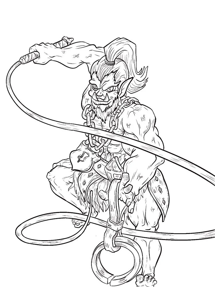
Here’s the process I followed for creating this artwork: I started with a rough sketch to get the proportions right, focusing mainly on the stance and positioning.
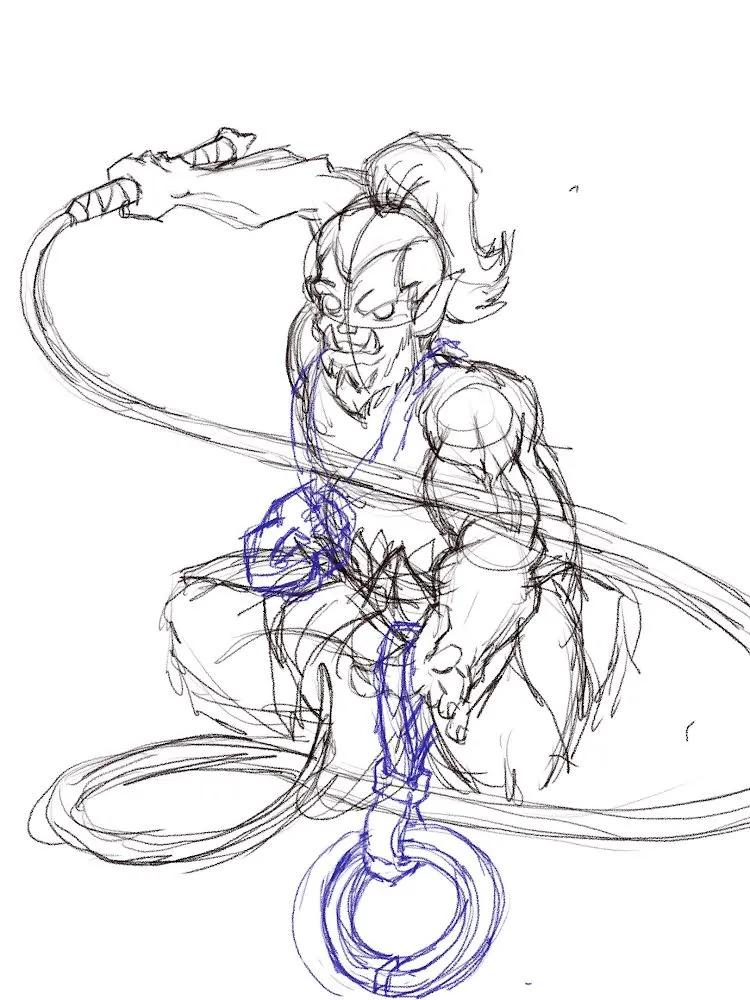
After completing the sketch, I moved on to outlining and adding finer details to the character.
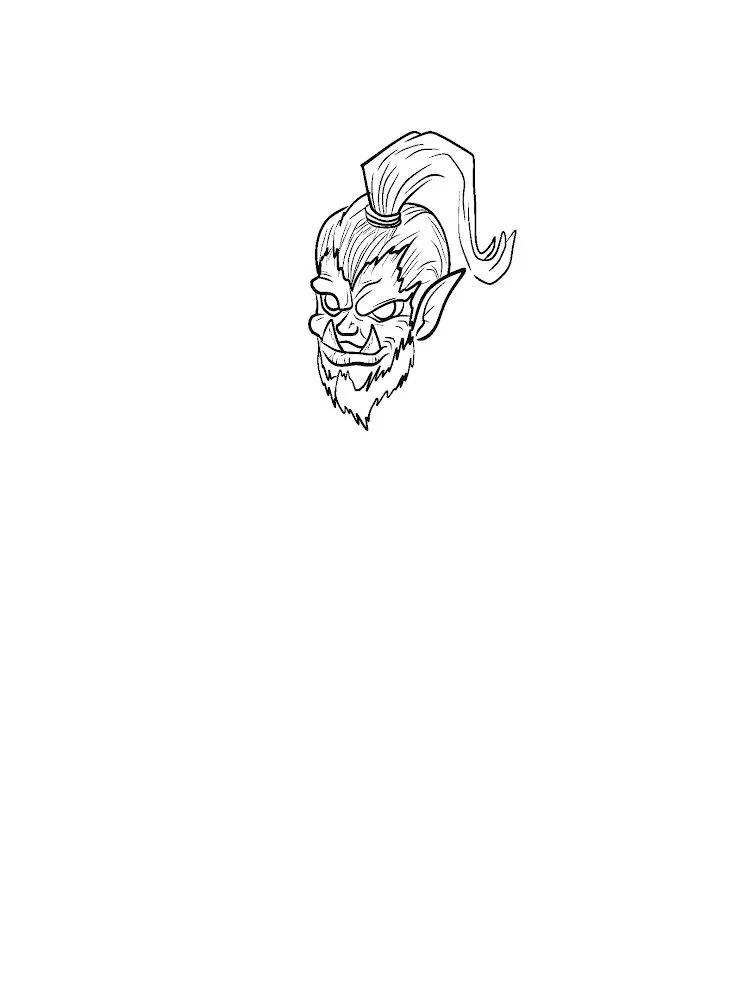
I made the outlines as detailed as possible, which made it much easier later on when working on shading and highlighting.
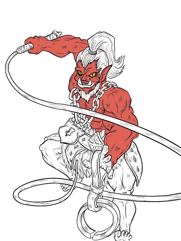
When it came to coloring, I discovered a tool in Procreate that allows you to tap on a closed area, and it will automatically fill in the color I chose with precision.
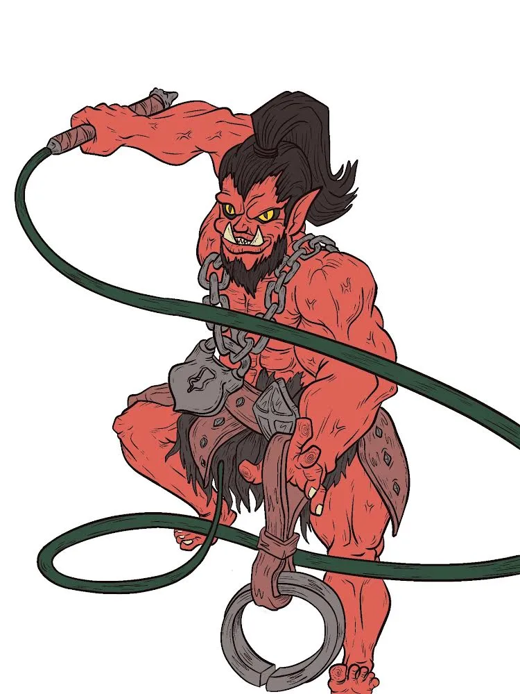
Once I finished the coloring, I worked on the background first, before doing any shading or highlighting. I felt that creating the background, especially with the lightning effect, would give me a better visual idea of how to shade and highlight the character.
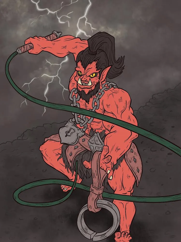
After completing the background, I started on the shading. I used two layers: a lighter shade and a darker one. I believe this adds more depth and appeal to the character.
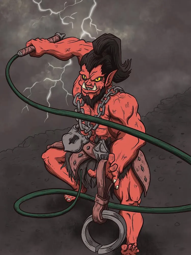
The same approach applied to the highlighting. I used two layers of brightness—one with a softer highlight and the other with a brighter highlight to emphasize the lightning effects.
For the finishing touch, I added some lighting flares or glares to the shiny accessories to make it look like there was a lightning strike in the background.
Overall, I'm really pleased with how this piece turned out, and I feel like my skills are improving with every new artwork. I can't wait to keep experimenting and see what I can create next!