Stats for Hive Sucre Showing All Time Highs For 3 of 4 Metrics
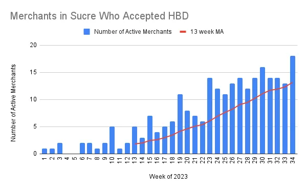

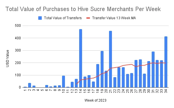
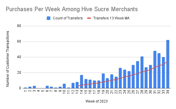
Increasing Weekly Changes Indicate an Exponential Growth Factor
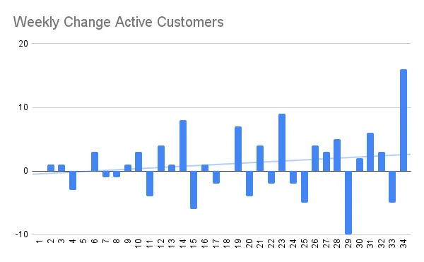
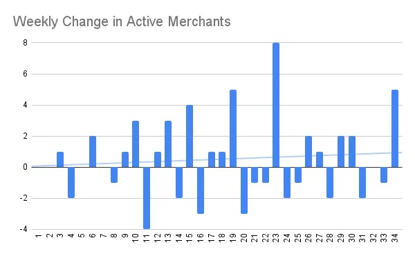
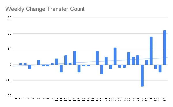
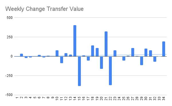
It can be useful to chart data as the weekly change rather than total amounts, as it can highlight the trend in growth. In a weekly change chart, the trend line can indicate if growth is
- Arithmetic - flat weekly change trend - growth that will not effectively scale
- Exponential - upwards weekly change trend - growth that will increase as we scale up
- Logistic - downwards weekly change trend - growth that will decline as we scale, usually a sign of market saturation or scaling problems
For example, if our growth was limited by the level of support we can provide from the DHF, we would first see indications of this on the weekly change charts.
All 4 metrics indicate an exponential growth factor, even transfer value which is influenced by some outliers at week 14 and 21.
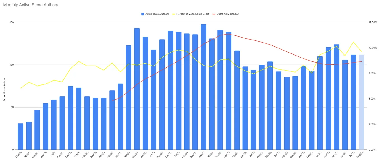
Active users with Sucre-based locations in their profiles are also on the rise. The month of August is incomplete and thus shaded differently.