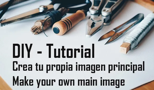
Saludos cordiales comunidad de Hive! En esta ocasión les traigo un paso a paso que les puede ser de gran utilidad a muchos creadores de contenido. Les enseñaré a hacer una imagen principal para sus publicaciones.
Para este paso a paso ocuparemos una herramienta muy útil llamada Photoshop, seguramente han oído de esta. Tal vez estén pensando que photoshop solo sirve para retocar fotografías y agregarle algunos efectos, pero lo cierto es que se pueden hacer cosas realmente fascinantes con este programa. Vamos, que incluso con paint (sí, ese básico programa de dibujo) se pueden hacer verdaderas obras de arte, y si no me creen busquen en youtube lo que se puede hacer con paint.
Necesitaremos lo siguiente:
*Un ordenador de escritorio o laptop
*Adobe Photoshop
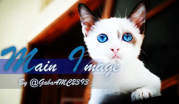
*Imagen 1
Para este tutorial yo usaré Adobe Photoshop CC 2015. He hecho tutoriales para otras comunidades de internet que me han solicitado realizar tutoriales para Photoshop más antiguos, como Photoshop CS6, CS5 e incluso CS4. Para que no haya problemas para los usuarios con versiones antiguas del programa, usaré solo herramientas básicas que se pueden encontrar en todas las versiones. De esta manera, todos se beneficiaran.
Bien, ahora que tenemos los materiales, vamos con la receta. ¡Comencemos!
Espacio de trabajo
Es probable que este primer paso no sea para todos, pero hay usuarios que saben poco o nada sobre las herramientas de este programa, así que lo primero es definir nuestro espacio de trabajo. Abrimos un proyecto nuevo en la pestaña Archivo y luego hacemos clic en la opción Nuevo. Aparecerá una ventana donde vamos a definir la configuración de nuestro proyecto. Solo lo vamos a dejar tal como está en la imagen a continuación y así de fácil tendremos nuestro espacio de trabajo.
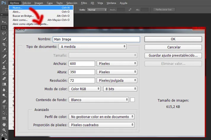
Imagen central
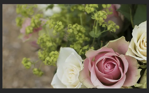
Esta será nuestra imagen principal. La colocamos en nuestro espacio de trabajo y la ubicamos en el lugar que más nos guste. En mi caso lo he dejado como muestra la imagen a continuación:
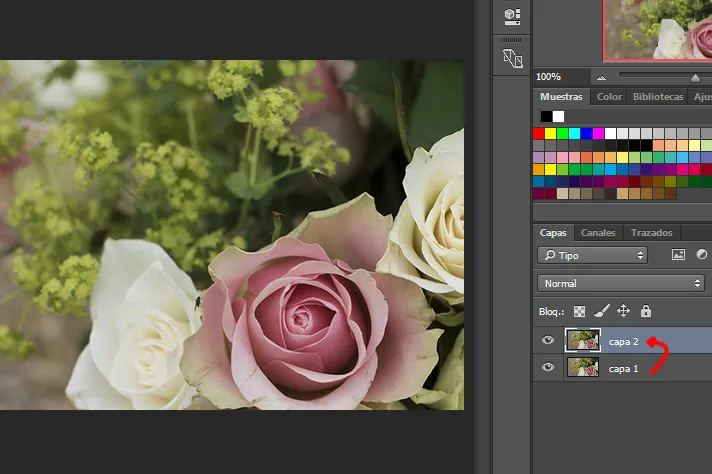
Luego duplicamos nuestra capa:
Decoración
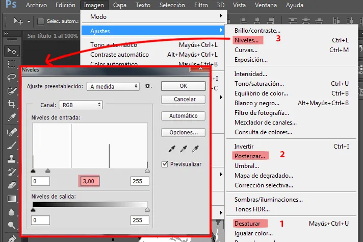
Vamos a hacer clic en nuestra capa 2 y le aplicaremos lo siguiente en este mismo orden:
1)Imagen>Ajustes>Desaturar.
2)Imagen>Ajustes>Posterizar (Escribimos 4 en niveles ).
3)Imagen>Ajustes>Niveles (Valor 3,00 en la casilla del medio).
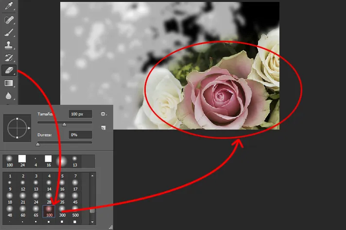
A continuación aplicaremos el siguiente filtro sobre nuestra capa 2: Filtro>Desenfocar>Desenfoque gaussiano (con un valor de 5,0). Ahora vamos a borrar (con un borrador difuso) la esquina inferior derecha de nuestra imagen, tal como se muestra en la imagen:
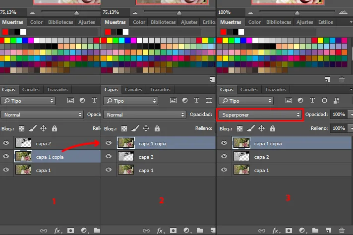
Después de haber hecho todo esto, duplicaremos nuevamente nuestra capa 1 y la arrastraremos con el cursor hasta colocarla sobre nuestras otras capas. Esta copia de capa 1 le colocaremos el modo de fusión “Superponer”.
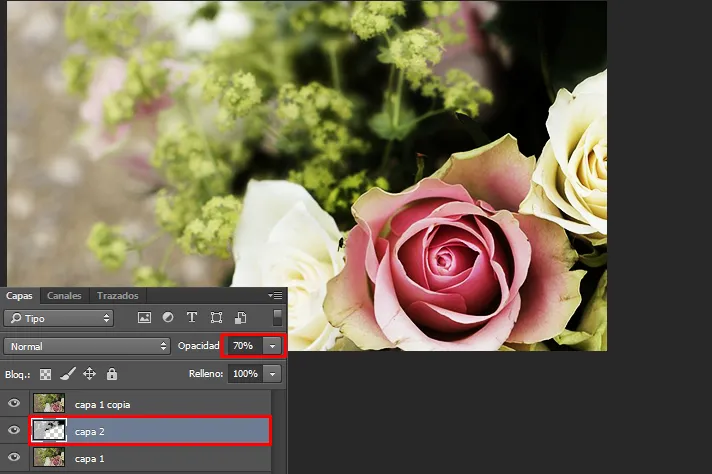
Finalmente seleccionamos la capa 2 y ajustamos la opacidad a 70%. Nuestra imagen estará lista, debería quedar de la siguiente manera:
Texto
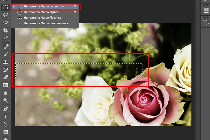
Una vez lista nuestra imagen base, le agregaremos texto. Creamos una nueva capa, sería la capa 3. Usaremos la Herramienta marco rectangular y crearemos un rectángulo alargado tal como se muestra en la imagen.
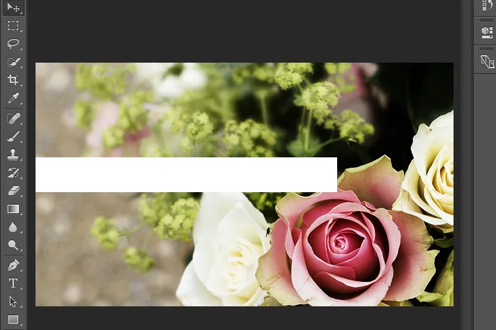
Con un pincel grueso de color blanco rellenamos la selección. Como recordatorio, esto hay que hacerlo sobre la capa 3. Nota: Para deseleccionar vamos al menú Selección>Deseleccionar (Ctrl+D). Debería quedar así:
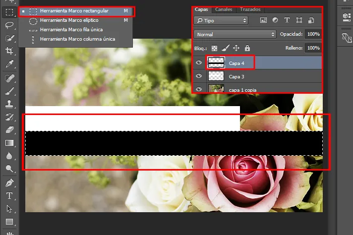
Ya que tenemos nuestro rectángulo blanco, creamos otra capa (sería la capa 4) y repetimos el proceso para hacer otro rectángulo, solo que esta vez haremos uno debajo de nuestro rectángulo blanco. La selección debe cruzar toda la imagen. La rellenamos con un pincel negro tal como se muestra en la imagen a continuación, luego deseleccionamos.
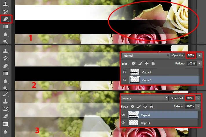
Con un borrador difuso vamos a borrar el borde derecho de los rectángulos (1). A la capa 3, el rectángulo blanco, le ajustamos la opacidad a 50% (2). A la capa 4, el rectángulo negro, le ajustamos la opacidad al 20%.
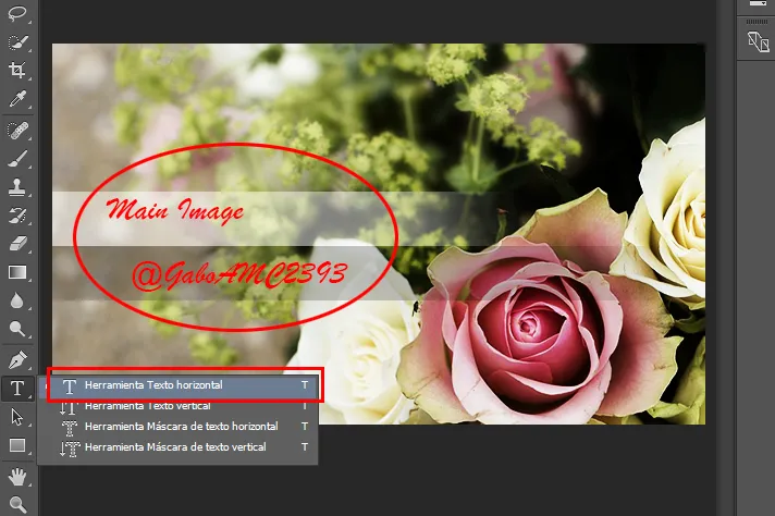
Hora de colocar el texto a nuestra imagen. Para este tutorial colocaremos la frase “Main Image” encima del rectángulo blanco y el nombre de usuario (@GaboAMC2393 en mi caso) sobre el rectángulo blanco.
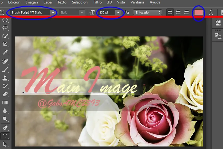
En mi caso yo elegí la fuente “Brush Script MT Italic. Para darle formato a nuestro texto, solo debemos seleccionar la herramienta texto horizontal otra vez y pulsar sobre la frase “Main Image” o el nombre de usuario para modificarlo. Se puede usar el panel superior para dar a nuestra fuente el estilo que queramos. En mi caso yo usé 130 pt para la primera letra de cada palabra y 72 para el resto de las letras. También jugué un poco con los colores para dar un mejor estilo al texto (colores usados: #e17f7f y #f9f6bf). El estilo que le demos al texto queda a criterio de cada uno. En mi caso quedó así:
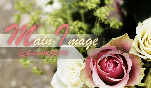
Finalmente podemos agregar sombra al texto para resaltarlo más, pero como dije, esto queda a criterio de cada uno. Yo sí lo hice, así que este es el resultado final del tutorial:
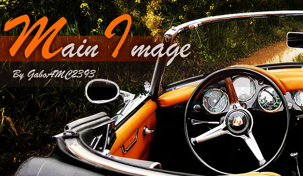
Este tutorial y los pasos que aquí se dictan pueden adaptarse a otras imágenes, como esta o esta. Yo hice prácticamente los mismos pasos en estas dos imágenes y los resultados fueron los siguientes:
Espero que el tutorial les haya gustado y que pongan en práctica lo aprendido. Cualquier opinión que tengan sobre la publicación la pueden dejar en los comentarios. Me despido entonces…
¡Hasta la próxima!
******ENGLISH VERSION*****
Greetings Hive community! This time I bring you a step by step that can be very useful to many content creators. I will show you how to make a main image for your publications.
For this step by step we will use a very useful tool called Photoshop, surely you have heard of it. You may be thinking that photoshop is only for retouching pictures and adding some effects, but the truth is that you can do really fascinating things with this program. Come on, even with paint (yes, that basic drawing program) you can make real works of art, and if you do not believe me look on youtube what can be done with paint.
We will need the following:
*A desktop or laptop computer
*Adobe Photoshop
*Image 1
For this tutorial I will be using Adobe Photoshop CC 2015. I have done tutorials for other internet communities that have asked me to do tutorials for older Photoshop, such as Photoshop CS6, CS5 and even CS4. So that there are no problems for users with older versions of the program, I will use only basic tools that can be found in all versions. This way, everyone will benefit.
Okay, now that we have the materials, let's get started with the recipe. Let's begin!
Workspace
.This first step is probably not for everyone, but there are users who know little or nothing about the tools of this program, so the first thing is to define our workspace. We open a new project in the File tab and then click on the New option. A window will appear where we will define the configuration of our project. We are just going to leave it as it is in the image below and we will have our workspace just like that.
Central image
.This will be our main image. We place it in our workspace and we place it in the place we like the most. In my case I have left it as shown in the image below:
Then we duplicate our layer:
Decoration
.Let's click on our layer 2 and apply the following to it in this same order:
1)Image>Adjustments>Desaturate.
2)Image>Adjustments>Posterize (We write 4 in levels).
3)Image>Adjustments>Levels (Value 3,00 in the middle box).
Next we will apply the following filter on our layer 2: Filter>Blur>Gaussian Blur (with a value of 5.0). Now we will erase (with a fuzzy eraser) the lower right corner of our image, as shown in the image:
After we have done all this, we will duplicate our layer 1 again and drag it with the cursor to place it on top of our other layers. This copy of layer 1 we will set the blending mode to "Overlay".
Finally we select layer 2 and adjust the opacity to 70%. Our image will be ready, it should look like this:
Text
.Once our base image is ready, we will add text to it. We create a new layer, this would be layer 3. We will use the Rectangular Frame Tool and create an elongated rectangle as shown in the image.
With a thick white brush we fill the selection. As a reminder, this must be done on layer 3. Note: To deselect go to the menu Selection>Deselect (Ctrl+D). It should look like this:
Now that we have our white rectangle, we create another layer (it would be layer 4) and repeat the process to make another rectangle, only this time we will make one below our white rectangle. The selection must cross the whole image. We fill it with a black brush as shown in the image below, then deselect it.
With a fuzzy eraser we will erase the right border of the rectangles (1). To layer 3, the white rectangle, we adjust the opacity to 50% (2). To layer 4, the black rectangle, we adjust the opacity to 20%.
Time to place the text to our image. For this tutorial we will place the phrase "Main Image" above the white rectangle and the username (@GaboAMC2393 in my case) above the white rectangle.
In my case I chose the font "Brush Script MT Italic. To format our text, just select the horizontal text tool again and click on the phrase "Main Image" or the user name to modify it. You can use the top panel to give our font the style you want. In my case I used 130 pt for the first letter of each word and 72 for the rest of the letters. I also played a little with the colors to give a better style to the text (colors used: #e17f7f and #f9f6bf). The style that we give to the text is at the discretion of each one. In my case it looked like this:
Finally we can add shadow to the text to highlight it more, but as I said, this is up to each one's discretion. I did, so this is the final result of the tutorial:
This tutorial and the steps dictated here can be adapted to other images, such as this or this. I did virtually the same steps on these two images and the results were as follows:
I hope you liked the tutorial and that you put into practice what you have learned. Any feedback you have on the publication can be left in the comments. I'll say goodbye then...
See you next time!
Imágenes editadas con Photoshop
Traducido con DeepL
Images edited with Photoshop
Translated with DeepL
Últimos tres post/Last three posts:
Contest: "Detox: first steps to purify our Body" / Concurso: "Detox: primeros pasos para depurar nuestro Cuerpo"
#LEARNANDEARN Contest - 2nd week in Hive / 2da semana en Hive
La última foto / The last picture