Hello, everybody!
It's a pleasure for me to show you a little bit of my art through this impressive platform, thanks to @splinterlands for giving us all the opportunity to express ourselves in the best way possible, each one showing his or her full potential, which I find impressive to see and be part of.
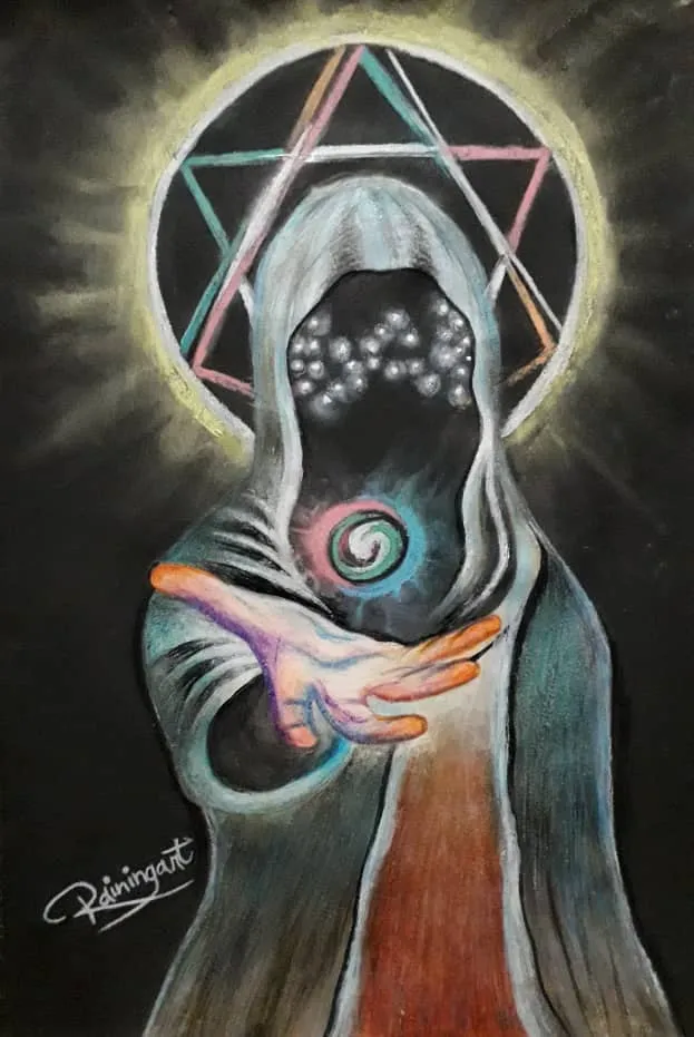
Here I share with you this illustration that I did recently to participate for the first time in Splinterlands Art Contest // Week 94 . I had a hard time to choose the lyrics that I was going to recreate, to be honest, because I liked them a lot, but in the end I decided to go for Elven Mystic of the Neutral element. I wanted to make some changes taking as a reference another image I found (that I'll leave at the end of the post), but always respecting how is the original card.
I also have to say that all my illustrations are made with colored pencils, also with some markers for some details that I want to highlight and paints only for more complex backgrounds.
I really hope you like the final result of the card I chose, soon you will be able to see more of my art.

The Making Process
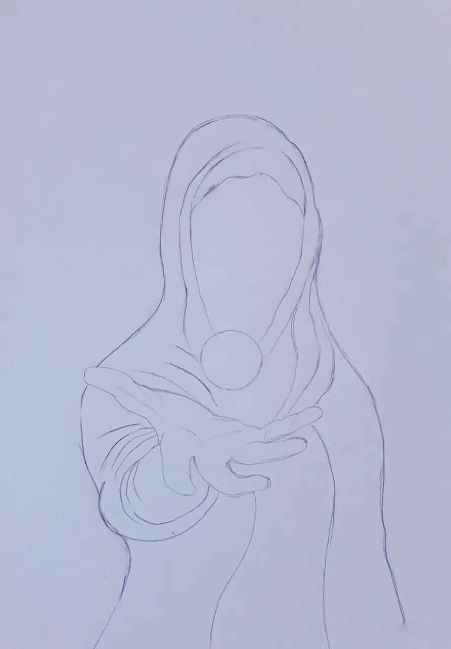
- As a first step to make my illustration will always be, of course, to capture the entire silhouette of the mage, which in this case is the character of the card I chose, once I have a good base in white I can start applying color.
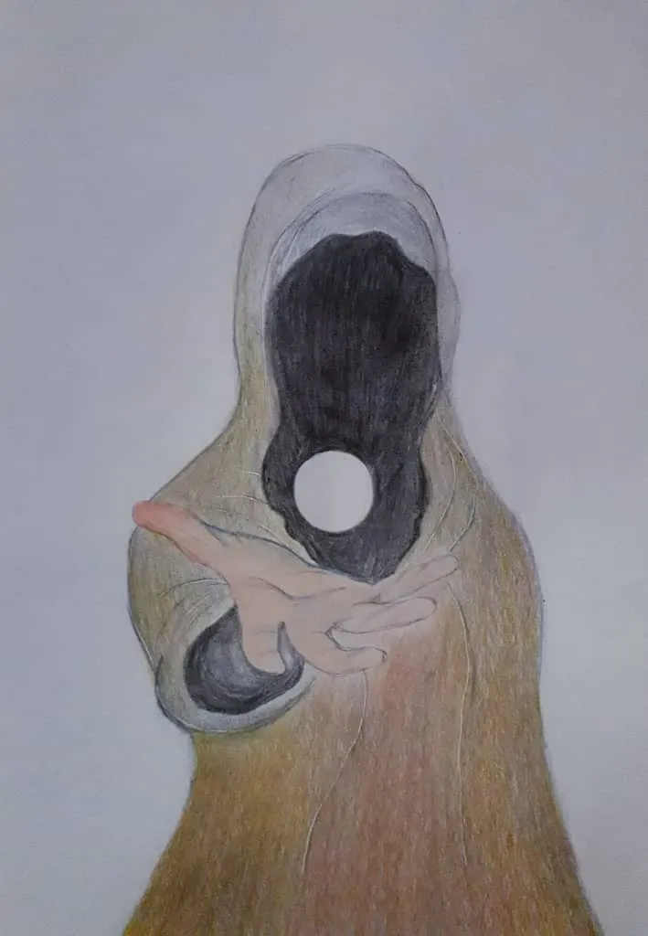
- Now in the second image you can see how I start to color the whole cape of the mage in beige tones and a little bit of gray too, inside I applied black because it is typical of this mystic character and I didn't want to make any change in that detail; I also gave a little bit of color to his hand. I apply all the color in a very soft way to create a kind of base first that I will keep working on.


- In the third step you can see how I am intensifying the color more and more, something I love to do since I was a child when I started drawing. In my illustrations the colour will always be intense so that it stands out a lot and is the protagonist. In the third image I advanced a lot in the color of the cape, I gave it much more texture, also details that are important like the sphere of light, which is characteristic of the character, the brightness that he has on top of his cape and light and shadow effects. Finally with black paint I covered the whole background with the intention of making the other colors stand out.

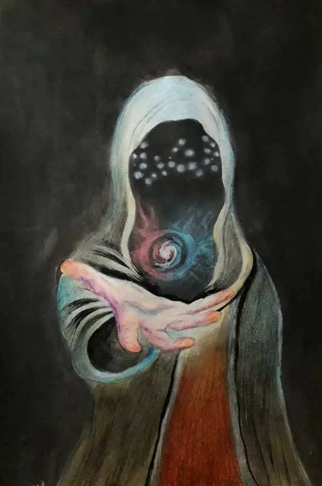


- To finish, as you can see in the last image, I worked on the last details to finish the whole figure of the magician. After having almost everything ready I made the star of light in the background that could not be missing and that gives the special touch to the illustration.

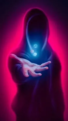
Reference photo
