
ENGLISH
Oliwis! Greetings from your little incubus, always looking for a little vitality to keep him full of energy and good mood. Today I bring you something super interesting and a bit different from the concept of art that we all know. For me it has also been a surprise to discover that I have the power to create this kind of things.
What I am going to show you is a chatbox. But what is a chatbox? It is what streamers use to display the chat during their streams and allow their viewers to interact with them. However, some take this a step further and create custom designs for their chat, adding a unique touch to their streams.
To create these types of chatboxes, here are some things to consider:
Required knowledge:
- HTML
- CSS
- JavaScript
Notes:
- This chat design is specifically designed to be used within Streamlabs.
- We will be working from the codebase provided by Streamlabs.
Instructions:
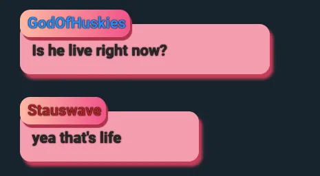
Viewer name:
#log .meta:
- This selector applies to any element with the
metaclass that is inside an element with the idlog.
position: relative;:
- Sets the
.metaelement to be positioned relatively. This means that it will be positioned relative to its normal position in the document flow.
top: 15px;:
- Moves the element
15pxdown from its original position.
display: inline;:
- Makes the element behave like an inline element (similar to a
span), allowing other elements to be on the same line.
background: linear-gradient(to right, #fdb9a3, #f15488);:
- Sets a background with a linear gradient that goes from left to right, starting with the color
#fdb9a3and ending with the color#f15488.
border-radius: 15px 15px 15px 15px;:
- Rounds the corners of the element with a radius of
15pxat each corner.
padding: 0.3em;:
- Adds a
0.3emspace inside the element, between its content and its borders.
white-space: nowrap;:
- Prevents text inside the element from wrapping on a new line. All inline content will remain on a single line.
text-overflow: ellipsis;:
- Displays an ellipsis (
...) when the text content is too long to fit in the bounded area of the element. This property works in conjunction withwhite-space: nowrapandoverflow: hidden.
overflow: hidden;:
- Hides any content that overflows the element's area.
box-shadow: 3px 5px 1px #af3349;:
- Adds a shadow to the element with a horizontal offset of
3px, a vertical offset of5px, a blur of1px, and a shadow color of#af3349.
z-index: 99;:
- Sets the layer on which the element is drawn, relative to other elements stacked in the same area. A higher value means that the element is drawn above elements with lower
z-indexvalues.
This code block styles elements with the meta class inside the log so that they look aesthetically pleasing with a background gradient, rounded edges, and a shadow, while ensuring that the textual content does not overflow and that the text stays on a single line.
#log .meta {
    position: relative;
    top: 15px;
    display: inline;
    background: linear-gradient(to right, #fdb9a3, #f15488);
    border-radius: 15px 15px 15px 15px;
    padding: 0.3em;
    white-space: nowrap;
    text-overflow: ellipsis;
    overflow: hidden;
    box-shadow: 3px 5px 1px #af3349;
    z-index: 99;
}
Viewer Message
#log .message:
- This selector applies to any element with the class
messagethat is inside an element with the idlog.
color: #292929;:
- Sets the text color to
#292929, a shade of dark gray.
background: #f49caf;:
- Sets the background color of the element to
#f49caf, a shade of pink.
font-weight: bold;:
- Makes the text inside the element bold.
padding: 1em 1em 0.8em 0.8em;:
- Adds padding around the element's content. In this case, it has a padding of
1emon the top and right, and0.8emon the bottom and left.
border-radius: 15px;:
- Rounds the corners of the element with a radius of
15px.
word-wrap: break-word;:
- Allows long words to be broken and wrapped on the next line to avoid overflowing the container.
width: 65%;:
- Sets the width of the element to
65%of the width of its parent container.
box-shadow: 5px 7px 4px #c83d56;:
- Adds a shadow to the element with a horizontal offset of
5px, a vertical offset of7px, a blur of4px, and a shadow color of#c83d56.
position: relative;:
- Sets the element to be positioned relatively. This means that it will be positioned relative to its normal position in the document flow, and allows the use of the
top,right,bottom, andleftproperties.
This code block styles elements with the message class within the #log container to look visually appealing with a specific text and background color, bold text, generous padding, rounded corners, and a shadow. The word-wrap property ensures that text does not overflow the container, while the position: relative allows for tight positioning within the normal flow of the document.
#log .message {
    color: #292929;
    background: #f49caf;
    font-weight: bold;
    padding: 1em 1em 0.8em 0.8em;
    border-radius: 15px;
    word-wrap: break-word;
    width: 65%;
    box-shadow: 5px 7px 4px #c83d56;
    position: relative;
}
Element Wrapping:
#log > div:
- This selector applies to all
divelements that are direct children of the element with the idlog. - The
>symbol indicates that the style only applies to direct children, not grandchildren or elements deeper in the DOM hierarchy.
margin: 1em;:
- This property sets a margin around
divdirect children of#log. - A
1emmargin is applied on all sides (top, right, bottom, and left). 1emis a relative unit that corresponds to the font size of the current element. Therefore, the margin will be equal to the font size of the element.
This CSS rule adds a 1em space (margin) around each div that is a direct child of the container with the id log, visually separating each div from the other surrounding elements.
#log > div {
  margin: 1em;
}
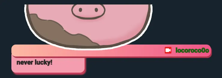
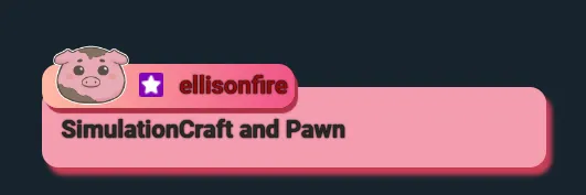
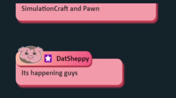
Adding emote:
- Purpose of
img:
- The
<img>tag is used to display an image on the web page. In this case, the image is placed inside aspancontainer with themetaclass, which also contains the user's name and possible badges.
chat-emoteclass,gelatine:
- The
chat-emoteclass assigned to the<img>tag suggests that the image is related to an emote or a visual element associated with chat messages.
- Image source (
src):
- The
srcproperty of the<img>tag points to a specific URL. This URL provides the location of the image on the web, which will be loaded and displayed at that specific place within the chat message.
altattribute:
- The
altattribute provides alternative text for the image. This text is displayed if the image cannot be loaded and is important for accessibility as it describes the image to screen reader users. In this case, the alternative text is "Chat Background".
The <img> tag inside the element with the meta class is placed to display a specific image (give a more unique style) associated with the user who sent the message. This enriches the chat experience by adding visual elements that can convey additional information or simply decorate the message.
<span class="meta" style="color: {color}">
 <img class="chat-emote gelatine " src="URL_IMG" alt="Chat Background">
      <span class="badges">

     </span>
Setting emote class chat-emote:
width: 6%;:
- Sets the width of the element to 6% of the width of its parent container. This allows the image to be resized proportionally to the size of the container it is in.
display: inline-block;:
- Makes the element behave like an inline element, but with the capabilities of a block. This means that a width and height can be set, and margins and padding will behave similarly to a block element.
margin: 0px;:
- Sets there to be no margin (space) around the element. This removes any white space that may be around the image.
position: relative;:
- Sets the element to be positioned relatively. This means that it will be positioned relative to its original position in the document flow.
top: 0.5em;:
- Moves the element
0.5emdown from its original position. Theemunit is relative to the font size of the current element, so0.5emis half the font size of the element. This is used to adjust the vertical alignment of the image within its container.
These properties ensure that emote images look well aligned, correctly sized, and without unnecessary space around them, providing a clean and professional look in the chat.
.chat-emote {
   width: 6%;
   display: inline-block;
   margin: 0px;
   position: relative;
   top: 0.5em;
}
Emote animation:
.element class
margin: 0 auto;:
- Sets a margin of
0at the top and bottom andautoon the left and right sides. This horizontally centers the element within its container.
animation-name: stretch;:
- Assigns the name of the animation to apply to the element, in this case,
stretch. Thestretchanimation must be defined in a@keyframesblock elsewhere in the CSS.
animation-duration: 1.5s;:
- Defines the duration of the entire animation, in this case,
1.5seconds.
animation-timing-function: ease-out;:
- Sets the timing function for the animation.
ease-outcauses the animation to start fast and then slow down towards the end.
animation-delay: 0;:
- Defines a delay before the animation starts. In this case, there is no delay (
0seconds).
animation-direction: alternate;:
- Makes the animation alternate in directions. This means that after each animation cycle, the direction is reversed (back and forth).
animation-iteration-count: infinite;:
- Makes the animation repeat infinitely.
animation-fill-mode: none;:
- Does not apply animation styles before or after the animation cycle. The element keeps its original style before and after the animation.
animation-play-state: running;:
- Sets that the animation is running (not paused).
.element {
  margin: 0 auto;
  animation-name: stretch;
  animation-duration: 1.5s;
  animation-timing-function: ease-out;
  animation-delay: 0;
  animation-direction: alternate;
  animation-iteration-count: infinite;
  animation-fill-mode: none;
  animation-play-state: running;
}
@keyframes stretch block
0%and100%:Defines the start and end states of the animation.
transform: scale(0.7);:At
0%(start of animation), the element is scaled to70%of its original size.border-radius: 100%;:At
0%, the element's border is completely rounded, forming a circle.transform: scale(1);:At
100%(end of animation), the element is scaled back to its original size (100%).
@keyframes stretch {
  0% {
    transform: scale(0.7);
    border-radius: 100%;
  }
  100% {
    transform: scale(1);
  }
}
.gelatine class
animation: gelatine 0.5s infinite;:- Assigns the
gelatineanimation to the element, with a duration of0.5seconds, and repeats infinitely.
.gelatine {
  animation: gelatine 0.5s infinite;
}
@keyframes jelly block
from, to { transform: scale(1, 1); }:Defines that at the start and end of the animation, the element will have its original size (
scale(1, 1)).25% { transform: scale(0.9, 1.1); }:At
25%of the animation cycle, the element is scaled to90%of its width and110%of its height, creating a vertical stretching effect.50% { transform: scale(1.1, 0.9); }:At
50%of the animation cycle, the element is scaled to110%of its width and90%of its height, creating a horizontal stretching effect.75% { transform: scale(0.95, 1.05); }:At
75%into the animation cycle, the element is scaled to95%of its width and105%of its height, creating a slight vertical stretching effect.
@keyframes gelatine {
  from, to { transform: scale(1, 1); }
  25% { transform: scale(0.9, 1.1); }
  50% { transform: scale(1.1, 0.9); }
  75% { transform: scale(0.95, 1.05); }
}
Summary
- .element: Applies a
stretchanimation that alternates between two states (smallest to largest) infinitely and with a duration of1.5seconds. - .gelatine: Applies a
gelatineanimation that scales the element in different proportions to create a bounce effect, with a duration of0.5seconds and that repeats infinitely.
Full code for the emote animation:
.element{
  margin: 0 auto;
  animation-name: stretch;
  animation-duration: 1.5s;
  animation-timing-function: ease-out;
  animation-delay:0;
  animation-direction: alternate;
  animation-iteration-count: infinite;
  animation-fill-mode: none;
  animation-play-state:running;
}

@keyframes stretch {
  0% {
    transform:scale(0.7);
    border-radius: 100%;
  }
  100%{
    transform: scale (1);
  }
}

.gelatine {
  animation: gelatine 0.5s infinite;
}
@keyframes gelatine {
  from, to { transform: scale(1, 1); }
  25% { transform: scale(0.9, 1.1); }
  50% { transform: scale(1.1, 0.9); }
  75% { transform: scale(0.95, 1.05); }
}
Class name settings:
margin-left: 0.2em;:
- Sets a margin on the left side of the element with the
.nameclass. 0.2emis a unit relative to the font size of the element. This means that the margin will be equal to20%of the font size. The extra margin provides a small space between the.nameelement and the content to its left.
font-weight: bold;:
- Applies a bold font weight to the text inside the element with the
.nameclass. - This makes the text thicker and more prominent, which is often used to emphasize names or other important text.
color: #000000;:
- Sets the text color to black (
#000000is the hex code for the color black). - This ensures that the text is a solid, dark color, providing good contrast against lighter backgrounds for easier reading.
In general, these styles ensure that names within elements with the .name class appear clearly prominent and well positioned within their container.
.name {
    margin-left: 0.2em;
    font-weight: bold;
    color: #000000;
}
Full code
<div id="log" class="sl__chat__layout">
</div>


<script type="text/template" id="chatlist_item">
  <div data-from="{from}" data-id="{messageId}">
    <span class="meta" style="color: {color}">
    <img class="chat-emote gelatine " src="url_imagen" alt="Chat Background">
      <span class="badges">
      </span>
      <span class="name">{from}</span>
    </span>

    <span class="message">
      {message}
    </span>
  </div>
</script>
@import url(https://fonts.googleapis.com/css?family=Roboto:700);

* {
    box-sizing: border-box;
}

html, body {
    height: 100%;
    overflow: hidden;
}

body {
  background: {background_color};
  font-family: 'Calibri';
    font-weight: 500;
    font-size: {font_size};
    line-height: 1.5em;
    color: {text_color};
}

#log>div {
    animation: fadeInRight .3s ease forwards, fadeOut 0.5s ease {message_hide_delay} forwards;
    -webkit-animation: fadeInRight .3s ease forwards, fadeOut 0.5s ease {message_hide_delay} forwards;
}

.colon {
    display: none;
}

#log {
     position: absolute;
    bottom: 0;
    left: 0;
    padding: 0 10px 10px;
    width: 100%;
}

#log>div {
  margin: 1em;
}

#log>div.deleted {
    visibility: hidden;
}

#log .emote {
    background-repeat: no-repeat;
    background-position: center;
    background-size: contain;
    padding: 0.4em 0.2em;
    position: relative;
}

#log .emote img {
    display: inline-block;
    height: 1em;
    opacity: 0;
}

#log .message,#log .meta {
    vertical-align: top;
    display: table-cell;
    padding-bottom: 0.1em;
}

#log .meta {
    position: relative;
  top: 15px;
    display: inline;
  background:   linear-gradient(to right, #fdb9a3, #f15488);
  border-radius: 15px 15px 15px 15px;
    padding: 0.3em;
    white-space: nowrap;
    text-overflow: ellipsis;
    overflow: hidden;
  box-shadow: 3px 5px 1px #af3349;
   z-index: 99;
}

#log .message {
    color: #292929;
  background: #f49caf;
  font-weight: bold;
  padding: 1em 1em 0.8em 0.8em;
  border-radius: 15px;
    word-wrap: break-word;
    width: 65%;
  box-shadow:5px 7px 4px #c83d56;
 position:relative;
}

.badge {
    display: inline-block;
    margin-right: 0.2em;
    position: relative;
    height: 1em;
    vertical-align: middle;
    top: -0.1em;
}

.name {
    margin-left: 0.2em;
    font-weight: bold;
    color:#000000;
}

.chat-emote{
   width: 6%;
   display: inline-block;
  margin:0px;
  position: relative;
  top: 0.5em;
}


.element{
  margin: 0 auto;
  animation-name: stretch;
  animation-duration: 1.5s;
  animation-timing-function: ease-out;
  animation-delay:0;
  animation-direction: alternate;
  animation-iteration-count: infinite;
  animation-fill-mode: none;
  animation-play-state:running;
}

@keyframes stretch {
  0% {
    transform:scale(0.7);
    border-radius: 100%;
  }
  100%{
    transform: scale (1);
  }
}

.gelatine {
  animation: gelatine 0.5s infinite;
}
@keyframes gelatine {
  from, to { transform: scale(1, 1); }
  25% { transform: scale(0.9, 1.1); }
  50% { transform: scale(1.1, 0.9); }
  75% { transform: scale(0.95, 1.05); }
}
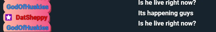
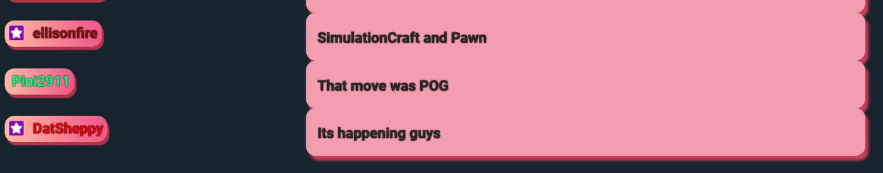
Final score
SPANISH
¡Oliwis! Les saluda su nekito íncubo, siempre en busca de un poco de vitalidad para mantenerse lleno de energía y buen humor. Hoy les traigo algo súper interesante y un tanto diferente al concepto de arte que todos conocemos. Para mí también ha sido una sorpresa descubrir que tengo el poder de crear este tipo de cosas.
Lo que les voy a mostrar es un chatbox. Pero, ¿qué es un chatbox? Es lo que utilizan los streamers para visualizar el chat durante sus transmisiones y permitir que sus viewers interactúen con ellos. Sin embargo, algunos llevan esto un paso más allá y crean diseños personalizados para su chat, añadiendo un toque único a sus streams.
Para crear este tipo de chatboxes, aquí hay algunas cosas a considerar:
Conocimientos deseados:
- HTML
- CSS
- JavaScript
Notas:
- Este diseño de chat está diseñado específicamente para ser utilizado dentro de Streamlabs.
- Trabajaremos a partir del código base que nos proporciona Streamlabs.
Instrucciones:
Nombre del viewer:
#log .meta:- Este selector se aplica a cualquier elemento con la clase
metaque está dentro de un elemento con el idlog.
- Este selector se aplica a cualquier elemento con la clase
position: relative;:- Establece que el elemento
.metaestá posicionado de manera relativa. Esto significa que se posicionará en relación a su posición normal en el flujo del documento.
- Establece que el elemento
top: 15px;:- Mueve el elemento
15pxhacia abajo desde su posición original.
- Mueve el elemento
display: inline;:- Hace que el elemento se comporte como un elemento en línea (similar a un
span), permitiendo que otros elementos estén en la misma línea.
- Hace que el elemento se comporte como un elemento en línea (similar a un
background: linear-gradient(to right, #fdb9a3, #f15488);:- Establece un fondo con un degradado lineal que va de izquierda a derecha, comenzando con el color
#fdb9a3y terminando con el color#f15488.
- Establece un fondo con un degradado lineal que va de izquierda a derecha, comenzando con el color
border-radius: 15px 15px 15px 15px;:- Redondea las esquinas del elemento con un radio de
15pxen cada esquina.
- Redondea las esquinas del elemento con un radio de
padding: 0.3em;:- Agrega un espacio de
0.3emdentro del elemento, entre su contenido y sus bordes.
- Agrega un espacio de
white-space: nowrap;:- Evita que el texto dentro del elemento se envuelva en una nueva línea. Todo el contenido en línea se mantendrá en una sola línea.
text-overflow: ellipsis;:- Muestra puntos suspensivos (
...) cuando el contenido del texto es demasiado largo para caber en el área delimitada del elemento. Esta propiedad funciona en conjunto conwhite-space: nowrapyoverflow: hidden.
- Muestra puntos suspensivos (
overflow: hidden;:- Oculta cualquier contenido que desborde el área del elemento.
box-shadow: 3px 5px 1px #af3349;:- Agrega una sombra al elemento con un desplazamiento horizontal de
3px, un desplazamiento vertical de5px, un desenfoque de1pxy un color de sombra#af3349.
- Agrega una sombra al elemento con un desplazamiento horizontal de
z-index: 99;:- Establece la capa en la que se dibuja el elemento, con respecto a otros elementos apilados en la misma área. Un valor más alto significa que el elemento se dibuja por encima de los elementos con valores de
z-indexmás bajos.
- Establece la capa en la que se dibuja el elemento, con respecto a otros elementos apilados en la misma área. Un valor más alto significa que el elemento se dibuja por encima de los elementos con valores de
Este bloque de código estiliza los elementos con la clase meta dentro del log para que se vean estéticamente agradables con un degradado de fondo, bordes redondeados, y una sombra, mientras se asegura de que el contenido textual no se desborde y que el texto se mantenga en una sola línea.
#log .meta {
    position: relative;
    top: 15px;
    display: inline;
    background: linear-gradient(to right, #fdb9a3, #f15488);
    border-radius: 15px 15px 15px 15px;
    padding: 0.3em;
    white-space: nowrap;
    text-overflow: ellipsis;
    overflow: hidden;
    box-shadow: 3px 5px 1px #af3349;
    z-index: 99;
}
Mensaje del viewer
#log .message:- Este selector se aplica a cualquier elemento con la clase
messageque está dentro de un elemento con el idlog.
- Este selector se aplica a cualquier elemento con la clase
color: #292929;:- Establece el color del texto en
#292929, un tono de gris oscuro.
- Establece el color del texto en
background: #f49caf;:- Establece el color de fondo del elemento en
#f49caf, un tono rosado.
- Establece el color de fondo del elemento en
font-weight: bold;:- Hace que el texto dentro del elemento sea en negrita.
padding: 1em 1em 0.8em 0.8em;:- Agrega un espacio interno (padding) alrededor del contenido del elemento. En este caso, tiene un padding de
1emen la parte superior y derecha, y0.8emen la parte inferior e izquierda.
- Agrega un espacio interno (padding) alrededor del contenido del elemento. En este caso, tiene un padding de
border-radius: 15px;:- Redondea las esquinas del elemento con un radio de
15px.
- Redondea las esquinas del elemento con un radio de
word-wrap: break-word;:- Permite que las palabras largas se dividan y se envuelvan en la siguiente línea para evitar desbordamientos del contenedor.
width: 65%;:- Establece el ancho del elemento al
65%del ancho de su contenedor padre.
- Establece el ancho del elemento al
box-shadow: 5px 7px 4px #c83d56;:- Agrega una sombra al elemento con un desplazamiento horizontal de
5px, un desplazamiento vertical de7px, un desenfoque de4px, y un color de sombra#c83d56.
- Agrega una sombra al elemento con un desplazamiento horizontal de
position: relative;:- Establece que el elemento está posicionado de manera relativa. Esto significa que se posicionará en relación a su posición normal en el flujo del documento, y permite el uso de las propiedades
top,right,bottomyleft.
- Establece que el elemento está posicionado de manera relativa. Esto significa que se posicionará en relación a su posición normal en el flujo del documento, y permite el uso de las propiedades
Este bloque de código estiliza los elementos con la clase message dentro del contenedor #log para que se vean visualmente atractivos con un color de texto y fondo específicos, texto en negrita, un padding generoso, esquinas redondeadas, y una sombra. La propiedad word-wrap asegura que el texto no se desborde del contenedor, mientras que el position: relative permite un posicionamiento ajustado dentro del flujo normal del documento.
#log .message {
    color: #292929;
    background: #f49caf;
    font-weight: bold;
    padding: 1em 1em 0.8em 0.8em;
    border-radius: 15px;
    word-wrap: break-word;
    width: 65%;
    box-shadow: 5px 7px 4px #c83d56;
    position: relative;
}
Acomodo de elementos:
#log > div:- Este selector se aplica a todos los elementos
divque son hijos directos del elemento con el idlog. - El símbolo
>indica que el estilo solo se aplica a los hijos directos, no a los nietos o elementos más profundos en la jerarquía del DOM.
- Este selector se aplica a todos los elementos
margin: 1em;:- Esta propiedad establece un margen alrededor de los
divhijos directos de#log. - Un margen de
1emse aplica en todos los lados (superior, derecho, inferior e izquierdo). 1emes una unidad relativa que corresponde al tamaño de la fuente del elemento actual. Por lo tanto, el margen será igual al tamaño de la fuente del elemento.
- Esta propiedad establece un margen alrededor de los
Esta regla CSS añade un espacio (margen) de 1em alrededor de cada div que es un hijo directo del contenedor con el id log, separando visualmente cada div de los demás elementos circundantes.
#log > div {
  margin: 1em;
}
Agregar emote:
Propósito del
img:- La etiqueta
<img>se utiliza para mostrar una imagen en la página web. En este caso, la imagen está situada dentro de un contenedorspancon la clasemeta, que también contiene el nombre del usuario y los posibles badges.
- La etiqueta
Clase
chat-emote,gelatine:- La clase
chat-emoteasignada a la etiqueta<img>sugiere que la imagen está relacionada con un emote o un elemento visual asociado a los mensajes de chat.
- La clase
Fuente de la imagen (
src):- La propiedad
srcde la etiqueta<img>apunta a una URL específica. Esta URL proporciona la ubicación de la imagen en la web, la cual será cargada y mostrada en ese lugar específico dentro del mensaje de chat.
- La propiedad
Atributo
alt:- El atributo
altproporciona texto alternativo para la imagen. Este texto se muestra si la imagen no se puede cargar y es importante para la accesibilidad, ya que describe la imagen a los usuarios de lectores de pantalla. En este caso, el texto alternativo es "Chat Background".
- El atributo
La etiqueta <img> dentro del elemento con la clase meta se coloca para mostrar una imagen específica (dar un estilo mas unico) asociada con el usuario que envió el mensaje. Esto enriquece la experiencia del chat al añadir elementos visuales que pueden transmitir información adicional o simplemente decorar el mensaje.
<span class="meta" style="color: {color}">
 <img class="chat-emote gelatine " src="URL_IMG" alt="Chat Background">
      <span class="badges">

     </span>
Ajustar emote clase chat-emote:
width: 6%;:- Establece el ancho del elemento como un 6% del ancho de su contenedor padre. Esto permite que la imagen se redimensione proporcionalmente al tamaño del contenedor en el que se encuentra.
display: inline-block;:- Hace que el elemento se comporte como un elemento en línea (
inline), pero con las capacidades de un bloque (block). Esto significa que se puede establecer un ancho y un alto, y los márgenes y el relleno se comportarán de manera similar a los de un elemento de bloque.
- Hace que el elemento se comporte como un elemento en línea (
margin: 0px;:- Establece que no haya ningún margen (espacio) alrededor del elemento. Esto elimina cualquier espacio en blanco que pueda haber alrededor de la imagen.
position: relative;:- Establece que el elemento esté posicionado de manera relativa. Esto significa que se posicionará en relación con su posición original en el flujo del documento.
top: 0.5em;:- Mueve el elemento
0.5emhacia abajo desde su posición original. La unidademes relativa al tamaño de la fuente del elemento actual, por lo que0.5emes la mitad del tamaño de la fuente del elemento. Esto se usa para ajustar la alineación vertical de la imagen dentro de su contenedor.
- Mueve el elemento
Estas propiedades aseguran que las imágenes de los emotes se vean bien alineadas, correctamente dimensionadas y sin espacio innecesario alrededor, proporcionando una apariencia limpia y profesional en el chat.
.chat-emote {
   width: 6%;
   display: inline-block;
   margin: 0px;
   position: relative;
   top: 0.5em;
}
Animacion emote:
Clase .element
margin: 0 auto;:- Establece un margen de
0en la parte superior e inferior yautoen los lados izquierdo y derecho. Esto centra horizontalmente el elemento dentro de su contenedor.
- Establece un margen de
animation-name: stretch;:- Asigna el nombre de la animación a aplicar al elemento, en este caso,
stretch. La animaciónstretchdebe estar definida en un bloque@keyframesen otro lugar del CSS.
- Asigna el nombre de la animación a aplicar al elemento, en este caso,
animation-duration: 1.5s;:- Define la duración de la animación completa, en este caso,
1.5segundos.
- Define la duración de la animación completa, en este caso,
animation-timing-function: ease-out;:- Establece la función de temporización de la animación.
ease-outhace que la animación comience rápido y luego disminuya la velocidad hacia el final.
- Establece la función de temporización de la animación.
animation-delay: 0;:- Define un retraso antes de que la animación comience. En este caso, no hay retraso (
0segundos).
- Define un retraso antes de que la animación comience. En este caso, no hay retraso (
animation-direction: alternate;:- Hace que la animación alterne en direcciones. Esto significa que después de cada ciclo de animación, la dirección se invierte (de ida y vuelta).
animation-iteration-count: infinite;:- Hace que la animación se repita infinitamente.
animation-fill-mode: none;:- No aplica estilos de animación antes o después del ciclo de animación. El elemento mantiene su estilo original antes y después de la animación.
animation-play-state: running;:- Establece que la animación está en ejecución (no en pausa).
.element {
  margin: 0 auto;
  animation-name: stretch;
  animation-duration: 1.5s;
  animation-timing-function: ease-out;
  animation-delay: 0;
  animation-direction: alternate;
  animation-iteration-count: infinite;
  animation-fill-mode: none;
  animation-play-state: running;
}
Bloque @keyframes stretch
0%y100%:- Define los estados iniciales y finales de la animación.
transform: scale(0.7);:- A
0%(inicio de la animación), el elemento se escala a70%de su tamaño original.
- A
border-radius: 100%;:- A
0%, el borde del elemento es completamente redondeado, formando un círculo.
- A
transform: scale(1);:- A
100%(final de la animación), el elemento se escala de nuevo a su tamaño original (100%).
- A
@keyframes stretch {
  0% {
    transform: scale(0.7);
    border-radius: 100%;
  }
  100% {
    transform: scale(1);
  }
}
Clase .gelatine
animation: gelatine 0.5s infinite;:- Asigna la animación
gelatineal elemento, con una duración de0.5segundos, y se repite infinitamente.
- Asigna la animación
.gelatine {
  animation: gelatine 0.5s infinite;
}
Bloque @keyframes gelatine
from, to { transform: scale(1, 1); }:- Define que al inicio y al final de la animación, el elemento tendrá su tamaño original (
scale(1, 1)).
- Define que al inicio y al final de la animación, el elemento tendrá su tamaño original (
25% { transform: scale(0.9, 1.1); }:- A
25%del ciclo de animación, el elemento se escala a90%de su ancho y110%de su alto, creando un efecto de estiramiento vertical.
- A
50% { transform: scale(1.1, 0.9); }:- A
50%del ciclo de animación, el elemento se escala a110%de su ancho y90%de su alto, creando un efecto de estiramiento horizontal.
- A
75% { transform: scale(0.95, 1.05); }:- A
75%del ciclo de animación, el elemento se escala a95%de su ancho y105%de su alto, creando un ligero efecto de estiramiento vertical.
- A
@keyframes gelatine {
  from, to { transform: scale(1, 1); }
  25% { transform: scale(0.9, 1.1); }
  50% { transform: scale(1.1, 0.9); }
  75% { transform: scale(0.95, 1.05); }
}
Resumen
- .element: Aplica una animación de estiramiento (
stretch) que alterna entre dos estados (de menor a mayor tamaño) de forma infinita y con una duración de1.5segundos. - .gelatine: Aplica una animación de efecto gelatina (
gelatine) que escala el elemento en diferentes proporciones para crear un efecto rebote, con una duración de0.5segundos y que se repite infinitamente.
Codigo completo de la animacion emote:
.element{
  margin: 0 auto;
  animation-name: stretch;
  animation-duration: 1.5s;
  animation-timing-function: ease-out;
  animation-delay:0;
  animation-direction: alternate;
  animation-iteration-count: infinite;
  animation-fill-mode: none;
  animation-play-state:running;
}

@keyframes stretch {
  0% {
    transform:scale(0.7);
    border-radius: 100%;
  }
  100%{
    transform: scale (1);
  }
}

.gelatine {
  animation: gelatine 0.5s infinite;
}
@keyframes gelatine {
  from, to { transform: scale(1, 1); }
  25% { transform: scale(0.9, 1.1); }
  50% { transform: scale(1.1, 0.9); }
  75% { transform: scale(0.95, 1.05); }
}
Ajustes clase name:
margin-left: 0.2em;:- Establece un margen en el lado izquierdo del elemento con la clase
.name. 0.2emes una unidad relativa al tamaño de la fuente del elemento. Esto significa que el margen será equivalente al20%del tamaño de la fuente. El margen adicional proporciona un pequeño espacio entre el elemento.namey el contenido a su izquierda.
- Establece un margen en el lado izquierdo del elemento con la clase
font-weight: bold;:- Aplica un peso de fuente en negrita al texto dentro del elemento con la clase
.name. - Esto hace que el texto sea más grueso y destacable, lo que suele utilizarse para enfatizar nombres u otros textos importantes.
- Aplica un peso de fuente en negrita al texto dentro del elemento con la clase
color: #000000;:- Establece el color del texto en negro (
#000000es el código hexadecimal para el color negro). - Esto asegura que el texto sea de un color sólido y oscuro, proporcionando un buen contraste con fondos más claros para facilitar la lectura.
- Establece el color del texto en negro (
En general, estos estilos aseguran que los nombres dentro de los elementos con la clase .name se vean claramente destacados y bien posicionados dentro de su contenedor.
.name {
    margin-left: 0.2em;
    font-weight: bold;
    color: #000000;
}
Codigo completo
<div id="log" class="sl__chat__layout">
</div>


<script type="text/template" id="chatlist_item">
  <div data-from="{from}" data-id="{messageId}">
    <span class="meta" style="color: {color}">
    <img class="chat-emote gelatine " src="url_imagen" alt="Chat Background">
      <span class="badges">
      </span>
      <span class="name">{from}</span>
    </span>

    <span class="message">
      {message}
    </span>
  </div>
</script>
@import url(https://fonts.googleapis.com/css?family=Roboto:700);

* {
    box-sizing: border-box;
}

html, body {
    height: 100%;
    overflow: hidden;
}

body {
  background: {background_color};
  font-family: 'Calibri';
    font-weight: 500;
    font-size: {font_size};
    line-height: 1.5em;
    color: {text_color};
}

#log>div {
    animation: fadeInRight .3s ease forwards, fadeOut 0.5s ease {message_hide_delay} forwards;
    -webkit-animation: fadeInRight .3s ease forwards, fadeOut 0.5s ease {message_hide_delay} forwards;
}

.colon {
    display: none;
}

#log {
     position: absolute;
    bottom: 0;
    left: 0;
    padding: 0 10px 10px;
    width: 100%;
}

#log>div {
  margin: 1em;
}

#log>div.deleted {
    visibility: hidden;
}

#log .emote {
    background-repeat: no-repeat;
    background-position: center;
    background-size: contain;
    padding: 0.4em 0.2em;
    position: relative;
}

#log .emote img {
    display: inline-block;
    height: 1em;
    opacity: 0;
}

#log .message,#log .meta {
    vertical-align: top;
    display: table-cell;
    padding-bottom: 0.1em;
}

#log .meta {
    position: relative;
  top: 15px;
    display: inline;
  background:   linear-gradient(to right, #fdb9a3, #f15488);
  border-radius: 15px 15px 15px 15px;
    padding: 0.3em;
    white-space: nowrap;
    text-overflow: ellipsis;
    overflow: hidden;
  box-shadow: 3px 5px 1px #af3349;
   z-index: 99;
}

#log .message {
    color: #292929;
  background: #f49caf;
  font-weight: bold;
  padding: 1em 1em 0.8em 0.8em;
  border-radius: 15px;
    word-wrap: break-word;
    width: 65%;
  box-shadow:5px 7px 4px #c83d56;
 position:relative;
}

.badge {
    display: inline-block;
    margin-right: 0.2em;
    position: relative;
    height: 1em;
    vertical-align: middle;
    top: -0.1em;
}

.name {
    margin-left: 0.2em;
    font-weight: bold;
    color:#000000;
}

.chat-emote{
   width: 6%;
   display: inline-block;
  margin:0px;
  position: relative;
  top: 0.5em;
}


.element{
  margin: 0 auto;
  animation-name: stretch;
  animation-duration: 1.5s;
  animation-timing-function: ease-out;
  animation-delay:0;
  animation-direction: alternate;
  animation-iteration-count: infinite;
  animation-fill-mode: none;
  animation-play-state:running;
}

@keyframes stretch {
  0% {
    transform:scale(0.7);
    border-radius: 100%;
  }
  100%{
    transform: scale (1);
  }
}

.gelatine {
  animation: gelatine 0.5s infinite;
}
@keyframes gelatine {
  from, to { transform: scale(1, 1); }
  25% { transform: scale(0.9, 1.1); }
  50% { transform: scale(1.1, 0.9); }
  75% { transform: scale(0.95, 1.05); }
}
Resultado Final
Separator, image of a little pig made by @softy1231 softy1231
Vtuber, Panels made by @panna-natha pannanatha
Logo made by KivaVT