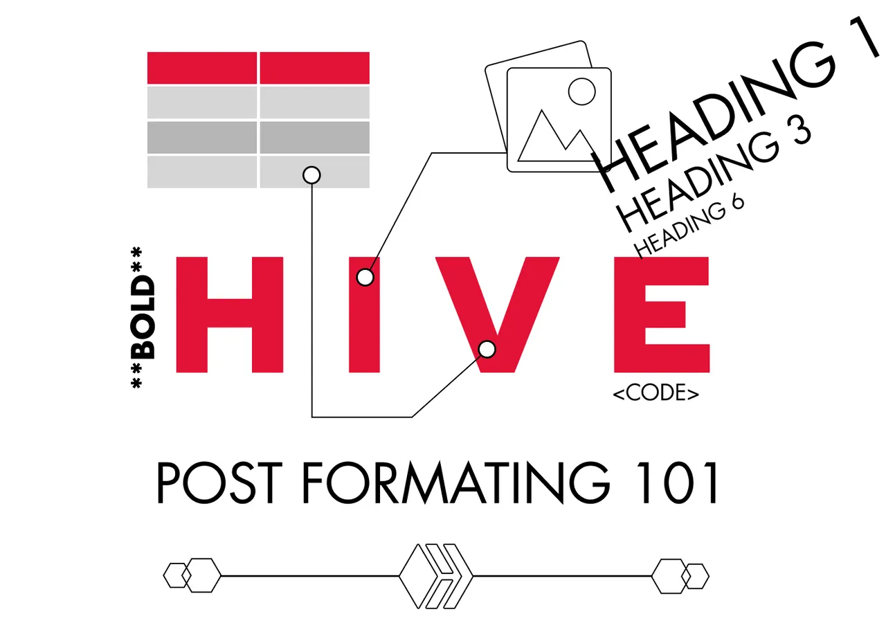
Part 2 with even more formatting and HTML
Formatting your post for dummies!
Today I spent some time commenting on newbies posts. I did that to help @aliento in giving them feedback. As a former graduate from his Newbies Initiative I am really happy to give back some of the help, that I received.
So I decided to write this post for all the newbies and give them some advice on creating more aesthetic, appealing and easy to read posts.
Why would you need that?
Aesthetics and the Aesthetic-Usability Effect is a principle in UX design that states that Users or in our case Readers tend to understand better, more beautifully created applications or in our case - posts.
Reading a beautiful post can make readers feel less fatigued, make them think more clearly, be more creative in their responses, be more patient in reading long post and even be more generous in upvoting.
More about this effect in the UX experience you can read here, but let’s continue with the practical advice.
Use nice images.

You can use your own, but If you don't find them appealing you can always find some free to use.
Optimal is to use an image for every section of your text. But it is still great if you can provide 3 images for 350 word post.
Some of best sites to use for commercial free images are:
- https://unsplash.com/
- https://www.pexels.com/
- https://www.canva.com/photos/free/
- https://stocksnap.io/
- https://pixabay.com/
Use headings and separators
Using #, ##, ###, ####, ##### - at the start of a line of text, let you make a H1, H2, H3 and so on.
According to @projectmamabg, it is good to have just one H1 - heading, probably at the top of your post, which can just rephrase the title or tell more about it.
If you don't know what H1, H2, H3 ... means these are the different sizes of Headings.
This is H1 Heading
This is H2 Heading
This is H3 Heading
This is H4 Heading
This is H5 Heading
This is H6 Heading
In My post I am using H2 Heading to separate the different sections/blocks of text.
⠀

You can use image separators, to make the task of separating the blocks of text even more aesthetic.
You will make them easier to read - so better User Experience or maybe Reader Experience and better aesthetics - So even better usability.
You can use different separators, that people share for free or you can make you own in minutes using a lightweight software like Figma or Canva.
You can even make your own beautiful Headings in the form of Images.
Format your Text
Don't just write a long blanket of words. When you are done writing, read you text, find a way to stress out the important words or sentences. If you just scroll up and scan this article without even reading a word, you have some idea what it is about. This is what you wanna do with formatting.
You can use the markup show below to stress out a word or a few words:
Bold - To make a word bold, surround it with double asterisks ** word** , please not I am leaving a black space before the word, so you can see the asterisks, if you remove the space the word will become bold
Italic - To make a word italic, use single asterisk to surround it: * word*
Code This is my favorite. Surrounding a word with code tags, make it have a background. You should write these: < code> word < /code> , again to make it work, remove the black spaces from my example.
citation - Using a single < symbol at the beginning of your post, makes you text look like this. You can use it in multiple cases.
You can also use lists. They can be:
- Ordered
- Unordered
You can make this effect using a digit and a dot just like that 1. for ordered list or just a asterisk and space at the start of a line to make unordered list like that *⠀
You can also use tables. It looks a little complex at the start, but actually it is pretty simple.
⠀| Column 1 | Column 2 | Column 3 |
⠀| ------------ | ------------ | ------------ |
⠀|⠀⠀Text⠀⠀|⠀⠀Text⠀⠀|⠀⠀Text ⠀⠀|
As you see above, It is done by drawing a table using | and -
If you copy-paste the code above and** remove the blank space** at the start of each line, you will see it working and start tinkering it till you understand how it works.
It should look like this:
| Column 1 | Column 2 | Column 3 |
|---|---|---|
| ⠀⠀Text⠀⠀ | ⠀⠀Text⠀⠀ | ⠀⠀Text ⠀⠀ |
✔️Another way to make you text more 😄 fun and 😎 fancy is by using 😉 smiles. You can use them to make
⚫ lists
🎯 attract attention
🙏 say Namaste to @iliyan90
👉 point the person, you blame for being on hive, @manoldonchev
🖖 Live long and prosper!
You can also use them to make
🔹🔹🔹🔹🔹🔹 SEPARATORS 🔹🔹🔹🔹🔹🔹🔹
Thank you for your time and I hope this helps!
Let me tag the new-bies, that could find this useful:
@projectmamabg, @jay-one, @maryjacy, @maykk, @mrenglish, @merit.ahama, @esther-emmanuel
Part 2 with even more formatting and HTML
Good luck!


Join our young UX / UI Design community

All images, text and illustrations in this post are original content.

