#ragnaroklogo
HELLO HIVERS🤩,
I saw so many people's posts related to the Ragnarok game logo proposal.so I decided to make one and participate in it. I am not good at the photoshop pc version😐. I bought this laptop 3 days ago. I like to start editing on pc version editing applications. so now I created this logo with an android application called " Photoshop cc"📱. I usually make all editing on my mobile phone. I make youtube thumbnails of my channels and other stuff are made with this mobile phone,
without wasting any time...
let's jump...in 🏃♂️ on to the making part of the LOGO
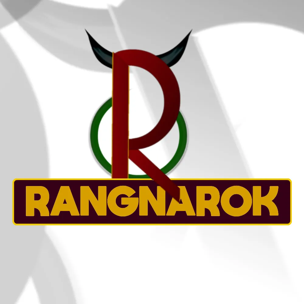
RAGNAROK LOGO MADE WITH MOBILE PHONE📱
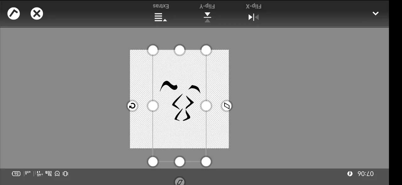
First, I checked the profile @ragnarok.game ...👈and I find this Article. I read the article once and I wrote some points and drew some rough sketches✒️ of what is came to my mind📔.
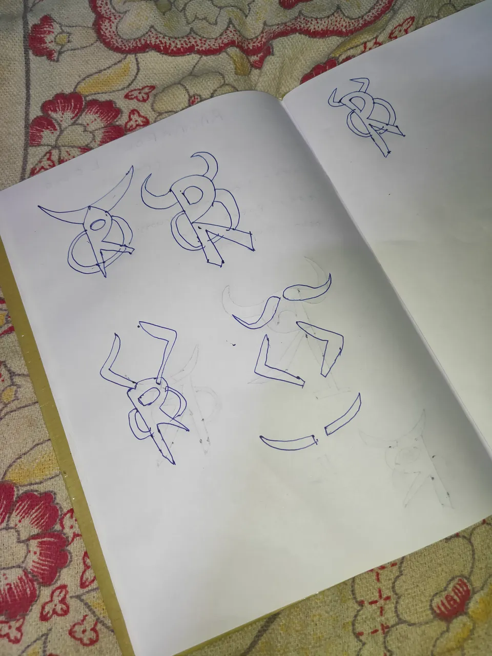
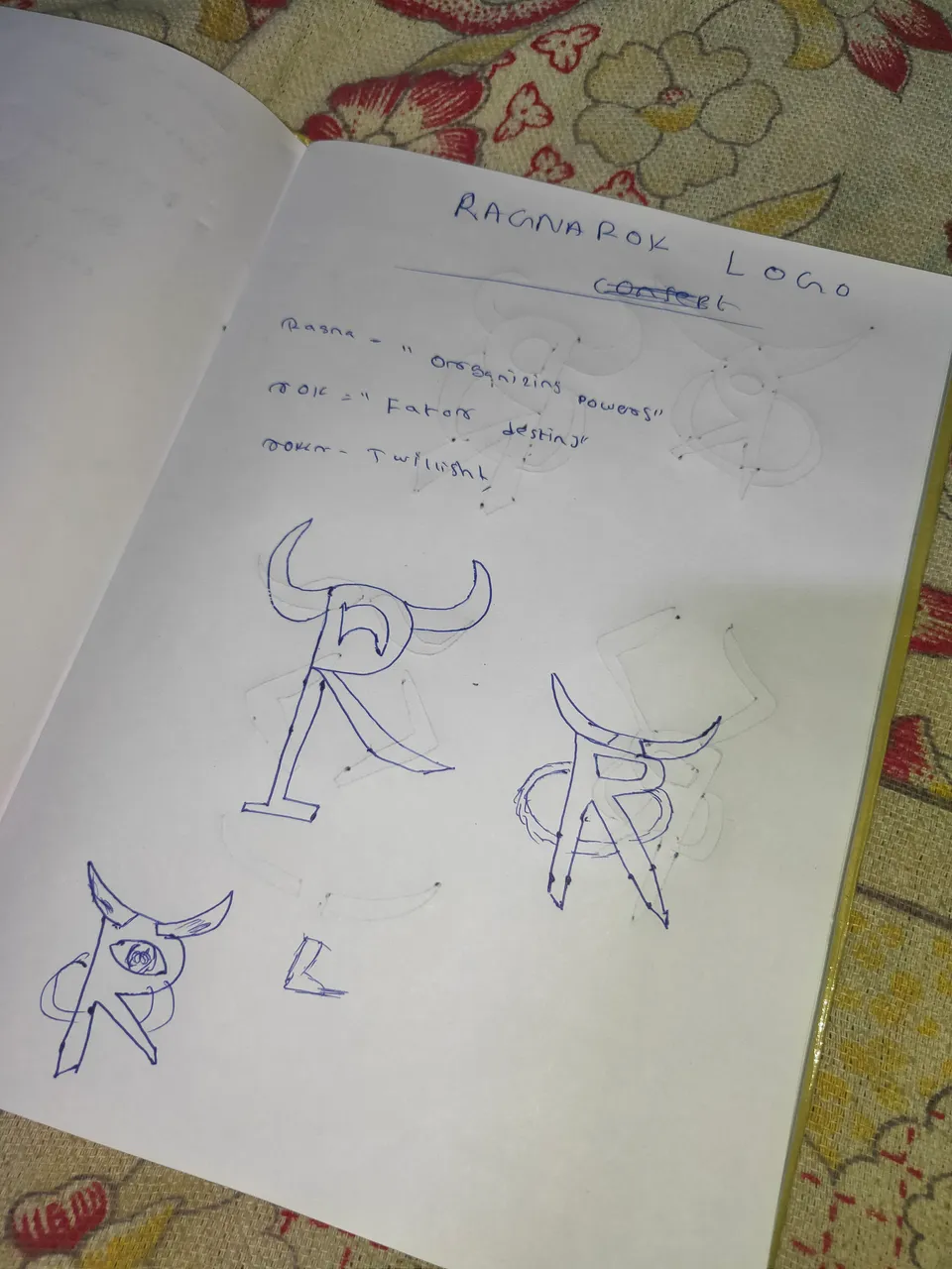
here some pictures
Getting the rough sketch on to real one...📱
I want to make the horn png format for the logo so. with the help of a mobile application "Infinite design" I drew the shape of different horn
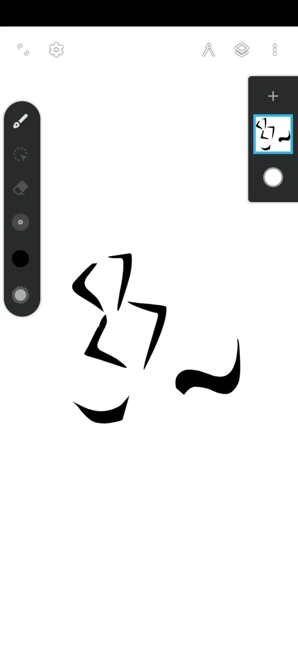
like this...👆👀
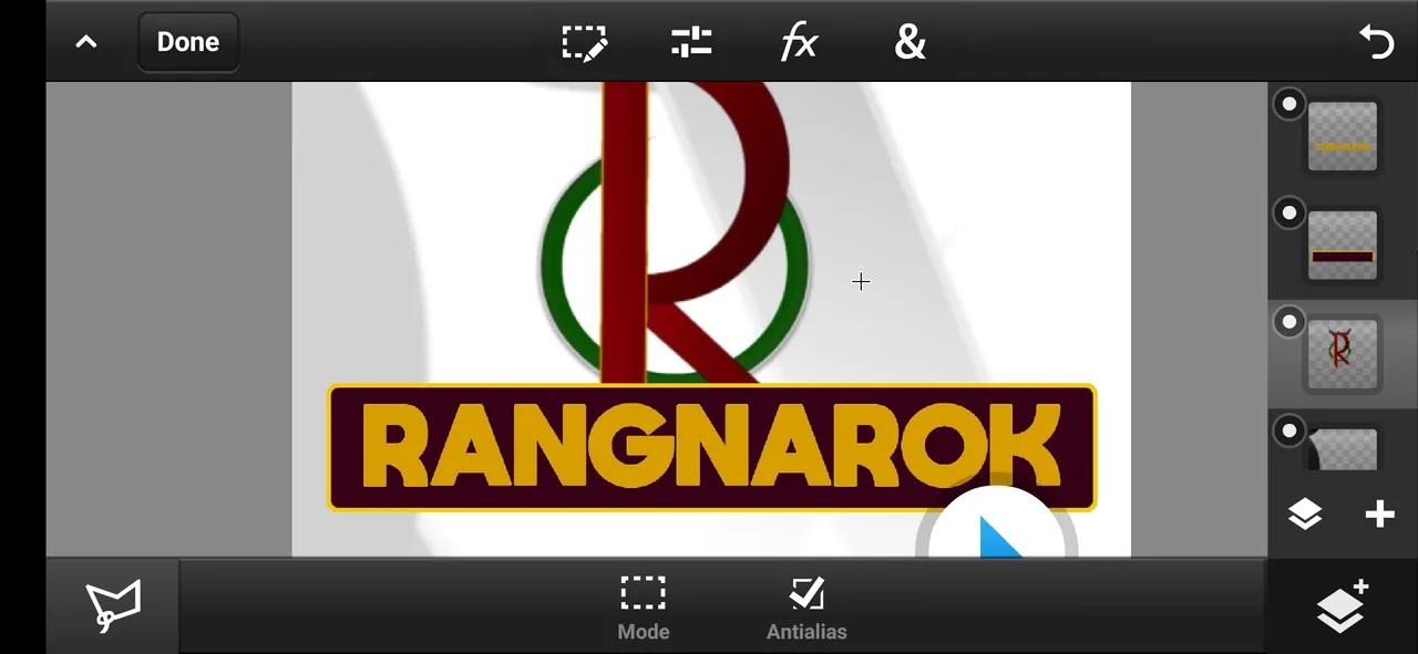
It is the main part of our work.
here I opened the photoshop cc and imported⬆️ the horn png which I created on "INFINITE DESIGN"
and Hide that layer to make other parts.🏬
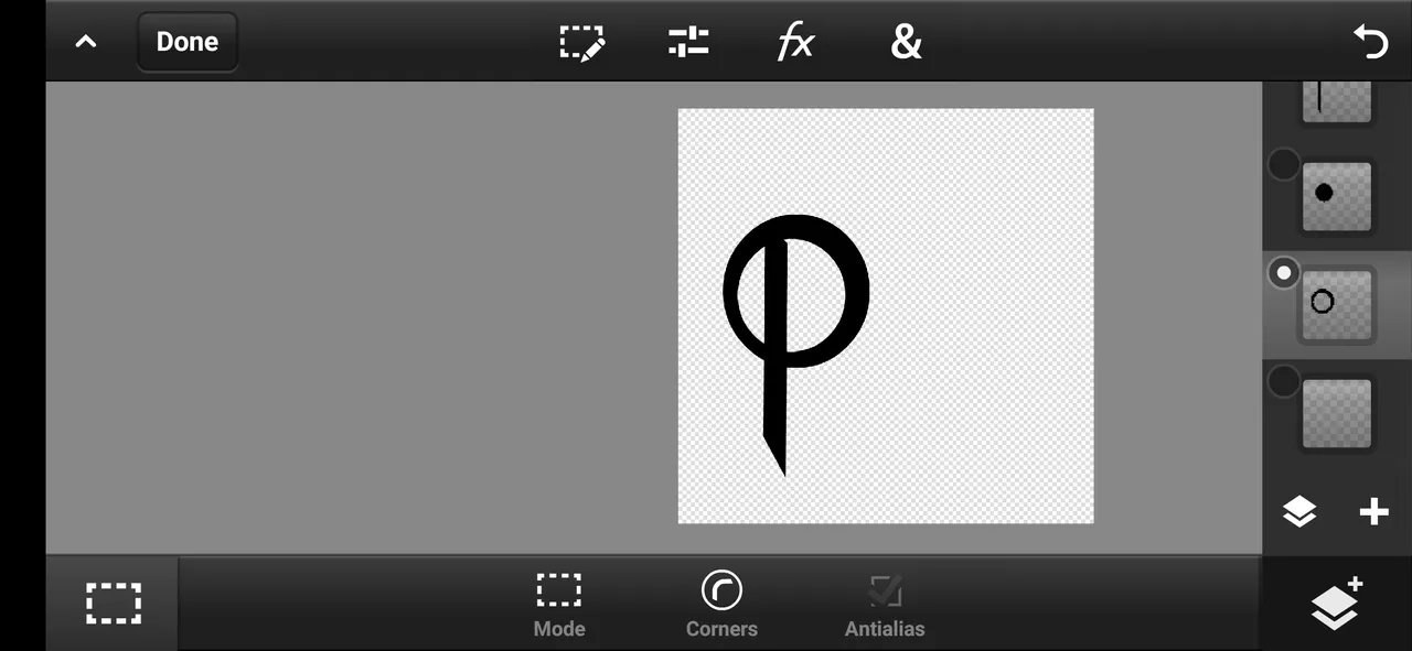
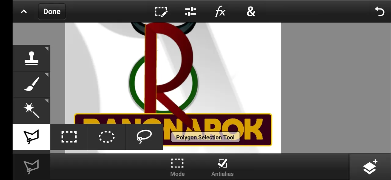
using the help of the "Polygon selection tool" we can create any shapes which we want ...🔶🔺🔴🔳... 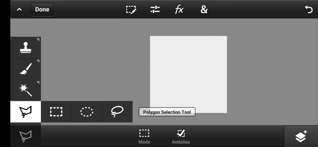
I created a shape like "P" and a small square shape to make it into an "R"
😎
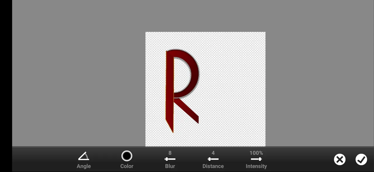
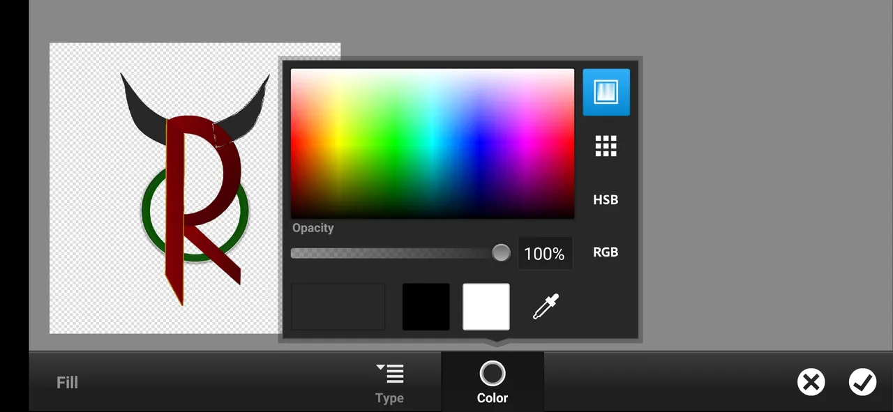
then I colored that shape brown gradient🐴. and added an ash color stroke in a new layer and enabled "shadow", but later I removed the stroke of the mirrored shape of "c"😣
brown: RGB=11304
Then I added a green circle shape on the below "R" layer⭕. and added stroke enabled its shadow, removed some errors
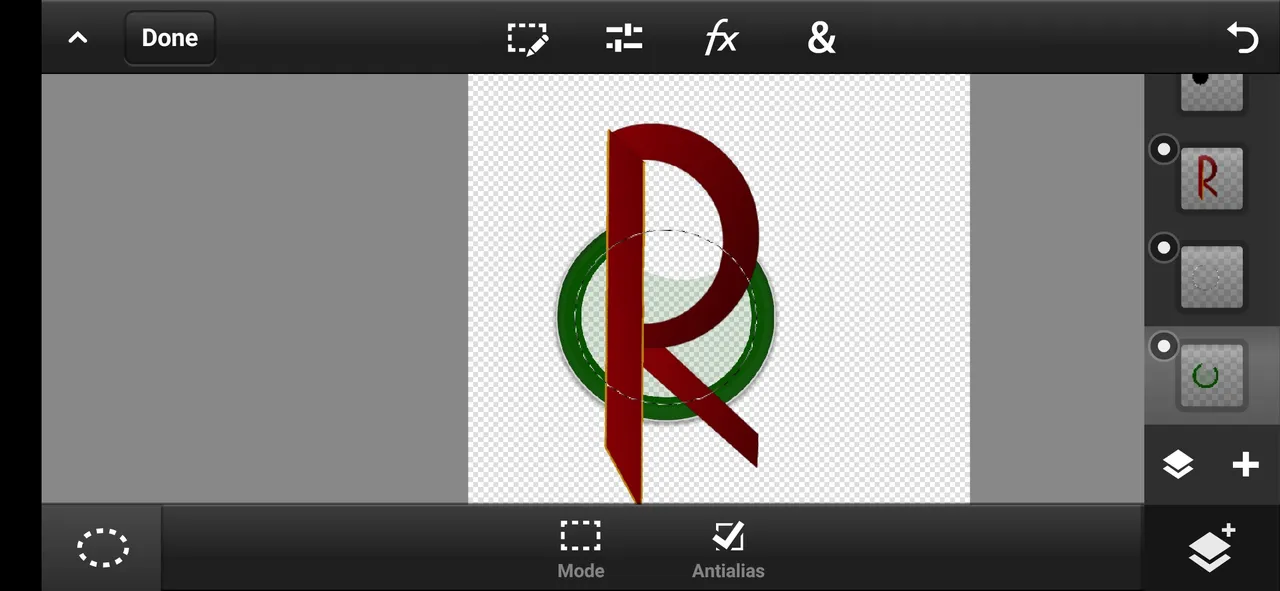
green: RGB=15838
stroke color: =RGB=185189185
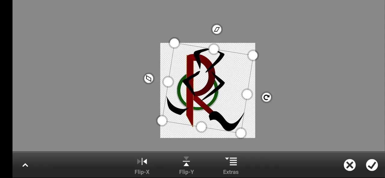
then turned on the horn layer,and i choose this horn shape because it is more good comparing with others💀
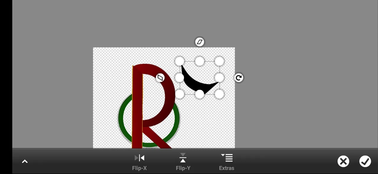
coloring;--
duplicated that horn layer and adjusted both sides
colored this horn into gray🎨🖌️
Gray:RGB=515151
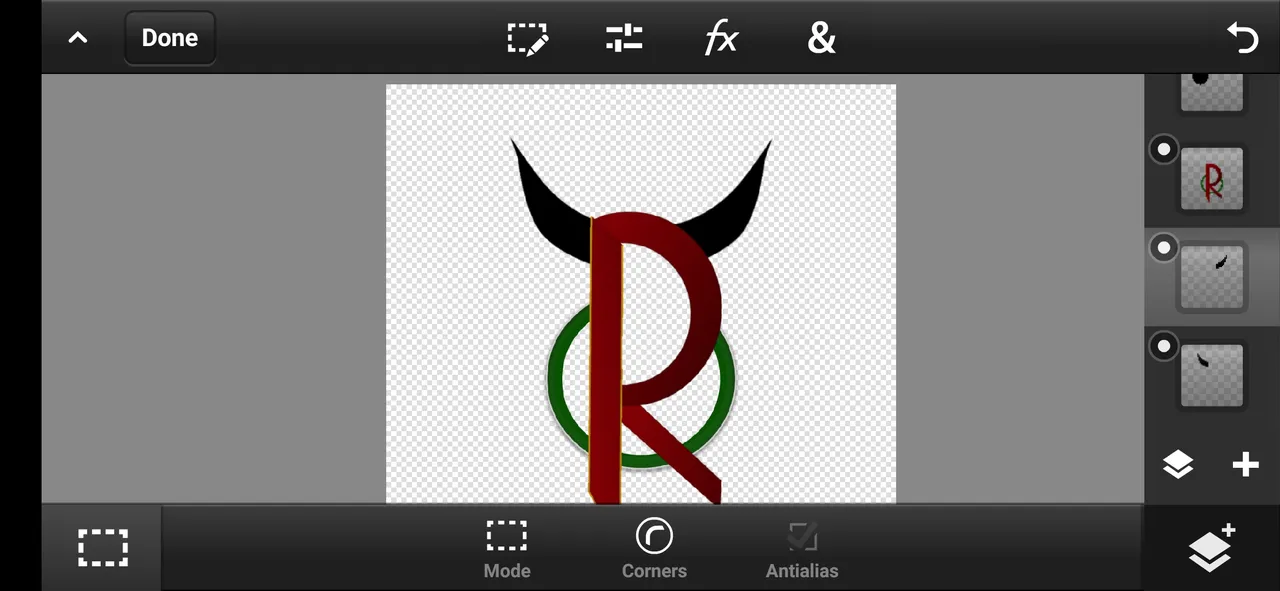
😻our logo shape is ready now. it needs some final touch and a background🤖
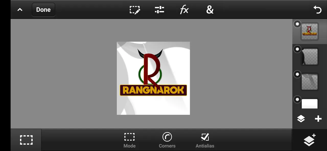
then everything is ready...👀💫
the background is made by simply duplicating the logo and turning that into "Black and white"🔳. and zoomed it reduced its opacity and moved to top right, bottom left corners. 👁️🗨️
conclusion
This is the full process of making this logo, it has taken one day to complete this entire logo.😵
All the logos shown in this post were designed by me. I didn't take any references for making this logo's or font and in case of any issues, you can contact me directly on my Instagram@akshay_ambrose