
Important update
Check the progress here
The colour or background colour of the proposed logo are flexible by design, to account for the many potential uses of the Gridcoin logo. If one colour comes out on top after further discussion, then this will be voted on and selected as the primary colour for the logo.
There's been a lot of exciting development across the Gridcoin community lately, so I thought it was high time for me to drop by and officially give you an update on branding efforts! I'm actually new to Steemit too, so since this doubles up as my first post - let's get introductions out of the way first...
Hey - great to meet you!
I'm Josh - a Designer & Marketing Manager based in the UK. I've been involved with BOINC since I was a kid and started using Gridcoin to support my BOINC efforts just over 18 months ago. I've always wanted to personally contribute to the Gridcoin project, so the establishment of the branding team on Slack has provided the perfect channel for me to get involved and volunteer my skills.
So what's new with branding?
Well, this is new for starters - and you're the first to see it!
We've been working tirelessly refining concepts to bring the Gridcoin logo up to date, whilst still maintaining the links to scientific research that you'd expect from a cryptocurrency that supports humanitarian research projects. Whilst the current 'artwork' logo (below) has some really fantastic detail when viewed at high resolution, it also has a number of problems as a general use logo - let's take a look at the logo and then discuss those:
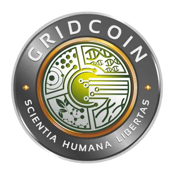
Existing Gridcoin Logo
Logo Issues
- Complexity - the existing logo tries to convey too many concepts at once - this is a big no-no in logo design and is the primary issue when this logo is used out in the wild
- Detail is rapidly lost - at smaller sizes this logo is no longer visually distinct or identifiable. This destroys branding efforts, as the logo becomes lost amongst better designed currencies.
- Tired design conventions - dated design techniques used in this design do not effectively communicate a modern image
- Ineffective font choice - the chosen, main font adds little to the design and does not maintain legibility well due to some unusual letter shapes
Logo Legibility
To demonstrate the issues with legibility, here's a little graphic showing the existing logo as it scales down from 200px to 16px:
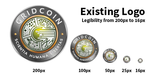
Existing logo, scaled from 200px to 16px
Now let's compare this to the proposed logo - shown here in a rather fetching purple (thanks for the suggestion @me-shell!):
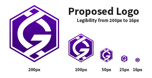
Proposed logo, scaled from 200px to 16px
Thanks to the simple form of the proposed logo, legibility is maintained across all sizes - this makes it invaluable for use as an icon, meaning it will be unique and identifiable even when minimised to 16px in a user's system tray. By making use of a simplified design, we're able to tick off two of the major issues with the existing logo - "Complexity" and "Legibility."
Further to this, the proposed logo's unique shape, colour and design allow it to stand out from the crowd and be easily recognised when viewed alongside other altcoin logos - neat!
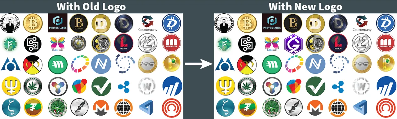
Spot the Gridcoin - Old logo vs Proposed logo alongside altcoins
Development, Symbolism & Styling
One of the major concerns when we began looking at branding was whether or not a link to scientific research and concepts could still be conveyed by a simplified logo - after all, Gridcoin is intrinsically linked to BOINC and the research projects BOINC supports.
This was where the Slack branding channel came into its own - allowing for fast collaboration and discussion of mock-ups. Here's a small idea of how the concept has progressed from my initial designs to the current iteration (shown in green here):
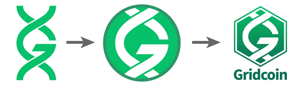
Design progression from initial concept to current
The key aspects of the current, proposed design are:
- Double-helix symbolism - neatly tying Gridcoin to the scientific projects it supports in a way that is easily recognisable
- Hexagonal framing - hexagons are frequently seen in both nature and science, providing another subtle link between Gridcoin and science (it's also a fun shape for designing with..!)
- Modern, clean font choice - selecting a modern, clean sans-serif font does wonders for updating Gridcoin's image and improves legibility of text across a range of sizes
- Versatile design - a design that remains clear and legible no matter its use or colour - it is just as recognisable in black and white, inverted or in full colour
A Word on Colour
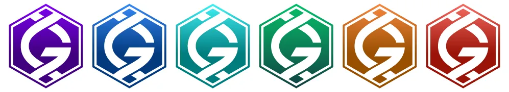
So, what about colour? We've tested a few options - including the white, green, and purple variants shown in this article - but the issue of colour is still up for debate.
Do you have any ideas? Feel free to share them below or in the branding channel on Slack - all will be considered, tested and new variants will be on display in the next Branding Update.
Thanks for Reading!
I'll be providing branding updates frequently over the coming weeks, especially as we ramp up to celebrate Gridcoin's Millionth Block. All community feedback is carefully considered, so get involved in the comments and keep an eye out for post #2 in a week's time!
A huge thanks to @dutch, @vortac, @me-shell, @jringo @slapbox and the rest of the Slack Branding team for your ongoing support, comments and collaborative efforts - be sure to check out their respective Steemit pages for more info' and updates.
Send GRC to this address and support my caffeine addiction :)
S4mJngSgfTyGEUsmTaFGNmr6GFJGCRLXvH