Inkscape Day 2
Somebody Shoot Me
Results of Day 1
| 9:00 | Just opened the shop. Some dumb fuck is already waiting for me. |
| 9:10 | That was a close call. They just wanted to collect work from the previous day and give me money. |
| 11:00 | I figured out how to make the text go blurry and look like superman apart from the super part.  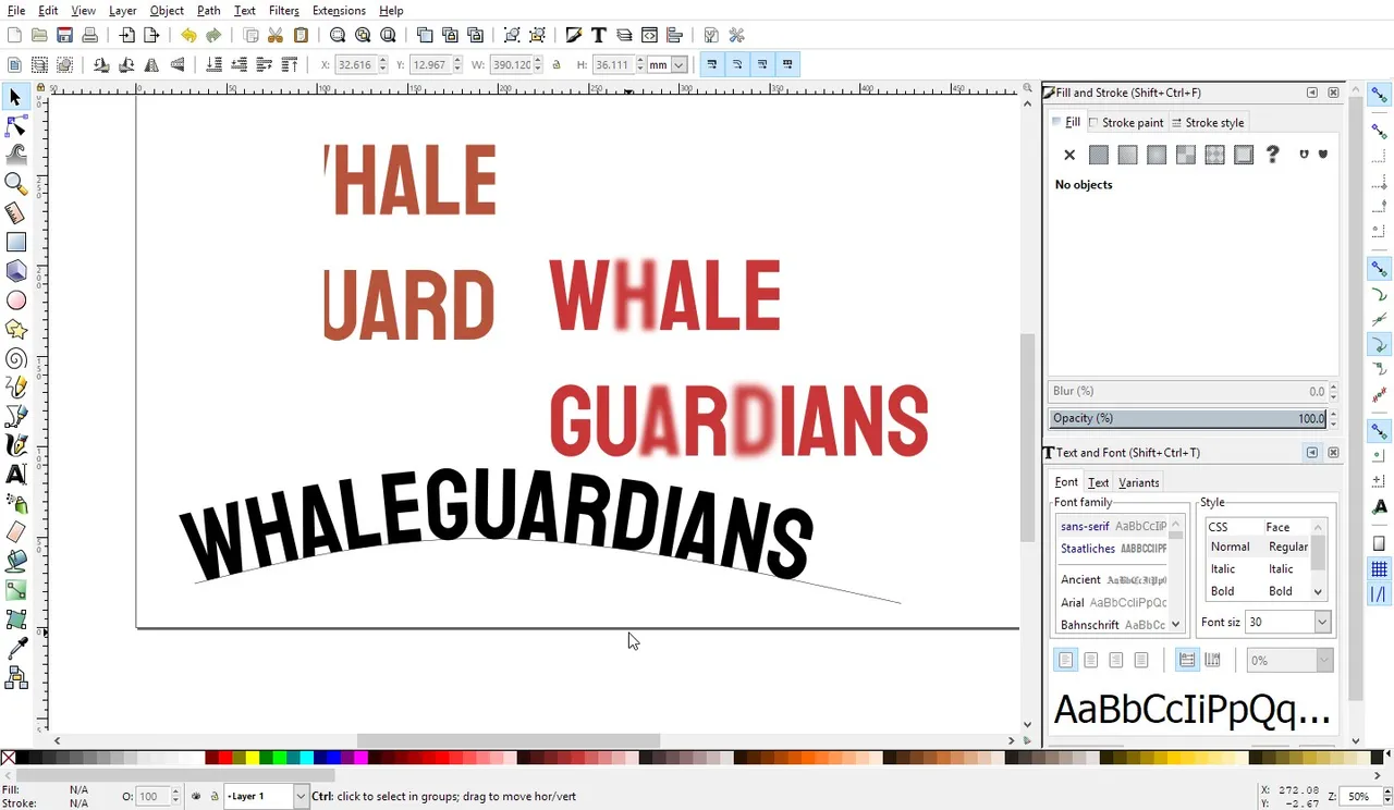 |
| 12:00 | Googling whale types. I really hope this customer gets upset and leaves. |
| 12:10 | Smoke Break. Lucky my boss saw there was no intention to deal with that fucks work. |
| 12:14 | Googling whale types, shields and are Orcas whale clowns? |
| 12:30 | Ok, so how do I draw a tail? |
| 12:35 | Upload file to dropbox these people clearly don't understand we only open the shop because it seems to be what people do with shops. Not going to get shit done now. |
| 13:10 | Phew. What a day. Home now so I think it is time for a nap. |
| 14:30 | Tail time!!!!!!!! Ooh and a shield. |
| 15:40 | Clickity Click. Inkscape makes that part at least easy enough. Bezier tool, I love you! 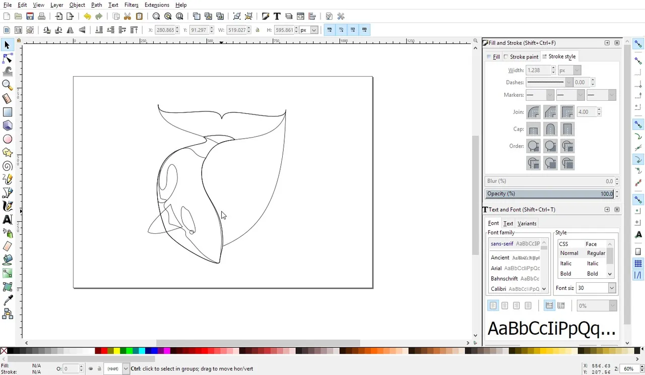 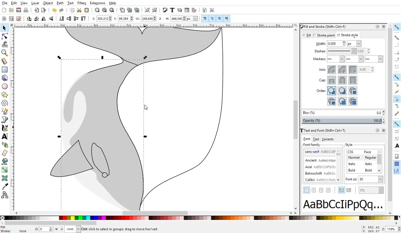 |
| 16:26 | Time to use my text super powers. Sidekick powers. Text Powers and orcas are black right?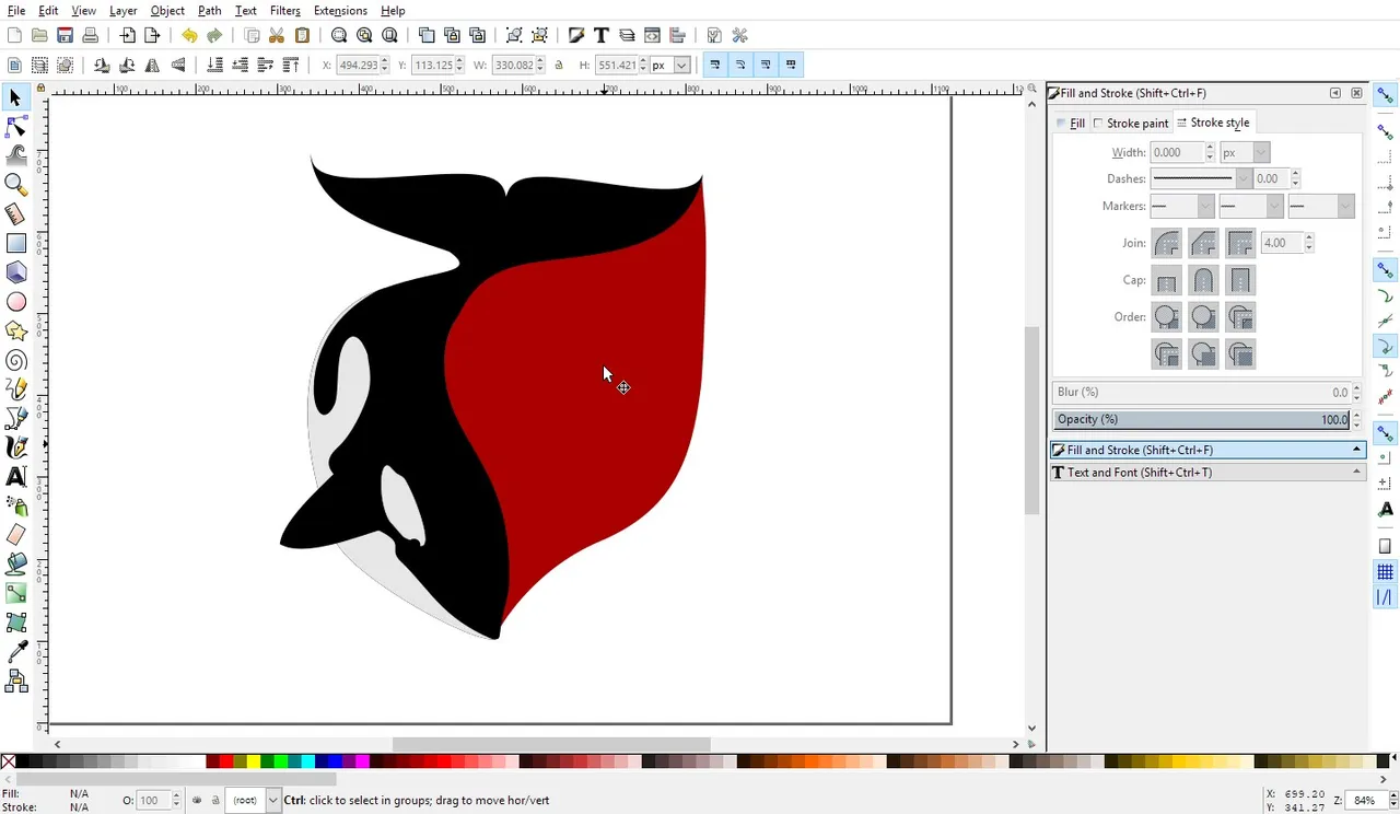  |
| 16:43 | Then you lose your fucking mind, because blockchain. I also learned that it is a good idea to start using the object manager / layer manager. If you name layers that is. Format Reinstall.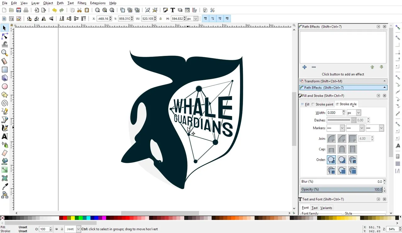 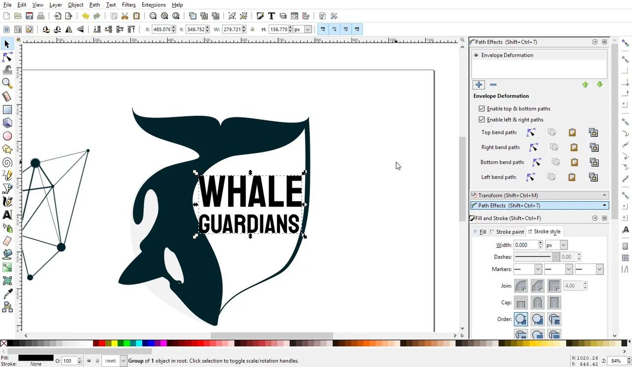 |
| 17:34 | So I try fancy text powers again, that is the point of the day. Before the Orcas invaded my mind. They like waves and I have not tried pointy things in Inkscape yet. 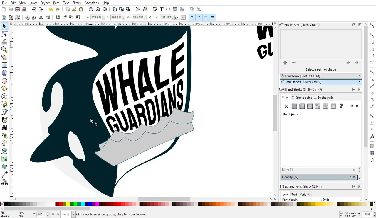 |
| 18:20 | I really hate how Inkscape manages to not give any real info on why a feature does not work. There is no difference between paths and text just cut it or I will cut you. The clipping mask is useful until it decides it is not getting paid enough, once clipped you can forget to access the items inside. Kinda like pregnancy I guess or marriage. |
| 19:10 | Things are coming together now. I have so many pointy things I can't keep track. It is awesome. Too bad I spent 30minutes figuring out why I can't cut parts away using another object. 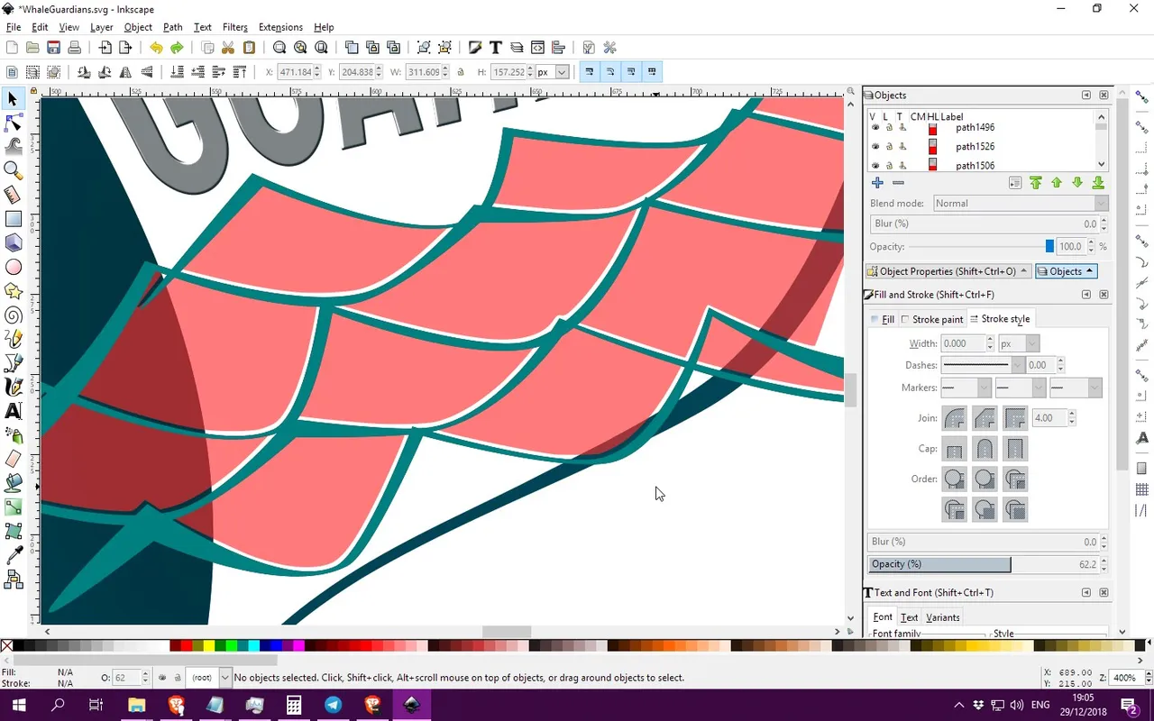 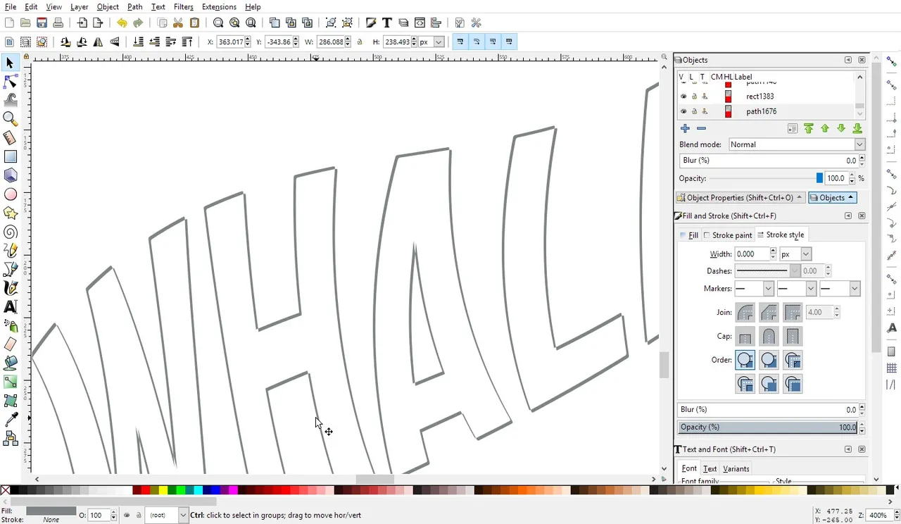 |
| 17:34 | After trying many colours, I think I just don't like the clown look or redneck race car decal pallette either. Grey is best.  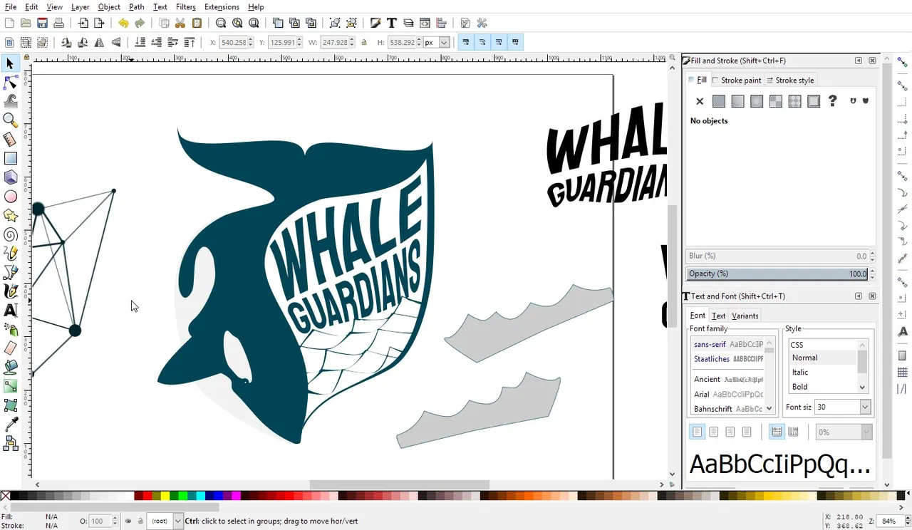 |
Day 2 - Inkscape was a bit fishy.
At least I got something done. I think instead of fiddling with a single thing like wanting to play just with the text. The sheer frustration of dealing with actual usage that is unplanned and about 6 crashes, taught me a bit more about this software. I despise it yet it is not like family so I will tolerate it.
It does have some cool features but needs a lot of polishing when it comes to using it without having to constantly check wtf went wrong. Text is a path. Get it right dammit, and always set default styles or the stupid thing will use whatever whacky settings you tested before when creating a simple square.


Don't have a design program? It seems a person can make a partial logo in Inkscape. :)
This has also been posted on the Whale Thingy