Recently I "announced" 5 Days of Hell in a bitch and moan post by the same name. For a change, this was not all talk, although I am a big fan of all talk. If I allowed myself to think on it a bit more I would have never posted. Hooray for not thinking.
Inkscape - Day 1 | Inkscapes Website
The tricky part for me is choosing something to do, then convincing myself that even if someone else can do it I should anyway. The bonus with Inkscape is that it is software and this means I will be learning the software, not trying to draw pretty things that anyone else can do better.
Don't start with hippy shit about my choice of phrasing. I don't give a fuck
I was going to go with GIMP but figured I did not have the temperament after the last time clicking around in it and when I considered usefulness, then vector will always trounce raster. I chose Inkscape since I have been threatening to replace or at least diminish my reliance or software like CorelDraw which is no simple task , similar to attempting to replace Photoshop depending on what your use case was.
My use case for vector design software is straightforward. I am not an artist, I design shitty flyers and marketing material etc. I do however need the software to get shit done in a reliable way, my colours need to be correct and the one thing I noticed with Inkscape was the lack of a CMYK colour profile and palette. Now I did not dig too much as I wanted to start clicking shit so will look into that again sometime.
Clickity Click


The interface is super clean, with not too many
icons cluttering the toolbar left specifically.
More pointless icons than tools.
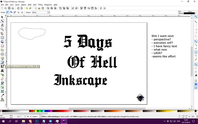
Right off the bat it is simple to select the text tool
and just start typing some stuff. Adding a new font to
the system had me close the file to update.
Added a fancy font, and made a list of things
I might try for day 1. Just clicky clicky.
Getting settled in and giving up on some text features.
I head for the bezier tool which I use almost exclusively.
Simple lines
To get started Inkscape is super simple. You don't need to be concerned with layers or anything silly like when you are in GIMP or Photoshop. That is why I will always do layouts in CorelDraw, literally, anything that will require some structure like collages, positioning, heck any content layout I will prefer to do in CorelDraw because of this. I can just click shit and make new objects, move around at will and I won't have to think about which layer I am on. It is just quicker.
I fiddled with the text a little and did not notice any generic effects I could do with it such as add perspective or extrude to create a 3d effect. I did find a 3d box extrusion which as it is, is fucking pointless. Same with their extrude filter which seems to require too much effort from my side. So I skipped that.
I ended up deciding and starting to make a cover for my 5 Days of hell Inkscape version instead. Sticking to generic shape creation via the bezier tool.
What I found very cool is the fact that I can add a gaussian blur to the vectors in real-time. I may have gone overboard on that feature.
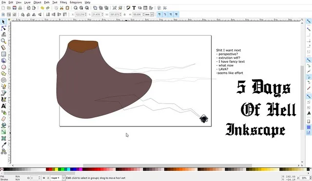
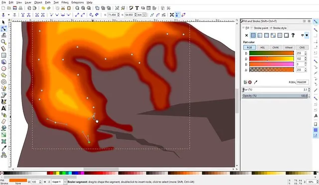
The clicking starts, it seems I want to
make a volcano. Retardcano
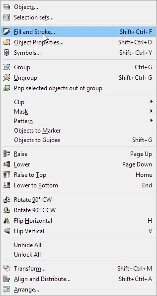
Fill and stroke opens
another window
of confusing magic.
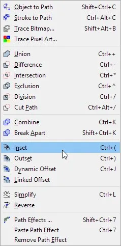
Inset is useful to
make concentric shapes.
Look Momma, one shape many versions.
Using the blur feature and inset I pray
and repeat.
Complete Blur Obsession
At this point I knew I was not going to explore many other features and was really enjoying being able to shape these things with a blur added on by default.
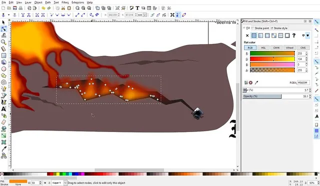
Fire is a bitch though since it requires quite a bit of variation. At this point, I was happy to see that grouping works ok and I can easily group and duplicate sections.

I had a bit of an issue when I wanted to have some of the fire bleed over onto my text but only keep it within the texts shape. They do offer a mask and clip feature, but these seemed to work a little bit wonky.
I ended up using clip which will remove the text from view then force the element I chose to stay inside the texts or parent object boundary. Actually manipulating and shifting it around only worked if I was using the path tool. I will need to make this work more seamlessly as it is a feature I use in CorelDraw for a myriad of reasons.

The other thing that is also not very useful is the colour wheel, and this might just be me using the wrong one. But actually just choosing a new colour quickly is a bit of a hassle.
Fortunately, I can easily sample a colour from any object on the page and seeing as I had no real use for new colours I just kept doing that instead of getting frustrated with not finding the hue I wanted.
When working with such big groups I did want to go look at the layers and see if it was not simpler to select from there, but the icons are not very indicative I ended up just alt+clicking until I got the layer I wanted.
It is super frustrating working with a layer beneath another and the tools try to think for you by selecting the one above even after you had the right one selected already.
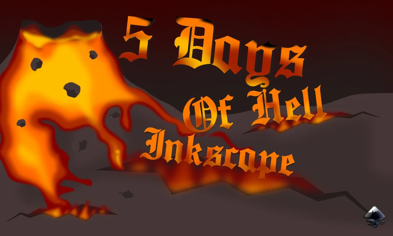
So clickity Click one Day Down and a cover for the other 4.