Hello my friends, today i will try to share my experience on how to use charcoal to sketch and draw portraits, how to start with the outlines, and continue to the final shading.
As I mentioned in my older posts, charcoal is different that graphite,makes him more expressive and artistic, with charcoal you can get the rich black color which you are not able to achieve in graphite, you can also use charcoals bars to fill big areas and to get artistic unique strokes, and as charcoals are more lighter that graphite, it is easy to smudge, which makes it really great for creating shades and midtones.
So lets start to draw, i will create an imaginary character and will break down the process into 3 steps and see how the character will be developed through these steps.
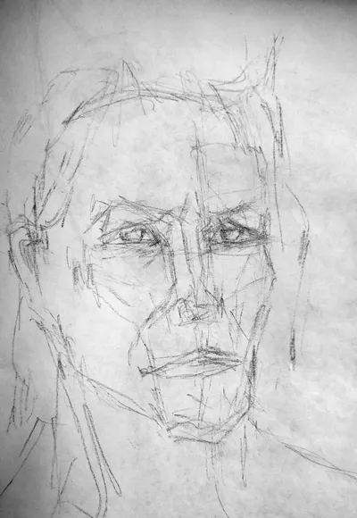
first step( experimental phase) : as usual, i started with drawing the outlines, i still did not have an idea what face i will draw, so using a soft charcoal bar, i started to create strokes to define the general look of the character, you can see wired eyes and strange nose but it is ok for the moment as this step is experimental; i also used the rubber often to wipe, adjust, correct shapes until i get satisfied with the overall shapes, then i move to the next step.
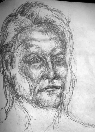
second step ( definition phase ) : now i am starting to be more specific and accurate, i am adding dark strokes using a little bit harder charcoal bar to be able to easily wipe them in case i made a mistake, those strokes will roughly define the shading of my drawing ( shadows, midtones, highlights ), which makes it easier for me later to smooth them and create the final look of the portrait, and to be honest, i like this style of drawing, it is more a free hand style method where you can experiment with different models to create unique portrait, but i will continue and see how the character will end up after shading.
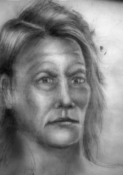
third step ( shading phase ) : basically we need to smooth out the strokes and start to setup the tone for the portrait, what is important here, is lightning, you will need to think were is the location of your light source compared to the portrait, you can see that my light source is on the character's left side so the right side is darker and the shadows are pointing towards right, i have also added what i call a Rim light on the left side of the character's face to give the character an edgy hard highlight for more realistic look.