TYPOGRAPHY
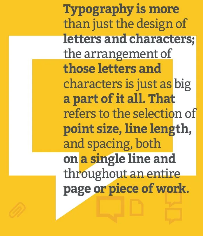
Typography is absolutely everywhere. Every font, letter, and character arrangement plays a part in determining how a message is conveyed.
It might seem trivial at times, but even the smallest of type adjustments can impact the look and feel of your work. For example, Facebook tested a new font on its users called Geneva. While the new font was only slightly thinner and lighter than the original, Helvetica, it made a noticeable difference to some.
“The overall effect is a lighter, more modern looking block of text,”
Same goes for when Apple changed its default font from the dra- matically thin Helvetica Neue to one they developed in-house called San Francisco.
“The differences between Helvetica and San Francisco are subtle, even to the trained eye, but they’re there,” wrote Liz Stinson
for WIRED. “While still an austere sans serif, San Francisco is bolder and friendlier than Helvetica Neue. Based on the German typeface DIN, San Francisco gives characters more breathing room, which will make it easier to read on relatively tiny mobile screens. Tall and skinny, San Francisco is space-efficient, like Google’s custom typeface Roboto, which you could consider a close cousin to Apple’s font.”
Source: Google
To understand where the importance of arrangement comes in, think back to Johannes Gutenberg’s printing press. At one point in time, people practiced typography using printed materials - meaning they were literally taking letters and characters and arranging them in physical space.
Today, thanks to computers, open source fonts, and scalable computer typography, it’s a
lot easier to arrange letters and characters. But that physical piece remains important, even in the digital sphere.
The little things do matter
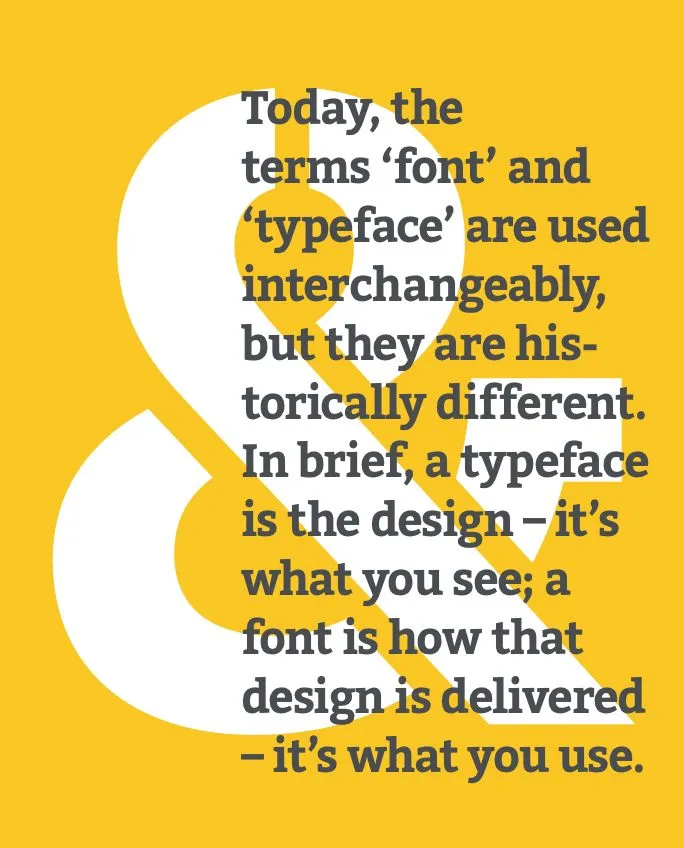
Typographer, Nick Sherman, once used a great analogy to explain the differences between the terms “typeface” and “font.” He suggested comparing these typography terms to the musical terms “song” and “mp3.” When you’re explaining how much you enjoy a particular tune, you say, “I love this song!” You wouldn’t say, “I love this mp3!” The song is the work of art, whereas an mp3 file is just the delivery mechanism.
The same rules apply in typography. You should use the word “typeface” when describing the creative work (i.e., what you see). This is a more abstract design term used when referring to the way a specific collection looks or feels. For example, Helvetica is a typeface.
If you’re describing the physical embodiment of the collection of letters and characters, you should use the term “font.” It refers to what you use -- whether that’s a file on your computer or a case full of metal letters. This is the tangible representation of that collection of letters and characters. For example, Helvetica Bold and Helvetica Light Oblique are fonts.
Here’s how you could use these two terms in a sentence:
“Wow. The typeface you chose really pulls this design together.” “I’ll change the font size to 12pt so it fits in the box.”
If you thought these two words were in- terchangeable, you’re not alone.
But they actually mean two different things.
Size: A font can be applied in all different sizes and can be used to differentiate create visual hierarchy.
Tip: Vary the size and weight of the fonts used for the heading, sub-heading and body copy. For example, a larger font size for the heading will amplify the focal message.
Trick: Use the golden ratio to determine the proportions of the font size used for the heading, sub-heading and body copy.
Weight: A font’s weight determines how thick or thin characters are displayed.
Tip: Narrow, thin fonts are a good way to create contrast between a heading and body text, but be
aware that they can be difficult to read on small body text because of how faint they can look. Baseline: The baseline is the line on which most letters sit and below which descenders extend.
Trick: Add a line of text along the baseline corresponding to the line above.
Ascender: The ascender is the vertical stem that extends above the mean line of a font. In other
words, the taller part of a lowercase letter or the upper portion of an uppercase letter. Trick: Place smaller, introduction or supportive text in this landing space.
Descender: The descender is the portion of the letter that extends below the baseline of a font. Trick: Place subheadings or less important text in this space. Or add a tagline or embellishment.
Serif: A serif is a typeface with small decorative edges at the ends of the letters. They have a more traditional and sophisticated look.
Tip: Use serif typefaces for long copy, as they are easy to read.
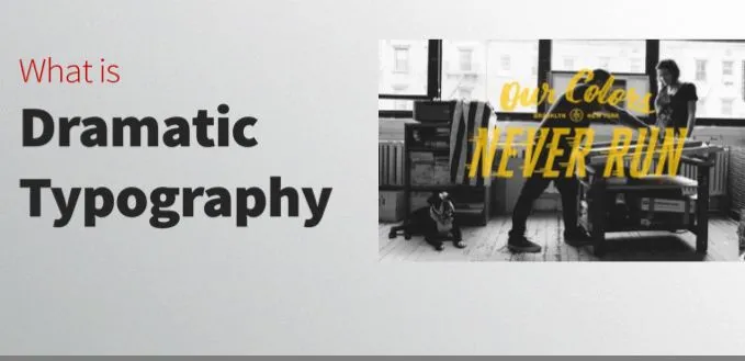
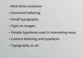
Today’s dramatic typography has a different meaning from some other areas in design. The current trend focuses on a few primary concepts that incorporate drama and lettering:
• Web fonts evolution • Oversized lettering • Small typography
• Type on images
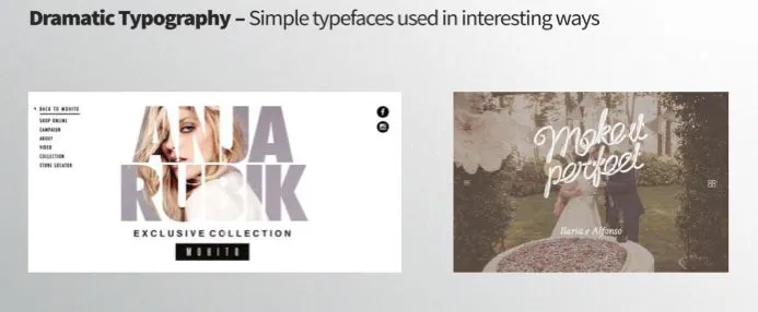
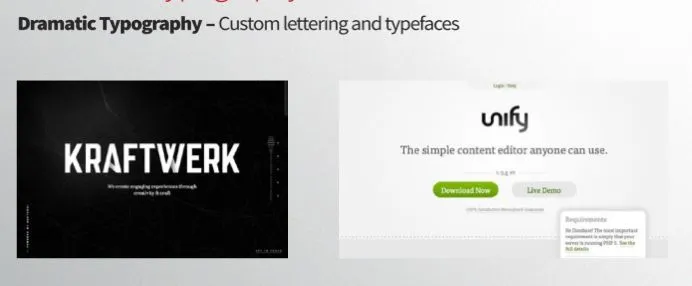
• Simple typefaces used in interesting ways • Custom lettering and typefaces
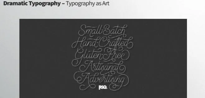
• Typography as art
Using one of these concepts alone is not enough to make a dramatic statement, but can be an essential part of creating a design framework that uses type in a way that grabs the attention of users and encourages interaction with the text.
Why Use Dramatic Typography?
The trend is popular for a simple reason:
Simple and dramatic typography is visually appealing and easy to read.
Focusing on the Basics:
Many forms of dramatic type in the past have centered around unusual typefaces. Early on, novelty typefaces were a key component of creating dramatic typography. Today’s dramatic typography comes primarily in the form of simple and basic fonts used in bold ways.
To make the most of this, you’ll want to think about the basic principles of typography. It is important to understand concepts in type categories, type families and letterform shapes and strokes.
Type is commonly broken into a handful of categories that embody the mood, structure and impact of lettering. The high-drama typefaces today tend to fall in one of the two broadest categories: serif or sans serif, with the latter being the overwhelming favorite. (A sans serif typeface is one without extra stroke at the end of letters, such as Helvetica.)
Designers are often sticking to a single type family to create a “big design.” A type family includes the font and all variants of it. If you were using Helvetica, this would include the light, condensed, black, bold, italic, regular and all other variations of the typeface.
Stroke weight is also a major consideration. The stroke is the width of each line used to create a character. Letters within a type family have either varying or uniform stroke widths. For many of the dramatic uses of typography, we are seeing, uniform stroke widths are the preferred choice. This is mainly due to the fact that uniform strokes can be easier to read across a variety of settings and against varying levels of contrast. These letterforms are also easier to read, both in terms of understanding and com- prehension and visually against other elements.
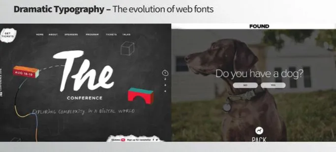
Evolution of Web Fonts: Dramatic typography has evolved so quickly because of the availability of typefaces to the masses. Aside from a handful of default typefaces or freebies that included questionable online usage, type kits are changing the game for designers.
More fonts are available at low cost (or no cost thanks to Google Fonts). The number of options is increasing almost daily as well. Adobe also includes its Typekit service in all Creative Cloud plans. Without a large budget, almost every designer now has an arsenal of typefaces to work with and choose from. This factor alone is almost enough to create a flood of type-based projects.
The flood of available fonts also opens the door to theme-based website design as well.
WordPress users have access to many of the same typefaces as home-grown websites and where font rendering was an issue even as little as 5 years ago, most modern browsers and interfaces can support pretty much any kit-based font today.might ‘weigh’ more than flatly coloured elements. Whatever the case for your design, balance these weighted elements out until you reach an effective equilibrium
Oversized Lettering: Once you select a type family to work with, size is the first consideration.
And oversized typography is the leading contender for a top design trend. Big, bold typefaces that are paired with images or against a texture or solid background create a strong first impression.
An oversized typeface is characterized by:
• A dominant proportion and weight compared other elements on the screen
• Size of the characters (often bigger than 85 points)
• Visual weight, such as all caps or super thick strokes (think slab serifs)
The way these supersized letters is being used is fairly unique as well. The focus is on serifs with rather thin strokes at incredibly large sizes. Designers are creating an outline that includes
three to five words that almost entirely fill the screen. The other common thread is actually the color – white – which is used almost exclusively with this trend.
This technique works because of contrast. Big, white (although sometimes black or another color) is placed on top of an image or brightly colored background. Other commonalities include lettering that is aligned to the center of the screen and use of all caps. The resulting design forces you to read what’s in front of you.
TIPS & TRICKS
Spacing letters to suit message
Reducing the space between letters, via tracking or kerning, makes text appear denser. Likewise, increasing the space between letters can make text appear more airy and transparent. Either way, experimenting with the letter spacing of a word can make that word look more impressive. But always ensure words are legible and readable.
Use typefaces that suit the content
Create a harmonious design by choosing typefaces aesthetically aligned to the content and other elements of the design. Is the message loud or subdued?
Is the style modern or traditional?
Is it appealing to children or adults? Select a typeface that embodies the essence of the brand and the message to reach the target audience.
Combining narrow typefaces
Narrow typefaces have thin and elongated letters that can have a light, modern and elegant appearance. Narrow fonts work better for headings than they do for blocks of text as words can be difficult to read when small or print too faint. Two similar narrow typefaces have been combined for a modern and interesting contrast.
Text over an image
When laying text over an image, be sure to use a contrasting or complementary colour and position the text, preferably over white or negative space, in order for it to be readable. Adjust the brightness and contrast of the image or add filters to the background image to improve the legibility of the text
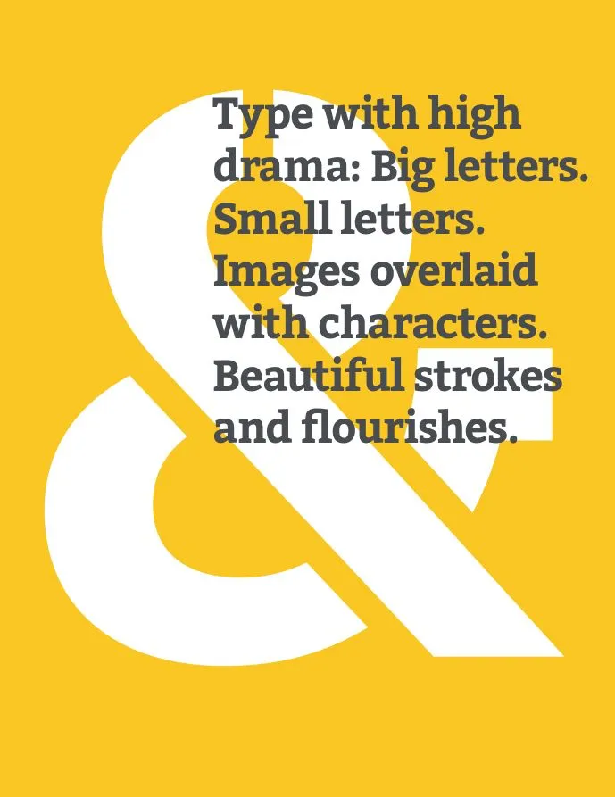
Play with outstanding characters
Take advantage of glyphs, symbols, characters, numbers and even capital letters when used on their own, and choose a typeface that transforms them into outstanding design elements. For example Ampersands can be enlarged and aligned to unite lines of text. It is a typographic feature that adds interest and elegance.
All caps for short headings
As a matter of habit, the human eye is more accustomed to reading lowercase text. Therefore, all-caps should be used sparingly and are best suited for short headings or sub-head- ings. Choosing a bold or light font will alter the meaning of the message. Grabbing for the audience’s attention? Go bold. Wanting to look modern but understated? Choose light.
Typeface mimics word
Select a typeface that mimics or expresses the meaning of the word or words. Writing the word ‘playful’? Then use a playful font. How about the word ‘narrow’? Then use a narrow font.
Combine light & bold
Using different styles, such as italic, bold or condensed, of one font can differentiate words without adjusting spacing

Love
🖤
Katrah