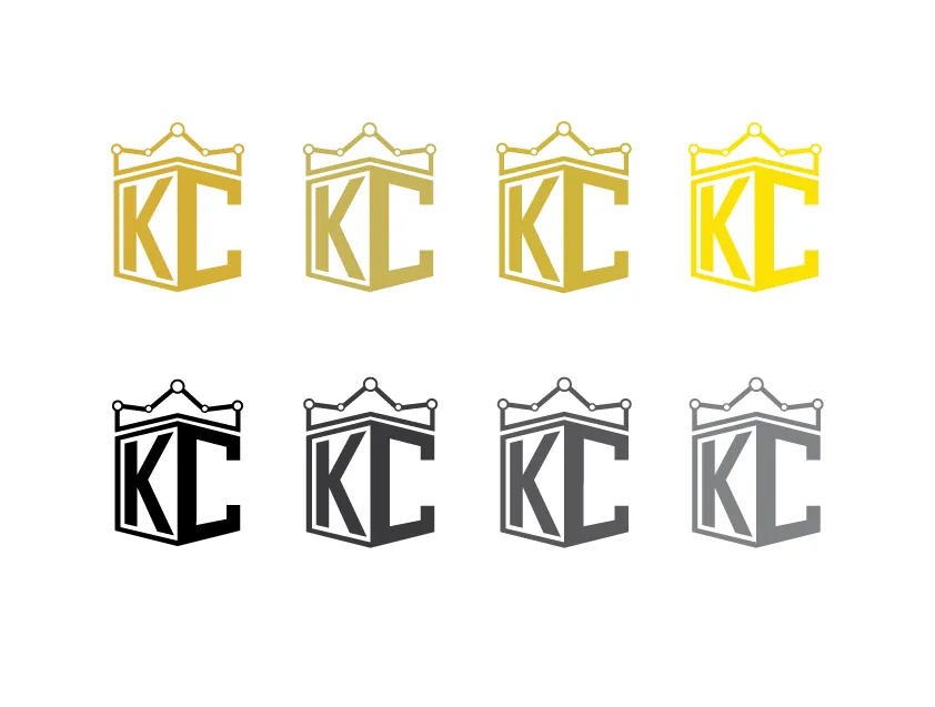
I was asked from @kingscrown to make a logo. I decided to play with the concepts of power and charts. The crown is shaped like a chart and the initials create a shield-like appearance with strong corners placed right underneath. I decided to go with quite a few variations for the gold and gray colors.
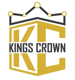


For smaller icons I believe it would be best if the initials dominate the logo. The small letters would bot be readable in small icons such as in chat rooms and steemit.