My friend Vincent aka @vcelier is writing a story about an entrepreneurial couple who create an electric trucking company and he asked me if I could make a logo for the fictional company that is called The NeMo Trucking Software Company. There is two companies in the story the first one is called RG Core Technologies and I guessed the reference right away as I knew that the pseudonym Hergé was based on the two letters RG, and that both Vincent and I are passionate about the work of Hergé, the creator of the comic about Tintin, one of the most popular comic book series in the world. But when it came to NeMo Trucking Software Company I missed completely by guessing it was a reference to the American turn of the century comic, Little Nemo in Slumberland.
It wasn't. Instead it was (as you can read in the this episode of the story) an hommage to Captain Nemo in the Books of Jules Verne.

Captain Nemo is a mysterious skipper of a state of the art submarine that terrorise the ships somewhere in the late nineteenth century. So I decided to give the logo a blue and white colour scheme. As the books was written in Victorian times I also made a small flower ornament to take some of the hardness off the modern gradients. I choose the EB Garamond for the same reason. A beautiful (and free) version of the classic French typeface from the mid seventeenth century, that was very popular in the late eighteen hundreds.
I had chosen a cigar shaped ellipse to hint to the shape of the Nautilus (the name of Captain Nemos submarine) but after some consideration I added a studded frame as it didn't really seemed submarine like at all. The result gave an unexpected effect as it suddenly looked like an elliptical porthole looking into dark water.
In the Novel (or at least in the original illustrations) Captain Nemo has installed such a large porthole in Nautilus. (A bit of a technical wonder one must add).
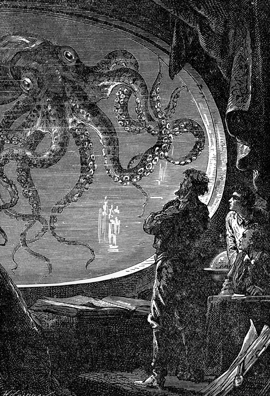
When Vincent and I was writing emails about this I remembered how my brother and I, with our insatiable hunger for adventure and our interest in technology and craft, read a lot of Jules Verne's novels, among them of course 20,000 Leagues Under the Sea. I always liked the thought of having a refuge in a Scottish island, a space vessel or a sorcerer's tower filled with books, musical instrument and canned fish - and Nautilus is sort of a perfect example of this vision.
After having seen the old illustrations again I realised that the oval window I placed in my living room in the video of my comic-fundraiser probably owed a lot to Jules Verne!