Even though a certain workflow has proven to work, sometimes things go slightly different. In this case I ended up doing the work without a clear conclusion. I'm not even sure the end-client ended up using the logo I made.
The Client

On behalf of the company he works for, @illestbambi approached me through Discord asking if I was interested in making him a logo for said company. The company, Hi-Rise Elevator Inspections LLC. , as the name suggests, inspects elevators to make sure they're not faulty and adhere to certain standards and regulations. Obviously, I was. I've had contact with him before regarding some Pixel Art Weekly challenges, so I knew he was an OK guy. That's always a nice ground to start from.
The Brief

Illest provided some base for what he'd like to see in the logo, mainly a circular pinion and a straight rack. He told me these items are the key components in hoists and other elevators. He also provided me with a similar logo which he really liked. In addition, he asked for either red or blue to be in the logo.
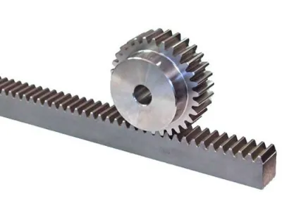
He also showed me an image of a pinion & rack as example, because I had no idea what they were:
Concept

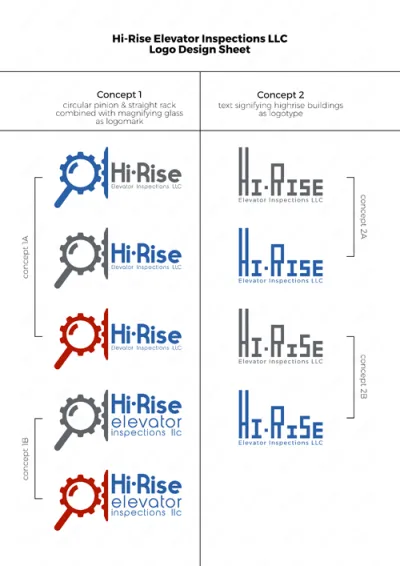
I used those two ingredients in sketching a few thumbnail concepts, but also wanted to provide a different approach, just to have some counter balance and make the client wonder if he actually wants what he thinks. Therefor there are also concepts without the Pinion & Rack
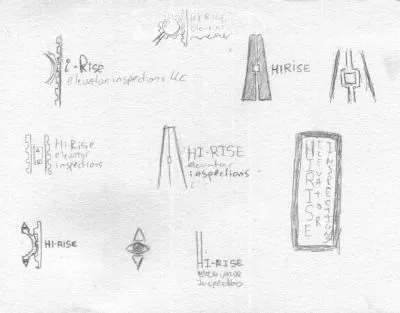
They liked two particular designs, the one in the top center and the one with the elongated H. I worked both of them out digitally and presented them in different colors & variations.
The Final Design

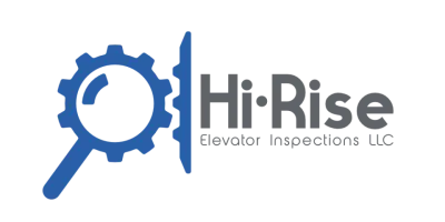
I had one particular concept sketch that combined the clients wishes for the circular pinion & straight rack with what the company actually does. Inspecting. For me, Concept 1, with the combination between a magnifying glass and the pinion which sat in the straigt rack was the clear winner. Luckily the client also agreed that that was by far the best design, so that's the one I developed further into the final logo.
I for one am completely happy with how the final design came out and so was @illestbambi. It's to bad he only functioned as the middle man. The company he initiated this for has a hard time deciding and committing to a design.
Full STEEM ahead my fellow Steemians - @eqko
Me and my friends have recently become witness as @blockbrothers
If you support us please for us vote here
Be sure to check that it says blockbrothers below the manual voting field.
Only press 'VOTE’, the green round button will cancel your vote.