Hello Steemians,
welcome back to the part 2 of the old site refreshing process! Without losing no time let's get into it!
First ideas
Fonts:
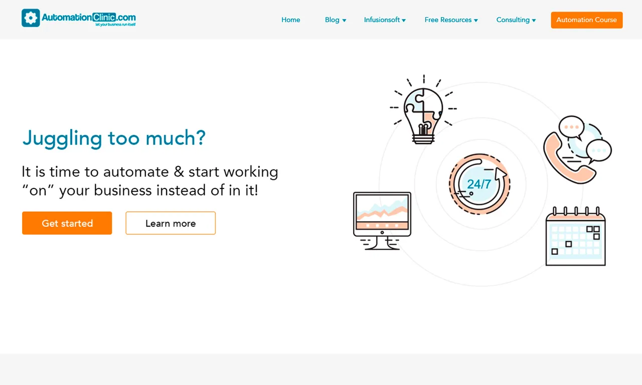
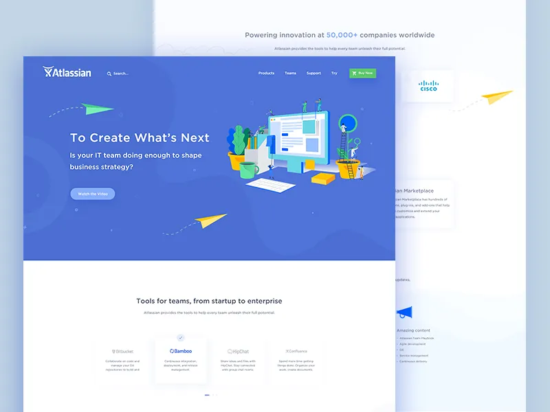
I was staring a bit a the screen finding out what could match the look of Automation Clinic site and then just by lookin at the logo I thought ok.. let's use sans serif, medium and thin size combination like this site:
 .
.
Colors:
Even if I think this could be the easiest way to achieve this, there is no need to stick to the previous colors. But I want to keep the same soul of what the regular customers know about it. I picked the colors from the old site, maybe I will do some small adjustments to the color but that's all.

Process
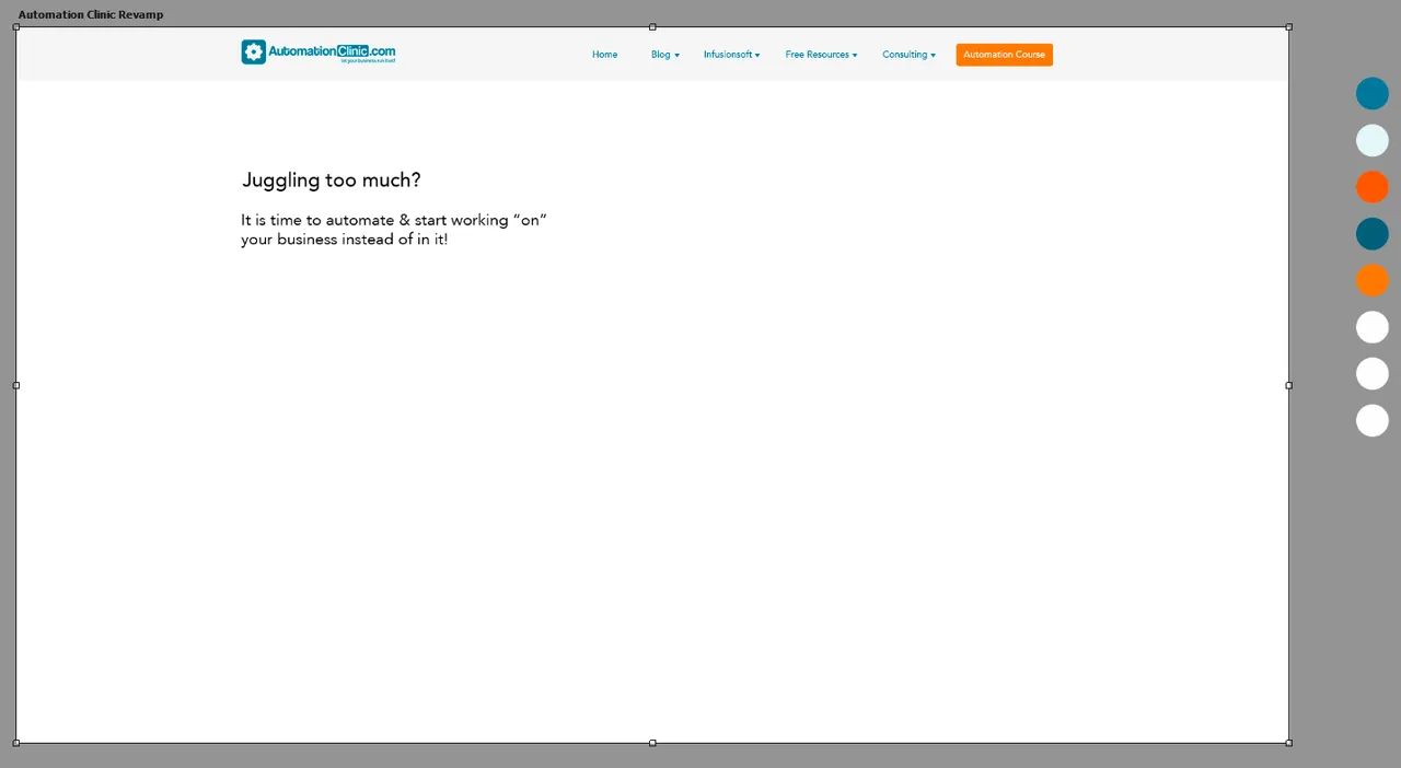
Menu bar
I made a soft look for the menu with arrows pointing down to indicate that there is more to see and a very strong focus on the Automation Course button.
Illustrations
Here I'm starting wondering if it will be a good idea to leave the white background or make a gradient.. also considering implementing an illustration to represent the main header.
I finally decided that I wanted to do make some illustations on the right side of this draft. The illustration should represent very well what the header says and gives a quick look of professionalism and experience. Also I included the buttons for registration and more information to complete the main section.
This is what I got:
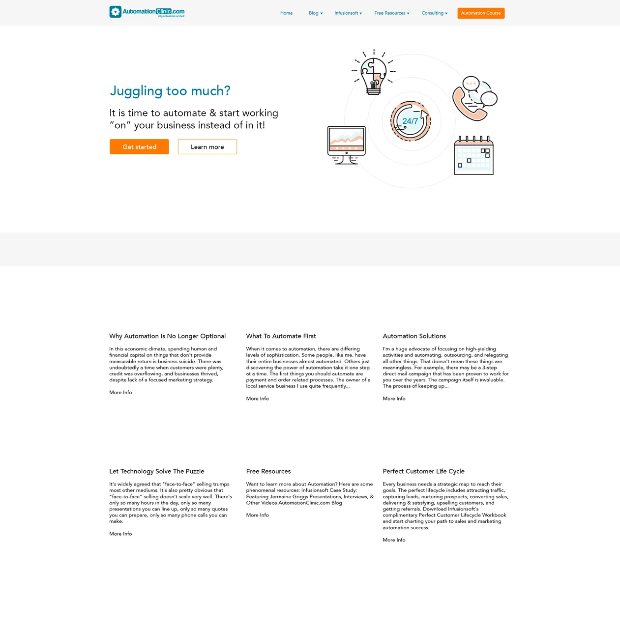
I will leave it like that for today. I have to focus on other tasks during the day so it will be nice to have fresh eyes for it tomorrow.