In this post, we have shown to break down tasks and write the tasks on the notes, and attach them to the white boards, in order to monitor the progress of the team. We can also have a burn-down chart, with X-axis the days (time) and the Y-axis the remaining number of tasks (in the form of y = -kx + b)
Ideally we should have an expected straight-line (on average) going down that means we finish all the tasks on the deadline. In reality, the line will fall below, which means we are doing better than average (or expected); stay over the line, meaning that we have delayed a little bit. Sometimes, we may fall behind and catch later or vice versa so you will have two lines cross each other.BTW, drawing on the white-board means so much fun than displaying on the monitor, which is great too!.
敏捷开发里有一个比较有用的图表就是 燃尽图 (Burn Down Chart).横坐标 是剩余时间 纵坐标是剩余任务数量. 理想状态下 我们会有一条 y = -kx + b 的直线. 当到最后规定时间的那一天 整个团队刚好完成所有的任务.
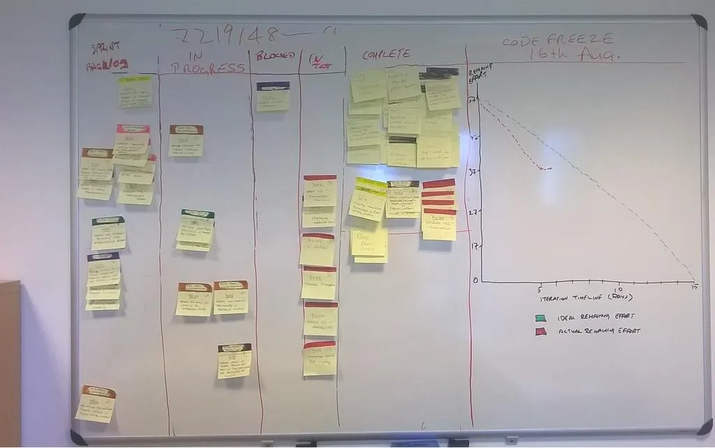
当然 团队做得进度比理想的要好的时候 实际的这条线就会在下面 相反如果进度拉后就会在上面 或者交叉前进. 这时候我们可以从这个表中大概估计团队的整体进度 或者及早发现如果有的任务卡住了怎么办.
Thank you for reading my post, feel free to FOLLOW and Upvote @justyy which will motivate me to create more quality posts.
感谢阅读,欢迎FOLLOW和Upvote @justyy 激励我创作更多更好的内容。