 Still no Angry Crab surf badges yesterday or today. But I did find the Angry Crab badge. Maybe that will turn on surf badges I need.
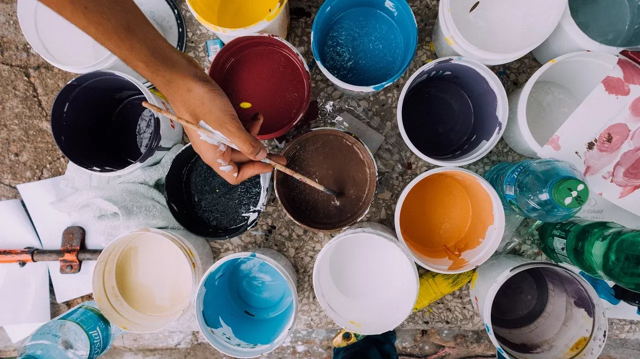
Boy, did I get myself side tracked yesterday. I have been working my way through the training on ClickTrackProfit. (Any of you who are CTP members know there is a LOT of training.) I'm in section of the training called 'Profit'. One of the modules is 'Color Theory'. I got fascinated learning about color theory in advertising. It is one of those things I never gave a thought before.
When I do splash pages, I have always just used the colors that looked good to me. I like a splash of color on the pages I create without going crazy. Black and white by itself would be boring. I almost always make "call to action buttons green but there was no thought be hind it. It turns out green is the best color for a 'SUBMIT' button. Split tests have shown over and over that green buttons get more clicks. Here is a list of colors and what they represent.
- Red - exciting, bold
- Orange - friendly, cheerful
- Yellow - optimistic, warm
- Green - healthy, peaceful, growth
- Blue - dependable, strong
- Purple - creative, imaginative, royal
- Gray - neutrality, calm
- Black - sophistication, simplicity
Red headlines, black text, green button on a white back ground make very effective pages.
If you are interested in learning more about color in advertising, just Google "Color in Marketing". Here is on page I found particularly interesting.
https://visme.co/blog/color-psychology-in-marketing-the-ultimate-guide
So I spent a lot of time yesterday learning about color. So much time there wasn't any time left for anything else.
Thank You for Reading,
Bob Caine
PS - As always your constructive comments are not only welcome but encourage. I can't get better without your help. Thank you in advance.