So, you might be thinking, “Well, I want to build a website and promote a brand, but I don’t want my website to be boring.” Picking the right font can take a "blah" website and turn it into a "wow!" website.
So Many Options!
In HTML, a font face or font family is the typeface that will be applied by a web browser to your text. The first thing you will find when you start looking around for the perfect font is that there are thousands of font faces to choose from. To keep it simple, there are four main classifications Serif, Sans Serif, Script, and Decorative.
Serif and sans serif are the most common classifications. Serif fonts have small, decorative flourishes on the ends of the strokes that make up letters and symbols within that font family. Sans serif fonts are seen as more traditional in comparison with their opposite. Sans serif, literally “without serif,” are fonts that do not have any flourishes at the ends of their strokes, and generally are seen as more modern, streamlined fonts. Script fonts are visually what we think of as cursive, or
Script fonts are visually what we think of as cursive, or handwriting-stylized. They have connecting letters and come in a wide variety. Script fonts are commonly used to emphasize a particular word or phrase.
The last classification, decorative fonts, are also referred to as display or novelty fonts. Decorative fonts are made exclusively to grab attention and are often times more unusual than actually practical. They should only be used in small doses, for specific purposes, and shouldn’t be something you consider for things like blog posts or articles.
Choosing Your Fonts
When you start considering fonts for your brand or website, there are a few things you want to consider.
You want a font that matches the overall feel of your brand. Brainstorm the qualities you want to project to your audience. Do you want something simple but elegant, or something more modern?
What size will the font you are using be? Is your font going to be small for the most part, or large? Many designers prefer sans serif fonts for websites, especially at smaller text sizes, simply because it’s crisper than serif fonts. Serif fonts, however, are usually seen as easier to read and navigate visually over longer periods of time.
What are you using the font for? Website graphics can support a more creative font than a business card.
Who is your audience? Younger audiences will have a harder time reading cursive fonts. Older audiences might have a harder time reading fonts that are close together.
Where is your audience seeing the font? If most of your audience reads your content on a mobile device, a smaller font will be hard to read on a 3-inch screen.
There are thousands of font choices out there. Keep your audience in mind and where you plan on putting the font in mind when you make your choices.
Combining Fonts
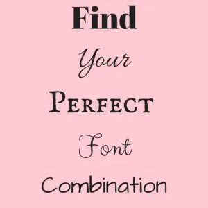
Chances are you will want more than one font to represent your brand. Combining fonts is a great way to spice up a boring look while still conveying the information you want to get across. A good rule of thumb when combing fonts is to choose one font from the sans serif family and one from the Script family. If you are worried about using a script font because of your audience, try two fonts from the serif family to create some interest in the fonts without over doing it.
Try it Out
Want to see what your phrase will look like in your font? Google Fonts has tons of free fonts and lets you type a test phrase so you can see what your phrase will look like in any font. There are tons of other places you can find free fonts, check out our 101 Free Blogging Resources to find some more ideas.
As long as you keep your brand identity in mind along with your audience, choosing your fonts will be a lot of fun.