Firmo is..
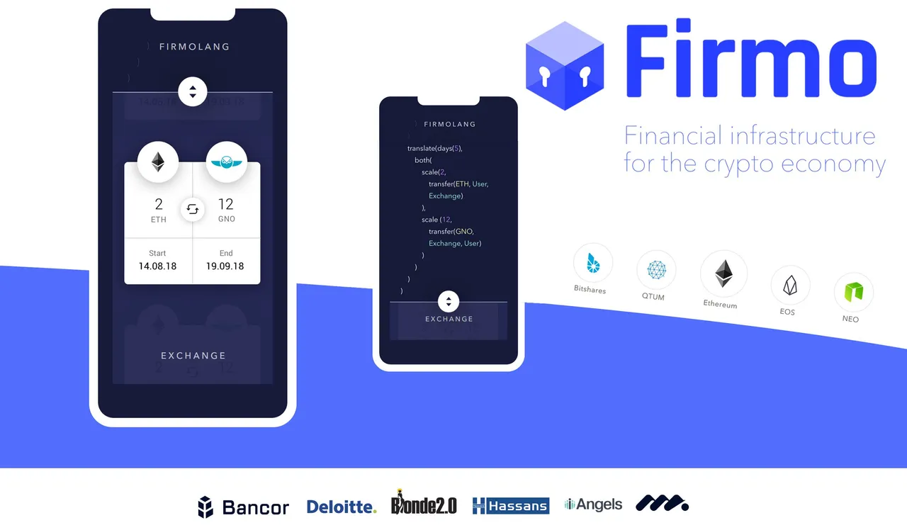
..as the title says, all about developing much needed financial infrastructure for the crypto economy. It's a very interesting concept and I've just written an article about it which you can read here. Article about Firmo by @outerground. This is the header image I created to introduce my article and it uses various elements from Firmo's comms to sum up it's key features and their partnerships.
Firmo want to see steemit community creativity and this augmented contest hosted by @mediaworks is an open invite for GFX components which Firmo could use. I am going to show you the journey I have taken so you can see the design in development.
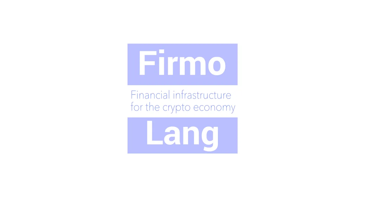
In this initial idea I split the block into three. There are three parts to what could become a strap or tag line for Firmo / FirmoLang. (Above). The rule of thirds uses the middle block as a traditional strapline container. Below, the strap has been shortened for a more specific functional & technical role. Handshake - Contract - Transaction
FirmoLang
I thought I'd concentrate on giving FirmoLang an identity. It's a child of Firmo but it's also the main component of the brand; - the verified, secure programming language which they have developed so that anybody can create financial contracts and place them straight onto the blockchain. They will become verified secure contracts or VSC's.
Firmo is inseparable from the Language FirmoLang so I attempted to join the two. This parenting of the world Lang by Firmo is a subtle reference to the nested statements of programmed code and re-iterates the L of the language by in effect, lengthening it. The familiar 3D block of the now ubiquitous blockchain logo has been replaced with a more emblematic and subtle square shape. The L shape of the Lang which identifies a language, is recreated in the bottom left using a fairly standard logo negative space in white, inspired by the use of a negative border space as used in the existing website graphics. An inference to compiling is made with the layers as well as the three phases of handshake, contract, transaction. The horizontal line of the inverted frame is slightly heavier than the vertical to make it sit down.
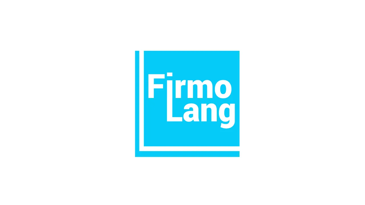
Simple
For simplicity and logo flexibility I have used a single tone on white, which can in theory be any colour. Think of any iconic logo. It can be stamped in one colour or black and white, this means it can be applied as a surface pattern design to anything. It's the hallmark of a classic logo, the ability to be placed in any colour or tone, inverted and still be immediately and instantly recognisable.
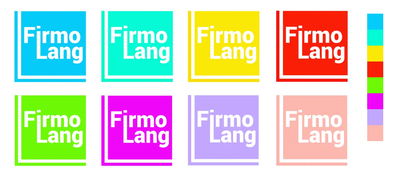
Colourway
To explore how the design works in different tones I have compiled a colourway sheet with a hue selection and some paler shades. Inverting the white invisible frame creates a stronger black version with distinct layers, reflecting the act of compiling more explicitly. It's a happy experiment and is equally viable as the white version, although it is now evolved into a duo-tone design with black as a primary element
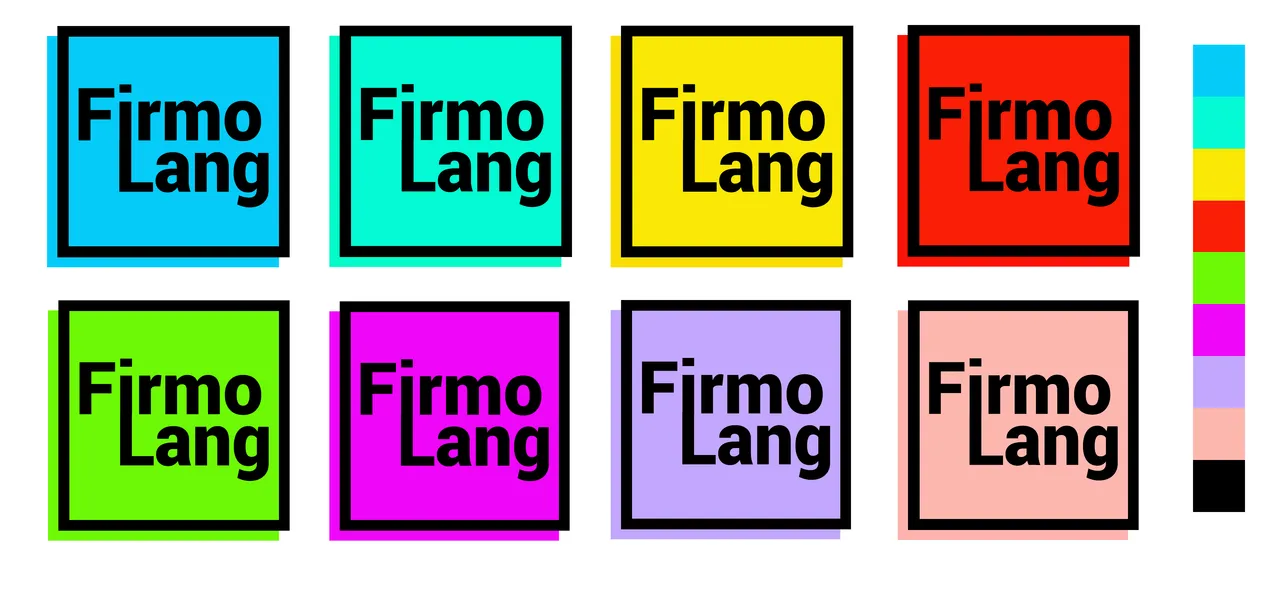
Font
I have taken inspiration from the web graphics for the type and used the Roboto font family by Christian Robertson. Here the Black heavier weight is used. It has been given a slight vertical stretch to elongate and make it more elegant. A box is strong. The font has been adapted to fit the square shape. Roboto is a popular and modern font family, well balanced and suitable for contemporary design.

Unused Ideas
Here are a selection of the Cambrian Explosion of ideas which contributed to the finished idea for a FirmoLang Logogram
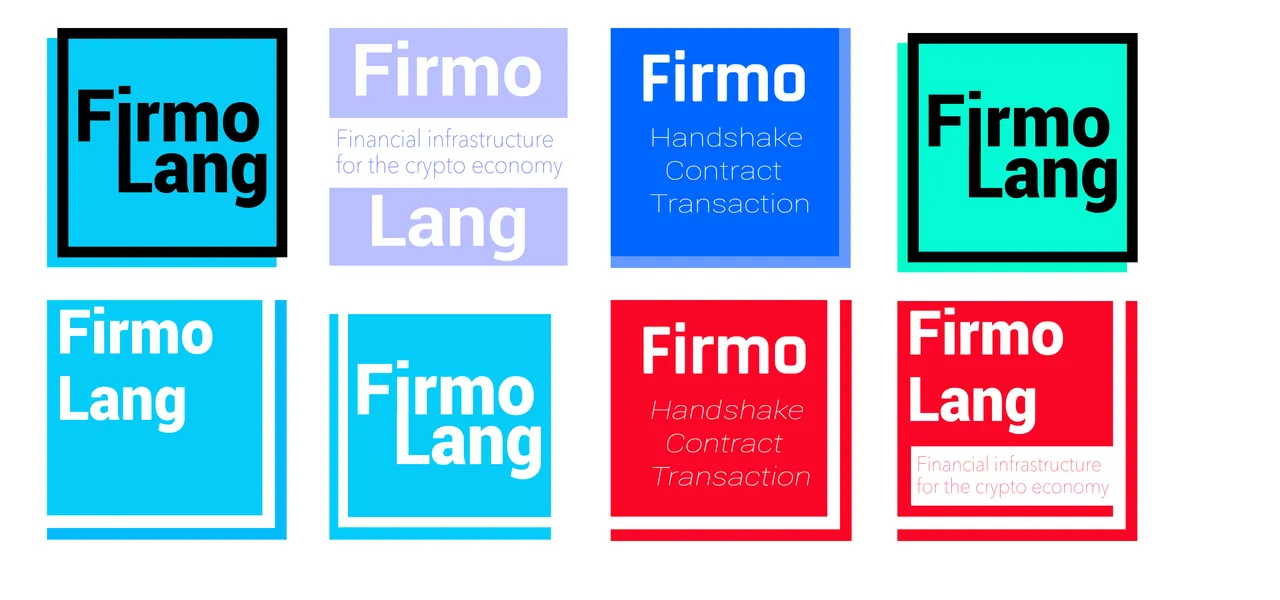
One Last Piece of Inspiration
Negative Space in Logos is effective so I decided to clip off the corners to create a z-axis depth. It's now a 3 dimensional shape with the 3 layers in a biscuit configuration. An acute angle to the cut on the bottom right provides a slightly forced perspective instead of equal angles which create an orthogonal view (which is a bit boring). Although a subtle effect it gives the final look a slightly more dynamic feel. I've rendered this one in Black & White. I rather like it :)
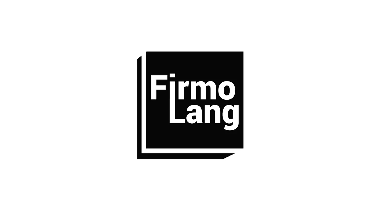
The Journey Continues
I couldn't help thinking about just the letterform on it's own and then I got to thinking about a more elegant and bookish font. SF Movie Poster. By the time I had re-arranged it into the 3D lozenge, I felt it was time to take it back to a much more simplified boxed shape.
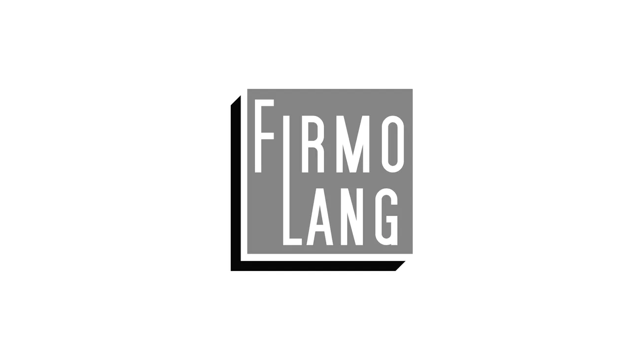
So I used a dark grey bound and separated the F from Firmo, leaving the corners to meet at bottom right forming an inverted block
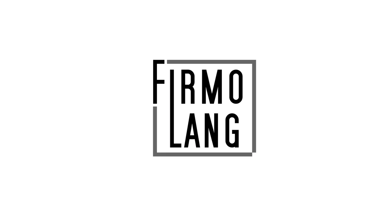
..and then I thought (on reflection) it would be prudent to box it up in a single black line and fill in the bottom corner. The FirmoLang logo now feels complete. I wonder if Firmo could be adapted into this form ?

yes, of course it could ;)
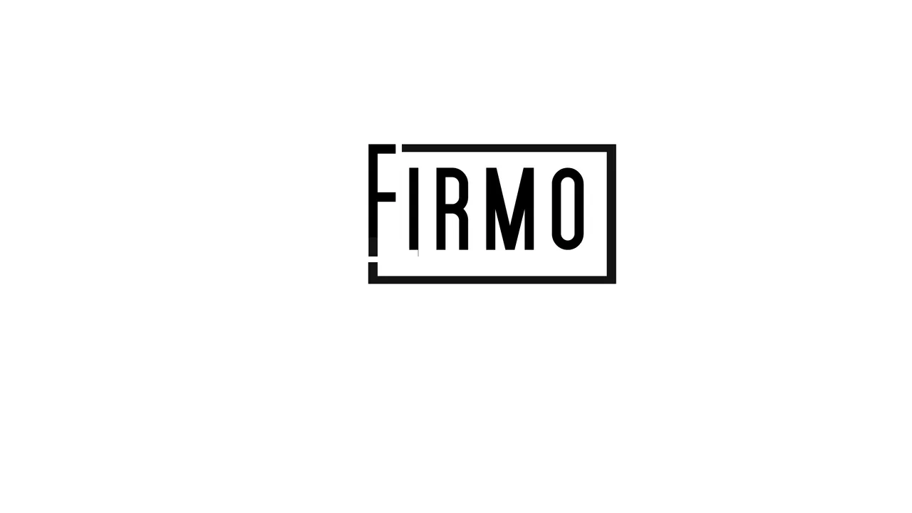
what if we now recycled the compiled 3 layer biscuit effect ?
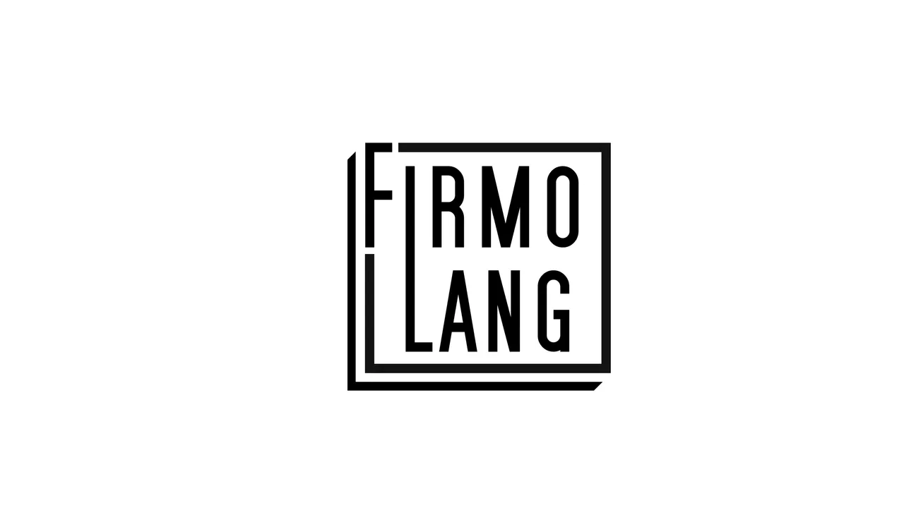
..and added some descriptive straplines in a slightly lighter charcoal grey tone
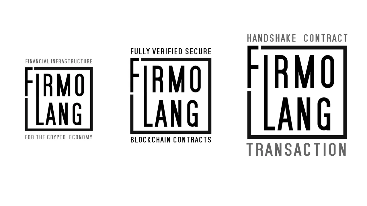
notes on branding
A logo is the highly visible symbolic wrapper of Branding. The larger picture is about communicating a narrative and instantly relaying to a potential client what the company is about, what they stand for and what their Unique Sales Proposition is. It's the way a client is enabled to make a positive choice over the competition. This equally applies to ICO funding campaigns as to sales clients for the product.
The story should be authentic, cogent and fit in with the industry sector, truthfully reflecting the values of the company. Like a logo, a brand and it's narrative evolves over time as the company story unfolds / changes over time to fit re-evaluated goals, new ambitions and diversification.
One of the most important elements of a brand is it's core values. what does the company stand for? They can only be true values if they influence the company culture. I have helped over 100 start up companies build their brand in the role of business mentor and no matter what the company service or product, the challenge is the same.
I am also active as a Visualiser in the Blockchain sector specialising in communicating highly targeted messages using the potent medium of motion graphics and animation through lively scripting, demystifying often technical language into digestible information for laypeople or more specifically for a stakeholder audience. My passion for blockchain advocacy and experience as a Creative Director running the award winning shroomstudiogive me a unique insight into the challenges of taking blockchain projects to the mainstream and I have enjoyed this 36 hour challenge to come up with some theoretical new ideas for Firmo. I hope you find something useful contained in this post.