Most media look at the price of Bitcoin on a chart like the one above and go:
This is insane!
The price seems to go straight up and then straight down again.
However, I believe this to be a skewed view on the price. The price it self is not the most interesting thing to look at. It is more interesting to see the growth in price. This can be viewed by setting the y-axis where the price is as a log-scale. With this scale, the doubling of the bitcoin price from 1000 usd to 2000 usd shows the same distance as the doubling of the price from 2000 usd to 4000 usd.
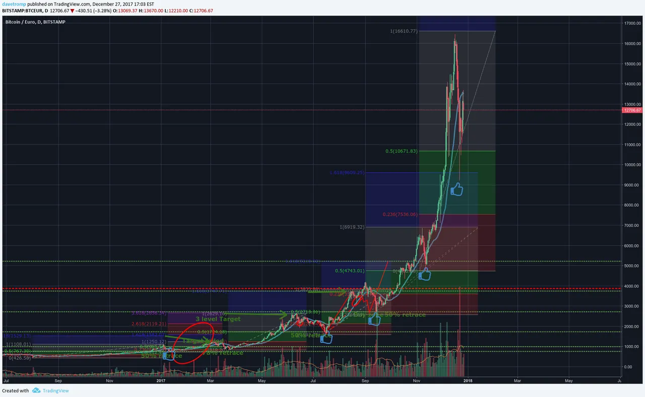
If we look at below logarithmic chart, then the growth of bitcoin looks much more like a healthy up trend.
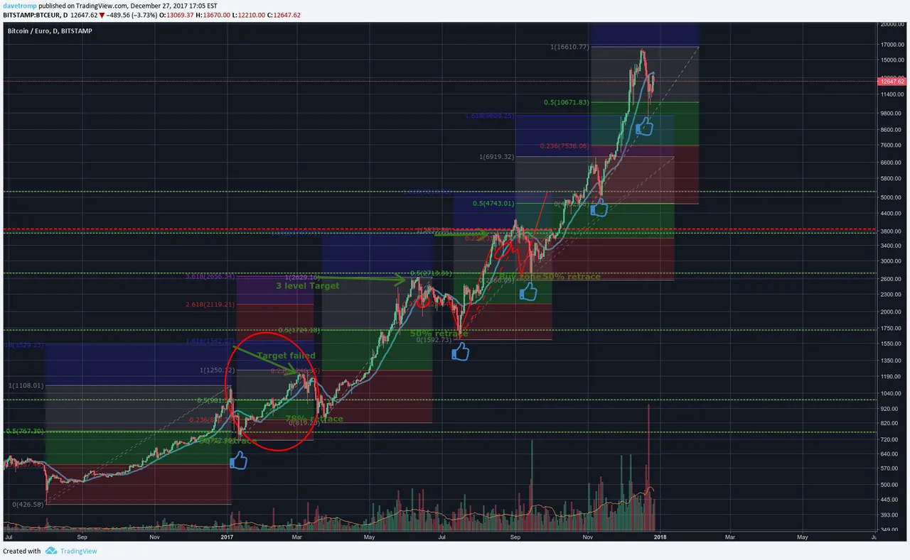
There is a very clear pattern that the price of bitcoin follow. After a run up there always seem to be a more or less 50% pullback. So around these level I would comfortably add to my position.
Charts are by Tradingview