Or at least - My attempt at an answer
This post is directly linked to my post of yesterday: To CAPITULATE or NOT to CAPITULATE? That is the question. - Part 1: The Question - you'll need to read it for background information if you are to follow this post.
Okay, I have a few important things to say here, each of which is worthy of consideration. Their are four major factors which could be the answer to the question of BTC capitulation; either in isolation or combined with one another.
The first of these is by far the longest to explain. This post will look at the first factor. I will do a follow-up post to cover the others.
I strongly recommend reading "The NEED for CRYPTO to CAPITULATE" if you have not already done so, it explains the possible alternative scenarios of a Rounding Bottom and a Capitulation which already happened without being noticed.
To CAPITULATE or NOT to CAPITULATE? That is the question. - Part 2: The Answer
Consideration 1: - Long-term MA
Long-term MA and its associated patterns are what got me started on this post. Credit must be given to fellow TIMMian @heyimsnuffles who's post titled "Imaginary Line Wins Again! Sell Below the 200 MA!" led to me analysing the 200 day MA in more depth.
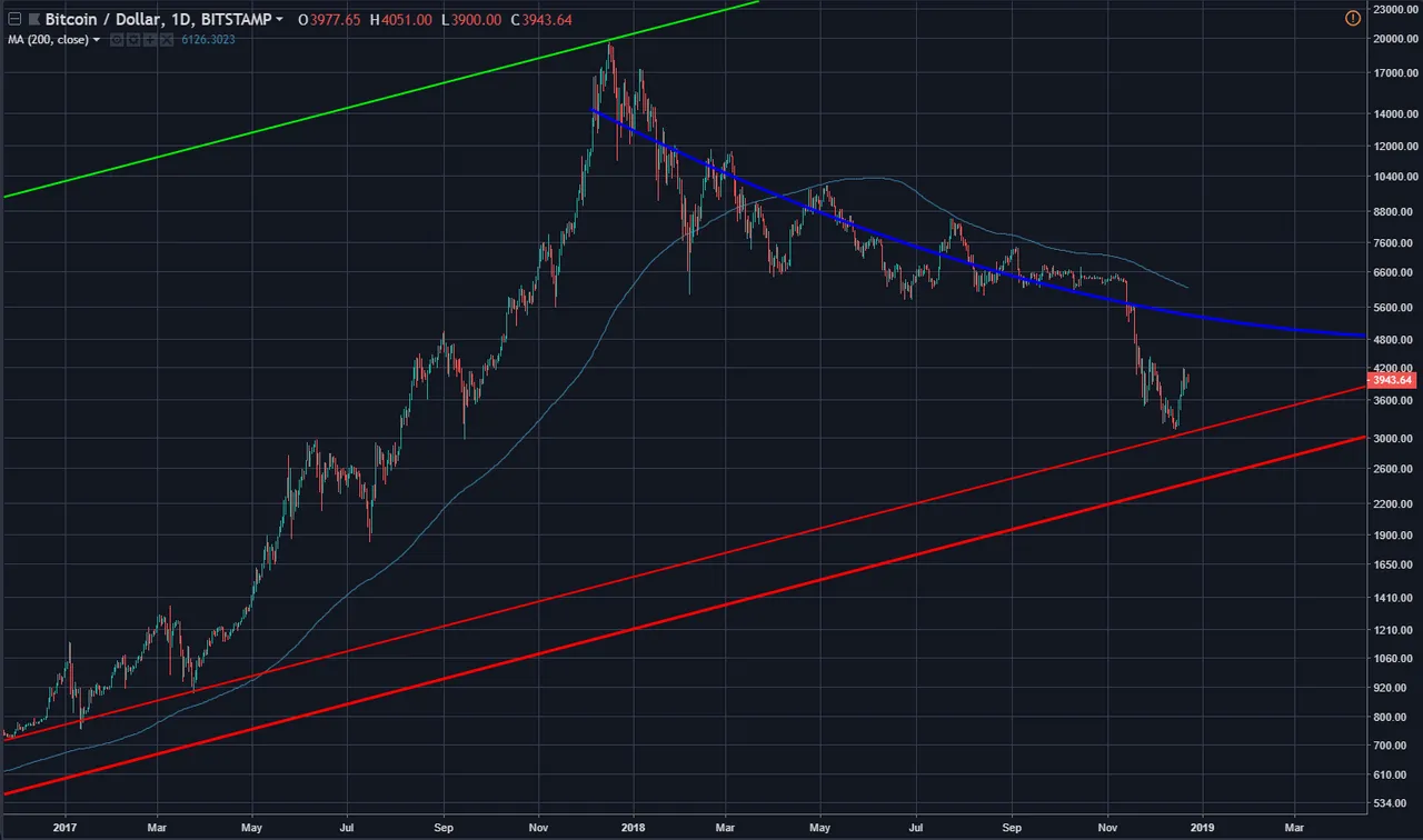
Chart 1: 200 Day MA
This chart shows the 200 Day MA (hereafter referred to as "the MA") for the last 12 months. Kindly ignore the red, green and blue lines - they are not strictly part of this post, but I am using them to track capitulation - as I did with the growing "$80 gap" in yesterday's post. As you can see, the current price of BTC is well below that of the MA; but with the MA dropping and the price rising, that may change, which is a strong bullish signal.
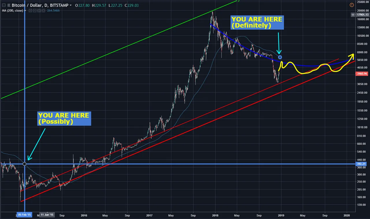
Charts 2 & 3: 2018 MA vs 2014 MA
I am presenting these two charts one after the other with no text in between so that you can make a direct comparison. I have tried to scale them so that the MA's appear almost identical.
As you know, I am a strong believer in repetitive patterns in markets, this includes patterns in indicators such as MAs. If the 2018/2019 crypto market is anything like the 2014/2015 crypto market, which I believe that it is, the the moving averages should also resemble one another - probably more so than price (which is more erratic and does not benefit from the 200 period smoothing). The Moving Averages of two similar periods should resemble one another closely, the more similar the period, the more similar the MAs. Obviously this means that a similar MA from the past can be used to predict the future of the current period. With that in mind, take a good look at the two charts below.
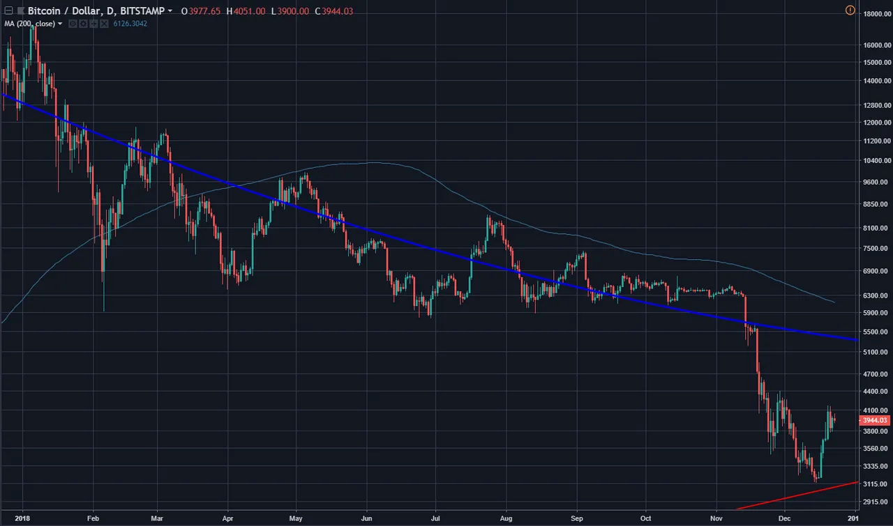
I think you will agree that the MAs of the two are very similar indeed. While TA can never predict the future with certainty, it is a powerful tool nonetheless, especially when used for long-term analysis and with indicators that have such a strong correlation.
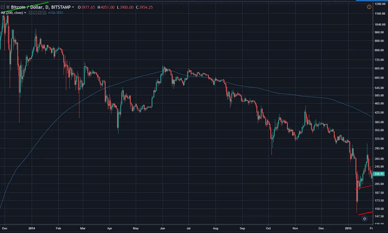
Chart 4: Zooming out and identifying the 2018 MA position on the 2014 MA curve
I've said it in the heading. Look at the long-term chart and see how the MA compares now to how it was in 2014. I consider the resemblance to be strong and I have done my best to indicate the point on the 2014 curve which I think corresponds with our current market.
Of great significance to this post, remembering it is about capitulation, is that this point on the 2014 MA occurred after the market had bottomed - after the capitulation was complete.
Of course I may have chosen the wrong point, but really, can you see a better match?
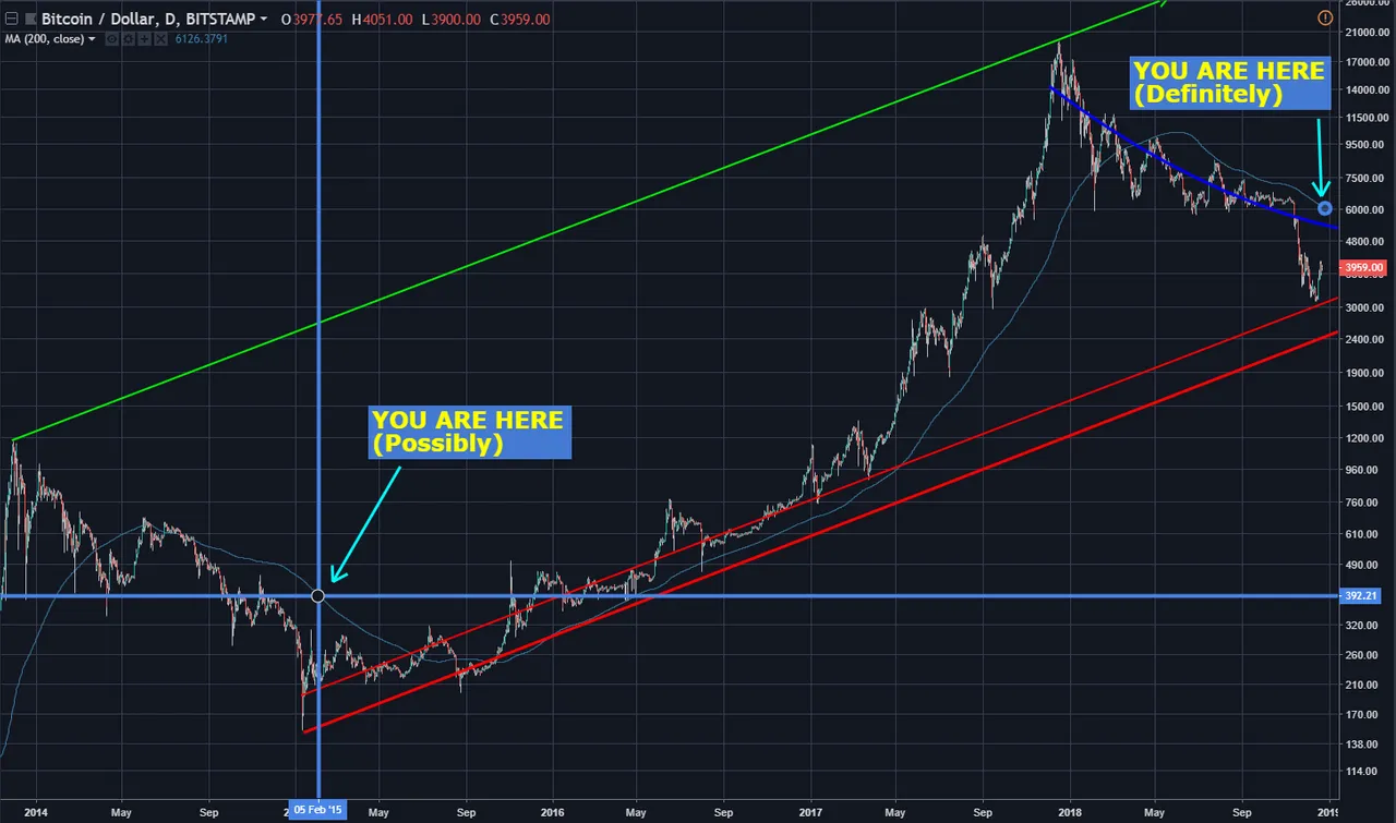
Chart 5: Stochastic Indicator
We are no longer strictly within the realm of MA's, but being momentum based indicators, Stochs are similar in nature. I wanted to show you the Stoch because it is showing an oversold signal which is stronger than ever before in the history of BTC!
The setting I used is my regular K=50 setting which Bit Brain readers are probably familiar with by now. Below is the entire history of BTC available on TradingView, so note that I am using weeks, not days - which makes it a 50 week MA and explains why there is no MA for the first year of charted data.
Look at that indicator, just LOOK at it! Charts don't lie. You can be as bearish as you like, but how do you make a convincing argument against that and remain steadfast in your convinctions? It's impossible unless you are in denial - and this is something which really bothers me as I seek to claw onto my belief of a future Dead Cat Bounce and a new 2018 (and now 2019) All Time Low.
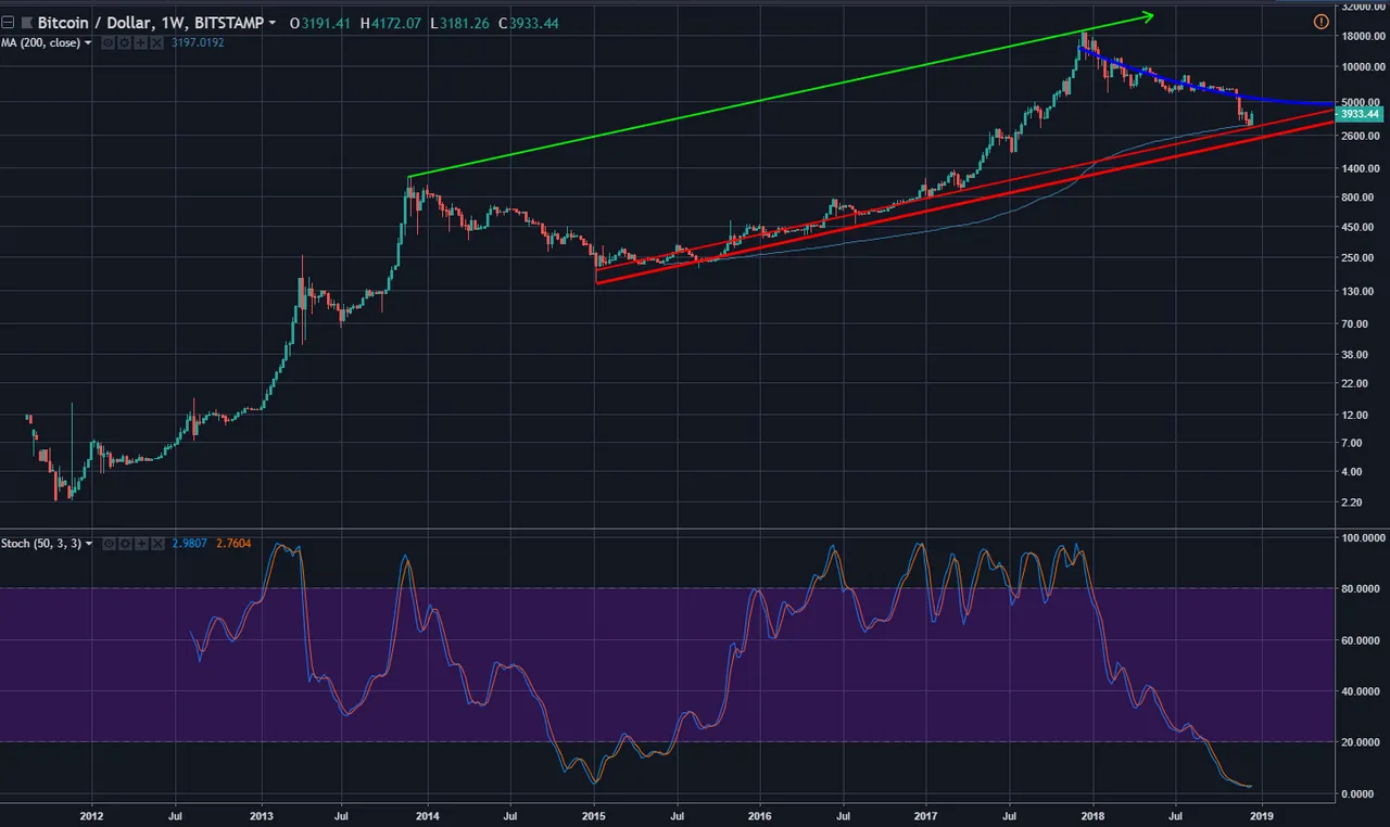
Chart 6: Relative Strength Index
I believe that based on their equations, it is better to use RSI for crypto/crypto pairs, but Stoch for crypto/fiat pairs. But I know that most people stick to RSI regardless and are therefore more comfortable with it. I include this chart to cover all the bases and to show the RSI fans that their indicator is saying much the same thing as mine.
Once again I am working with the entire history of BTC available on TradingView, though I have left the RSI set to the standard 14 period setting, again, so as not to upset those who normally use a 14 period RSI.
The RSI shows only two brief occasions where BTC was "oversold" on the week chart, the first was during the 2014 capitulation event, and the second occurred two weeks ago and is now over!
Simple conclusion: the time for capitulation has passed.
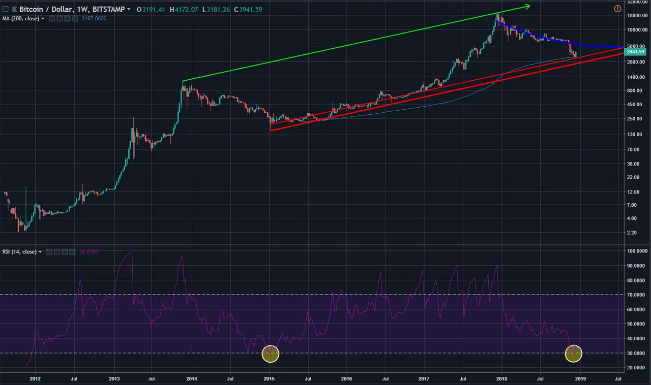
Chart 7: Back to the Stoch
Now that I have shown the traditional RSI, I can be more unconventional with my use of indicators and show you an alternative setting or two on the Stoch. For those who don't like using week long candles, here is a day candles chart, but now I have set the Stoch period (K value) to 200. This shows a market more oversold than ever before!
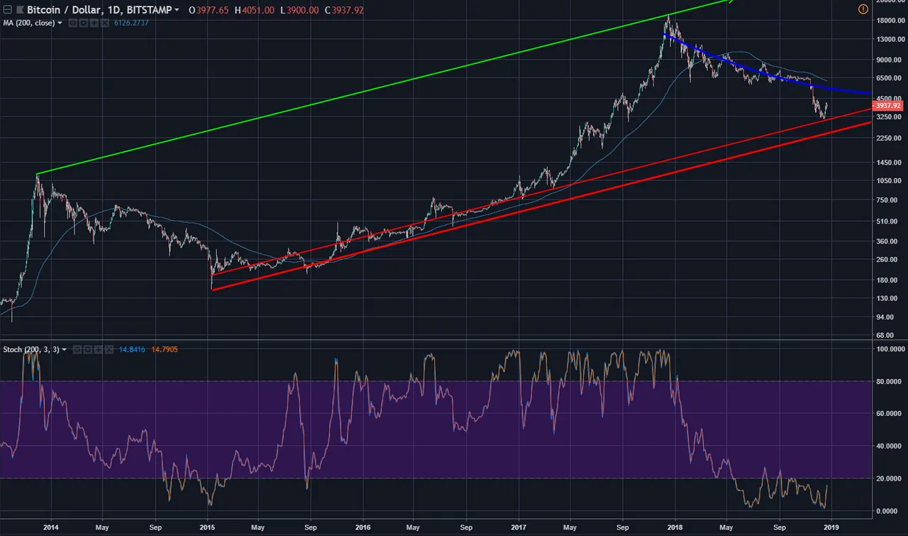
Chart 8: Same as above, but smoother
By tweaking the "S" setting of the Stoch you can smooth the curves out. If you change the default "3" to "50", you will get a similar but less erratic version of the chart above. It's still showing record oversold levels for BTC.
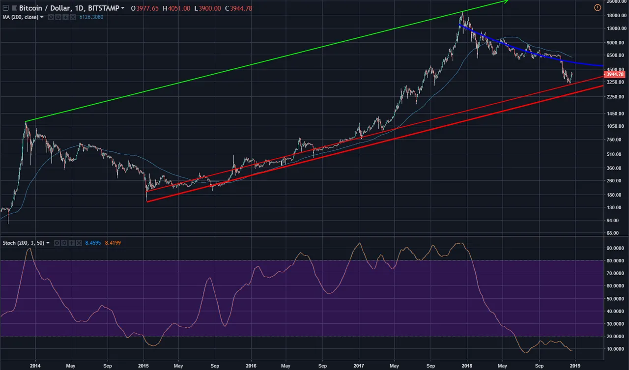
Chart 9: Throwing out a guesstimate
The above information has shown the strong similarity between the 2014 market and now. It's time to use that to make a prediction. Based solely on a rough copy of the 2014/2015, and not taking any other factors into account, the yellow line represents a possible future for the price of BTC.
Conclusion
That concludes "Consideration 1" with more to follow in the next post. I don't want to cloud your mind with further considerations until you have let the information of this post sink in a little first. I will make a more "conclusive" conclusion after the next post.
For now, take note how our MA has sailed over "Capitulation Valley", as it did in 2014. Take note that everything in this post indicates that the capitulation event is behind us. I leave you with that to think over until the next post.
Yours in capitulated crypto
Bit Brain
All charts made by Bit Brain with TradingView

Bit Brain recommends:
Crypto Exchanges:

 ---
---
Published by BitBrain
on