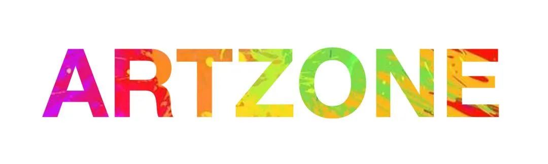
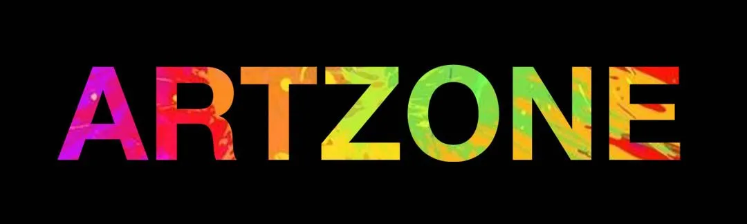
Today, I am sharing my logo design idea for the @artzone contest.
Find out more here https://steemit.com/artzone/@artzone/artzone-logo-contest-30-sbd
My idea of art is a combination of beauty and chaos.
In my logo design, I have used bright colours with a very clean text outline. The bright colours represent the chaos and the clean outline represents beauty.
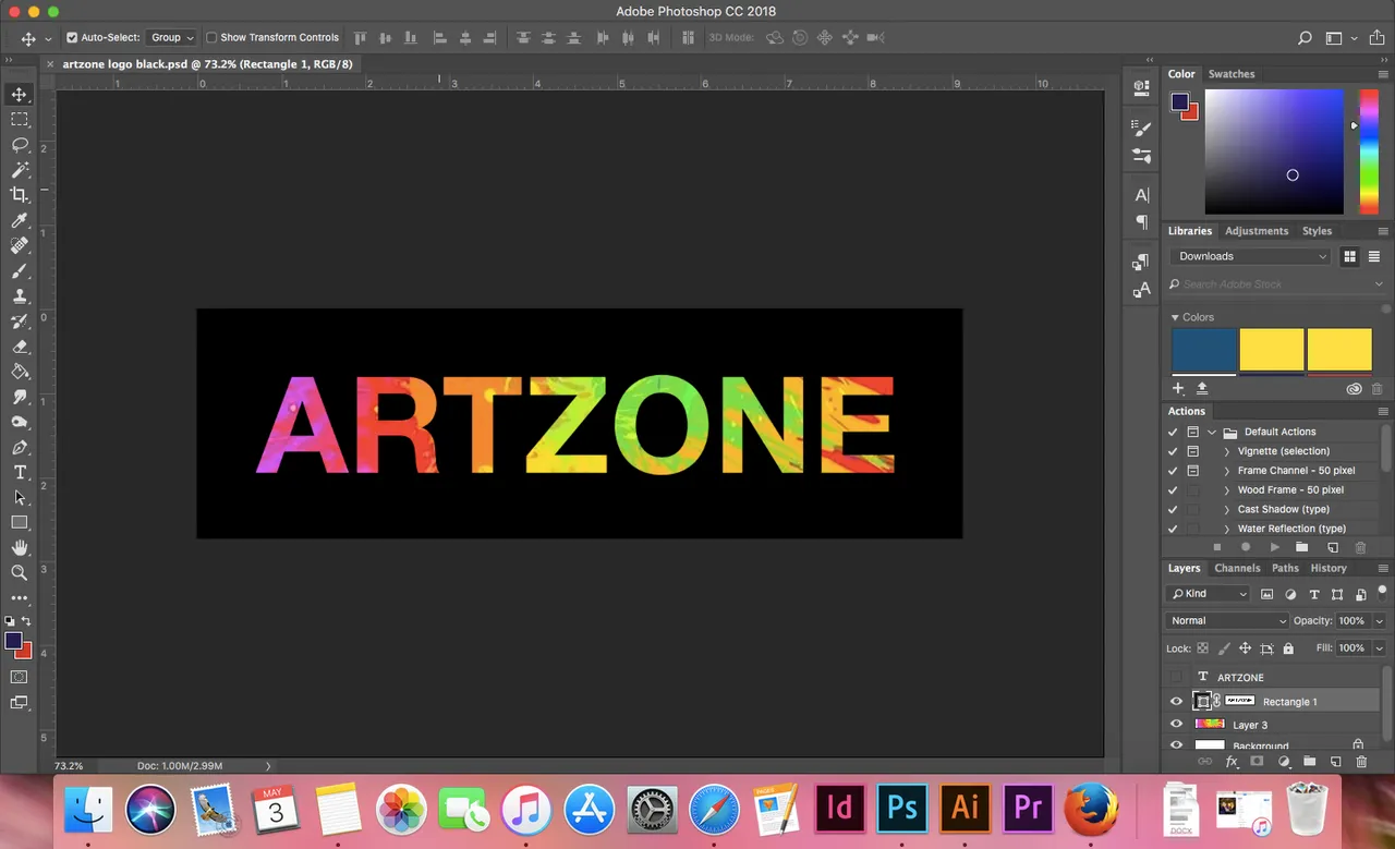
Evidence of work. Font used: Helvetica Neue - Bold. And I used a stock photo of paint splatter.
I would love your feedback!
