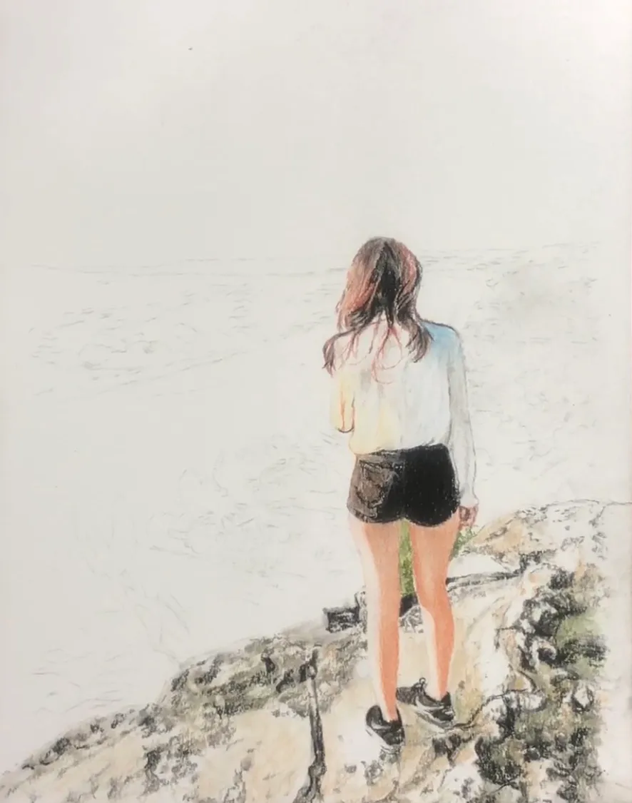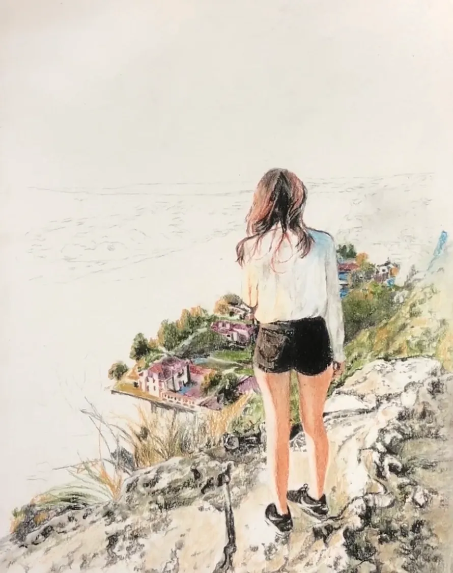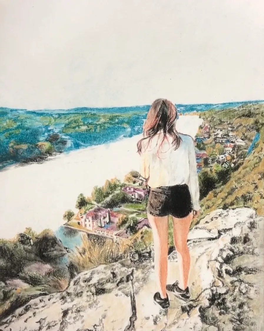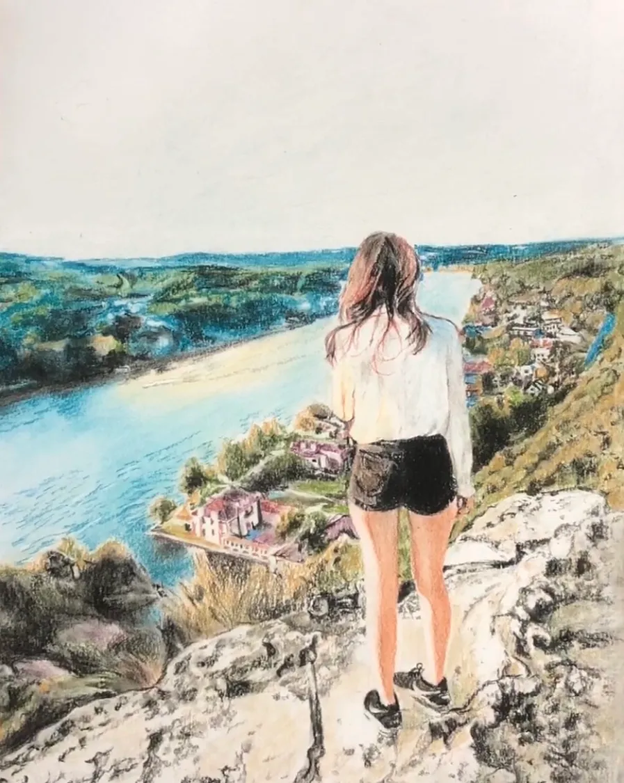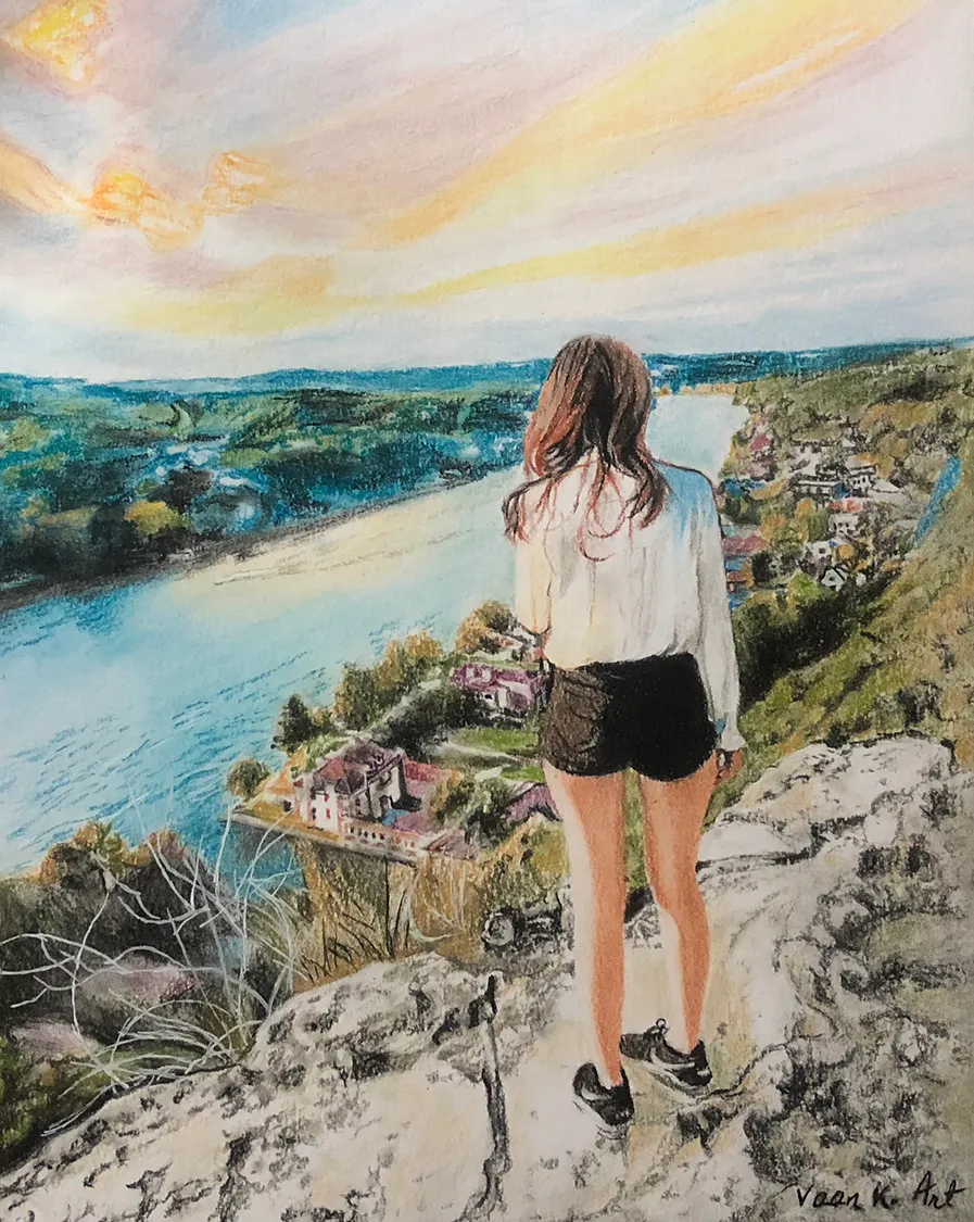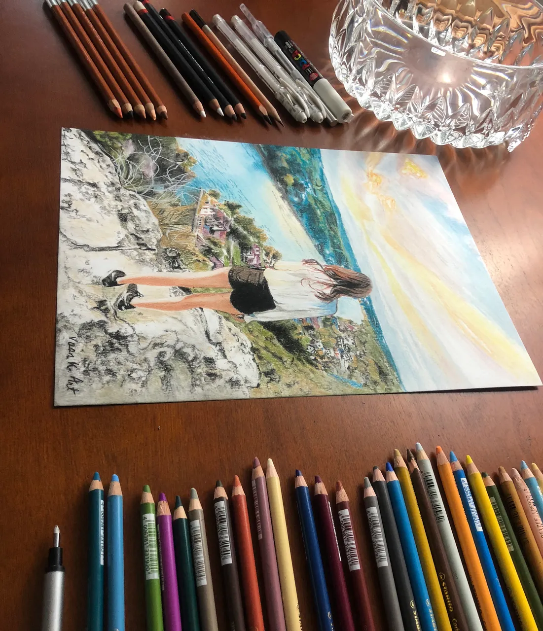
Materials: Chalk-pastel coloring pencils, Charcoal Black Medium, Charcoal Black Medium Dark Strathmore Bristol 300, Charcoal Primo, uni-ball Signo
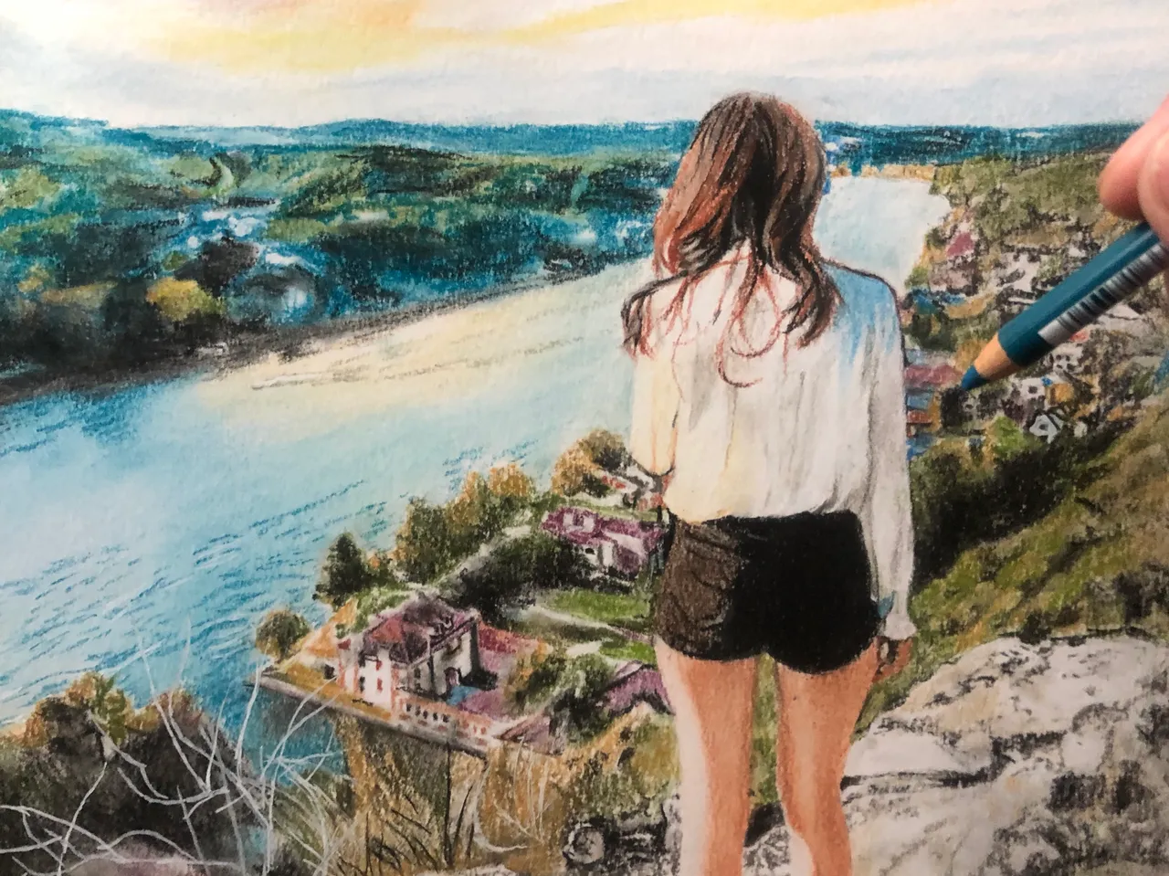
I'm using a variety of colored pencils. If you've been struggling with getting the color right. The first thing to remember is that the background sets the stage meaning it controls a lot about the final image and because of that level of importance you must always take your time, this is especially true when it comes to background. The numbers one mistake you're most likely to make when coloring landscape assuming that just because it's a background, you don't have any details that you can just rush through it. Let me assure you that you're making a huge mistake. So if you're coloring the background, stop rushing it and slow down. The second common mistake is over-saturating colors. I know the background is so bright colors but your eyes are perhaps the best liars you know. The truth is we are all susceptible to optical illusions which are what makes coloring so complex the way I control my color saturation is by using lighter d saturated colors for the base layer and then also for blending. That way when I start putting in some of my blues and greens they are being applied to a layer of color that will soften them. It's always better to use too little and spend a bit more time getting the right blend then applying way too much and turning your work into a mud puddle. The third idea to keep in mind is contrast even though the background is really important you have to remember that it isn't the focal point adding too much contrast to it will pull the viewer's eye away from your main subject after you've colored in the rest of your drawing you can always go back and make adjustments to color and contrast.