I am a big fan of post-production.
My objectives aren't to change completely the images, but to bring to life what is already there.
I like contrast and strong images. Actually, our brains do.
Our brain craves for contrast. Not only intensity and value contrasts but all kinds of contrast.
Hue contraste, saturation contrast, value contrast, shape contrast.
It's the way we can separate things and organize things in our minds.
Contrast is how our attention is caught.
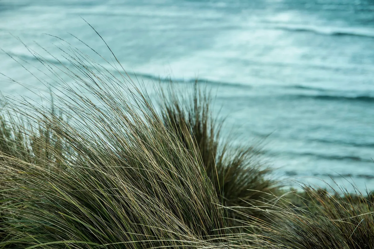
Look at the image below how we can differentiate the vegetation from the sea because of contrast. It is the shape, the values and the hue differences that allow us to organize this image correctly.
And as it is clean and easy to read, our brains like it. Or at least think it is balanced enough to not generate discomfort.
One of the things that I like to do most is to adjust the values of an image correctly.
In my workflow, I first make the image black and white. I just forget about the colours for some moments.
This way I can find the best values in terms of highlights and shadows.
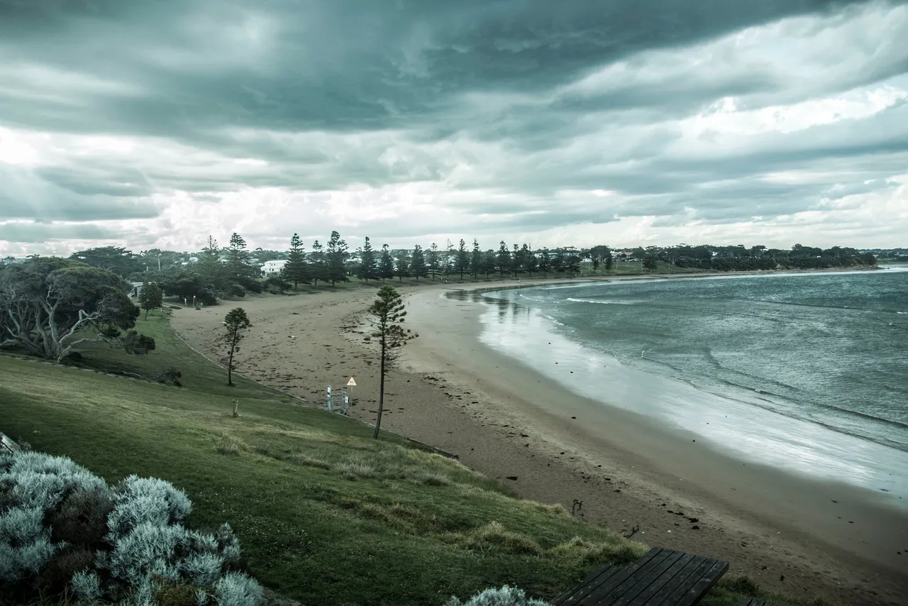
Although I like the image above, with its clean blocks of shapes and strong constrasts, I brought it here to show something that technically could be better. I could have avoided the overexposure on the sky and I think the image would be better balanced, but I also thought it would be good making the image more dramatic, and so I decided to keep it. I believe that as long as we are aware and have a good reason to do something in terms of crossing the lines, it is ok.
For every photo, I try to evaluate the best way to get what is already there and bring it to life.
I will probably talk a lot about gradients. Gradients are a subtle and important type of contrast.
Look at the image below and see how the values on the grass are full of gradients.
This brings our attention to there all the time.
I will talk about "economy" and "emphasis" as important principles for everyone that works with arts. For now, have a look at the shapes. They are very easily identified and clean to distinguish from one another. This helps a lot our compositions.
The different areas of the image that are very well defined help us to read the image fast.
Hope to explore more things on the next posts.
Please let me know if this is interesting so I can keep up doing posts like this.
Cheers