
Hello again, friends!
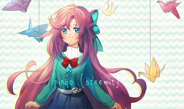
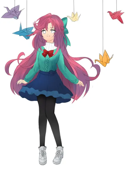
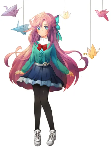
This post is a very special one to me. It is my own "mascot" or an anime version of myself, pinqo. I took many weeks to come up with her design and it has gone through many sketches and iterations. I have made many doodles of my persona, and have come to really love this character as time went on. When people think pinqo, I hope they think of her.
Please also note that I am an extremely experimental artist. I try out 23748 different techniques before settling down on one style that I like. Sometimes, I spend 5 hours to color hair in 10 different ways. Occasionally, I draw out a character design and almost finish it before scrapping it entirely and starting over (as you see from my previous Ahri drawing). That is why, I add up all that time "experimenting" and trying out new things in my Time Taken calculation.
Time Taken: 35+ hours
Materials 🖌️
- Wacom Intuos 3 Tablet, Medium
- Paint Tool SAI
- Adobe Photoshop CS5
Pre-Design
Before I get into the nitty gritty of this design in particular, I would like to present previous versions of my mascot that I had come up with before finalizing on the pink-haired wonder girl.

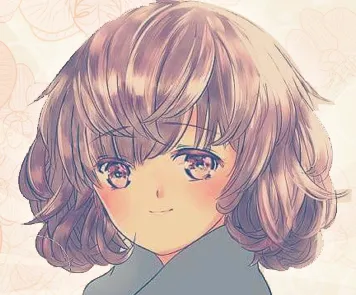
Design 1
I really liked this design because it captured many features I wanted in my mascot:
"Aloof" - I like to be seen as a very quiet and shy girl
"Cute" - I think the expression and pose in itself show off a very adorable aura
"Unique" - I really wanted the hair to be more special than just long, brown hair
"Simple" - The outfit is a very simple wardrobe, and I like to keep it that way
However, as I began to finalize her design, I began to think that her hair didn't represent me well enough. So I went onto version 2.
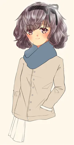
Design 2
As you can probably tell here, I kept the general outfit the same, but the hair was a lot more fluffy, poofy, and generally "cuter." I also thought that there weren't many characters out there that had this sort of hair style, so I thought this was it.
However, as I went on with the coloring process, I thought that this design made her look more like a human version of a Cocker Spaniel. Dogs are cute, but I didn't want my persona's hair to look like puppy dog ears. So... onto version 3 (final form)!
(Instagram filter for fun)
If you ask me how I colored the eyes... I will tell you that I don't remember. I am so, so experimental with my coloring that 99% of the time, I don't remember what I did.
The Process 🖼️
- 96 layers
- 13 folders/groups
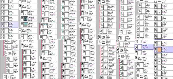
Just for fun, I wanted to show you how many layers I used to portray my character. I experiment so much that I can use 20 layers on just adding highlights to the hair. I also have 3-5 different versions of the background because some did not fit well in the whole composition.
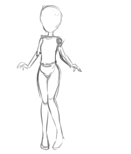
The Skeleton Stage
In the beginning, I wanted to figure out what kind of pose my character would make. With the same 4 features in mind (aloof, cute, unique, simple), I knew the gestures of pinqo would include a delicate, yet simple stature. Her hands out seemed almost playful, yet her legs being tucked in shows a sign of shyness.
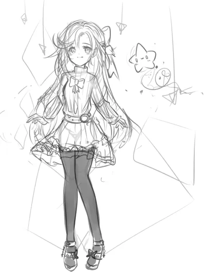
Detailed Sketching
I wanted to completely re-do the wardobe and include a really fluffy skirt! I love ribbons, and included a few of those. Shading also helps me visualize the overall dynamic of the colors that I would like to use throughout the picture. I thought a few twinkling stars and floating pixie dust would add an element of "purity" and "innocence."
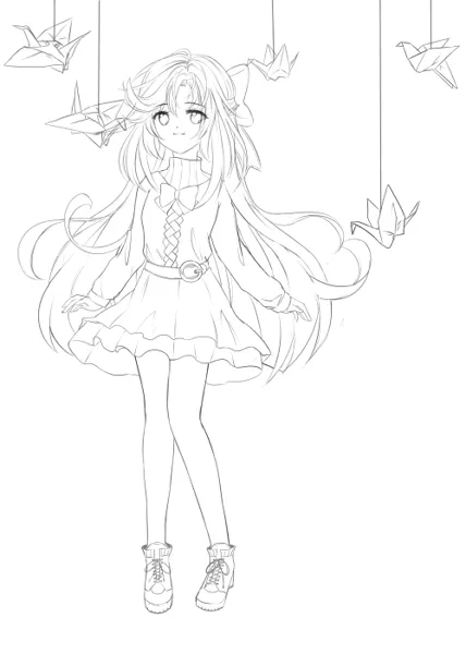
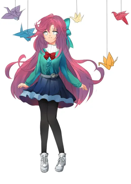
Inking Over Sketch
Some of the things I sketched did not make it to my "lineart." The shoes were changed because I thought the heels made pinqo seem too girly and high maintenance. Boots definitely fit her more because I wanted her to be more approachable. I also changed the background to include origami because they're cute, too! I fixed a few things in her proportions as well.
Sometimes when you stare at a picture for too long, and you know something is wrong, but you can't tell what it is because you have looked at the drawing for over 10 hours straight (Trust me, I probably sketched out at least 15 different poses for her before I finalized on this one).
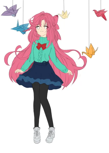
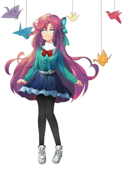
Adding Base Colors
I love blue (teal and baby blue specifically) and pink. Why not combine those together?! Black always looks good in anything, and white is to balance off all of these strong, vibrant primary colors. It did take me a while to finalize on this color choice, but with an abuse of the "Hue/Saturation Wheel" on Paint Tool SAI, I picked the ones I liked.
Adding Gradients
Here, I have probably added at least 15 to 20 layers of pure gradients. I would overlap existing gradients on top of each other. Different shades of purple and violet would interweave together. On the legs, I probably added 4 gradients of black and gray, along with silver in areas with more light.
Cell-shading with Shadows
Now I have begun to add "clean" shadows that are more visible via the hard lines of shading I added. This is called "hard cell-shading."
When you add shadows that can be constructed with the usage of 1 shade of a shadow, this is referred to as "hard." When you use blurring and blending a lot between colors, that is called "soft." You can see this technique used most on the shoes. The sweater uses mostly soft cell-shading, whereas the skirt uses a good amount of hard cell-shading.
Highlights & Overlay
Highlights are my next favorite friend. I abuse the "overlay" function on Sai. It adds a very neon texture on top of existing layers and colors. You can see many areas of yellow and neon teal on the hair, sweater, and ribbons. It adds so much vibrancy, and I love it!

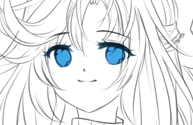
Coloring the Eyes
When I'm not too lazy to color eyes properly, I love adding very small details to the eyes. It almost seems like a "galaxy" of sparkles in the eyes. I begin with darkening the top of the eyes, and adding more "overlay" layers on the bottom of the pupil to add shines.
Finishing Touches
Again, I added more overlay layers with a touch of yellow and orange. This adds a more warmth tone throughout the girl. I really like warm, vibrant, popping colors! Having layers that are applied to all your other layers and colors helps with bringing that out. I added a pinch more gradients, too.
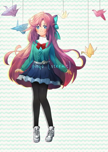
Background + Credits
Don't forget to add something in the background, along with credits to make the picture seem more "full" and complete!~


Feel free to leave comments & questions. Let me know what you think!
Anime Art #1 : Mystic Messenger Yoosung (Original)
Anime Art #2 : "V" Fanart, Old Manga Style
Anime Art #3: Two Beautiful Boys to Die For
Anime Art #4: Playtime isn't over for Ahri~
Anime Art #5: 2 Boys 1 Cat (Yuri On Ice)
Anime Art #6: My Own Anime Mascot (Pinqo)
Anime Art #7: 최세영 Saeyoung Choi 707 Fan Art