Digital Painting tutorial 01
Hey guys, I'm back with another tutorial breakdown. We'll be looking at how you can turn a quick thumbnail sketch that did here into a base for a really nice painting or piece of concept art. It is especially useful if you need to show a client your work but have a limited time to do so. This is a nice, quick process. I am using Adobe Photoshop, but the theory applies to any medium, be it digital or traditional. Value is lightness and darkness. We tend to think of value as black and white, and the grey scale that sits inbetween. It is not to be confused with saturation, which is the intensity of a colour.
We use value to quickly block in a scene to give it depth. First off, if your drawing was on paper like mine, you need to get it into the computer. You can either use a scanner or take a photo. I don't have a scanner at the moment so I took a photograph. It requires an extra step, but it is still easy.
Step one:
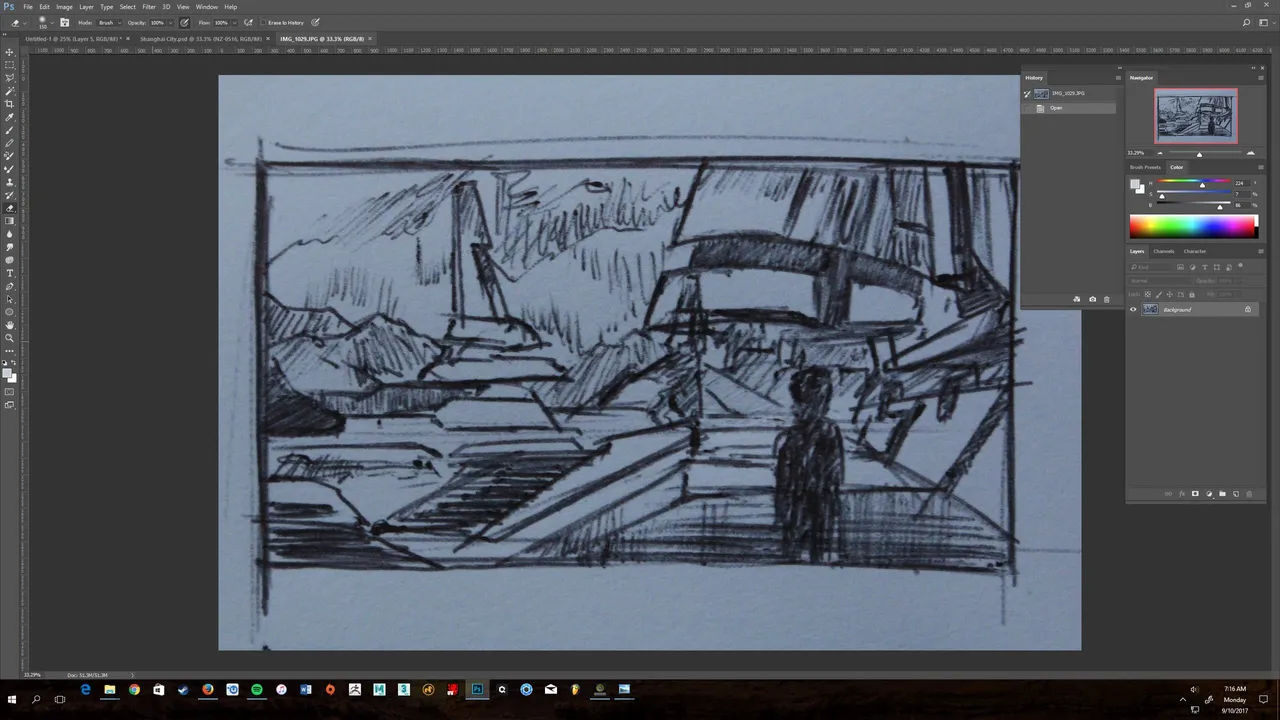
We start off with our sketch, and I want to use a technique to lay my sketch over like a lightbox. We do this by using our layer mode and selecting "multiply". Multiply only works if your image is purely black and white, and as I took a photo in, I have the natural light on the paper. I need to get rid of this by desaturating the image to make it black and white, and then deliberately overexposing the paper. I'll quickly copy my layer, and then on the top menu bar, I go Image>Adjustments>Desaturate, and then Image>Adjustments>Levels and tweak the settings until my line drawing is dark and the background is white. It should look something like this. 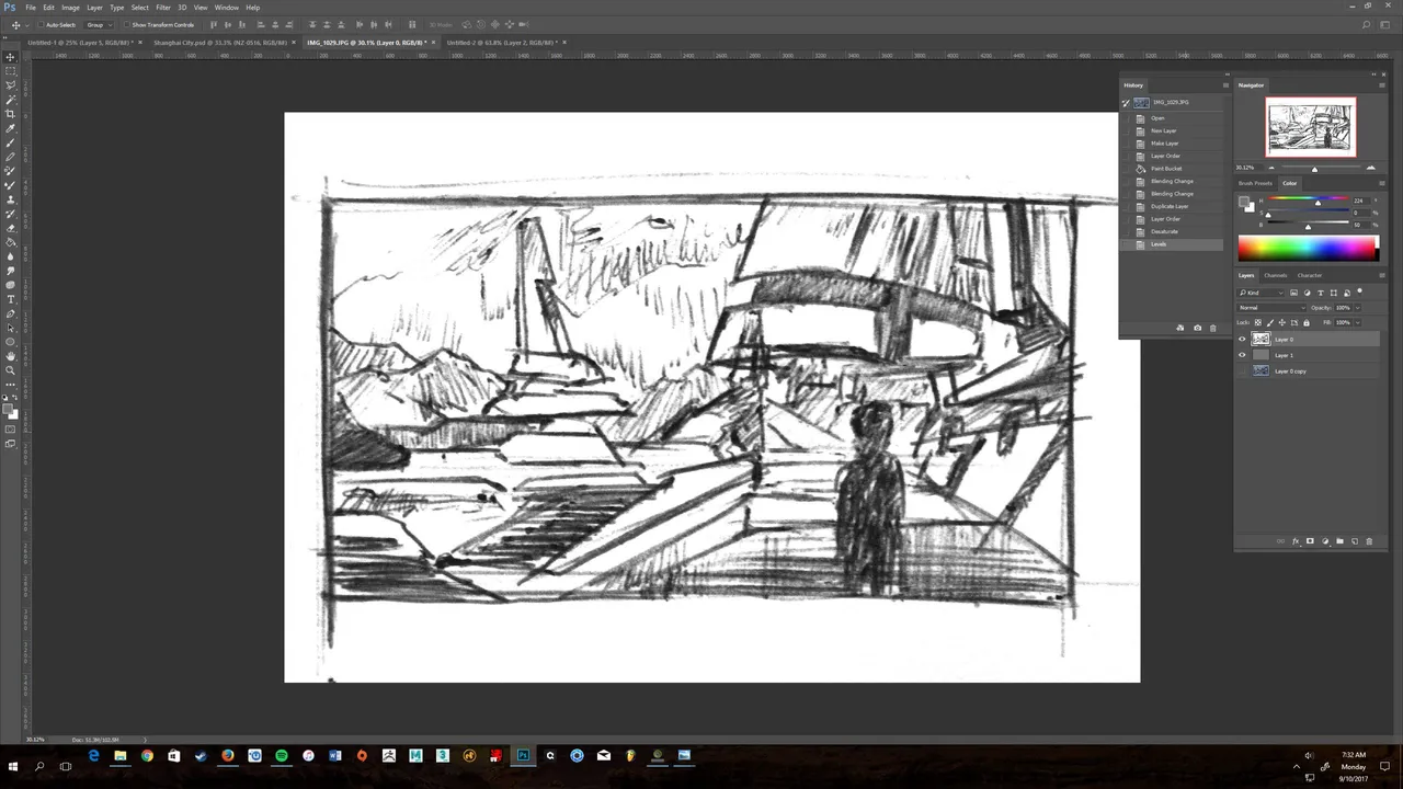
Step 2:
Next up, I'm going to crop the drawing in using the crop tool, to get a nice, squared off border around the image, ready for painting. I will create a new layer, and use the paint bucket tool to drop in a solid 50% grey. This is just my personal taste, as I prefer not to work on a perfectly white canvas. I will then put the original layer on top, and put it to the blend mode "multiply". This hides the background so all you see is the outline. I will lower the opacity a bit to see what I'm doing underneath. It should look something like this. 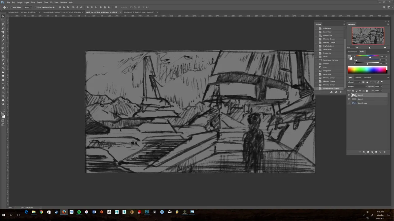
Step 3:
On a new layer underneath the original sketch, I'm going to make a selection of my mountains using the lasso tool. I'll paint this in (use any brush you prefer). In nature, a phenomenon called atmospheric perspective makes objects further away appear lighter with less contrast and more washed out. This means that we can use a rule of thumb that helps us a lot when painting and that is: The lightest lights and the darkest darks are in the foreground. Here is what a selection looks like. 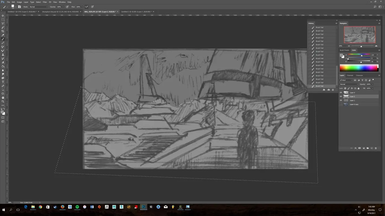
Step 4:
Once I've made my selections, I now have objects on different layers, their darkness dependent on how close they are to the viewer. Mine looks like this. 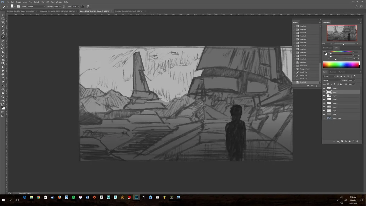 From here I will determine my light source. I want it to be mid-late afternoon when the sun is high, but just starting to lower. I'll have it coming in from the left. To make the composition more dynamic, I'll direct the light by pretending there are clouds obstructing some of the sun beams. This will create nice areas of light and shadow across my scene. I want to make selections of each of the layers I separated and use them like a mask to quickly paint in some value. To do this, go Ctrl (or cmd for a Mac)+ Left Click on the layer icon, and a selection should appear. Have a go blocking in some value via your desired light direction. Here is what mine looks like.
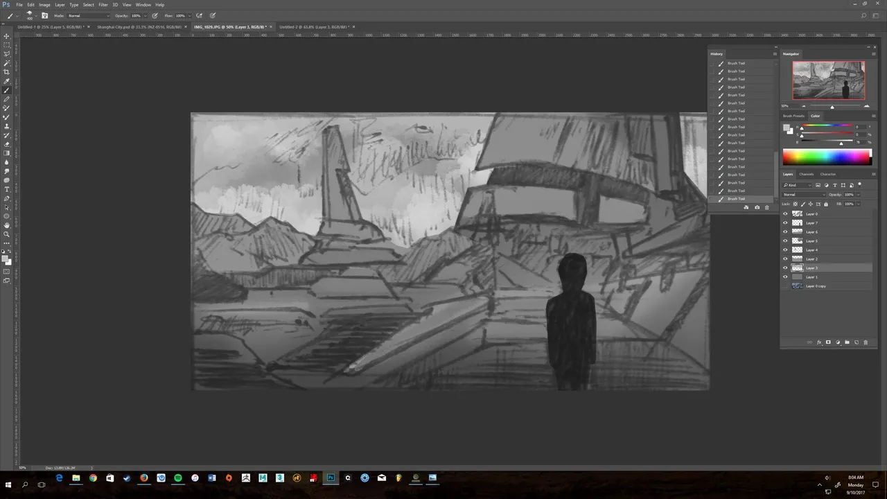
Step 5:
Continue to block in your scene. Add highlights to areas that are closer to the sun. For me this mean't adding stronger highlights to the left side of the right building to suggest some curvature in the structure. I keep the foreground darker to suggest stronger shadows from clouds. Mine looked like this.
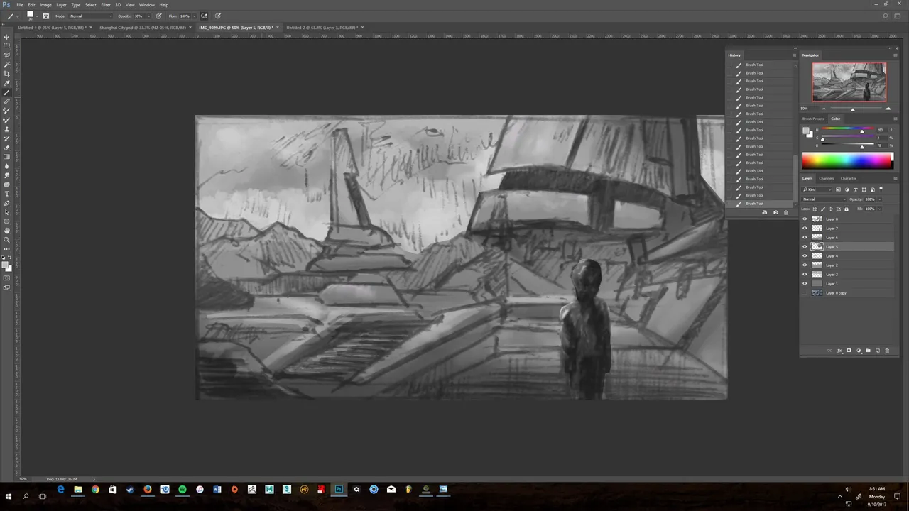
Step 6:
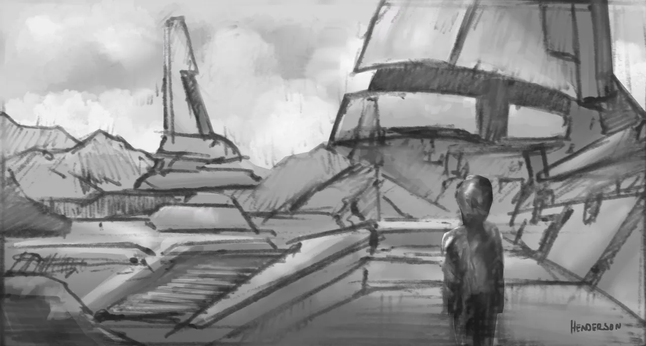
We're nearly done! All that's left now is to erase any of the original drawing that you do not want, and do a quick contrast adjustment. I liked to keep some of the original sketch to keep some character. I made a quick adjustment in levels, and boom, a nice, quick value sketch that shows basic form and depth. Don't forget to sign your work :)
Feel free to upvote, resteem and follow if you liked this and want more.
Cheers