Since some of you have responded positively to this type of thing, here is another illustration I did for the Cartooner game.
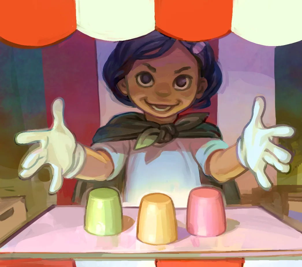
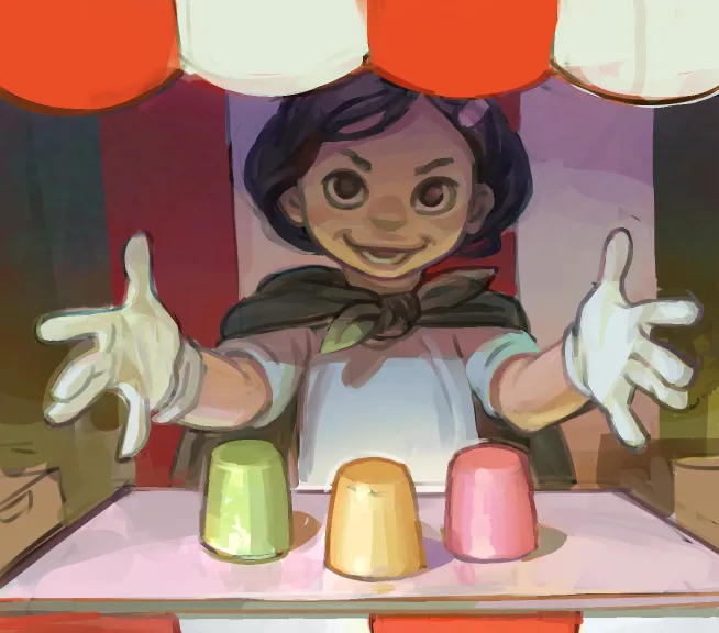
This one was for a card that is designed to help the losing player, kind of like the blue shell in Mariokart. The card is called "Secret Trend" and it reveals the topic only to the player who is most behind on points, basically giving him a handicap for the round. Because of this I was a bit stumped as for the right concept for the image; it had to be something that related to the idea but did not seem overtly unfair. Even though it basically was.
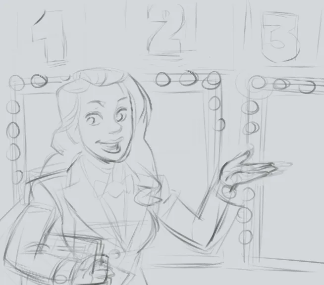
This was my first sketch. It occurred to me that the TV game environment is pretty light and maybe all doors contain a prize... but the client wanted to try the 3-cup game idea. I have no huge love for the 3-cup game because it is a street hustle. But I felt fairly happy when I thought of making it this type of thing with an adorable child at some country fair. That would take the "edge" off the concept and give me room to still make her look miscievous but ultimately harmless. Mostly.
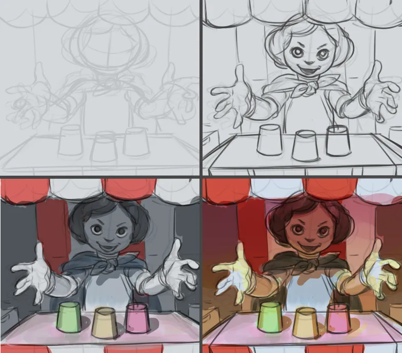
The beginning is where the meat and potatoes of the design really took place, with the sketch down and the values blocked in, the rest was pretty relaxing.
I think it is very helpful to not start going to fully opaque and specific paint before figuring out where everything goes. In other words, I used the lasso a lot, and thought about the value groups and the saturation. You can particularly see this on the bottom left; I knew the awning stripes would be saturated red so I thought I would them red to begin with. This would give me a better idea of how areas of different saturation would be distributed and where their boundaries would fall.
Here is a shot with the color removed for this stage. I had just started smoothing out some areas with opaque paint. I highlighted the areas in the "dark" value group, you may see I am trying to use them to "hold" and "frame" the character for the viewer so the eye can easily find her in the shadow on the awning. Having the shadow fall over her face and the light only on her hands was one of the first ideas I had. I thought it would be good theater to make her face more mysterious and the hads clear in front, like a magician's.
You can try to find the boundaries between 'mid" and "light" values and also the boundaries between saturated and less saturated areas. Thinking about these things is just another way I try to make the picture read clearly. Additionally, I believe there is a sort of freshness for the eye in all forms of contrast.
Here the painting is well advanced and you can see I am working comfortably within what I had established earlier. When things go this way, aggravation is much less likely.
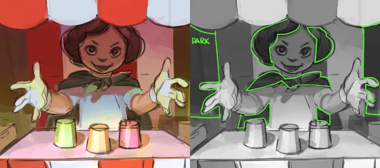
You may detect I threw in an overlay layer colored a light blue, and used a noise filter to make it grainy. I erased out most of the parts where the girl is. I was trying to make it feel like it somewhat cool and breezy under the canopy, contrasting with the warm reds and yellows outside.
In the end I think it might have looked even better if I didn't blow out saturation on the whole image and just kept it for the top and bottom, but also perfect is the enemy of good did you think of that? ;)
Thanks for reading. Please comment and upvote if you like this content. Leave your questions in the comments and I will try to address them in my next post.