Hi, guys!
I'm making this review on a day later, then I promised, but after all the main thing is that I'm finally making it:)
So, in the previous one I've been talking about "Art of Hobbit", artbook that includes all the illustrations ad descriptions to them that were made by professor himself. So it's a great possibility to look at how the author imagined all the locations Bilbo passes by during his greatest adventure. How was Mirkwood supposed to look like, and Shire, and the Misty Mountain.
Some of these illustrations were later used to create concepts for movies, for example the way Torin's map looks like is exactly the way Tolkien drew it.
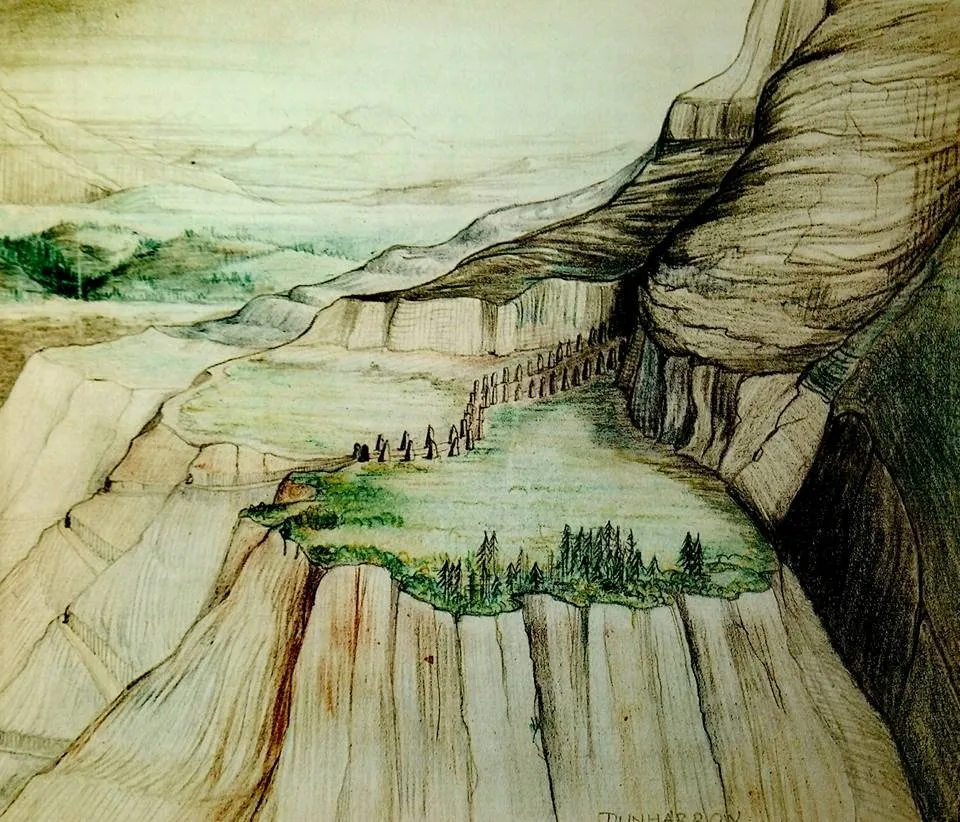
Dunharrow, art by J.R.R.Tolkien
In this particular artbook finished artworks are met really rare. It just has another focus, on different things (which doesn't make it less valuable). But after 100% inking in the first one meeting a watercolor here (even despite the fact that there's only three of them) is fantastic:) Not sure if it's mixed with ink, but it seems so to me.
This is how the cover looks like this time The ring was connected with the white tree of Gondor here, the king's tree. As in previous book this one also includes super cover (and this one is it), and the cover drawing repeats only the white tree

Map constructing by J.R.R. Tolkien.
In my previous post I mention Tolkien saying that "If you're planning an adventure fantasy - draw the map first, or it will be too late to do it". In this book the main part is dedicated exactly to creating the map. Really, it's almost a half of all the artbook, and it's so wonderful to follow professor's thinking about it, discover some tiny place in Middle Earth you never noticed before. I put here this part of map creating as an example, in the artbook itself there are dozens of them. It looks like a strange conspectus, but when you start looking at it with attention everything becomes clear, and it becomes clear how much work was put in it.
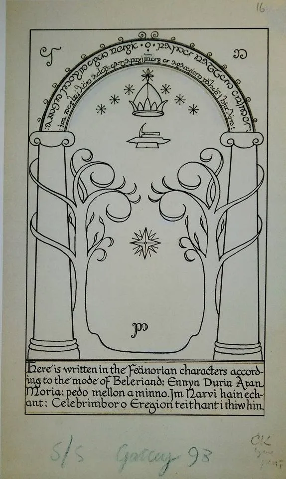
Gates of Moria by J.R.R. Tolien
This is exactly the case when something that was at first Tolkien's drawing for the story became concept for the movie years after. Moria gates moves to the movie without any changes, and I'm sure here you recognized them. Only this wonderful blue glowing effect added to them - everything that has hanged from the very first concept.
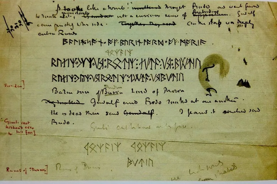
Inscription on Balin's tomb by J.R.R. Tolkien
There are a couple of versions of what has been written on Balin's tomb, this is the first one. Even if not to go deeply in all the forms of elvish - looks mysterious, isn't it? Yet I saved the pleasure for the next time, but may be when I'll finish reading the book I'll make another post about languages of Middle Earth.
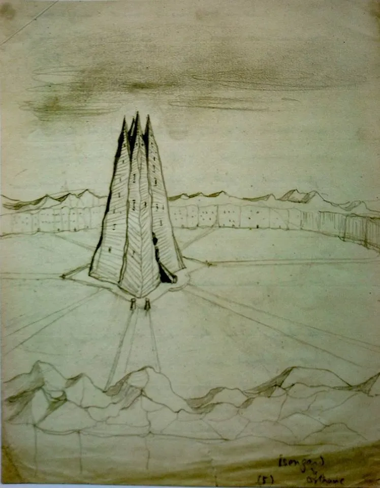
Isengard by J.R.R. Tolkien
Remember how all the drawings in the first artbook looked like? Most of them were made with ink, and they were really detailed. I even opened Tolkien as a graphic artist for myself. In "Lord of the Rings" artbook main attention is given to the maps, languages and all the tiny details, while finished artworks take only a tiny spot. Most of them are made with a pencil, and don't reflect the whole concept. They're just like "catching the idea while it's still in the air".

I wish you all the best and will be happy if you'll support me with vote:)
Love, Inber