In this post, I have the article for you guys in which I will tell you that how I have made this interesting logo :)
In this article I used one of the coolest tools in the illustrator to make such things. You can use it anywhere because this technique is very good and save a lot of time as well. As you know that you always looking for cool and awesome logo for you brand. So for today I will tell you how you create a clean and prefect logo from frog!
In this tutorial, I have explained all the procedure step by step how you can try these type of interesting logo as well.
The idea of presenting is come to my mind. When I'm just telling my student about the iconic logo. Then I thought that I should present it here as well to enhance your knowlegde as well so. I come here with this frog logo
Lets have talk about this logo!
This logo is design by me for my customer which need a logo for its biding site. They like the concept of frog so they want a frog it their logo and need a brand name which is "bidtoed". They need a clean and attractive logo for his brand. They like greenish colors in his logo.
As you know that Green color is the symbol of nature, trust, honest, determind etc. So that's why I used this color scheme which is liked him because client is always right I said and they have right to present its thought emotions story and what they feel about the work. These litle things help you alot in your working and make it awesome for you and for your client as well.
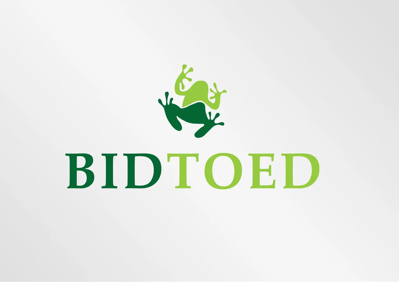
Let me show the logo!
As you can see this simple and attractive as well. I have made 6 versions of this logo which give you 6 different looks. First I have design the frog and you two colors in it and the also used to color in the brand name which "Bidtoed". The Bid is in dark green and toed is in lgiht green color.
Let me show you the frog on top designs!
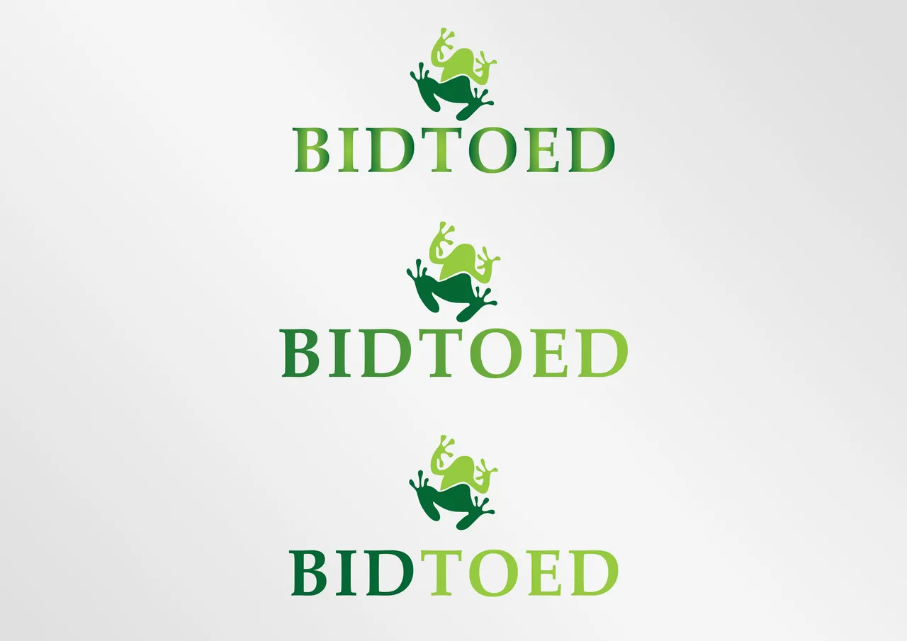
As you have seen in these images these are the 2 versions of this logo that I have created. In the first I have used two colors both in frog and text as well. In 2nd logo I have used same two colors but in frog but in text I used these colors gradient. which is linear. In 3rd design I created the outline and then ungroup each letter and apply gradient on indivisual which also create different look of the logo in appearance.
Now let me show you the other 3 versions of this logo!

As you can see that the above design is quite also different from the previous 3 versions but use the same color scheme for it. As I earlier discuss I have apply the same method as in the previous 3 design but I take this frog inside the "O" which also increase it beauty and make it eye-catching as well for it customer.
Here is the all design that I have created!

This lecture is delivered on steemit and youtube, you can ask any query or question in the Discord Channel of "Rainbow Warriors"
Here is the link to join this channel for any work or query regards anything that comes to your mind!
Note!
If you want further details about this you are most welcome I will provide you what you are looking for :)
Because I'm here at your services! O:)
As you can clearly see that this designed according to the requirement of the customer. I think its good if you people try it once as you can althought these type of logo are very simple but it needs lot more attention of the designer as well.But if you want to make more awesome you can try different effect on it. I'm also planning to make a video tutorial for that purpose. But the problem is that I have taken the initaitive so for that I start my work from sratch and moving step by step. But all the video come an uploaded as I said :)
Steps to do!
- First open the new page.
- Design a from as you like.
- Then set the color scheme which suit the design as well.
- Take a text for brand name.
- Now create outline and ungroup the text to apply the gradient.
- Now make different design as I have designed 6 different versions of it.
Remember!
- Always take clean background for uniqueness and readability.
- Before gradient must convert it into outline or ungroup it.
Note please!
Make you interesting logo like that as you like according to this I have tell you and show me the work that you have done don't shy or feel free nad share it with me!
Hope you guys like this initiative of making the Adobe Illustrator tutorials for those who are unable to find jobs and not able to pay a fee or they are looking for some skills to build on for a long term.
Here is the link of my page like please and share it and like it with others
https://www.facebook.com/Graphics-Channel-151412682234319/
Here is the link of my youtube channel "Graphics Channel
https://www.youtube.com/channel/UCSQy1JJthJG3l0MI6RR4Rew/featured?view_as=subscriber
Please Like it share it and also subscribe it
I'm here to showcase my talent in front of you guys need your huge support and motivation. If you guys keep in touch with me and support my work. I surely gonna rock-on the steemit
Please share your valuable feedback about this post. So in future, I will make better as I can. Thanks for your precious time to reading this post
Regards: Aqib Ashiq
CEO of "Graphics Channel, Rainbow Warriors, Cross Technology"
Fiverr profile
https://www.fiverr.com/aqib_ashiq
Facebook Profile
https://www.facebook.com/aqib.ashiq.31
Upwork Profile
https://www.upwork.com/o/profiles/users/_~0169657518d328561e/