
Introduction
Recently, I had the privilege of presenting Dashboard Dangers: Tips & Tricks for Improving your BI Implementation at Innovate16. I will be presenting a similar topic at Collaborate 18 next month and wanted to start putting some content out there. The purpose of this presentation was to contribute some dashboard tips & tricks as well as the pitfalls of using BI without analytics. I received great feedback from the attendees and wanted to share some of the key topics.
Why BI is NOT Enough
Many organizations have turned to Business Intelligence Software for their reporting needs. Often times, the information displayed in these dashboards is used as the basis of strategic decision-making. They say that a picture is worth a thousand words, but are our dashboards telling us the full story?
$ vs. %: Using the RIGHT Metrics
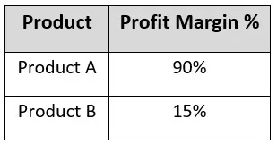
When creating dashboards, it can be a struggle to determine whether our KPIs should display dollar values or percentages. Let’s look at an example of why choosing one may not tell us the full story. Suppose we have two products we are selling. For simplicity, we will refer to them as Product A and Product B. Product A has a 90% profit margin, while Product B has a 15% profit margin. Should we focus our efforts on increasing sales of Product A by 50% or should we focus on Product B?
It’s easy to look at these numbers and think that we should put all our efforts into producing more of Product A. However, what if we looked at a different situation, where we looked at the revenue for two products?

All metrics are depicted per unit
In this case, we see that Product B has much higher revenue and should be the focus of our retention campaigns. However, in looking at these metrics, are we missing out on the true story?
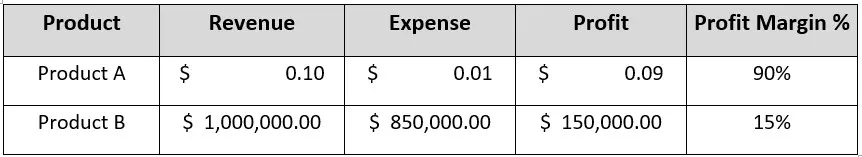
All metrics are depicted per unit
If we look at the metrics together, we can see that we have a high margin product with low revenue (Product A) as well as a high revenue product with low margin (Product B). In looking at these metrics together, we can see that it is better to sell 1 more unit of Product B than 1,000 more units of Product A. However, looking at the full picture can give us some additional insights. Rather than focusing purely on sales, we can also see that finding ways to increase revenue or reduce expenses for Product B may be more valuable than increasing sales of Product A. We hear the adage “Less is More” all the time, but showing less can lead to an incomplete story.
Normalization of Data Groups
Screen real estate becomes increasingly more valuable as device sizes shrink. The same dashboards we used to view on a web browser are viewed on mobile devices; thus, there is constant pressure to consolidate visualizations. One of the ways to do this is to group data. Let’s take an example of an organization measuring customer attrition rates by age group. Creating a retention campaign to retail all employees exactly 42 years of age doesn’t make much sense, so why not group our data into age buckets? Our organization will set a threshold of 15%, meaning that we will create a retention campaign to retain employees in the age group(s) exceeding 15% attrition; attrition under 15% will be deemed acceptable, and no action will be taken. Let’s take a look at our visualization. Note: to calculate attrition percent, we divided attrition for a given age group by total employees in that age group.

As a result of this visualization, our organization issues a retention campaign to three age groups (18-25, 25-30, 45-50). If we assume that a retention campaign costs $100,000 per age group, a total of $300,000 was spent to retain 3 groups of employees. Let’s see how effective this retention campaign is; we will measure effectiveness by number of employees targeted by the retention campaign.
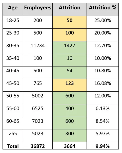
The table above contains the data for our attrition visualization. The beige cells indicate the values that exceeded the attrition threshold. As you can see, the total number of employees targeted is 273 out of 3,664, which is less than 8% of the total attrition. As we look across the data set, we see that if we want to reach the most employees, we are targeting the wrong age groups. Where did we go wrong in our visualization? Our visualization results would have been correct if the data was evenly distributed across all age groupings. However, because all groupings have a varying total customer amount, the percentages are not equally significant; a grouping of 3 employees with an attrition of 2 would result in an attrition percentage of 66.67%. While the percentage is very large, two employees leaving would not be grounds for a retention campaign. In order to gain actionable intelligence from our visualization, we need to ensure that the data is normalized.
Actionable Intelligence
How can we modify our metrics to highlight the most relevant age groups? The good news is that we do not have to change too much in our approach. We can determine better insights by changing our attrition percent calculation. Instead of dividing by the total employees in a given age group, we can take our attrition for each age group and divide by the total attrition value. This tells us which age groupings contributed the most to the total attrition rate. If we analyze our new visualization, we see a totally different picture.
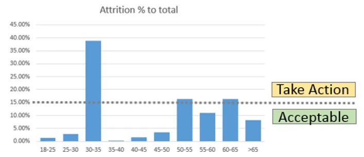
Notice how this new visualization displays different age buckets for our retention campaign (30-35, 50-55, 60-65). If we assume the same $100,000 retention cost per age bucket, we are spending the same amount as our previous example ($300,000). However, let’s see how our effectiveness stacks up against the previous visualization. Again, we will measure retention by the number of employees targeted in our campaign.

The table above contains the data for our attrition visualization. The beige cells indicate the values that exceeded the attrition threshold. As you can see, the total number of employees targeted is now 2,627 out of 3,664, which accounts for more than 70% of the total attrition. With the same retention budget, we targeted 8.6 TIMES the employees in our retention campaign.
Conclusion
This concludes our first post in the series. We have more tips to come in the future. We will dedicate some posts to basic statistical techniques, tips, and pitfalls.