
DropdoneJS is an opensource library that allows us to upload files only by drag and drop into the upload zone that we have specified, even for the image file type can be displayed preview image uploaded so that more interesting.
Upload is also the process of transmitting a file from a computer system to another computer system in the opposite direction of download. From the internet, users who do the upload process is a process where the user sends the file to another computer that requested it.
#####Creating Upload Script With PHP
"
< ?php
if (!empty($_FILES)) {
    $targetDir = "uploads/";
    $fileName = $_FILES['file']['name'];
    $targetFile = $targetDir . $fileName;
    move_uploaded_file($_FILES['file']['tmp_name'], $targetFile);
}
? >
"
"
< !DOCTYPE html>
< html lang="en">
    < head>
        < title>Tutorial dropzone
        < !-- Add Dropzone -->
        < link rel="stylesheet" type="text/css" href="css/dropzone.css" />
        < script type="text/javascript" src="js/dropzone.js">< /script>
    < /head>
    < body>
        < h1>Upload Multiple Files Menggunakan DropzoneJS and PHP< /h1>
        < div class="image_upload_div">
            < form action="upload.php" class="dropzone">
            < /form>
        < /div>
    < /body>
< /html>
"
'
/*
* The MIT License
* Copyright (c) 2012 Matias Meno <m@tias.me>
*/
@-webkit-keyframes passing-through {
0% {
opacity: 0;
-webkit-transform: translateY(40px);
-moz-transform: translateY(40px);
-ms-transform: translateY(40px);
-o-transform: translateY(40px);
transform: translateY(40px); }
30%, 70% {
opacity: 1;
-webkit-transform: translateY(0px);
-moz-transform: translateY(0px);
-ms-transform: translateY(0px);
-o-transform: translateY(0px);
transform: translateY(0px); }
100% {
opacity: 0;
-webkit-transform: translateY(-40px);
-moz-transform: translateY(-40px);
-ms-transform: translateY(-40px);
-o-transform: translateY(-40px);
transform: translateY(-40px); } }
@-moz-keyframes passing-through {
0% {
opacity: 0;
-webkit-transform: translateY(40px);
-moz-transform: translateY(40px);
-ms-transform: translateY(40px);
-o-transform: translateY(40px);
transform: translateY(40px); }
30%, 70% {
opacity: 1;
-webkit-transform: translateY(0px);
-moz-transform: translateY(0px);
-ms-transform: translateY(0px);
-o-transform: translateY(0px);
transform: translateY(0px); }
100% {
opacity: 0;
-webkit-transform: translateY(-40px);
-moz-transform: translateY(-40px);
-ms-transform: translateY(-40px);
-o-transform: translateY(-40px);
transform: translateY(-40px); } }
@keyframes passing-through {
0% {
opacity: 0;
-webkit-transform: translateY(40px);
-moz-transform: translateY(40px);
-ms-transform: translateY(40px);
-o-transform: translateY(40px);
transform: translateY(40px); }
30%, 70% {
opacity: 1;
-webkit-transform: translateY(0px);
-moz-transform: translateY(0px);
-ms-transform: translateY(0px);
-o-transform: translateY(0px);
transform: translateY(0px); }
100% {
opacity: 0;
-webkit-transform: translateY(-40px);
-moz-transform: translateY(-40px);
-ms-transform: translateY(-40px);
-o-transform: translateY(-40px);
transform: translateY(-40px); } }
@-webkit-keyframes slide-in {
0% {
opacity: 0;
-webkit-transform: translateY(40px);
-moz-transform: translateY(40px);
-ms-transform: translateY(40px);
-o-transform: translateY(40px);
transform: translateY(40px); }
30% {
opacity: 1;
-webkit-transform: translateY(0px);
-moz-transform: translateY(0px);
-ms-transform: translateY(0px);
-o-transform: translateY(0px);
transform: translateY(0px); } }
@-moz-keyframes slide-in {
0% {
opacity: 0;
-webkit-transform: translateY(40px);
-moz-transform: translateY(40px);
-ms-transform: translateY(40px);
-o-transform: translateY(40px);
transform: translateY(40px); }
30% {
opacity: 1;
-webkit-transform: translateY(0px);
-moz-transform: translateY(0px);
-ms-transform: translateY(0px);
-o-transform: translateY(0px);
transform: translateY(0px); } }
@keyframes slide-in {
0% {
opacity: 0;
-webkit-transform: translateY(40px);
-moz-transform: translateY(40px);
-ms-transform: translateY(40px);
-o-transform: translateY(40px);
transform: translateY(40px); }
30% {
opacity: 1;
-webkit-transform: translateY(0px);
-moz-transform: translateY(0px);
-ms-transform: translateY(0px);
-o-transform: translateY(0px);
transform: translateY(0px); } }
@-webkit-keyframes pulse {
0% {
-webkit-transform: scale(1);
-moz-transform: scale(1);
-ms-transform: scale(1);
-o-transform: scale(1);
transform: scale(1); }
10% {
-webkit-transform: scale(1.1);
-moz-transform: scale(1.1);
-ms-transform: scale(1.1);
-o-transform: scale(1.1);
transform: scale(1.1); }
20% {
-webkit-transform: scale(1);
-moz-transform: scale(1);
-ms-transform: scale(1);
-o-transform: scale(1);
transform: scale(1); } }
@-moz-keyframes pulse {
0% {
-webkit-transform: scale(1);
-moz-transform: scale(1);
-ms-transform: scale(1);
-o-transform: scale(1);
transform: scale(1); }
10% {
-webkit-transform: scale(1.1);
-moz-transform: scale(1.1);
-ms-transform: scale(1.1);
-o-transform: scale(1.1);
transform: scale(1.1); }
20% {
-webkit-transform: scale(1);
-moz-transform: scale(1);
-ms-transform: scale(1);
-o-transform: scale(1);
transform: scale(1); } }
@keyframes pulse {
0% {
-webkit-transform: scale(1);
-moz-transform: scale(1);
-ms-transform: scale(1);
-o-transform: scale(1);
transform: scale(1); }
10% {
-webkit-transform: scale(1.1);
-moz-transform: scale(1.1);
-ms-transform: scale(1.1);
-o-transform: scale(1.1);
transform: scale(1.1); }
20% {
-webkit-transform: scale(1);
-moz-transform: scale(1);
-ms-transform: scale(1);
-o-transform: scale(1);
transform: scale(1); } }
.dropzone, .dropzone * {
box-sizing: border-box; }
.dropzone {
min-height: 150px;
border: 2px solid rgba(0, 0, 0, 0.3);
background: white;
padding: 20px 20px; }
.dropzone.dz-clickable {
cursor: pointer; }
.dropzone.dz-clickable * {
cursor: default; }
.dropzone.dz-clickable .dz-message, .dropzone.dz-clickable .dz-message * {
cursor: pointer; }
.dropzone.dz-started .dz-message {
display: none; }
.dropzone.dz-drag-hover {
border-style: solid; }
.dropzone.dz-drag-hover .dz-message {
opacity: 0.5; }
.dropzone .dz-message {
text-align: center;
margin: 2em 0; }
.dropzone .dz-preview {
position: relative;
display: inline-block;
vertical-align: top;
margin: 16px;
min-height: 100px; }
.dropzone .dz-preview:hover {
z-index: 1000; }
.dropzone .dz-preview:hover .dz-details {
opacity: 1; }
.dropzone .dz-preview.dz-file-preview .dz-image {
border-radius: 20px;
background: #999;
background: linear-gradient(to bottom, #eee, #ddd); }
.dropzone .dz-preview.dz-file-preview .dz-details {
opacity: 1; }
.dropzone .dz-preview.dz-image-preview {
background: white; }
.dropzone .dz-preview.dz-image-preview .dz-details {
-webkit-transition: opacity 0.2s linear;
-moz-transition: opacity 0.2s linear;
-ms-transition: opacity 0.2s linear;
-o-transition: opacity 0.2s linear;
transition: opacity 0.2s linear; }
.dropzone .dz-preview .dz-remove {
font-size: 14px;
text-align: center;
display: block;
cursor: pointer;
border: none; }
.dropzone .dz-preview .dz-remove:hover {
text-decoration: underline; }
.dropzone .dz-preview:hover .dz-details {
opacity: 1; }
.dropzone .dz-preview .dz-details {
z-index: 20;
position: absolute;
top: 0;
left: 0;
opacity: 0;
font-size: 13px;
min-width: 100%;
max-width: 100%;
padding: 2em 1em;
text-align: center;
color: rgba(0, 0, 0, 0.9);
line-height: 150%; }
.dropzone .dz-preview .dz-details .dz-size {
margin-bottom: 1em;
font-size: 16px; }
.dropzone .dz-preview .dz-details .dz-filename {
white-space: nowrap; }
.dropzone .dz-preview .dz-details .dz-filename:hover span {
border: 1px solid rgba(200, 200, 200, 0.8);
background-color: rgba(255, 255, 255, 0.8); }
.dropzone .dz-preview .dz-details .dz-filename:not(:hover) {
overflow: hidden;
text-overflow: ellipsis; }
.dropzone .dz-preview .dz-details .dz-filename:not(:hover) span {
border: 1px solid transparent; }
.dropzone .dz-preview .dz-details .dz-filename span, .dropzone .dz-preview .dz-details .dz-size span {
background-color: rgba(255, 255, 255, 0.4);
padding: 0 0.4em;
border-radius: 3px; }
.dropzone .dz-preview:hover .dz-image img {
-webkit-transform: scale(1.05, 1.05);
-moz-transform: scale(1.05, 1.05);
-ms-transform: scale(1.05, 1.05);
-o-transform: scale(1.05, 1.05);
transform: scale(1.05, 1.05);
-webkit-filter: blur(8px);
filter: blur(8px); }
.dropzone .dz-preview .dz-image {
border-radius: 20px;
overflow: hidden;
width: 120px;
height: 120px;
position: relative;
display: block;
z-index: 10; }
.dropzone .dz-preview .dz-image img {
display: block; }
.dropzone .dz-preview.dz-success .dz-success-mark {
-webkit-animation: passing-through 3s cubic-bezier(0.77, 0, 0.175, 1);
-moz-animation: passing-through 3s cubic-bezier(0.77, 0, 0.175, 1);
-ms-animation: passing-through 3s cubic-bezier(0.77, 0, 0.175, 1);
-o-animation: passing-through 3s cubic-bezier(0.77, 0, 0.175, 1);
animation: passing-through 3s cubic-bezier(0.77, 0, 0.175, 1); }
.dropzone .dz-preview.dz-error .dz-error-mark {
opacity: 1;
-webkit-animation: slide-in 3s cubic-bezier(0.77, 0, 0.175, 1);
-moz-animation: slide-in 3s cubic-bezier(0.77, 0, 0.175, 1);
-ms-animation: slide-in 3s cubic-bezier(0.77, 0, 0.175, 1);
-o-animation: slide-in 3s cubic-bezier(0.77, 0, 0.175, 1);
animation: slide-in 3s cubic-bezier(0.77, 0, 0.175, 1); }
.dropzone .dz-preview .dz-success-mark, .dropzone .dz-preview .dz-error-mark {
pointer-events: none;
opacity: 0;
z-index: 500;
position: absolute;
display: block;
top: 50%;
left: 50%;
margin-left: -27px;
margin-top: -27px; }
.dropzone .dz-preview .dz-success-mark svg, .dropzone .dz-preview .dz-error-mark svg {
display: block;
width: 54px;
height: 54px; }
.dropzone .dz-preview.dz-processing .dz-progress {
opacity: 1;
-webkit-transition: all 0.2s linear;
-moz-transition: all 0.2s linear;
-ms-transition: all 0.2s linear;
-o-transition: all 0.2s linear;
transition: all 0.2s linear; }
.dropzone .dz-preview.dz-complete .dz-progress {
opacity: 0;
-webkit-transition: opacity 0.4s ease-in;
-moz-transition: opacity 0.4s ease-in;
-ms-transition: opacity 0.4s ease-in;
-o-transition: opacity 0.4s ease-in;
transition: opacity 0.4s ease-in; }
.dropzone .dz-preview:not(.dz-processing) .dz-progress {
-webkit-animation: pulse 6s ease infinite;
-moz-animation: pulse 6s ease infinite;
-ms-animation: pulse 6s ease infinite;
-o-animation: pulse 6s ease infinite;
animation: pulse 6s ease infinite; }
.dropzone .dz-preview .dz-progress {
opacity: 1;
z-index: 1000;
pointer-events: none;
position: absolute;
height: 16px;
left: 50%;
top: 50%;
margin-top: -8px;
width: 80px;
margin-left: -40px;
background: rgba(255, 255, 255, 0.9);
-webkit-transform: scale(1);
border-radius: 8px;
overflow: hidden; }
.dropzone .dz-preview .dz-progress .dz-upload {
background: #333;
background: linear-gradient(to bottom, #666, #444);
position: absolute;
top: 0;
left: 0;
bottom: 0;
width: 0;
-webkit-transition: width 300ms ease-in-out;
-moz-transition: width 300ms ease-in-out;
-ms-transition: width 300ms ease-in-out;
-o-transition: width 300ms ease-in-out;
transition: width 300ms ease-in-out; }
.dropzone .dz-preview.dz-error .dz-error-message {
display: block; }
.dropzone .dz-preview.dz-error:hover .dz-error-message {
opacity: 1;
pointer-events: auto; }
.dropzone .dz-preview .dz-error-message {
pointer-events: none;
z-index: 1000;
position: absolute;
display: block;
display: none;
opacity: 0;
-webkit-transition: opacity 0.3s ease;
-moz-transition: opacity 0.3s ease;
-ms-transition: opacity 0.3s ease;
-o-transition: opacity 0.3s ease;
transition: opacity 0.3s ease;
border-radius: 8px;
font-size: 13px;
top: 130px;
left: -10px;
width: 140px;
background: #be2626;
background: linear-gradient(to bottom, #be2626, #a92222);
padding: 0.5em 1.2em;
color: white; }
.dropzone .dz-preview .dz-error-message:after {
content: '';
position: absolute;
top: -6px;
left: 64px;
width: 0;
height: 0;
border-left: 6px solid transparent;
border-right: 6px solid transparent;
border-bottom: 6px solid #be2626; }'
- if all finished and run index.php then it will look like this:
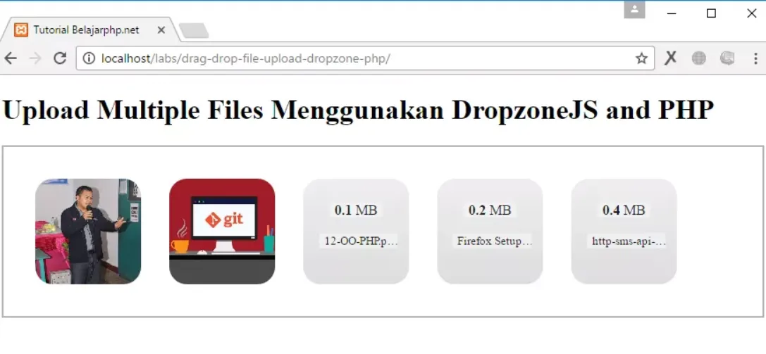
by using this dropzoneJS library then now the file upload process is more interesting and interactive.
Curriculum
- TUTORIAL || How To MAKE GRAPHS WITH PHP MYSQL AND WITH CHARTJS METHOD
- TUTORIAL || Cara Membuat Form Pencarian Dengan PHP Dan MYSQL [ How To Create Search Form With PHP And MYSQL]
Posted on Utopian.io - Rewarding Open Source Contributors