No suelo dibujar pájaros pero creo que me salió bastante mejor de lo que esperaba.
Con la temática de "raven" pude hacer muchas cosas, ya que es una palabra que puede tener muchos significados, o maneras de captarlo, como por ejemplo un personaje animado, hay muchos que se llaman raven. Cuando estuve buscando referencias me salían todo tipo de cosas.
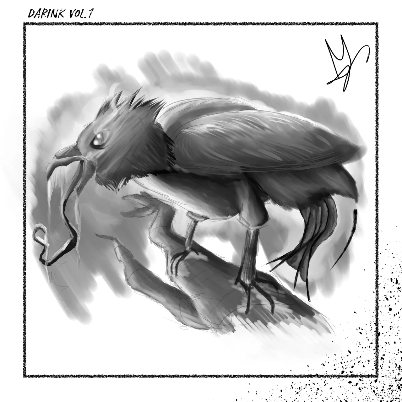
Este cuervo es una especie del bosque el cual tiene la peculiaridad de atacar a sus victimas antes de que estas mueran, básicamente es un cuervo asesino. Además de que segregan un compuesto corrosivo con el que sus ataques hacen muchísimo mas daño.
vamos a empezar a analizar el dibujo:
Para empezar la pose del pájaro es simplemente, que esta apoyado en una rama pero en una pose de alerta para dar sensación de hostilidad. Piernas abiertas y pico abierto para dejar ver sus ácidos.
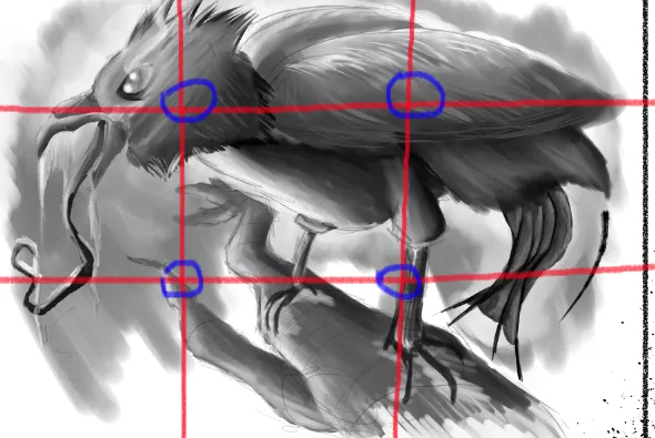
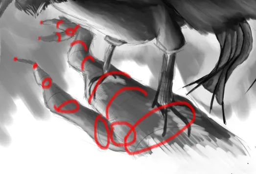
Su composición, es bastante sencilla, las cruces apuntan mas o menos a las zonas mas importantes del dibujo, como su cabeza, ramas en la que esta apoyado, alas y piernas, además de que entre los puntos hay unas líneas invisibles que nos llevan de manera indirecta hacia otros puntos de interés. Podría mejorar la composición si hubiese girado la cabeza unos 50 grados y así dejar la lengua al mismo nivel q la raya invisible.
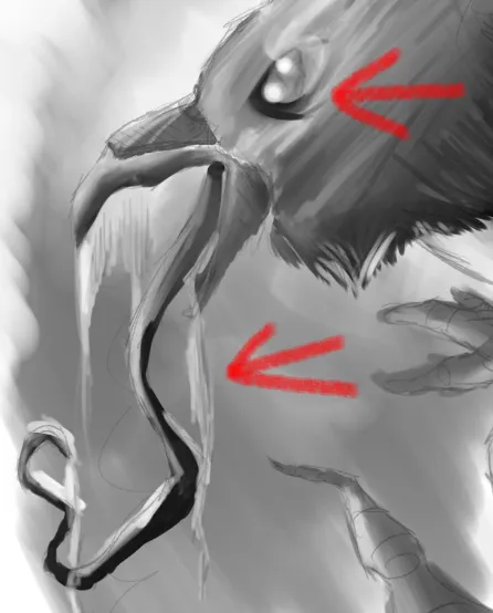
Podemos apreciar unos ojos con bastantes ojeras y una leve modificación en los ojos para imitar a lo que serian las cejas, el hecho de que tenga un aura es un toque personal que me gusta añadir siempre que quede bien, la en la parte de la lengua, al ser blanco y negro hay que jugar con las sombras, para que de impresión de ser una sustancia viscosa y densa. cuanto menos densa sea hay que dejarla mas transparente y mas reflejos que sombras, no como en esta imagen.
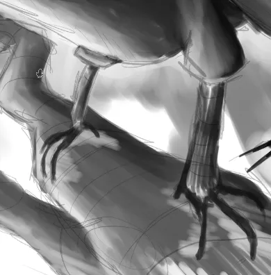
En las piernas es la zona mas apreciable donde podemos ver como es una zona donde se aprecia bastante el boceto, lo deje ya que al venir la iluminación de abajo, no se identificaría el fondo con el borde del dibujo, por lo que decidí dejar el line art entre 30% y 50% de opacidad, para que no fuese muy brusco pero no invisible.
Para terminar un consejo doy es que para hacer ramas de arboles, partamos de aros que representan el radio de la rama, una vez se tiene eso unir los bordes y ya tendríamos las ramas solo dar detalles y listo!
Espero que les haya gustado el post. Un saludo! 😄
ENGLISH:
I don't usually draw birds but I think it came out better than I expected.
With the theme of "raven" I could do many things, since it is a word that can have many meanings, or ways to capture it, as for example an animated character, there are many that are called raven. When I was looking for references I came up with all kinds of things.
This raven is a species of the forest which has the peculiarity of attacking its victims before they die, basically it is a killer crow. In addition to secrete a corrosive compound with which their attacks do much more damage.
let's start analyzing the drawing:
To begin with, the pose of the bird is simply that it is leaning on a branch but in an alert pose to give a sense of hostility. Legs open and beak open to show its acids.
Its composition is quite simple, the crosses point more or less to the most important zones of the drawing, like its head, branches on which it is leaning, wings and legs, besides that between the points there are some invisible lines that take us in an indirect way towards other points of interest. I could improve the composition if I had turned the head about 50 degrees and thus leave the tongue at the same level as the invisible line.
We can see some eyes with many dark circles and a slight modification in the eyes to mimic what would be the eyebrows, the fact that it has an aura is a personal touch that I like to add as long as it looks good, in the part of the tongue, being black and white you have to play with the shadows, to give the impression of being a viscous and dense substance. the less dense is to leave it more transparent and more reflections than shadows, not as in this image.
In the legs is the most noticeable area where we can see how it is an area where the sketch is quite visible, I left it because when the lighting comes from below, the background would not be identified with the edge of the drawing, so I decided to leave the line art between 30% and 50% opacity, so it was not very sharp but not invisible.
To finish a tip I give is that to make branches of trees, start from rings that represent the radius of the branch, once you have that join the edges and we would have the branches just give details and that's it!
I hope you liked the post. Best regards! 😄
Translated with www.DeepL.com/Translator (free version)