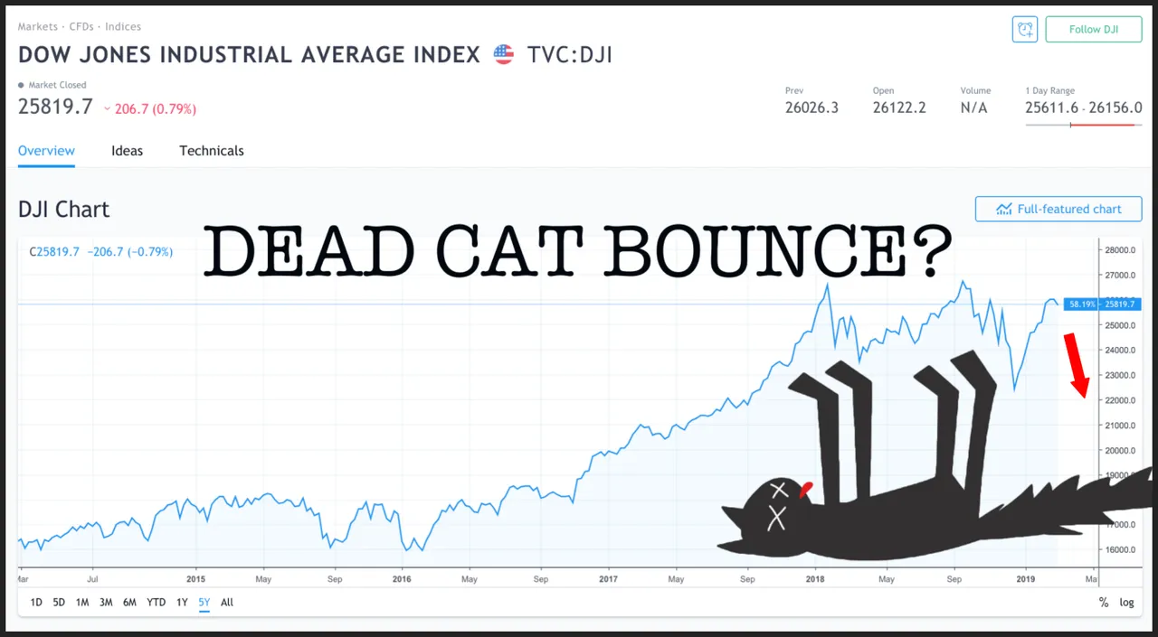
With all this talk of an upcoming recession (in alternative news) one cannot help but imagine based on the current charts that the party is now over for those in the traditional markets. I chose the Dow Jones Industrial Average for the above image but it truth they all look pretty similar.
Could we be at the peak of a dead cat bounce?
Or is this just a little pause on the way up to the next ATH?
Looking at the SPX we can see how the 50-day moving average crossed below the 200-day moving average in December. This is known as a death cross and indicates the potential for a major selloff.
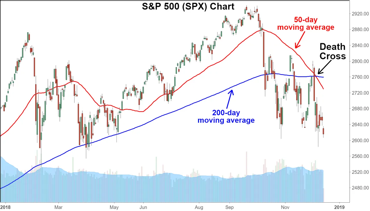
The death cross indicator has proven itself reliable in the past by predicting all of the most severe bear markets: 1929, 1938, 1974, 2008.
Investors who got out at the start of these bear markets avoided large losses which were as high as 90% in the 1930s. A percentage us crypto hodlers are rather more familiar with.
I don't claim to be any kind of expert when it comes to reading these charts. Instead I follow a few people who spend much more time than myself looking at them.
I enjoy following the charts of @silvergoldcrypto on Whaleshares because he always keeps it simple with just a few words on the chart itself.
https://whaleshares.io/@silvergoldcrypto
Here is one of his on the potential fate of the Dow Jones Industrial Average.

In the end of course no one really knows what is going to happen but to be aware of the indicators certainly gives us a heads up when there is potential trouble on the horizon.


The Aspiring Steemit Whales & Dolphins group on Facebook which seeks to help newcomers make the transition from Facebook to Steemit, providing them with detailed notes and personal assistance with their posts... resteeming them when he can.