How do you fomart the paragraphs & pages when you turn your posts to eBook? This is the second part of my first Tutorial series on #SteemitEducation, written in a personal #uLog style.
In my process to release my first book on steemit which included my #fiftywords stories. I have learned many things. This Three-Parter (semi-educational post) I'm sharing what I've learned. (Check the 1st part here.)
Here's "Fifty Words Collection" Announcement
In the last part I went over why I wanted to have book versions of my posts. How I collected the articles & how I came up with my intro and afterword. In this part I'll mention how I choose the font, page size & talk about paragraph styles. Leaving the talk about the book's cover to the final part.
Making Use Of Paragraph Styles
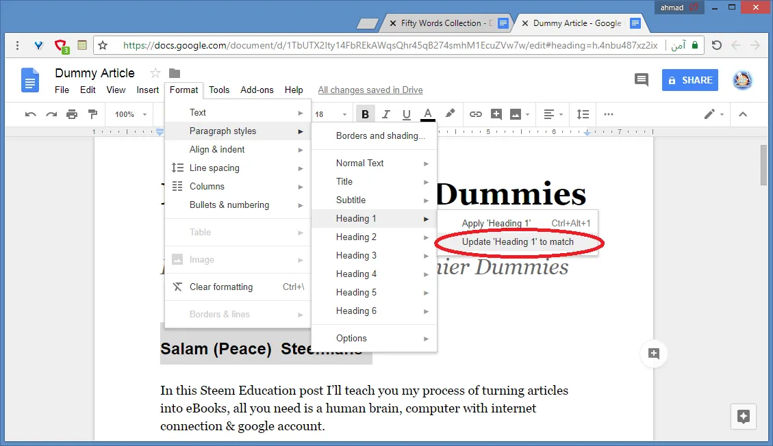
Changing the font types & sizes must be considered through Paragraph Styles first. I learned that the hard way. Maybe that's the first thing they teach when working with Document Editors, but for self taught people like me, it might slip.
Whenever you write a header, it's best to apply the style on the line. The body of the book must be done in a consistent style (typically called 'paragraph.') If you want to change the font type or size of one style, paragraph looks
Changing the style through all the book.
That way, if you want to change the size of the font of all pieces of paragraph or header types, you only have to do it once.
The Font
While I choose font size from the start at least compared to the page. Choosing the font type was very hard. I knew Arial is off limit, that font is a perfect example of Jack Of All Trades Master of None, and personally I feel it's not good choice, at least for my books. Times New Roman is a better choice but I feel I shouldn't choose it.
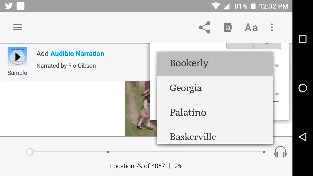
So I went around doing a small research. In the end I decided to choose one of the fonts in the Amazon Kindle list.
I couldn't find bookerly (my favorite font) in google docs. So I choose the next best thing: Georgia.
Georgia, the font I finally picked is... Gorgeous? Just kidding. It's just comfortable to read. I heard that a book font should be unnoticeable to the normal reader. Catchy fonts are better used for titles anyway.
Page Size & Final Touches
One of the problems I mentioned in the previous post, is that my fiftyword pieces were smaller than the page. I could have changed the font size, but I found a better solution to change the page setup itself. From A4 (typical papers) to B5 (typical book page.)
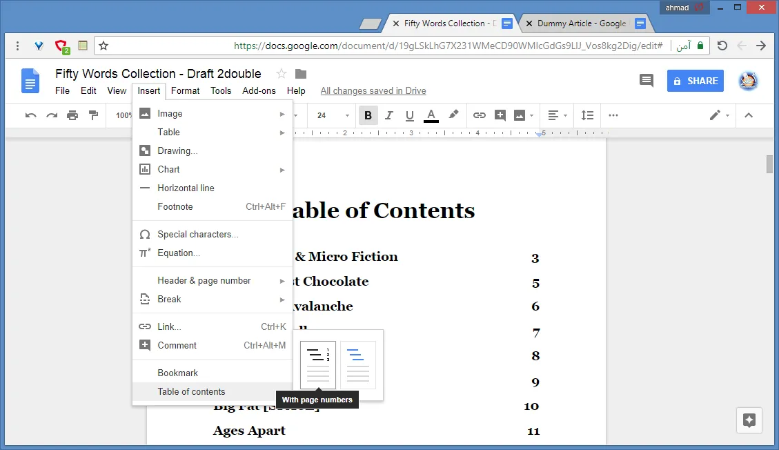
~ The finishing touch ~
I already made a place for it after the title page, it's easy to [insert] one if you've been using the header styles correctly. If you're aiming for Kindle you might want to use links instead of page numbers, but I found it more appealing to do it this way.
What do you think?
So this was how I styled my eBook & in the next part I'll talk about the making of the cover. This still my first ebook so I'm still learning. If you know something that can help please, tell me in comments.
If you haven't yet, you might want to check fifty word stories listed here. Or my longer ones like A Fascinating Legacy, A Murky liquid or Your Heart Would Remember.
