Hello Steemians, with this post I will start to express my considerations about Steemit from a User Experience point of view. I would like to point out that UX is not (only) UI, so I hope you do not mind if I do not immediately jump to fancy and seducing graphics that ultimately, without a high level discussion, may not work ;) Having said that, let’s start!
The WHAT and the WHY
Steemit is a social platform where everybody can, at the same time, produce and curate content. The goal is to encourage the community to produce and promote good content. Reading the white paper, it looks evident that the heritage (if we want to call it that way) of the Reddit experience and the observation of social media that handle content is pretty important.
REAL BEHAVIOURS
Unfortunately I do not have access to the stats. It would be interesting to see:
- what pages users check the most;
- what are the main users paths;
- at what point do users leave (within the path);
- what is the ratio between most used tags, most active and most paid ones;
- how the search functionality is used;
- how people browse the content;
… just to mention a few.
What it is currently evident is that there is a huge amount of users trying to catch the attention of the super-powered whales in order to get votes and, consequently, gain some money. The process is addictive and people are trying whatever: using appealing tags in non-related content (e.g. see the over use of ‘introduceyourself’), using female bodies (sadly, I am not sure that all these accounts are real… and no, the identification process does not help since I can pay my nice 20 year old neighbour to pose for me), checking at what time to post, analysing whales' behaviour and so on. The side effect of this is a massive overwhelming production of content that, as a flood in a river, hides the visibility of good quality content.
But is this what we want?
THE FAR WEST ERA
Steemit is in its gold rush age and we are witnessing the arrival of miners and cowboys that will try to get the best with any method. These activities produce a lot of noise. Theoretically speaking, this is fine. Nobody is doing anything illegal and all users are trying to get the best with a more or less scientifically approach. But this platform and, more important, the genuine community behind it, has a goal and the design can help the process of content curation.
TOWARDS MATURITY
Every social community is an emergent system whose collective behaviours are more than the sum of the single ones. Each single behaviour does not have conscience about the whole. Design can definitely help to build affordances and constraints to affect users' behaviours at the microlevel and improve the overall experience. Ethics and community culture are essential in the long term. If we want Steemit to be successful, we need an ethical, friendly community.
All the problems mentioned above are related to Steemit content curation.
THE PROBLEM OF CONTENT CURATION
Curating content involves the activities of (1) evaluating the quality, (2) sorting through the vast amount of materials and (3) classifying the content. The result is a meaningful and organised presentation that ease the consumption of content of interest for the user.
In the text below, I am going to highlight critical elements that affect the content curation in Steemit. Following, I am going to propose solutions that, hopefully, will trigger a meaningful dialogue in this community.
1 ACCESS THE CONTENT
In order to manage the content, one first needs to be aware that it exists! As simple as that!
1.1 TIME and the VISIBILITY
The presentation of new fresh content is a mere chronological list filtered by its category (or available, for a very tiny moment, in the big flow of the home page). Later in time, it may be listed according to this status (hot, active, trendy etc) but this depends on its success (people voting or commenting it). Curators only act at certain times of the day. These two factors increase the risk of missing good content produced in dead hours. More likely, if one does not get the vote of a whale in two hours, it will never get into trending and the content will be basically lost forever.
1.2 SEARCHABILITY and CONTENT GATHERING
Regardless the type of content organisation, searchability is an essential attribution to gather content of interest for the user. The actual Search Result Page featured by Google provides a list of content that does not add any information to each result. The user faces - again- a big almost unreadable long list. Additional information such as (as example) tags, time of publication, status of the user may help the searcher to select the result they are looking for.
1.3 BROWSEABILITY and SERENDIPITY
In general, the pleasure of browsing content is similar to the feeling of going to a bookshop without any idea about what book to buy. This is inexistent in the current design. The list format and the consequent vertical scroll kills this feeling. A different visualisation and a different type of interaction may improve the content discovering experience.
2 QUALITY CURATION
2.1 REPUTATION and the POWER OF VOTES
We all agree that limiting the curating activities of new accounts is necessary to contain bots or fake accounts. At the same time, we are experiencing the extremely heavy power of whales and the unbalanced effect produced by their actions. The importance of a vote is denoted by the Steem power which can be acquired by writing successful posts or voting for successful content. In such a system, the vote becomes an investment. One may risk and vote for a fresh promising content (that may not emerge because of many reasons) or vote for a safe post produced from a whale. Obvious to say, many people would not invest in risky content, unless there is a way to promote the content itself. Is there any way to trust newbies or to build a more balance system that it is based on users' reputation (e.g. this user is competent in 'quantistic mechanic' while this other user not) but give trust to genuine people that just arrived late?
2.2 TOOLS and CONTENT EVALUATION
Many tools are available to judge and organise the content:
- bookmarking: unavailable - it gives the possibility to come back and finish the work;
- vote: present but unbalanced. As it is possible to vote from the preview, the system does not guarantee that the curators have at least scrolled the text;
- tags: only attributed by the author and often abused (use of non-related tags or too many tags);
- rating: unavailable. It provides a more accurate evaluation of the quality of the content.
- commenting: present
3 TAILORING CONTENT TO THE USERS
And here we are in pure user experience! You do not want only the things working! you want the user having fun, enjoying the use, feeling pleased to be part of a community!
3.1 CONTENTS OF INTEREST and RECOMMENDATION SYSTEM
Profiling and providing tailor content is nothing new on the internet. All social media provide a customised feed where the user gets aware of what happened while they were not online. The feed is built with: (not exhaustive list) content produced by accounts the users is following; content of interest coming from trusted sources; recommendations provided according to the user profile; hottest general content from the platform. This is missing. Every user visualises exactly the same.
PROPOSED SOLUTION
DISPLAY
A different way of displaying the content is required. Long lists increase the risk of missing the content. Improving the browsability of content of interest and of the search result page eases the content gathering and the possibility of finding new fresh content. Underground content needs to be framed and leveraged. Visualisation plays a big role.

A customised feed, tailored to the user, improves the experience of the single person. It also raises the possibility of showing the right content to the right person (e.g. to a person competent able to judge it).
Additionally, inserting recommended content to the user feed generates serendipity and keeps the system dynamic. We agreed that a living system cannot stay stuck. StumbleUpon is very good at this.

The visualisation metaphor represented here takes inspiration from the magazine experience. Imagine browsing your featured content on the iPad like it was a magazine (swiping pages) and jumping to the section of interest whenever you want. The web visualisation provides a sum of interesting content produced while the user was not online.
Other additional interventions may be:
- allowing people to follow people (this is already possible but not clear), channels, topics;
- improving understandability of the status labels hot, trending and so on.
VOTING
Some ideas about voting:
- Re-thinking the attribution of the power of votes and balancing the power of whales will reconstitute the balance in the community;
- Voting should be displayed only in actual page and not in the preview;
- Allow users to evaluate the tags attributed by the content creator and suggest new tag (or propose the removal of some)
PERSONALISATION
Make the user aware of their status in the system. That way the user is conscious of the progress they are doing and their value into the system. Also, improving the profile and adding some gamification elements can make the experience more interesting.

Mockups

Wireframes for an iPad visualisation (responsive web view)
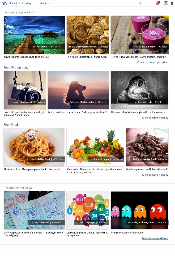
Desktop web view
I mocked up this UI for the sake of conversation, it doesn't mean to be exhaustive. I felt that notifications, channels and the profile pic were a nice add. Hope you like it!
This article has been written in a finca in Nicaragua 🇳🇮 , fighting against mosquitos, playing with chickens and enjoying the wild life 🐍 🐓 🐗 🌿 🐝 🐛 🌾 🌺 🎒