Hello Steemit. I am Josh. I like designing. Here is a new UI for Steemit.
New Steemit Interface - Mockup.
First lets take a look:
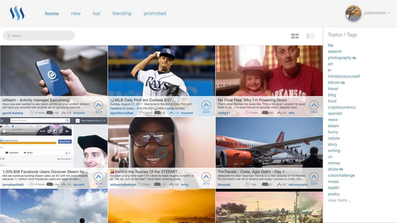
This is what I am calling the grid view. A 3 post wide look that is very image based. The row view can still be used
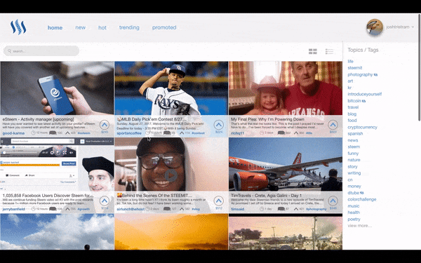
I made this gif of how scrolling would work, its not perfect, as I would make the site bar fixed. It still gives a good idea of how it would work.
Break down.
Lets look at all the changes. Note that this is just an idea and not official.
Where is the reputation?

In this mockup I removed it becouse:
- It was really hard to fit.
- Reputation is not a good way of seeing if a user is good. Spam bots have high rep because of the amount of comments they make. Reputation would still be on the profile.
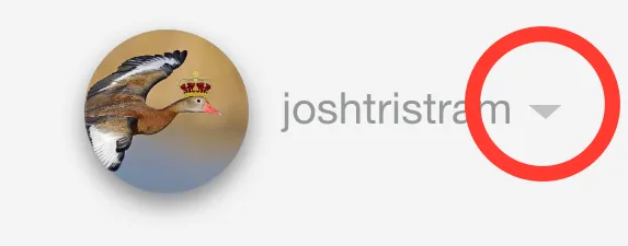
Where is the submit button?
In the drop, reveled when you click the arrow next to the profile. When I mockup the menu I will change the title as "Submit a Story" is not really fitting all the different type of posts on the platform now.
Whats the Steem logo doing next to topics.
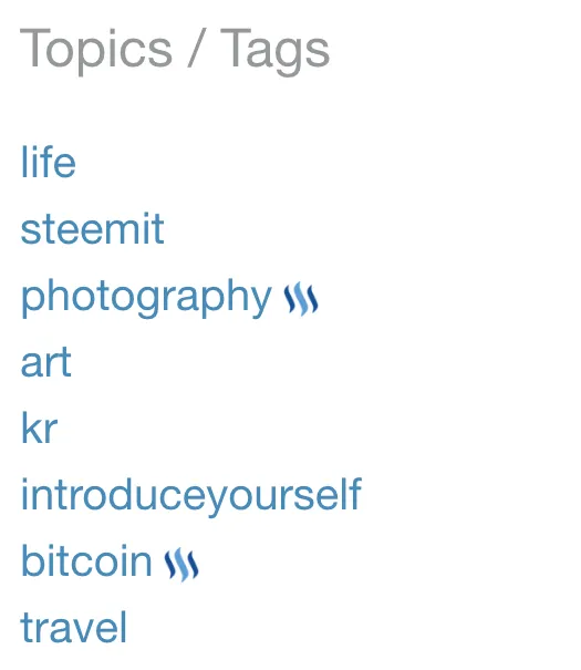
This is meant to show that its a trending topic. I don't like the current use of the steem logo next to 100% steem power post and think it can be better used to show what's trending.
Conclusion
I want to keep working on this mockup and making a working version that was more pages like profiles and posts. This is only the first version and would really like it if you left a comment with your thoughts.
If you like it please show your support for this community project but leaving an upvote and resteeming.
The posts and images used in the mockup belong to their respective owners.