Hi everybody!
I come back with step by step artwork. In my last post some of you asked me to explain better which is the metodo to make my artwork, explain better why I choose the colors tones and color harmony and now I would like to give some tips I use to create a digital illustration.
I use Adobe Photoshop to make my artwork. Personally I think that it does not matter if you use another drawing program, the concept is the same to create a digital illustrator. The most important is how you use the tool.
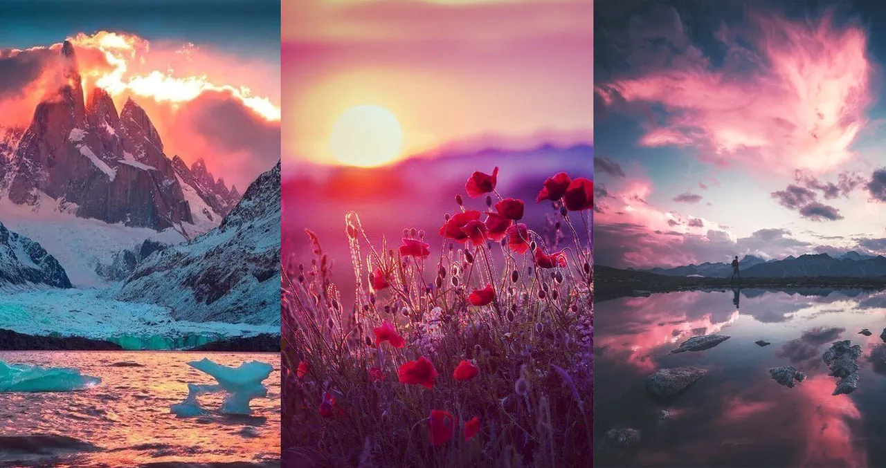
@fadamada asked me how I select the color in my composition. Generally it is a experimental process but I discover recently one way to have an idea about colors. For this illustration I search some pictures on www.pinterest and I create a moodboard with 3 landscape photo. This moodboard is a reference about how I would like to looks the composition at the end and Its help me to select colors and know what contrast I am looking. Here below the moodboard for this illustration.
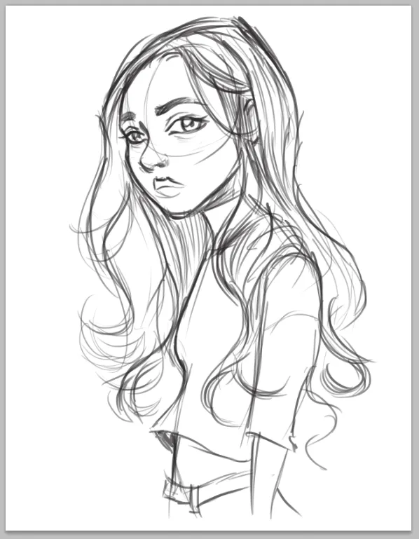
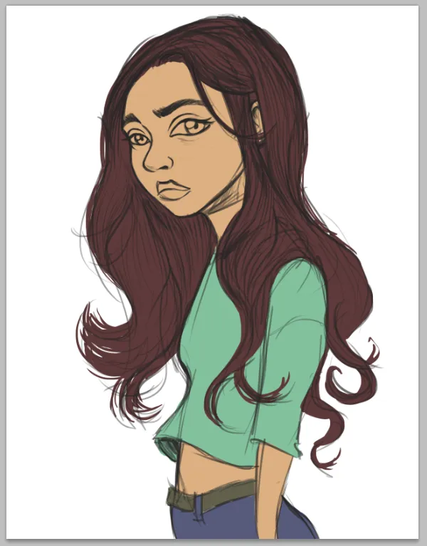
Step 1. The sketch is the base of the drawing. Dont worry if this drawing if rough. It is just a guie for the next step. Also each illustrator has a personal style of drawing and you decide to make cartoonish or realistic illustration.
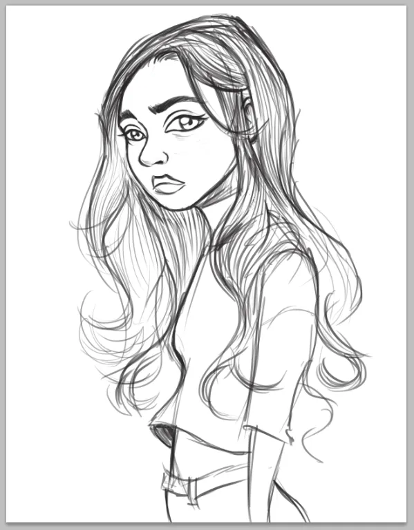
Step 2. I redefined some details on the face of main character.
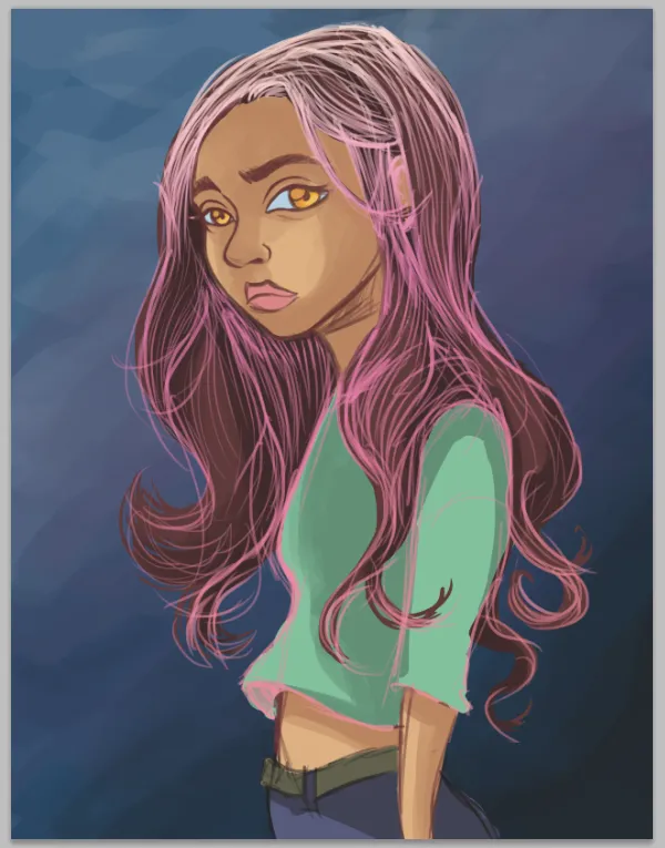
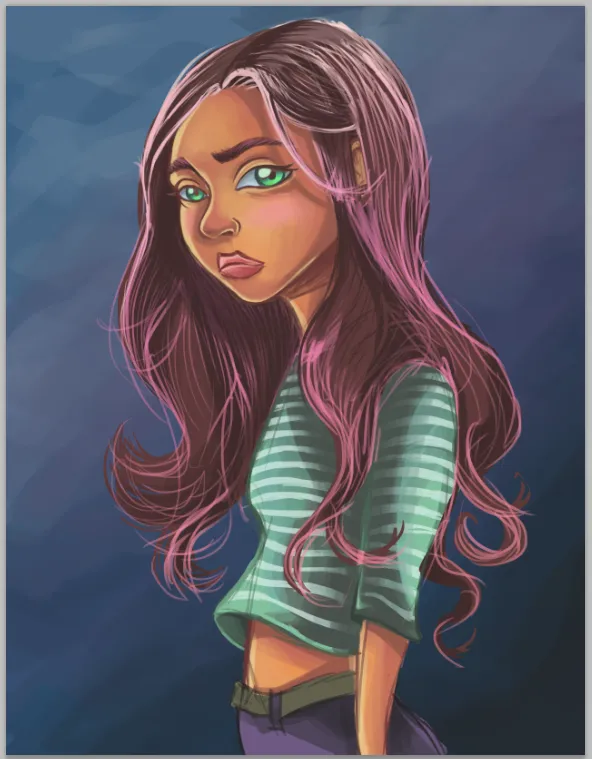
Step 3. Here I applied a flat color in each part of main character, skin, hair, t-shirt, jeans. Something important, I added black-brown color in the hair because I am thinking to add bright and light colors on hair in the next steps. If I want that looks awesome I need a base tone dark.
Step 4. I added a blue blackground. Thinking on the moodboard as a reference.
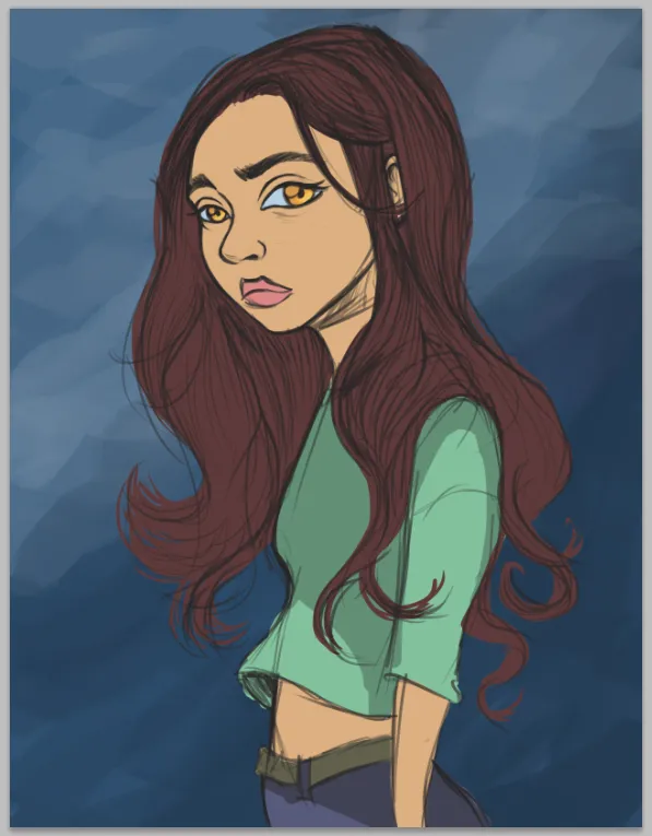
Step 5. If you see the background of previous step has a monotone, I mean the blue. To make more interesting harmony color I added a purple. When I applied a color on skin or eyes, ect I use diferents tones, not only one with degradation of Brightness (black or light) but a variation of Hue too. In this step I added some shadows on each flat colors layer.
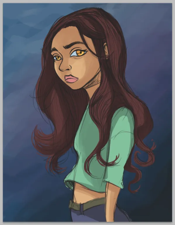
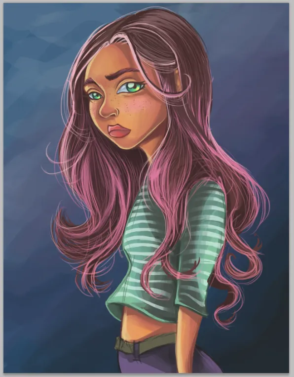
Step 6. Something that I used to make is a gradient color into sketch layer (it is a layer mask into the layer sketch). In this case is a gradient of pink and light-pink because I am thinking in the moodboard colors and it have been inspirated me to add this shining pinks colors on hair.
Step 7. Some ajustment on edges of color face and clothes.
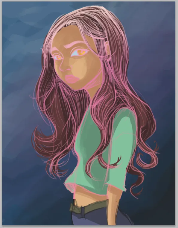
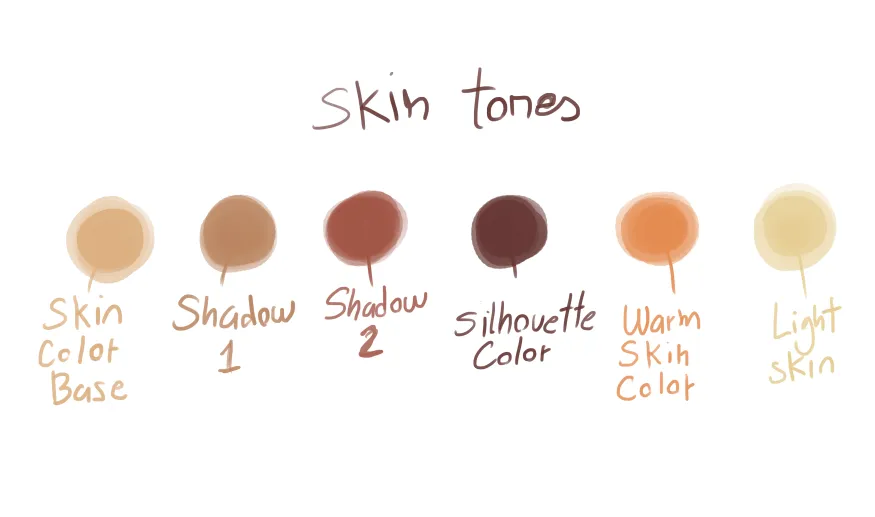
Step 8. Well its time to talk about skin color. I would like to show you a palete color I use for the skin. The key here is try to use not only one tone of brown. Also is important make a good blending color between “skin color base”, “shadow 1” and “shadow 2”. The ”warm skin color” (is a orange tone) help me to create a warm harmony. Some times it happend to me that I selected a black color skin tones and it looks too cooler.
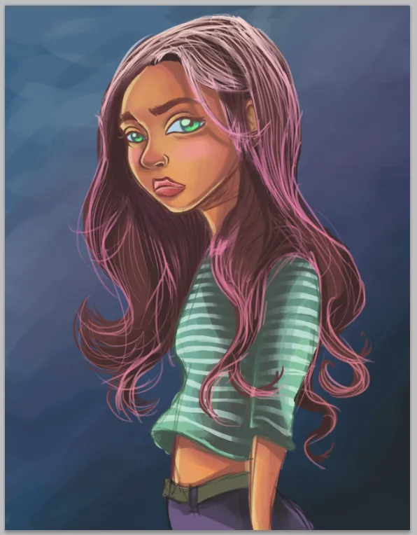
In this step also I added more details on t-shirt (some lines) because I thought that was so simple without it. Also I decided to change the eyes tones to green because the skin is already orange: I was looking contrast’s color.
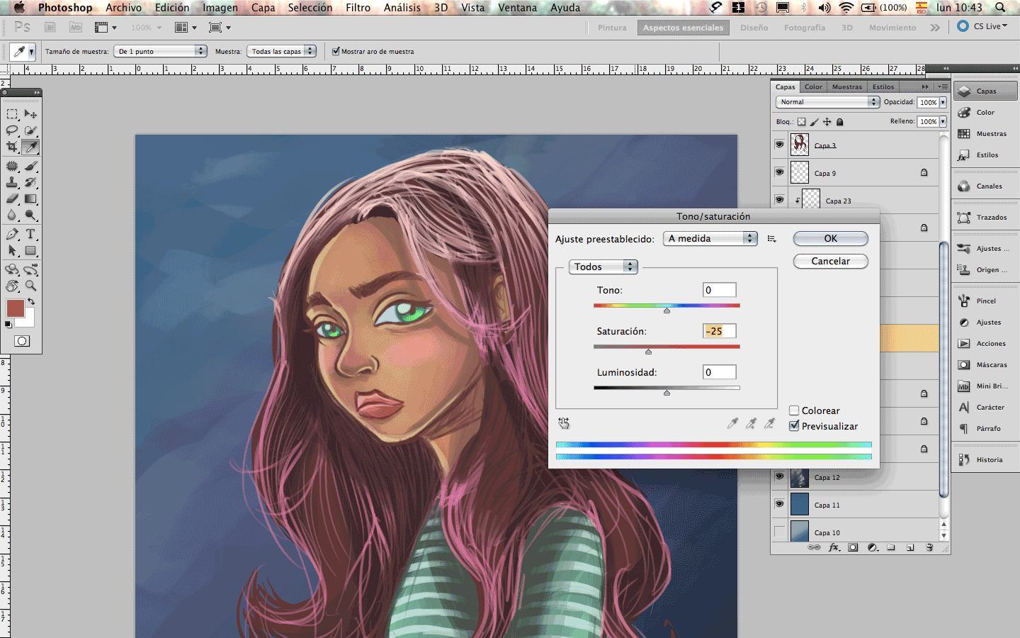
Just an advice: In Photoshop go to “Image” and “Hue/saturation” or just press the botom “control+U" you can use the saturation option and make the color tone of skin more bright with intensity color sliding through the option to the right (check the gif below to understand what I mean). Also in this panel you can change the tone with the Hue option, as well sliding through to the left or right it let you change the whole layer color and experiment with another chromatic possibility.
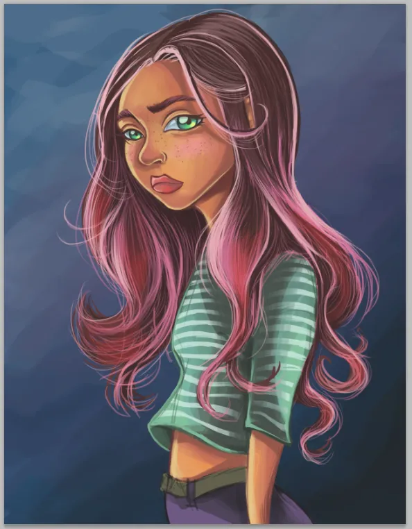
Step 9. More details on hair and blending color on skin. Pacience and pacience is the key here!
Step 10. The hair was a messy with confuse lines so I decided to work more on it.
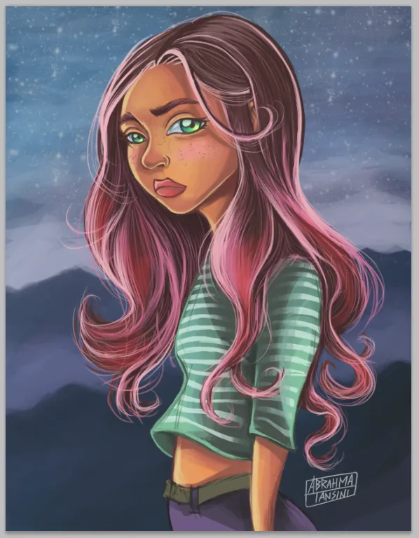
Step 11. So time ago I found a picture of a girl with had a red hair color, I thought that someday I am going to add this effects in one of my character and here was the perfect opportunity to make it.
Step 12. The hardest part to me. My speciallity is the character design and I used to created main characters more than background. This time I took the moodboard as an inspiration.
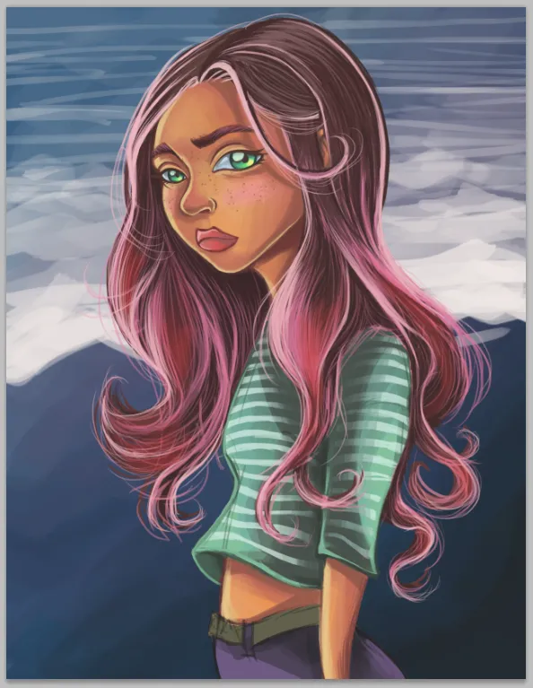
Step 13. More details on background
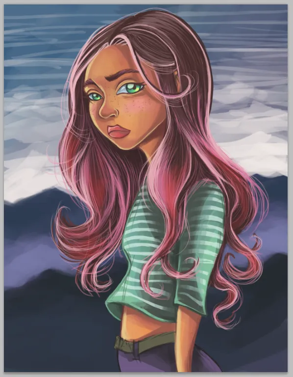
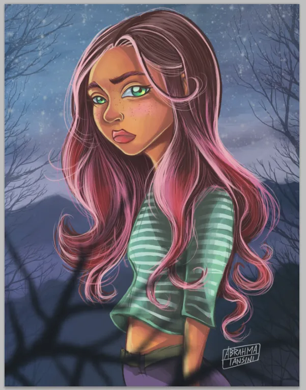
Step 14. I realized that mountain was too strong and it removed the protagonism of main character so I decided to reduce the opacity of layer.
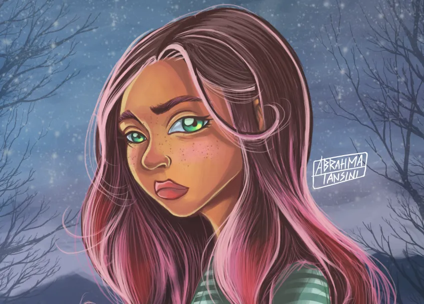
Step 15. Finally is almost completed. I only add some details on background: branches of trees without leaves.
Here I am upload a .gif file that show the step by step the process work. I hope you like it.

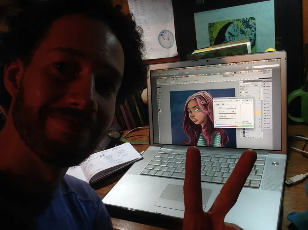
Also, a picture of myself and my old mac book pro 2006. The warrior!
I really sorry if my english is so basic with many mistakes. Is not easy express myself in another language. I speak an write only in spanish and italian. I hope to improve my write-english skills with this step by step post. If you like my post and you want to support my art, upvote me or reesteemit. I really apreciate all your feedbacks and opinions. I can talk about a particual aspect in this creative process if you asked me.
Thank you so much to check my post and enjoy it. Also if you would like to see more of my work, follow me at instagram: https://www.instagram.com/abrahmatan/
Copyright @abrahmatan - All Rights Reserved
Media: Adobe Photoshop and creativity! ;)